Overview
Many companies have annual reports to give up to date information to donors, owners, or shareholders of a company. Most of these annual reports are poorly designed because they just want to send out the information necessary. We were tasked with making a fun yet informative annual report.
Research and Brainstorming
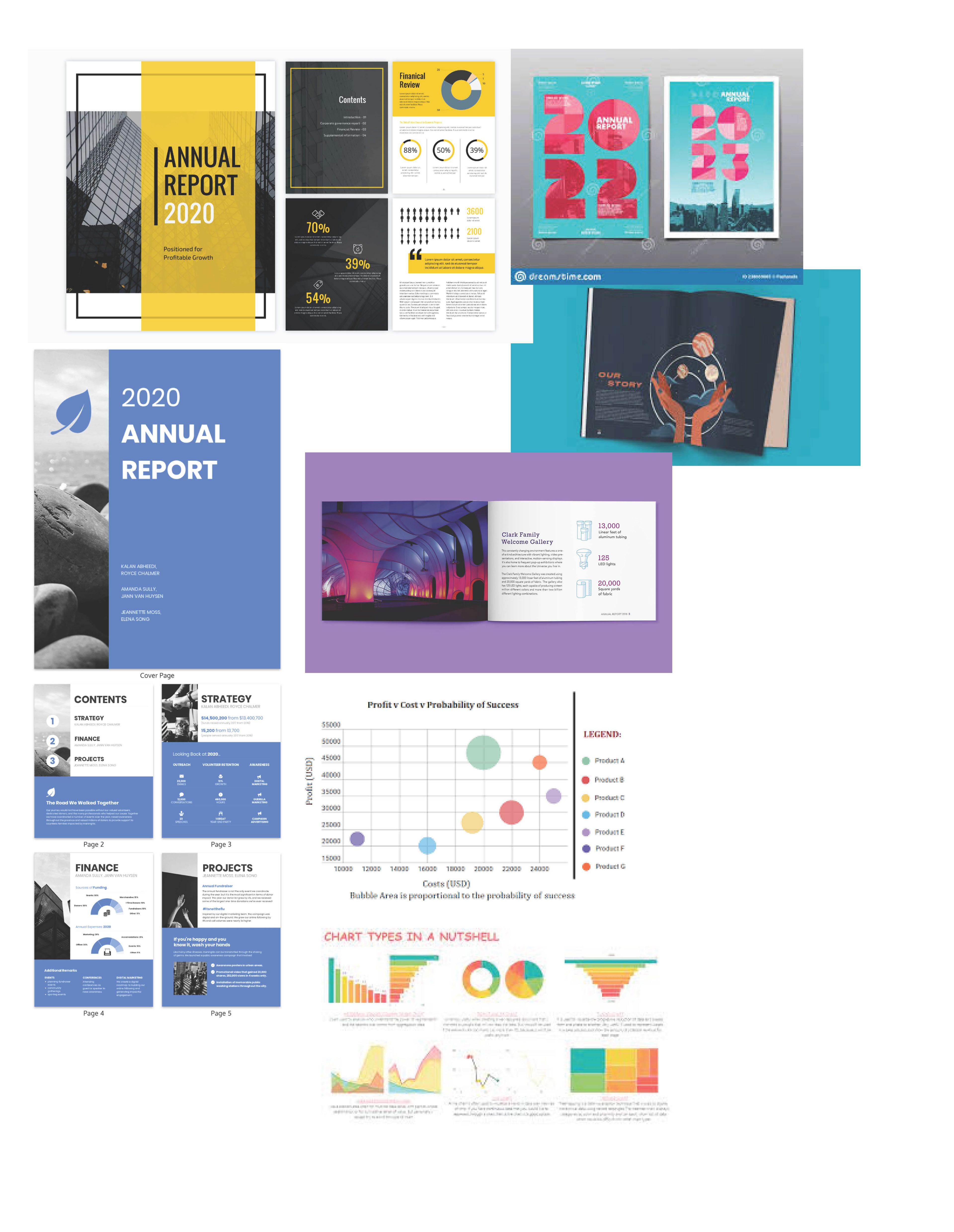
I was really drawn to the simple reports. I didn't like the overly complicated graphics and color blocking.
Sketches And Doodles
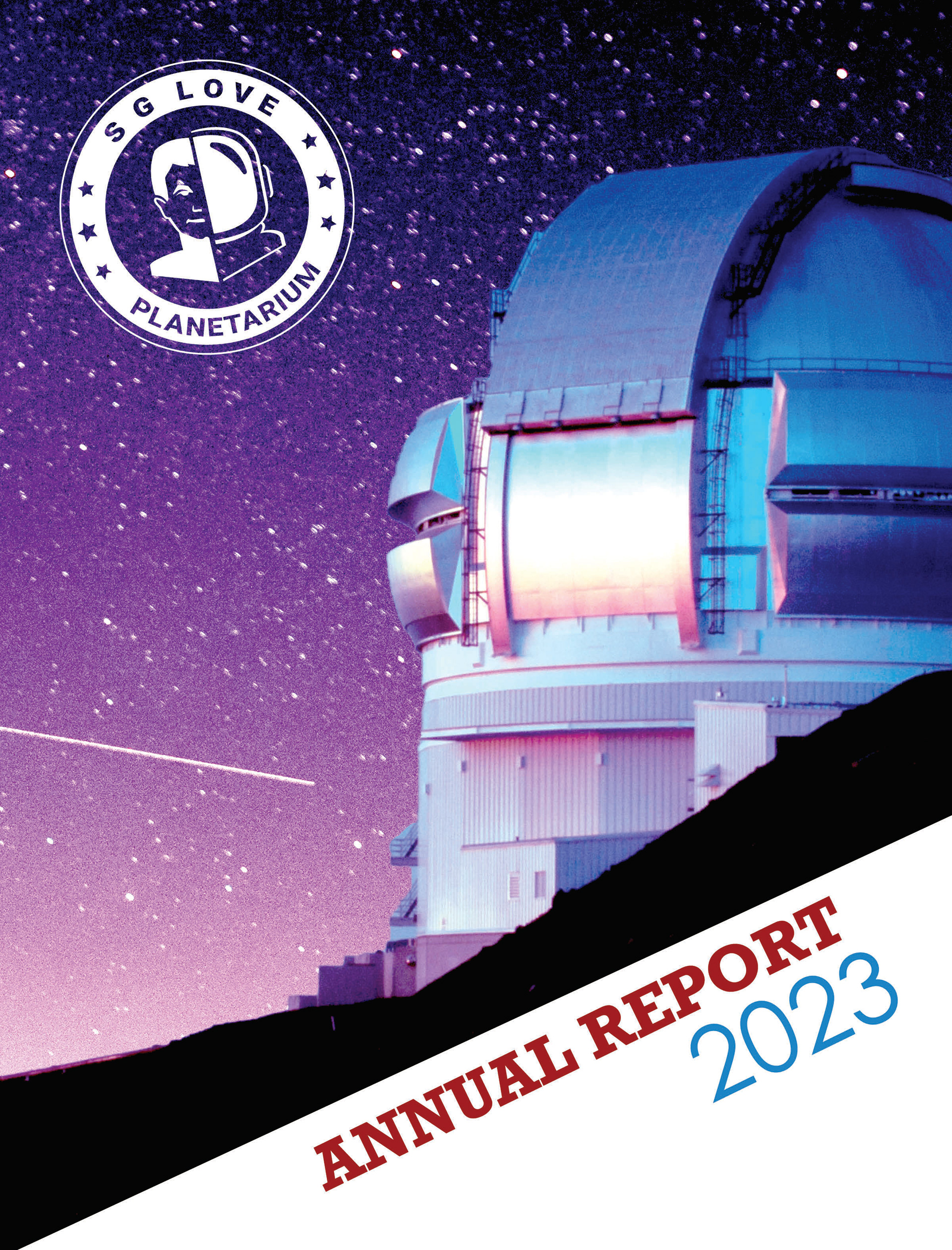
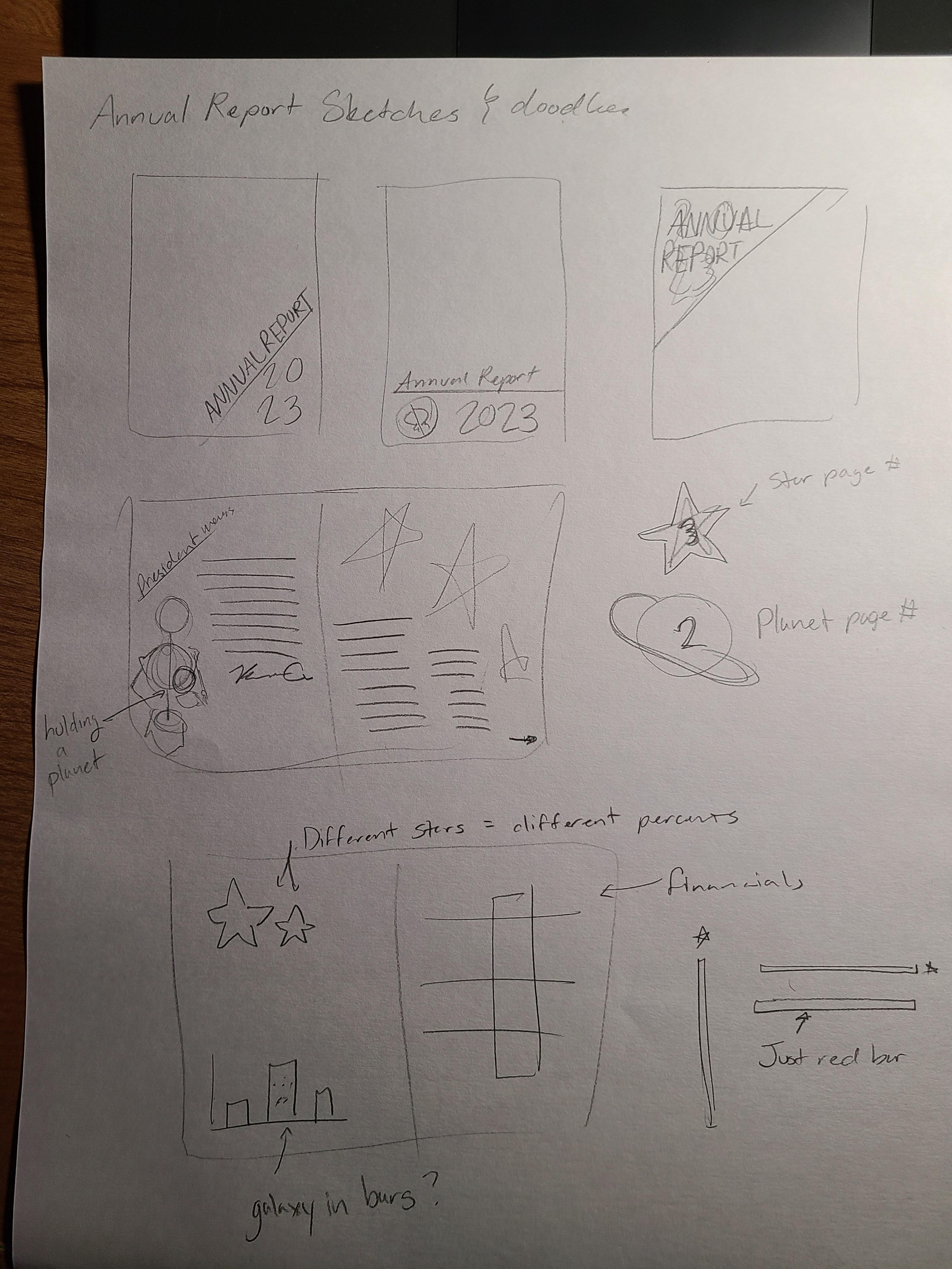
The first thing I wanted to get a layout of was the cover. I wanted something simple but impactful. I was going to do the planetarium photo that I prepared for the magazine ad and never used but the part that I was having trouble with was the type placement.
Thumbnails
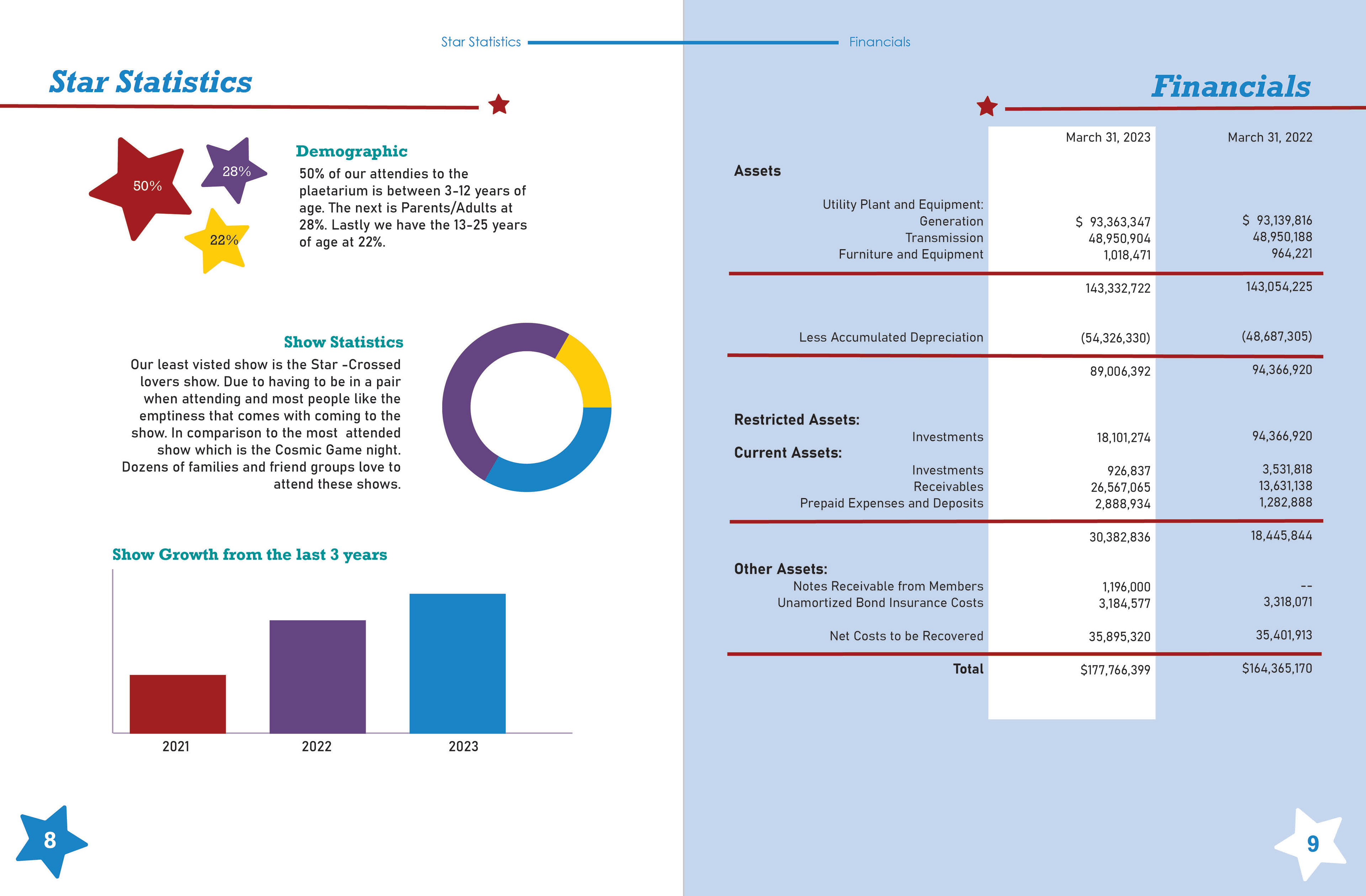
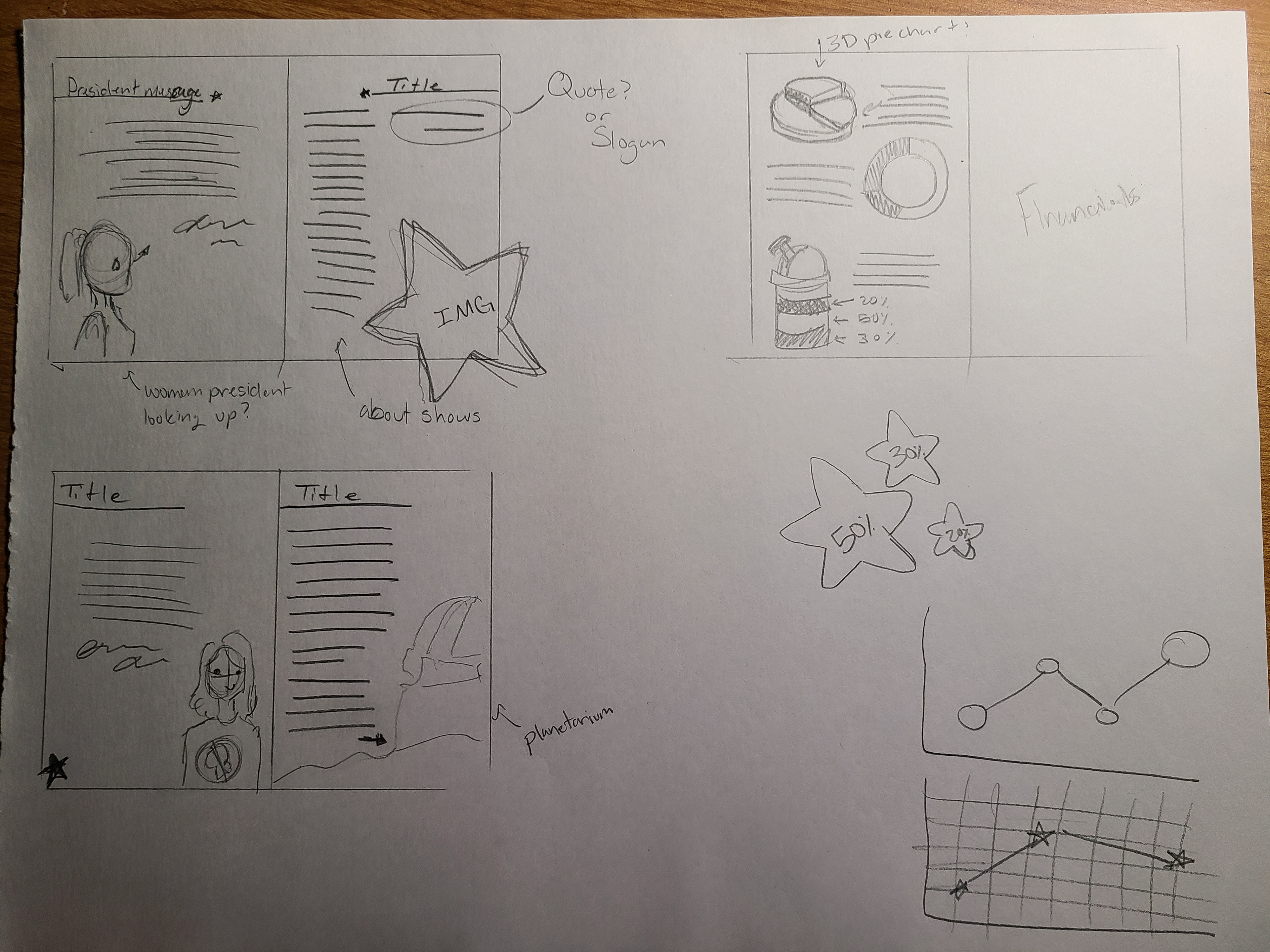
In my thumbnails I wanted to get a grasp of the inside layout and what I wanted to do. I did more research and found a great photo of a person smiling. I wanted her to be my president and I had a lot of fun making a signature. I also wanted it to be like she was really proud of where she worked so I even integrated a star into her signature.
Final
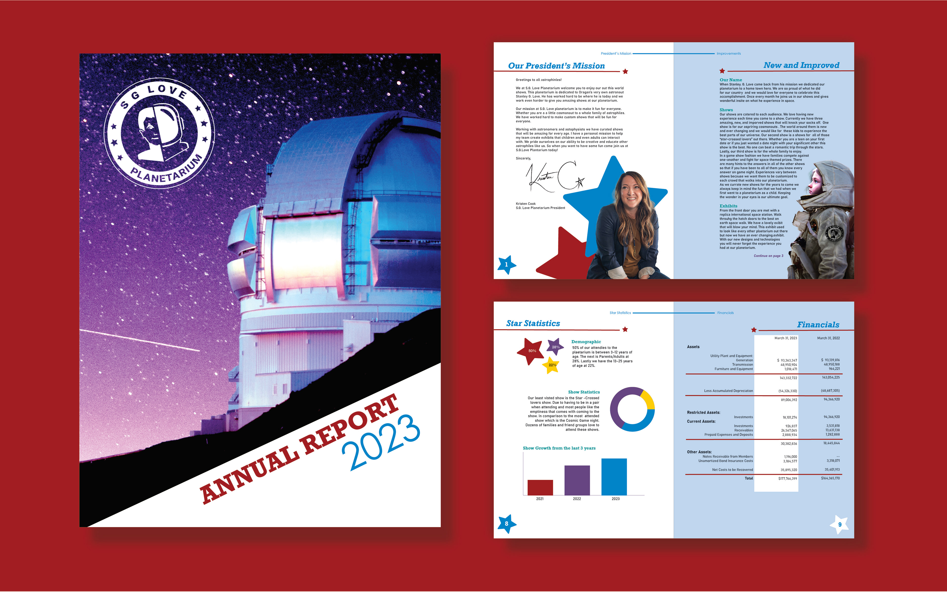
I didn't get to get many critique and help on this assignment like I should have. I really like how everything has turned out in the end. I am most proud of my front page. I know that there could be some work done on the type treatment for the Annual Report 2023 but none the less I like it. My logo is a make-shift moon and the planetarium looks wonderful.
The inside of the report could be fixed in some areas like in the widow department but after spending one all nighter on it I left them since it was crunch time. Note to self get better time management skills and don't take 2 advanced classes at the same time. I was shocked with myself in the end since I talked to some of my classmates and they were as far as I was by the time I finished. My favorite part of this has to be the bottom half of my president's page. I really like how the president looks with the stars and the signature was really fun to do.