
OVERVIEW
Bags are the delivery system for many products. The Client tasked with designing a bag that held a bulb, tuber or rhizome. We had to effective convey what was in the bag and make a name for it as well. The bag had to fold and glue into the finished bag. We also need to close the bag as well. This bag will be neat and upright for presentation just like at a store.
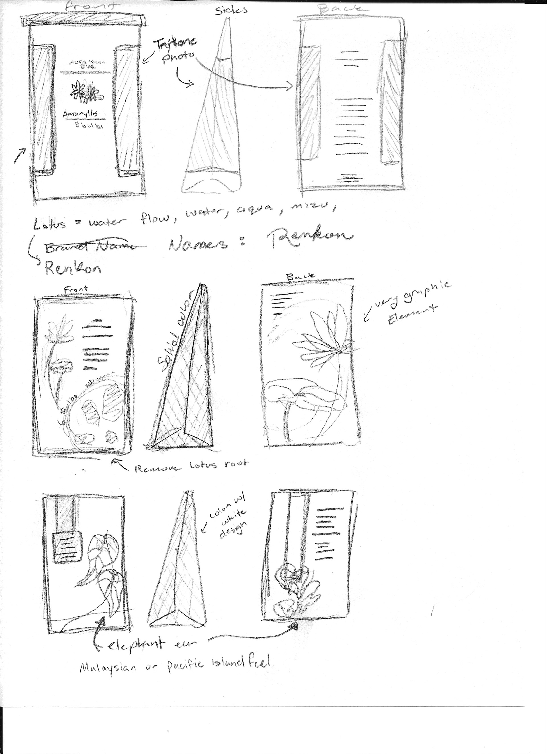
SKETCHES and DOODLES
These are the initial sketches that I thought would be really good. I ended up merging some designs together and adding quite a bit more detail to the final.
THUMBNAILS
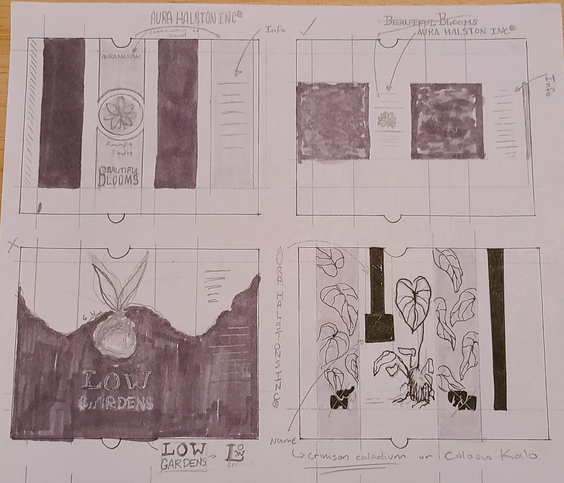
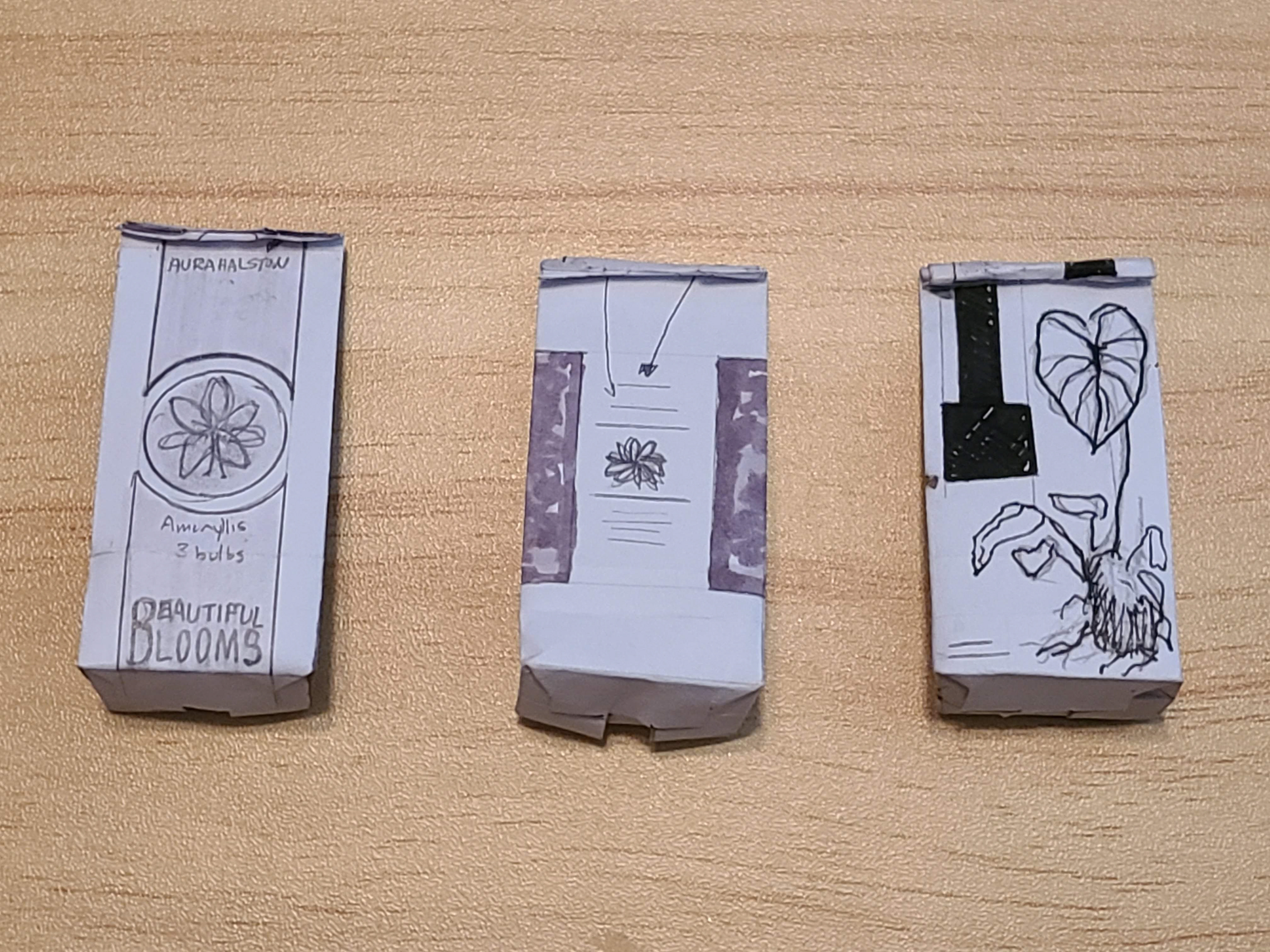
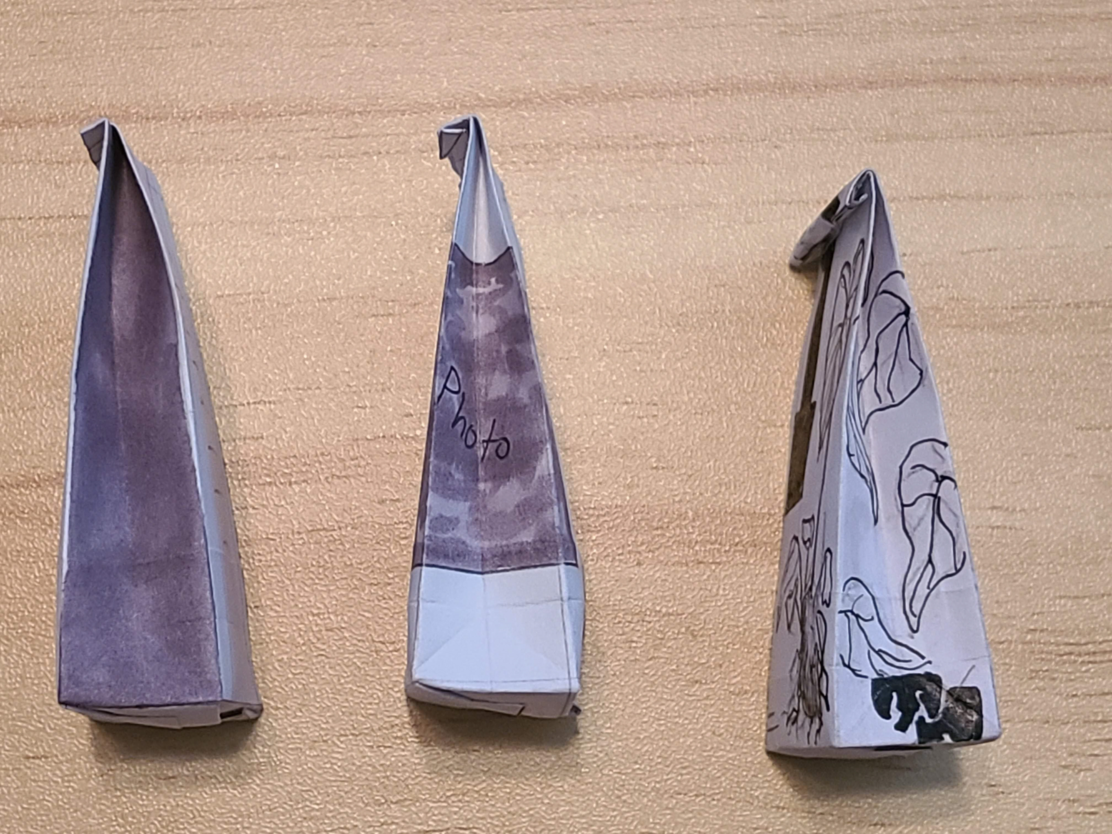
There was one thumbnail that I drew but didn't want to go through with at all so it never made it to the dummy. During this stage I was leading toward the elephant ear monstera and the Amaryllis. They were the middle and the right designs in the dummies for reference. I thought the use of a photo would be nice and I really liked the thought to have a really rough illustration of the monstera plant.
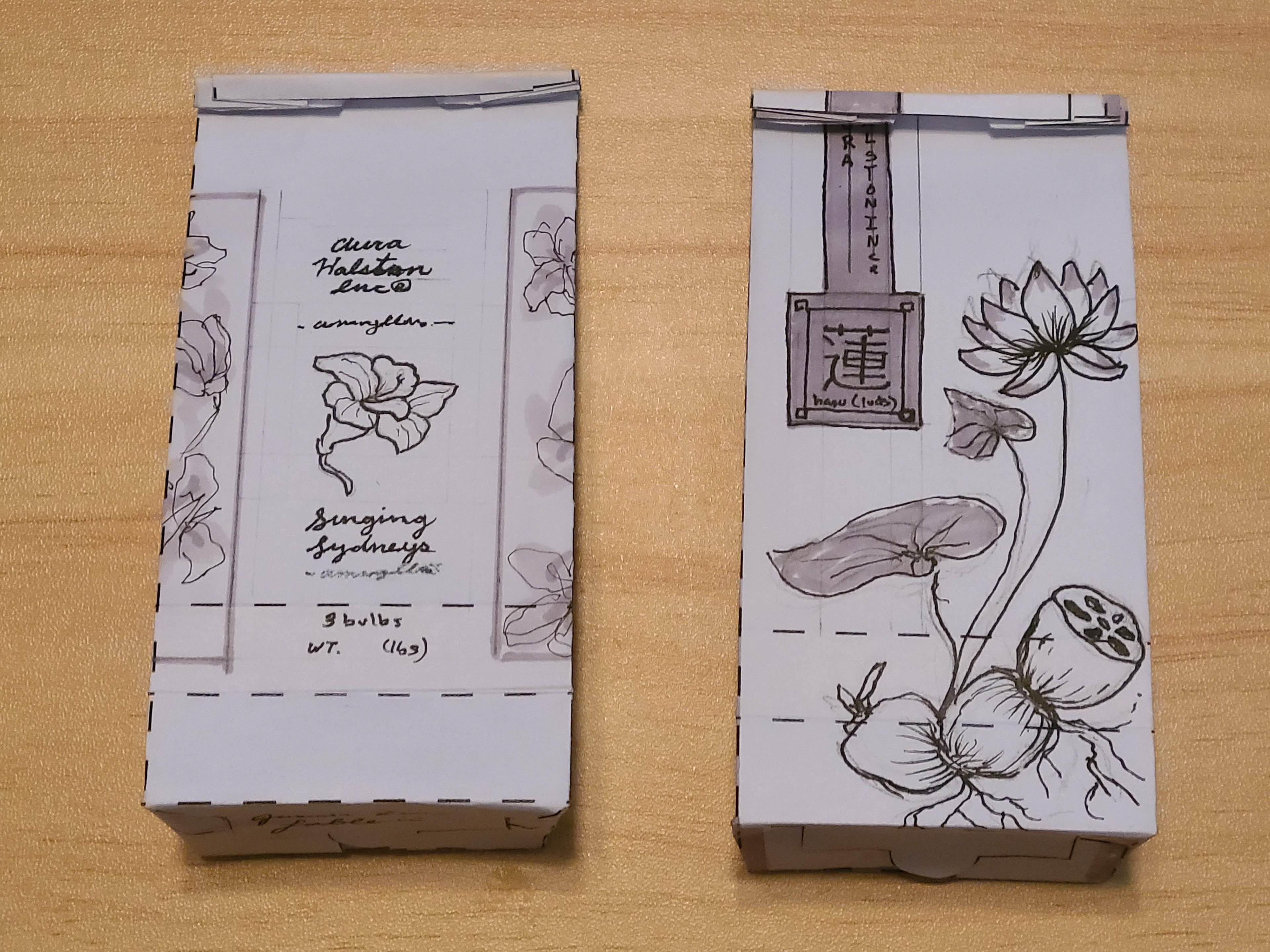
INTERMEDIATES
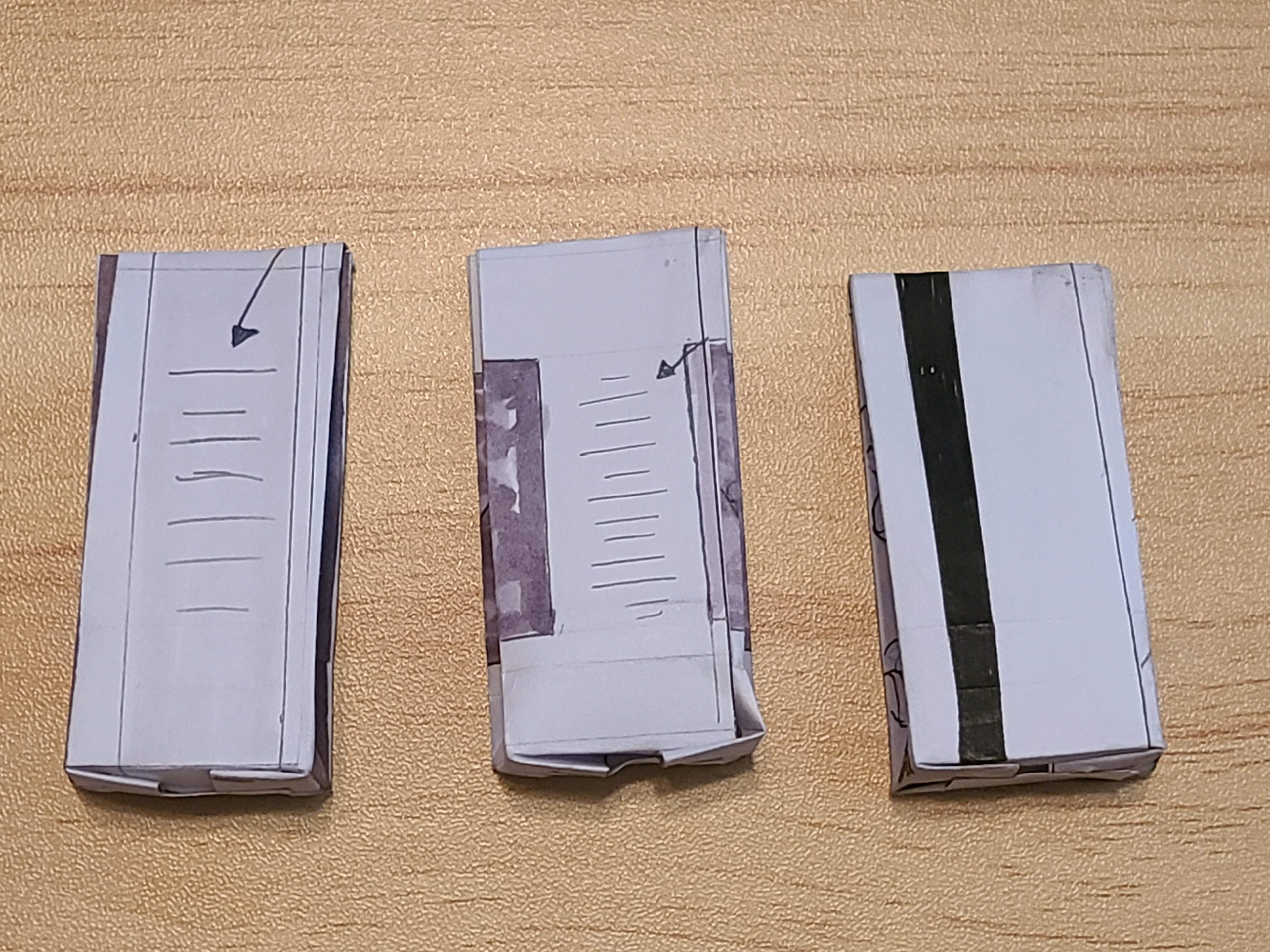
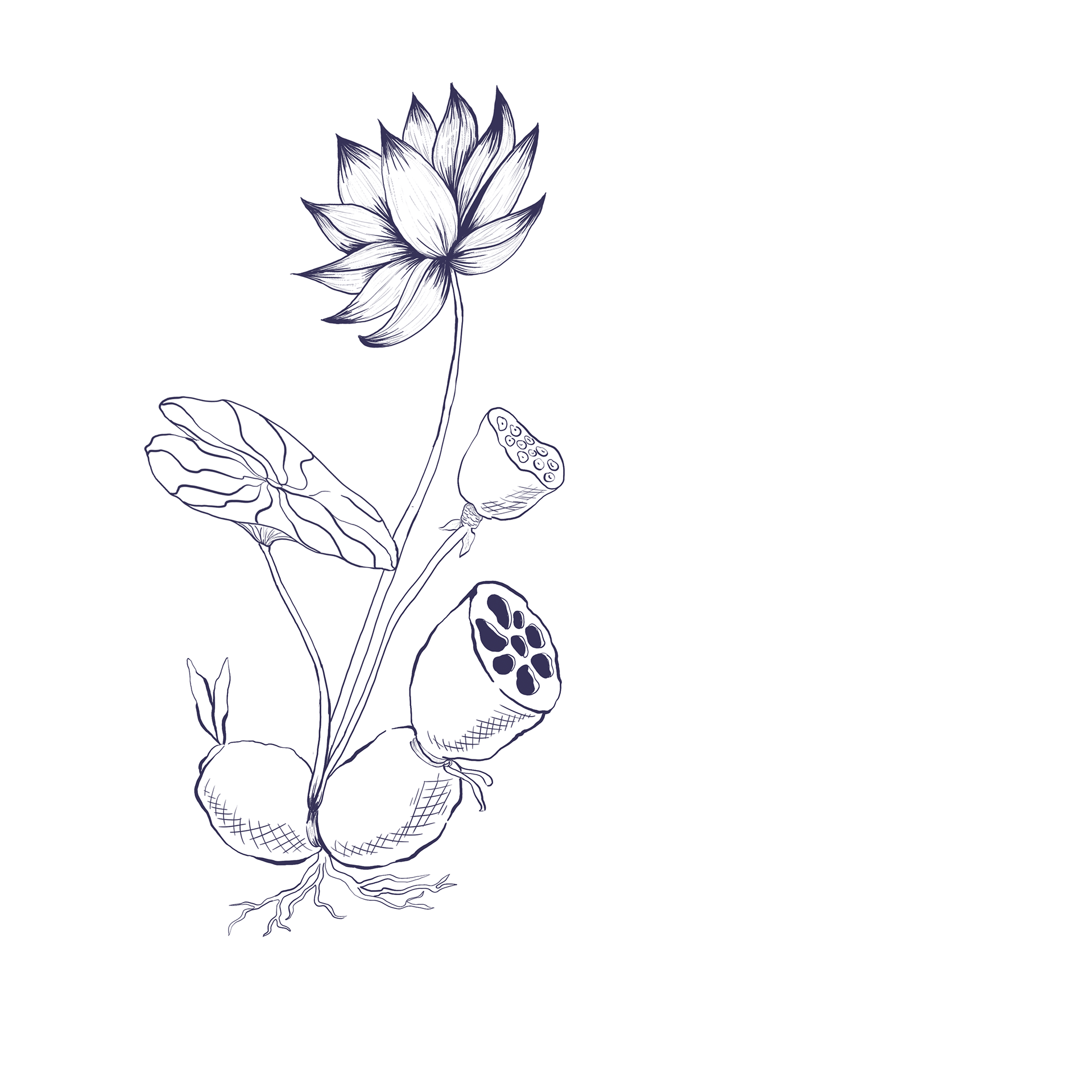
These Intermediates are at 75% and I got to add the detail that i wanted to convey. I changed the Monstera to the lotus because I wanted to draw the lotus more than the monstera also I saw that someone else was doing a monstera as well. I really liked aspects from each of these designs. I really liked the diagram that I had on the Amaryllis and I really like the whole front design on the lotus.

FINAL
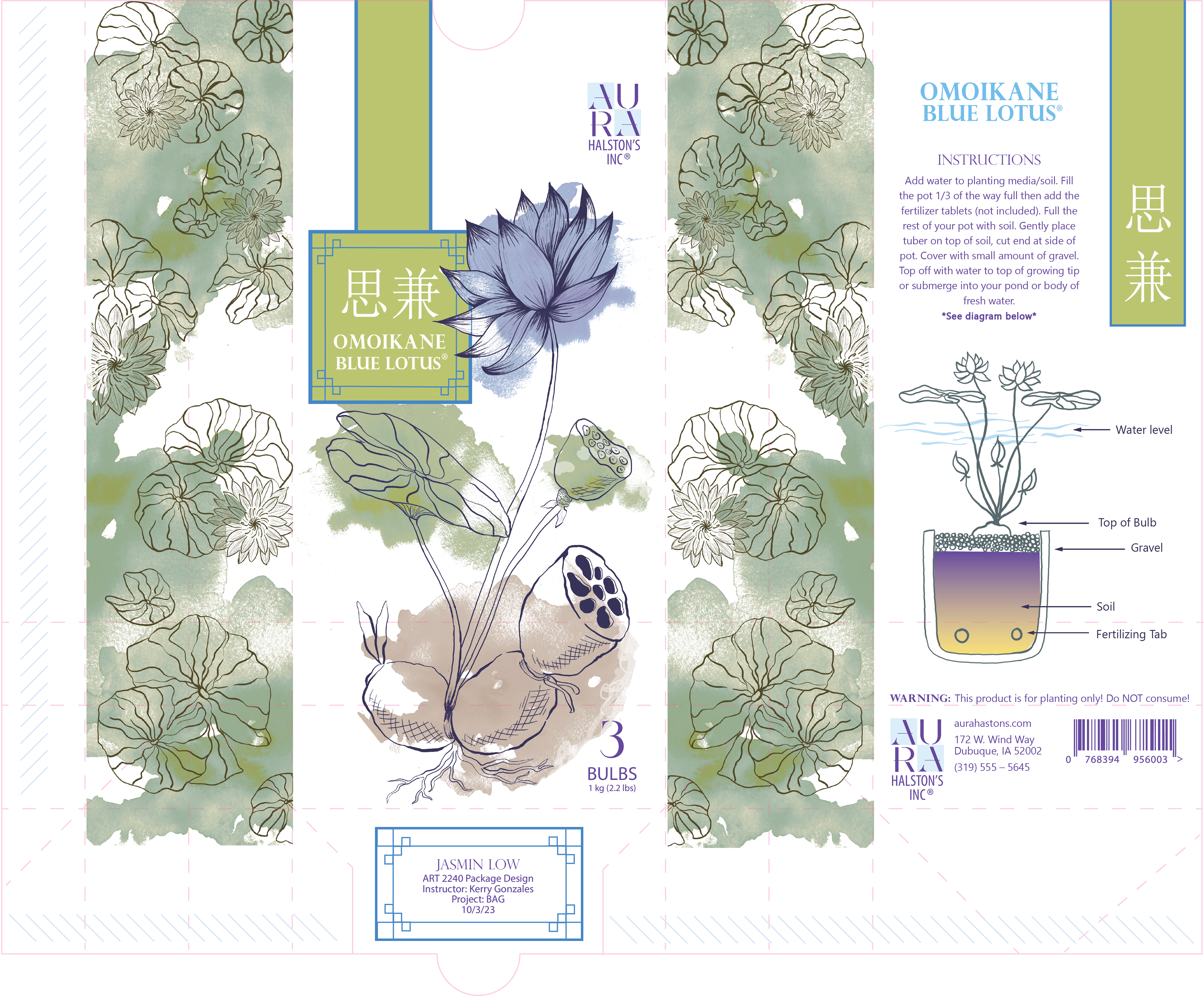
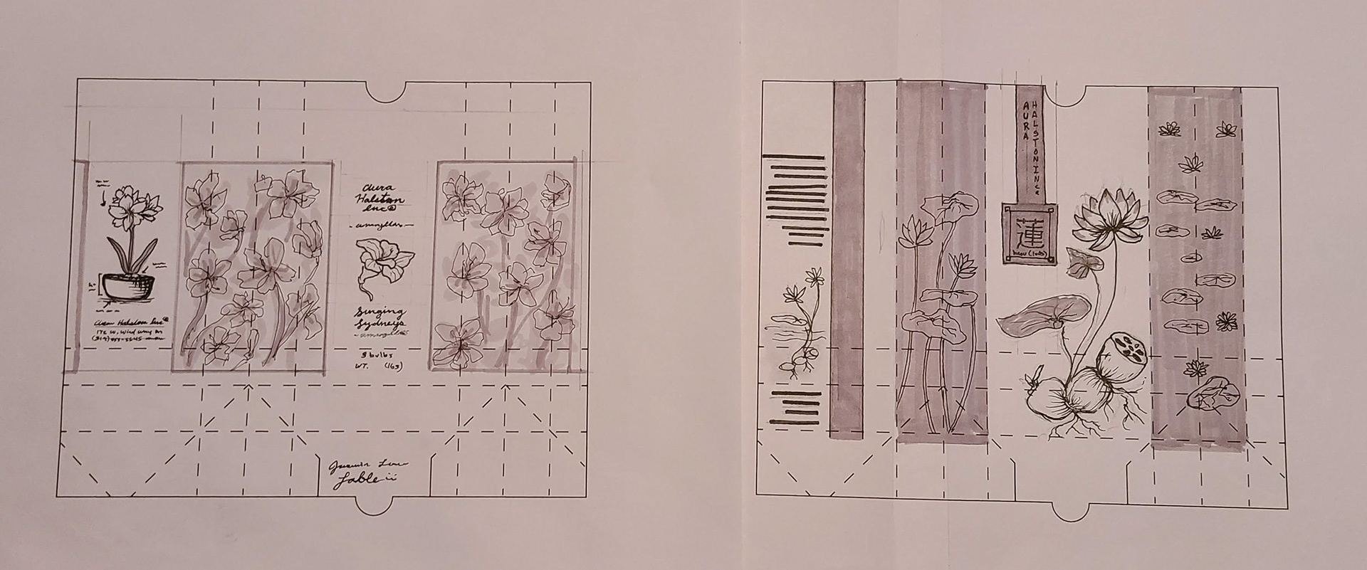
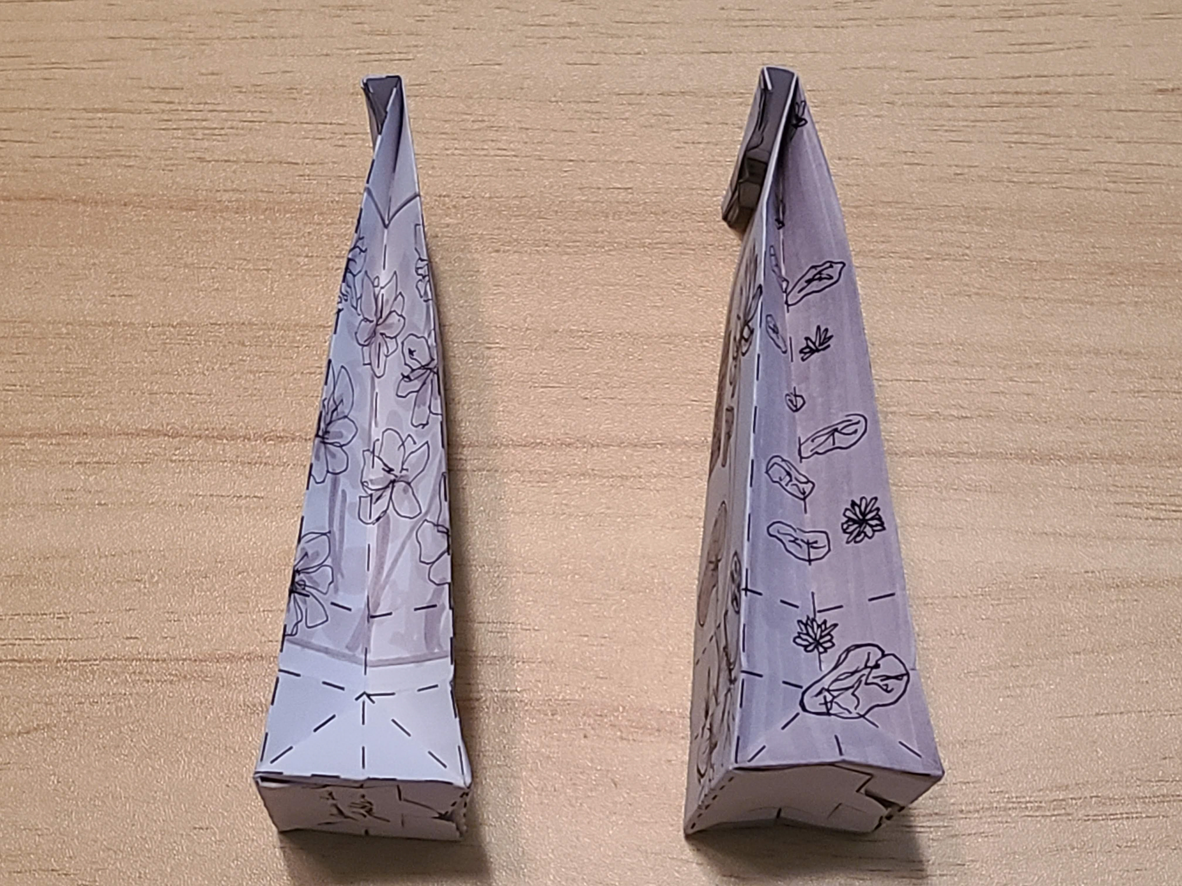
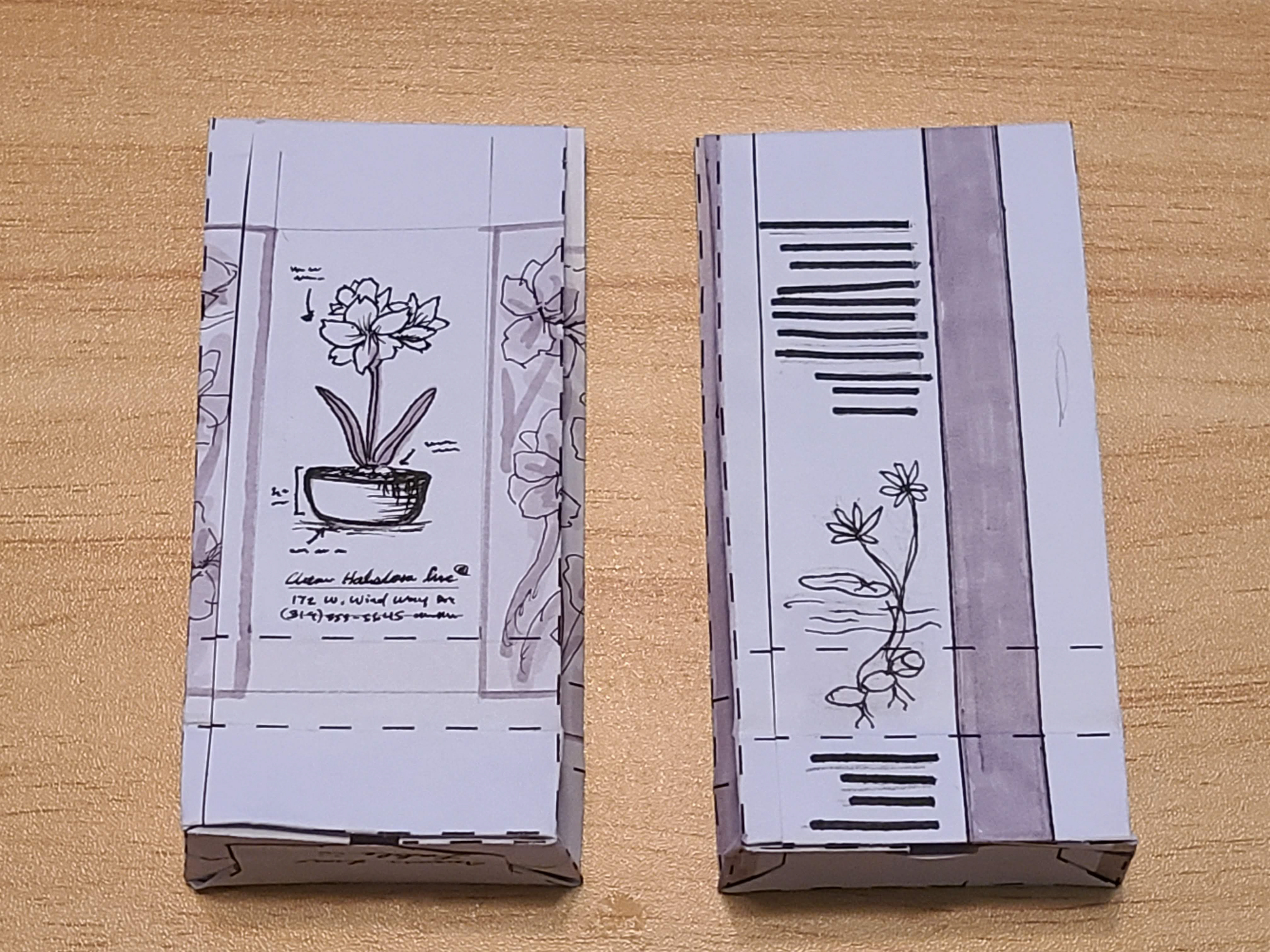
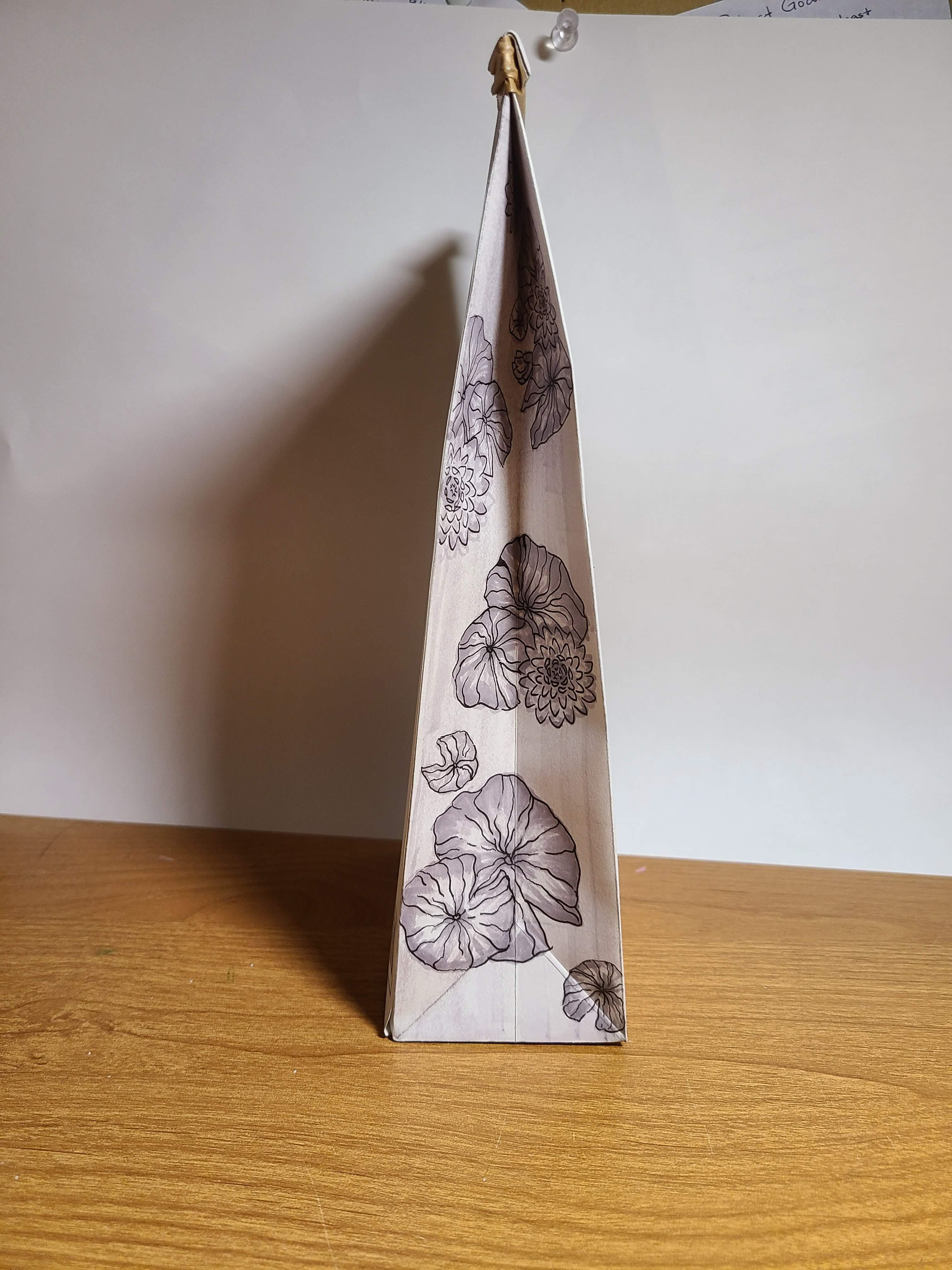
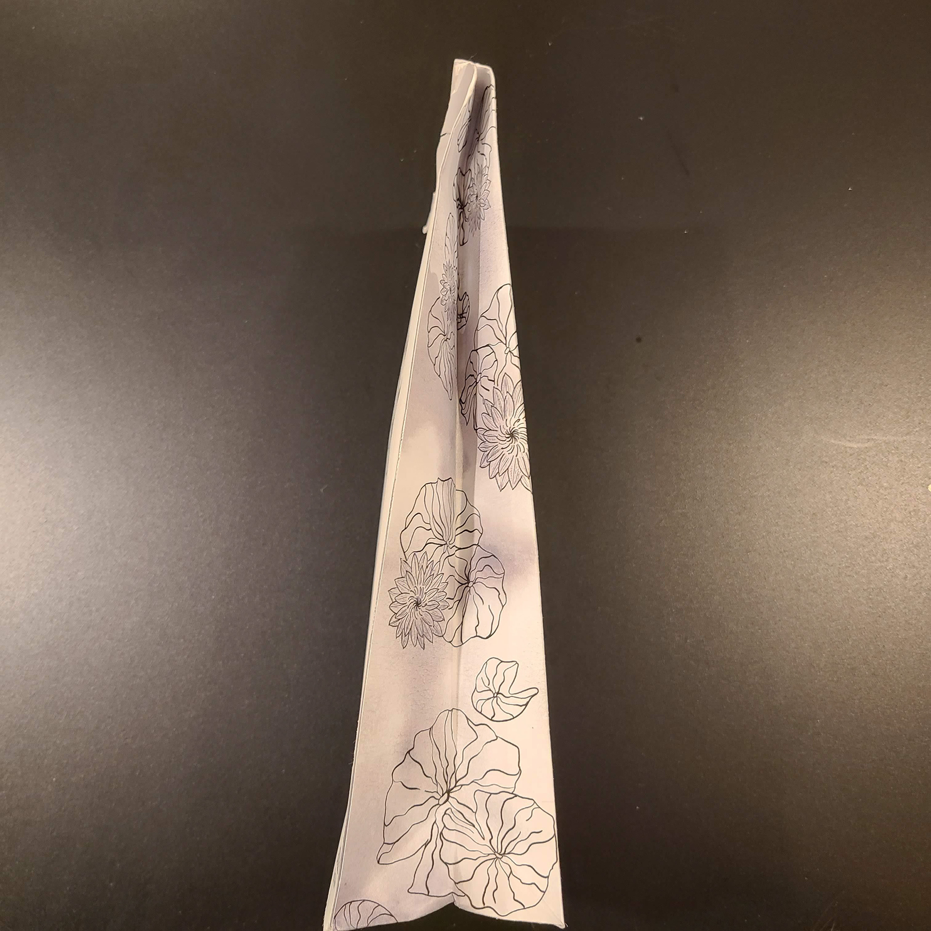
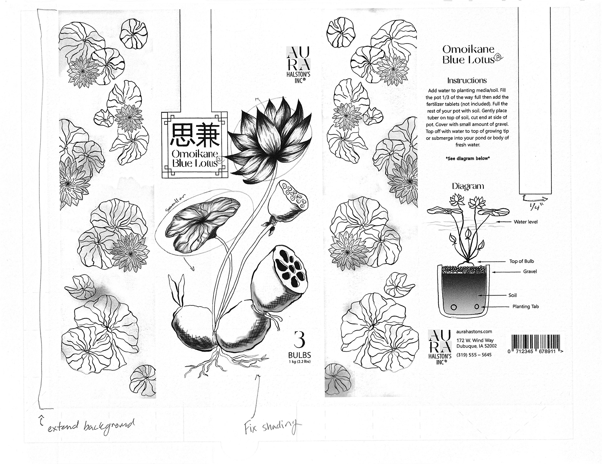
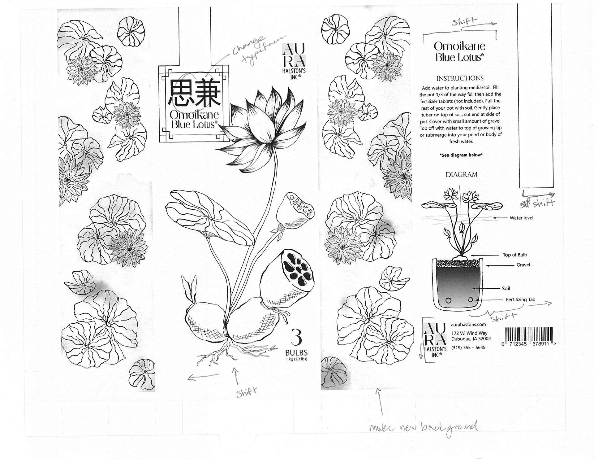
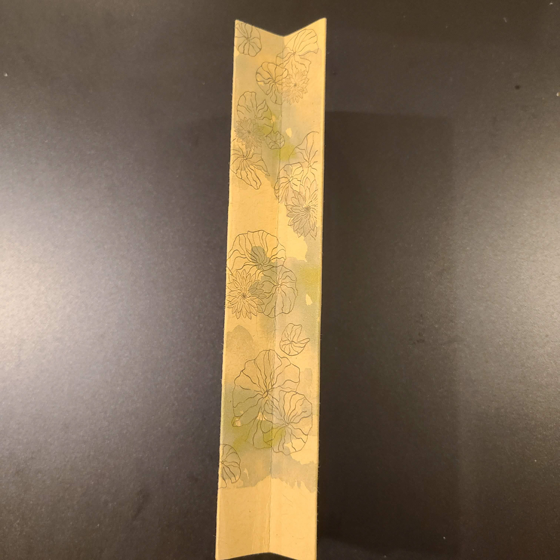
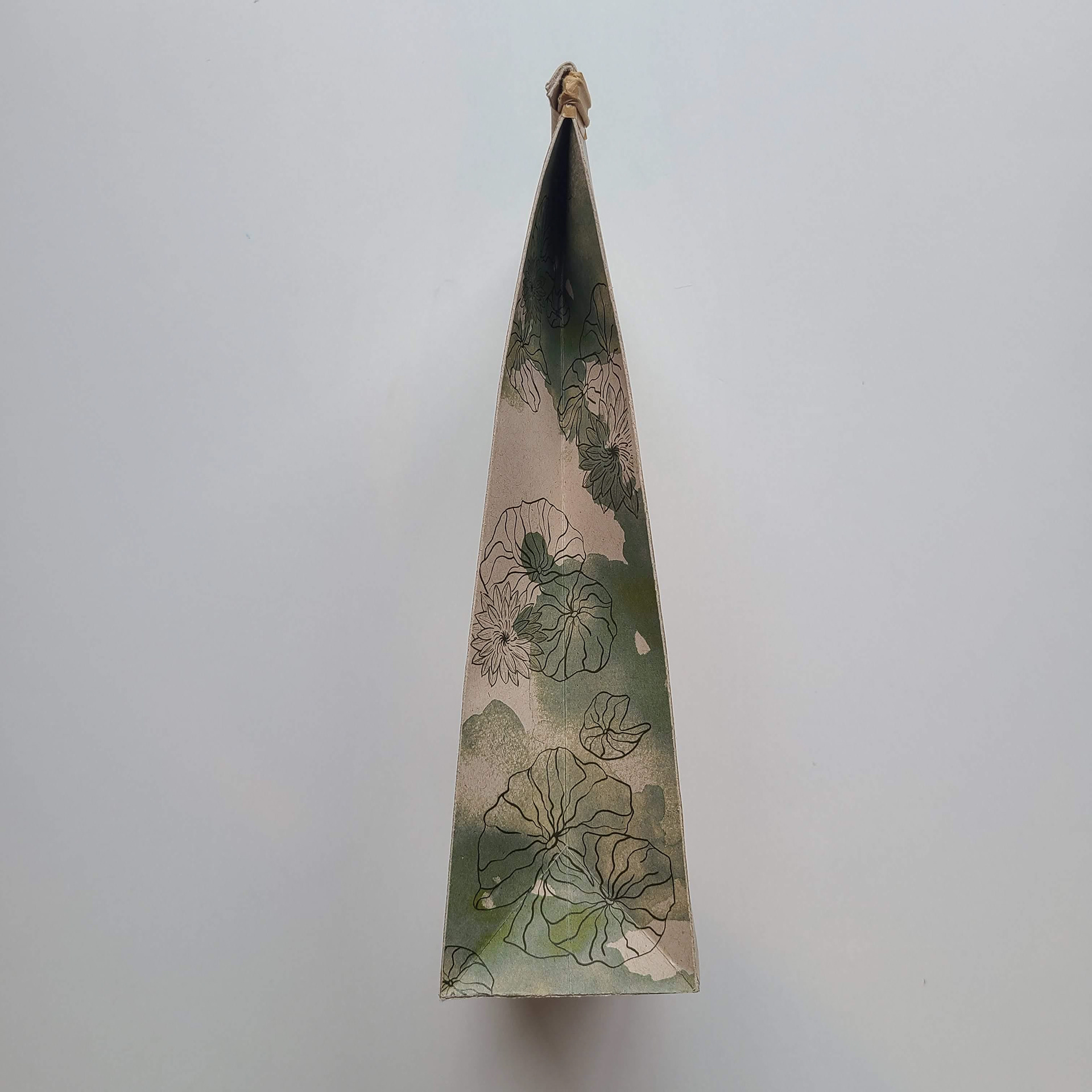
I combined the 2 designs and I got a design that I really liked. I tried to get this final hand as tight as possible so that I could just trace the drawing into the computer and keep my workload to a minimum. I especially liked my design on the sides of the bag.
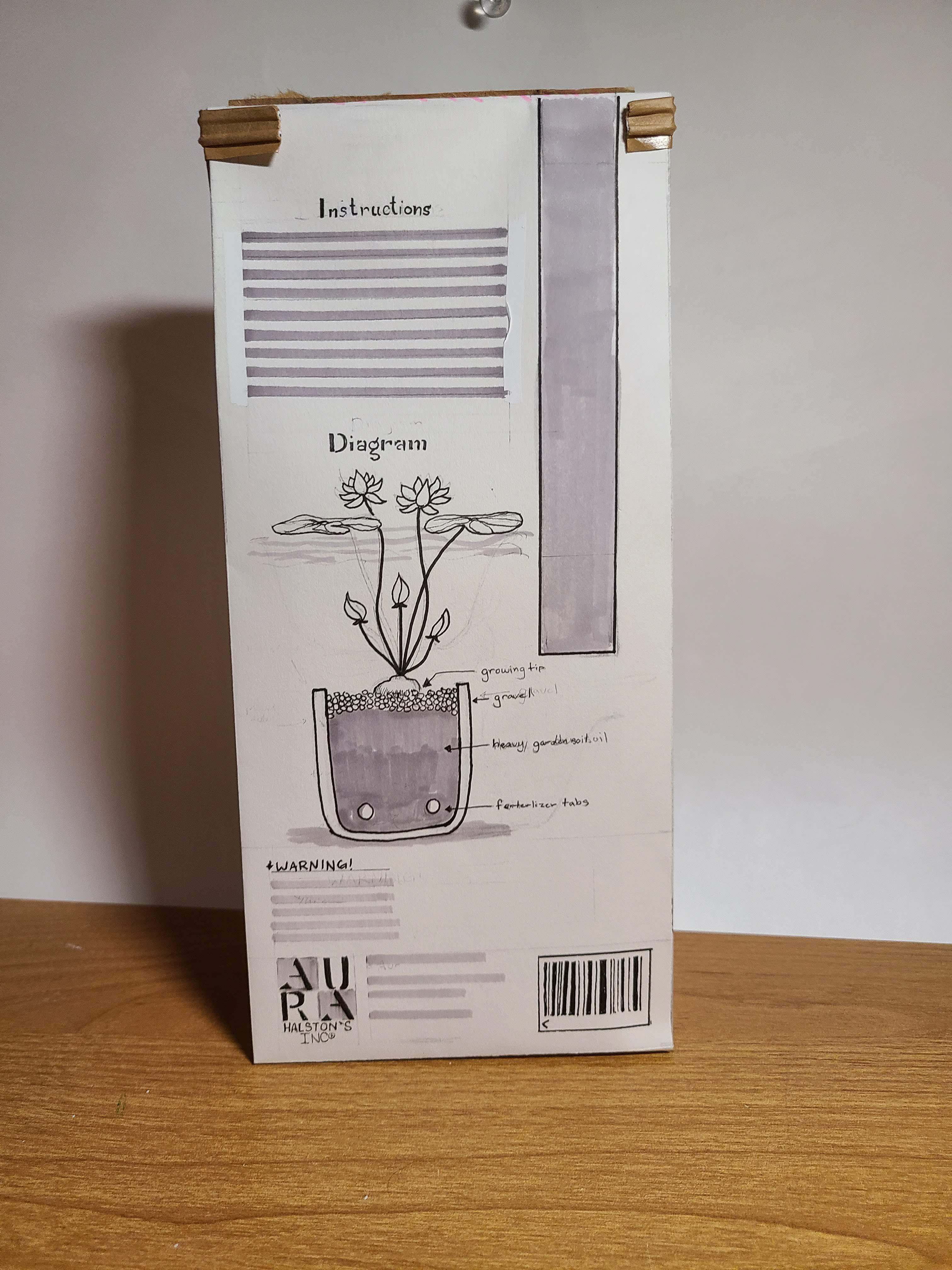
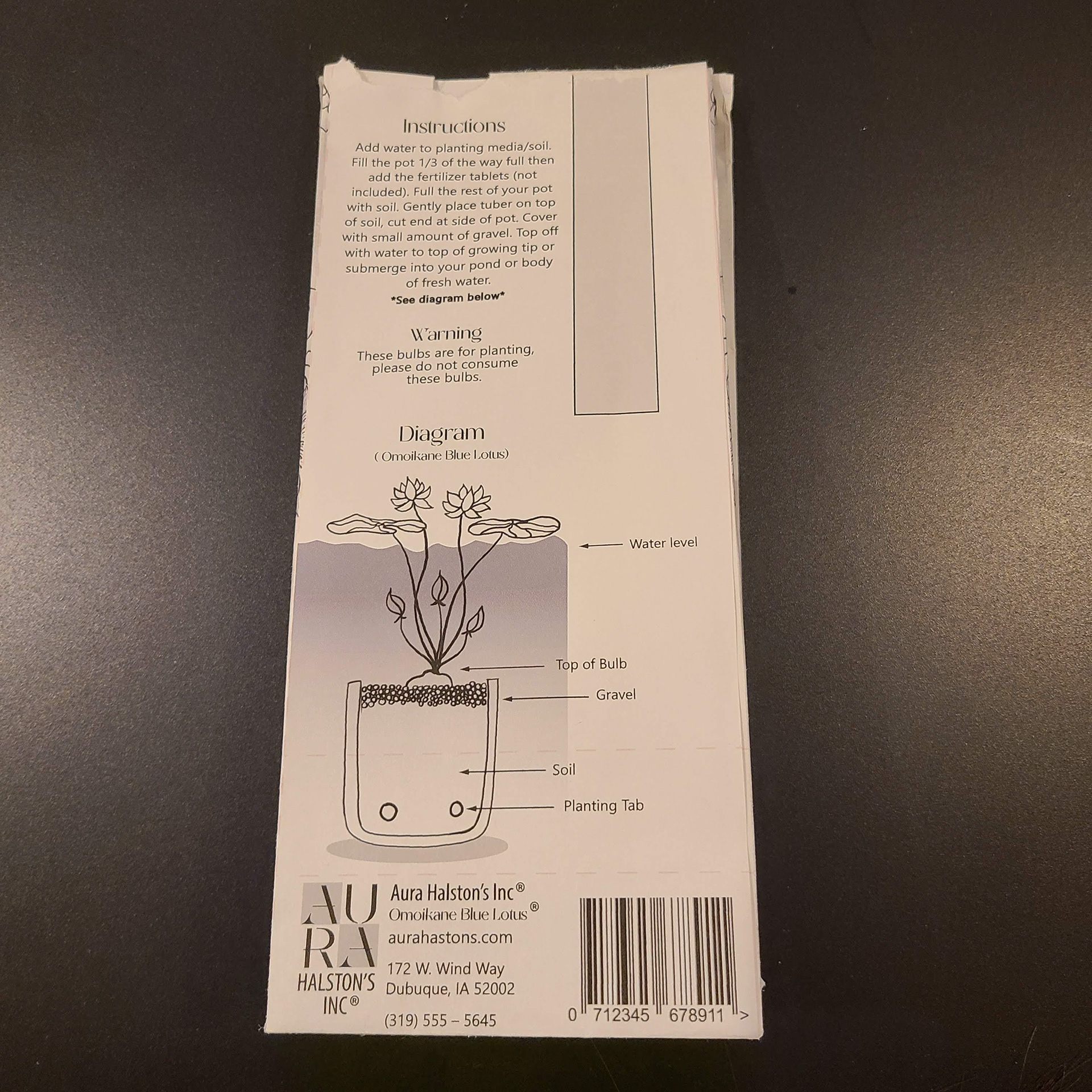
The problem areas for me were the warning and the front label. The warning was awkwardly placed and I didn't like it at all. The front label didn't convey what was needed so it all had to be changed.
COMPUTER PROGRESSION 1
The initial computer progression was rough. There were a lot of things that I needed to add and fix. There were certain items that I missed and there were aspects that I needed to figure out better.


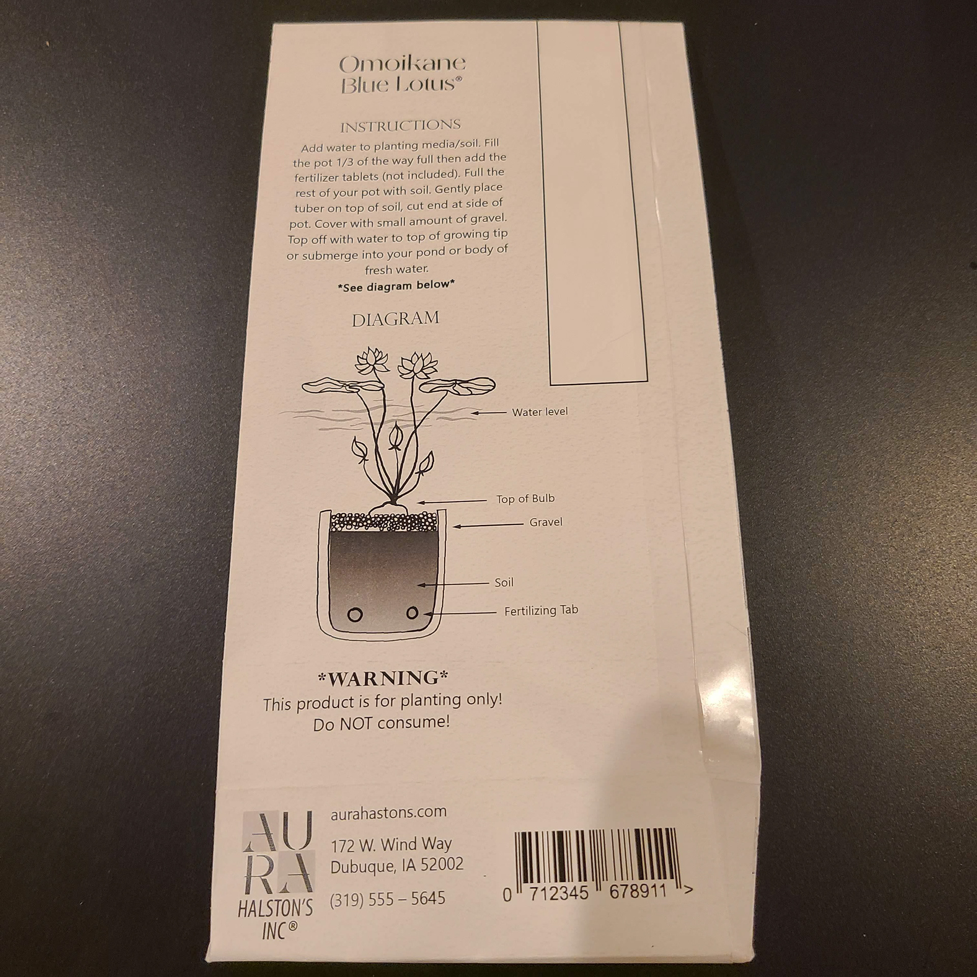
COMPUTER PROGRESSION 2
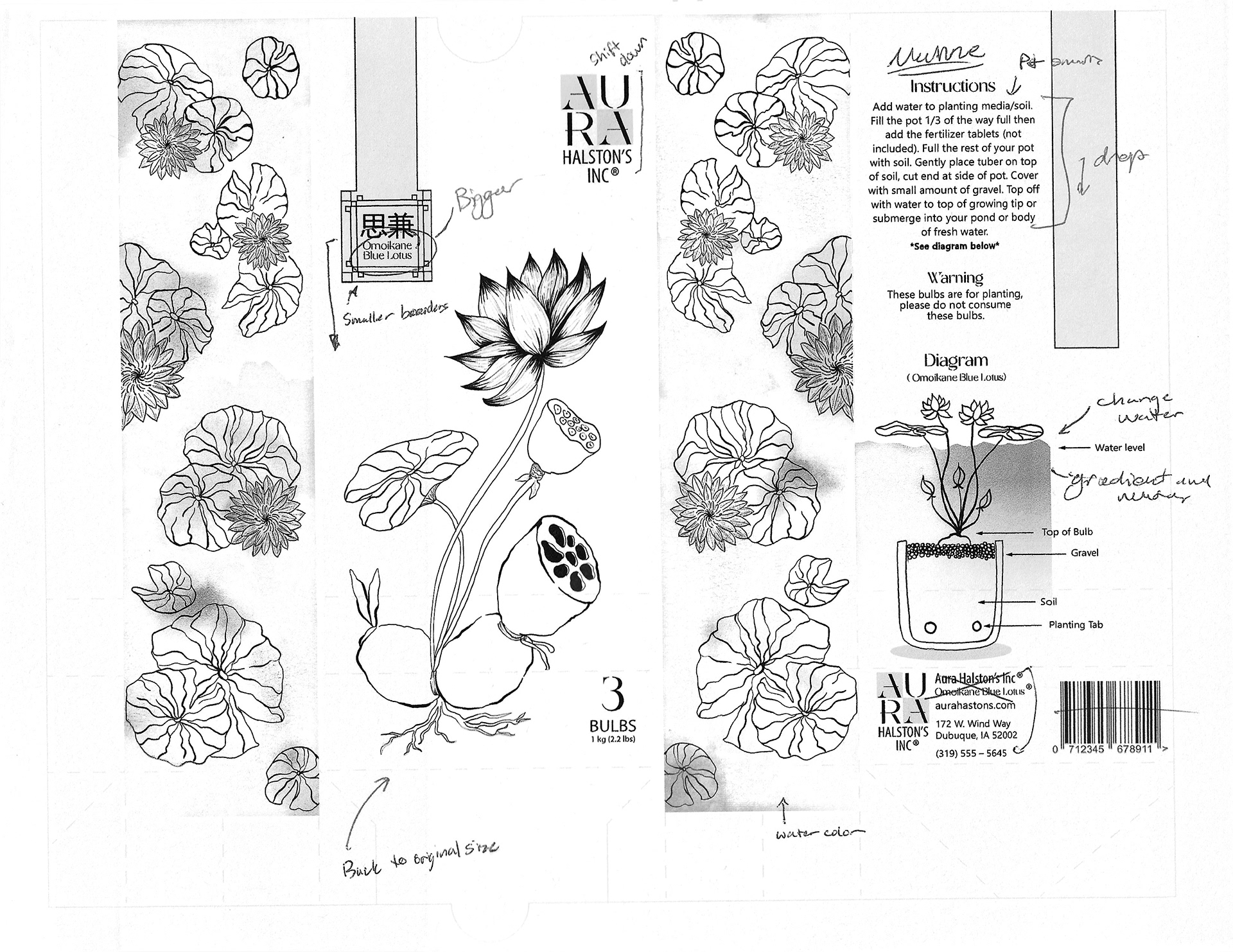
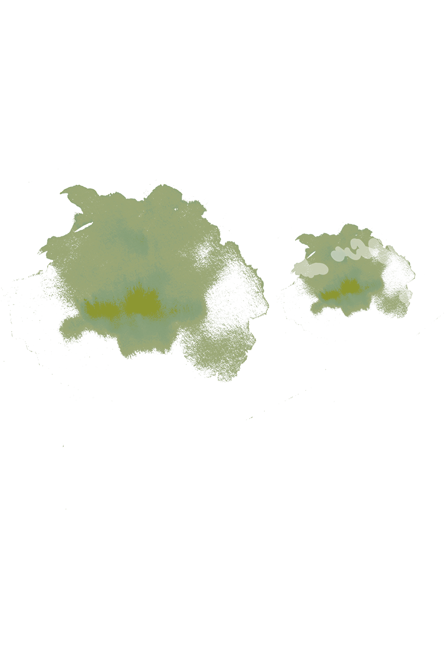
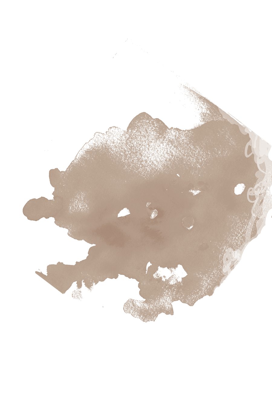
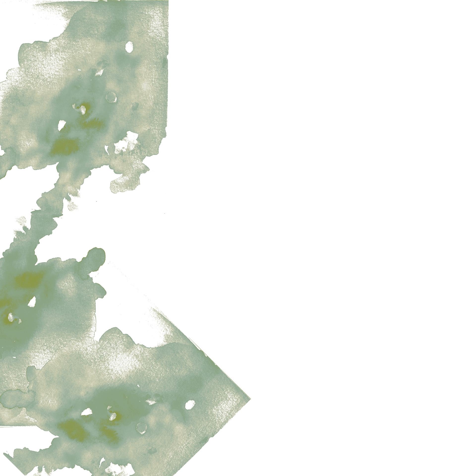
There were some things that I added in this stage that I liked and there were some that I didn't like at all. The scanner doesn't like the watercolor on the sides so it looks like it is missing which is not the case. I added the shading onto the lotus which felt to heavy. The gradient in the pot felt better than the gradient I had before. I also did a water like of water lines verses the gradient that I had before which looked weird. I needed to figure out the front tag more as well.
COMPUTER PROGRESSION 3
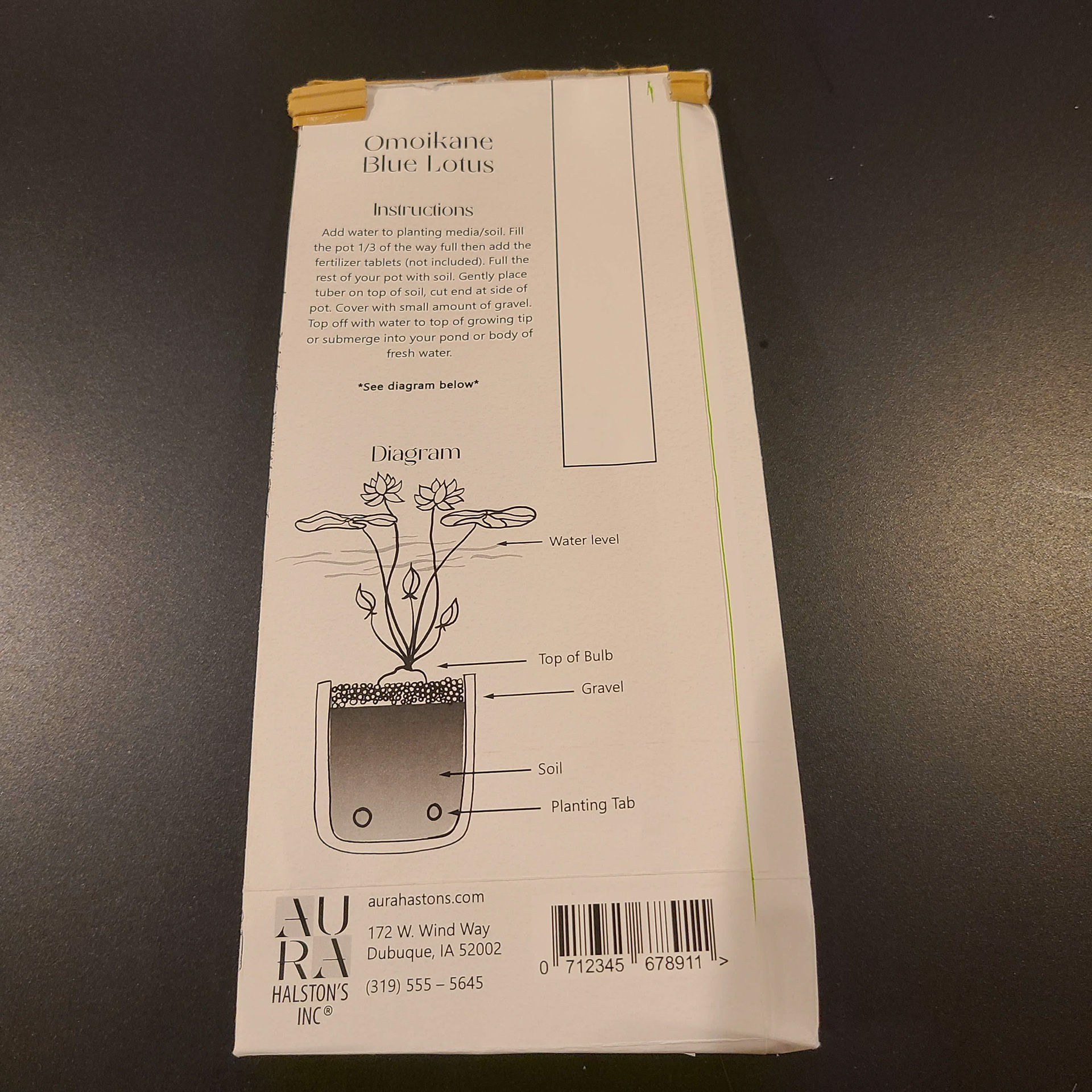
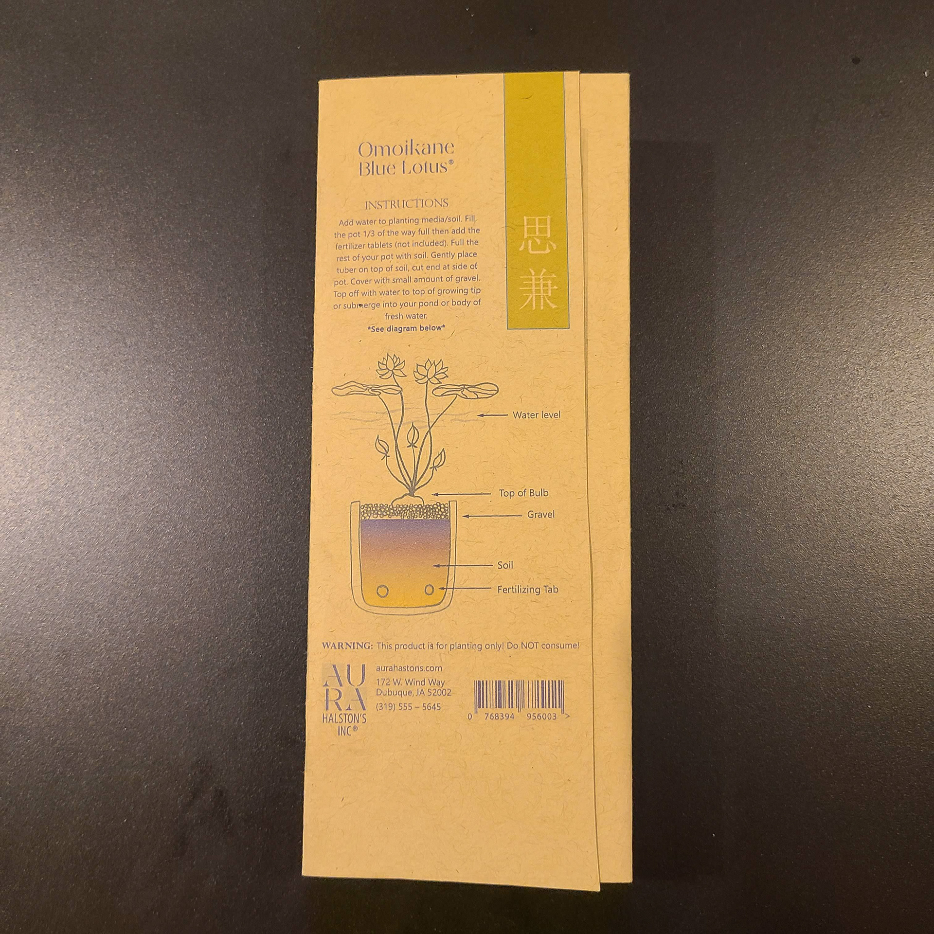
There are two markup pages because there were things that I forgot to add on the previous one as well. Some minor changes were made. I kept forgetting the warning and I made it a point on the next one to finally put it on my bag.


COMPUTER PROGRESSION 4
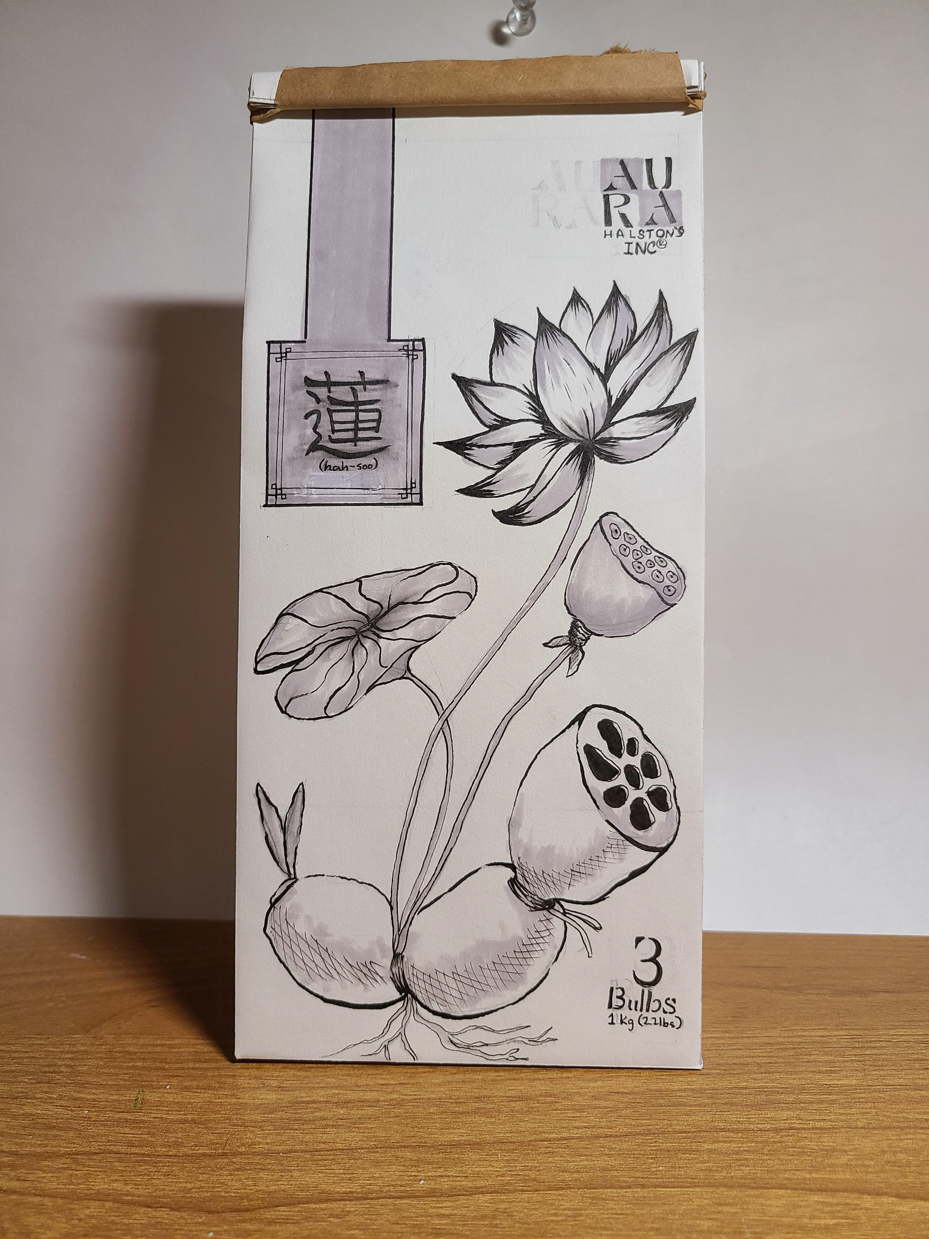
You still can't see the watercolor on the scan too much but I decided to do the watercolor as the shading instead of the shading I had in progression 2. I wanted the depth of the hand final in the final design so I made water color chips that were darker in some areas and lighter in others then scanned it in and that helps a lot with the shading.
COLOR STUDIES
I played a lot with duotones and tritones with this project. I used a dark purple, light blue and yellow. I wanted colors that would get me almost all of the other colors that I wanted. I needed a green which the blue and the yellow provided. I use the purple and blue to get a richer blue. The yellow and the purple got me a nice brown color as well. We were also allowed to use kraft paper as a paper to print on. I really liked my watercolor look with the kraft paper since the colors felt more earthy.
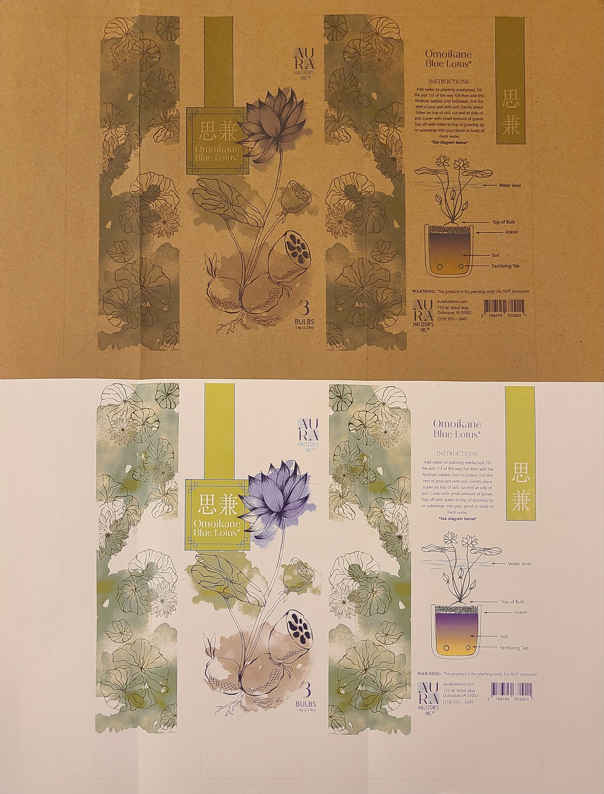
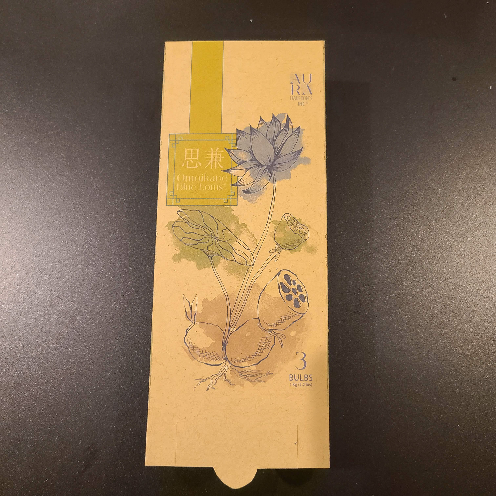


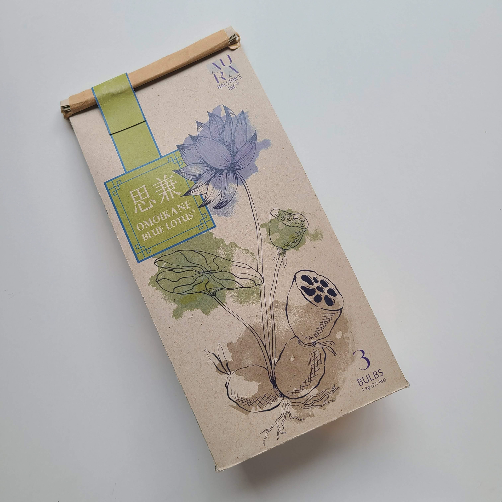

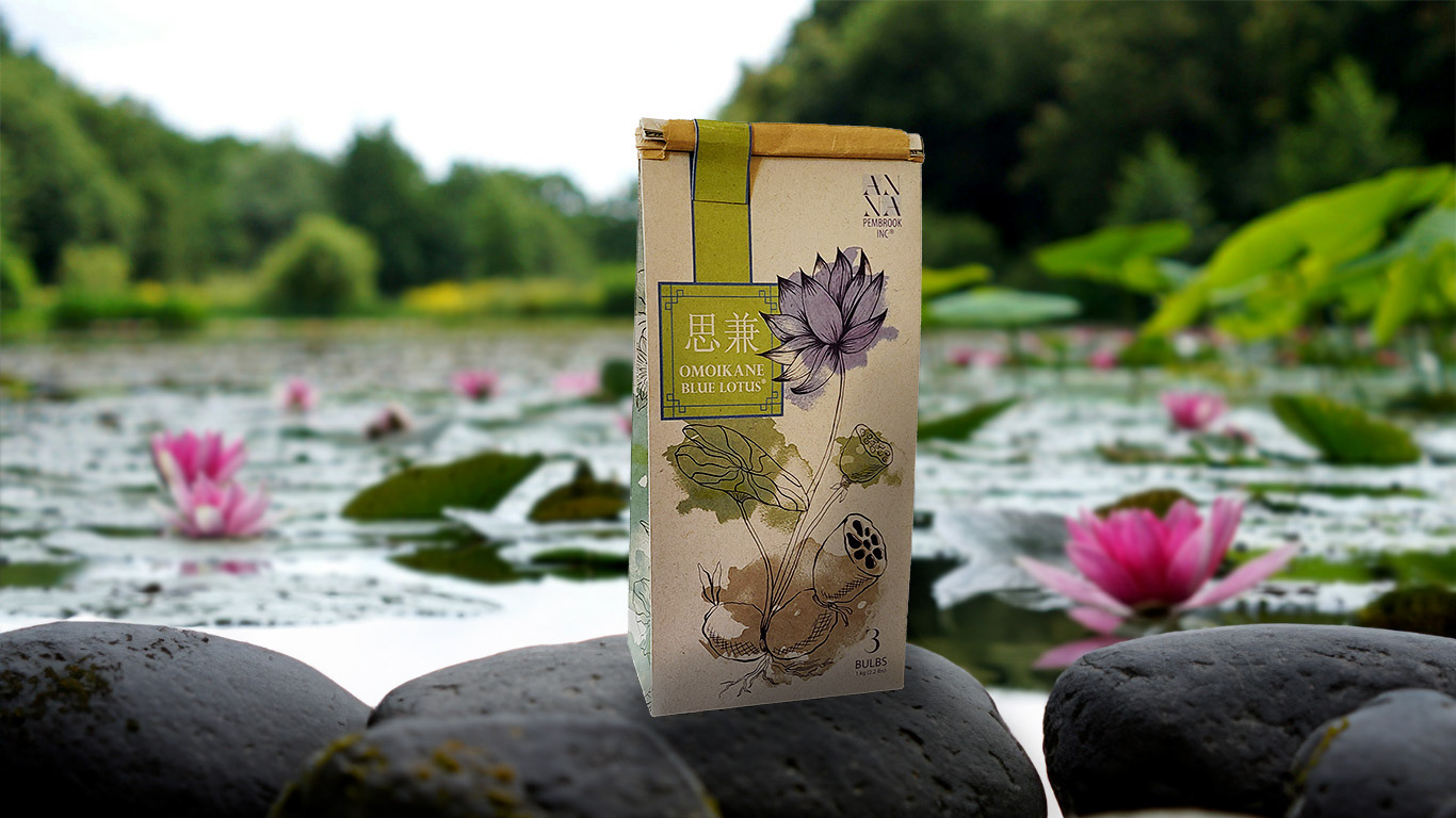
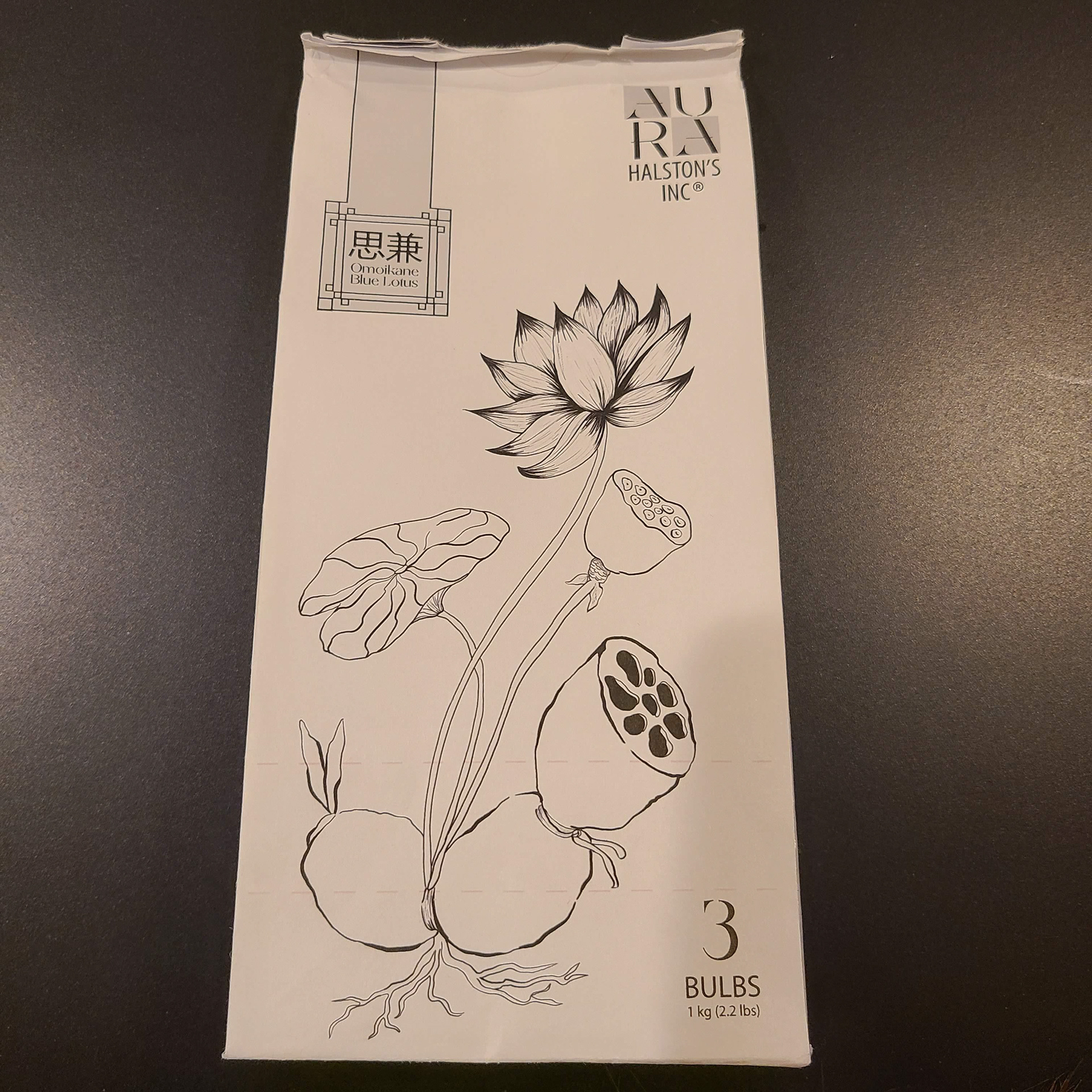
FINAL
I really like the final that I got to. I was really excited to get this printed and the colors really popped with the kraft paper which was a surprise. I really liked this project. All-in-all this came out really nice and I am happy with the result.