
OVERVIEW
In today's day and age more and more people are becoming "woke." This means that some of the books that we used to enjoy reading (or were forced to read) are being banned in schools. From Anne Frank telling us about a bodily function to Charlie and the chocolate factory describing a child as fat, there were many books that got put on the chopping block and we were tasked with making a poster about it. This project had use choose a banned book and create a poster with a catchy or eye catching title; body copy describing the who, what, when where and why; and an interesting dynamic that will draw someone in. With only the colors we are assigned we had to make something that will knock someone's sock off.
THUMBNAILS
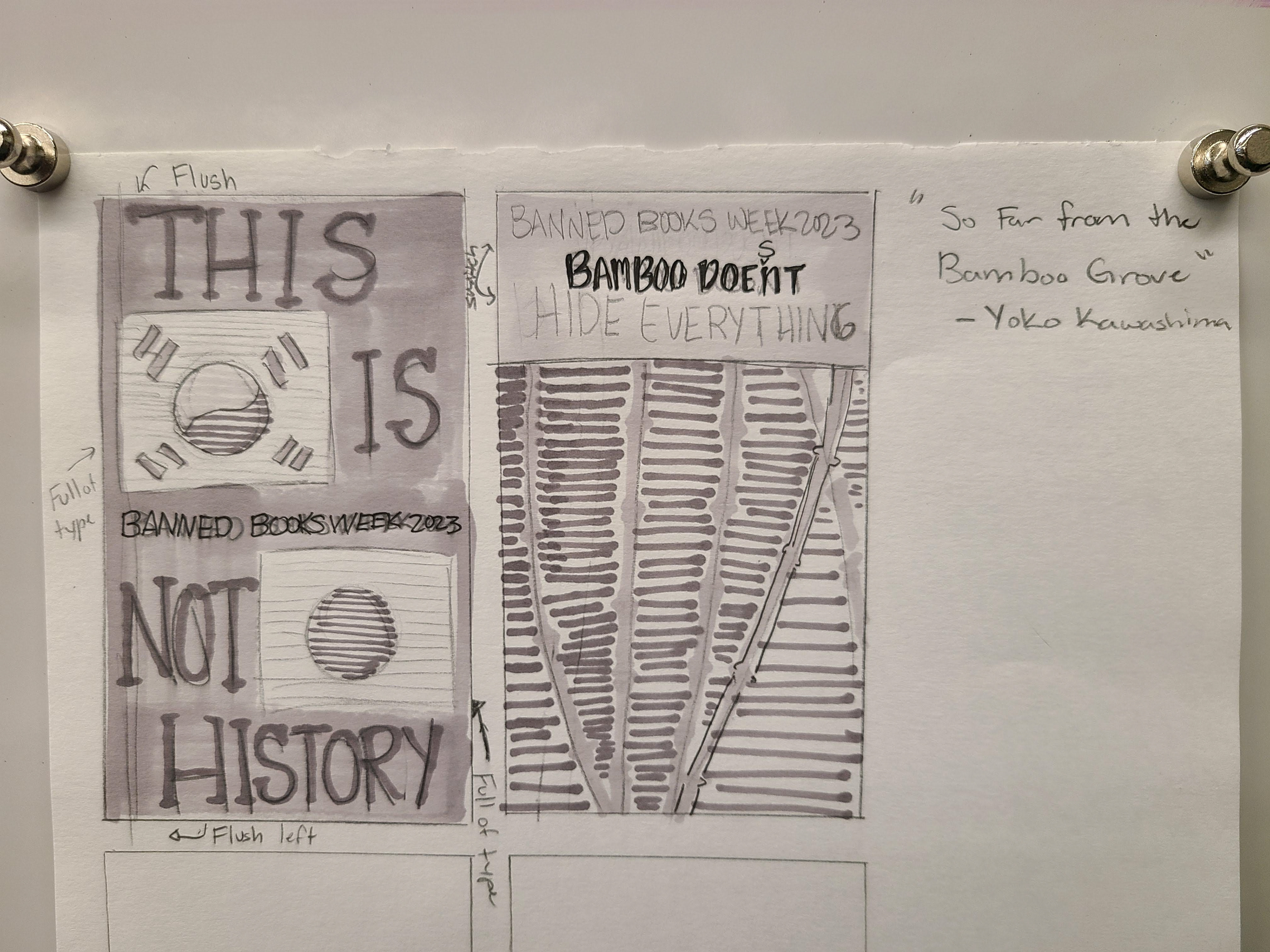
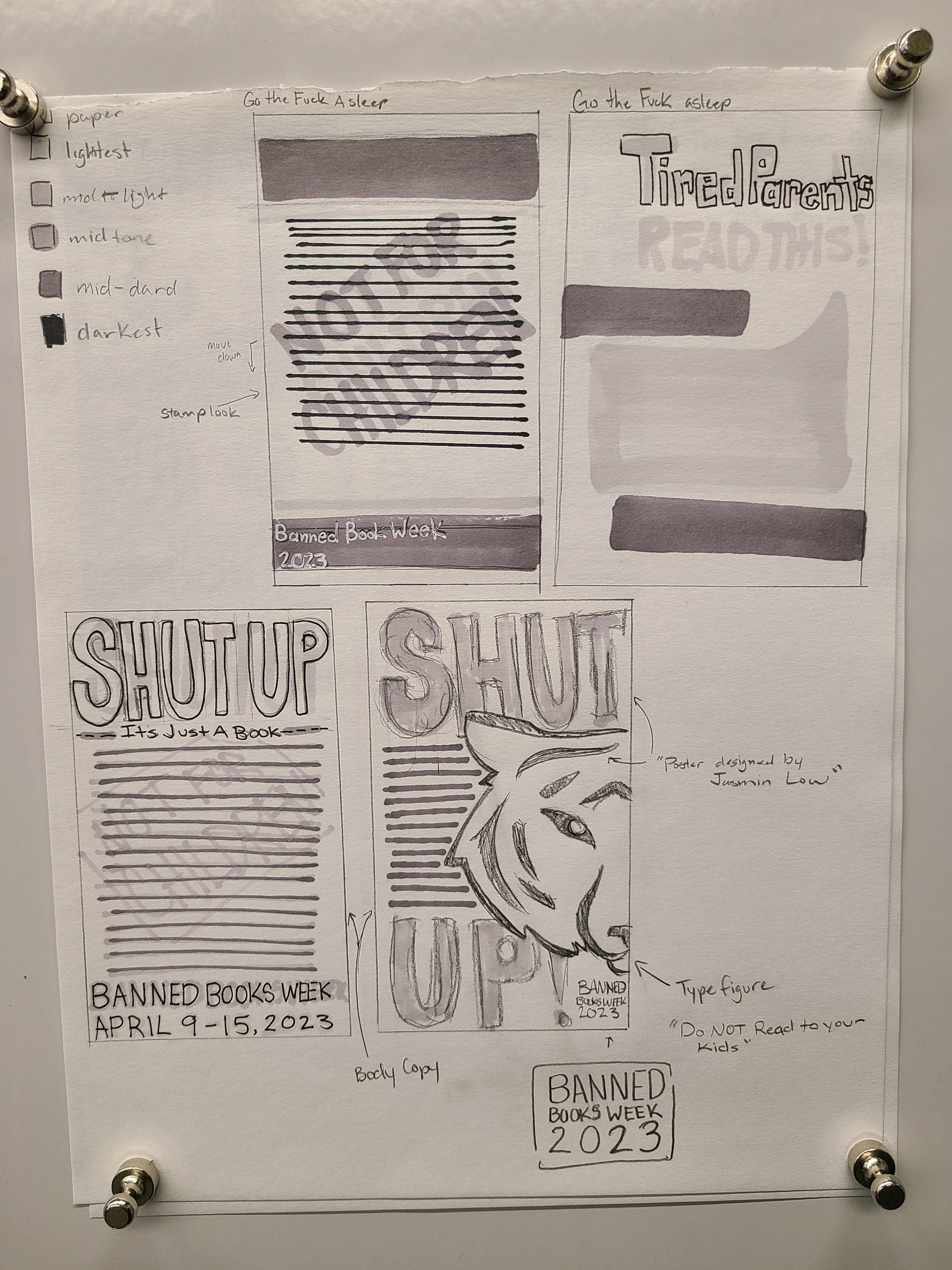
I got really into the thumbnails for "Go the Fuck to sleep" and I really liked my bottom right image. It was bold and fun and I felt it matched the theme of the book with a sort of aggressive title. The thumbnails for "So far from the bamboo grove" were pretty plain but I really liked how the left one worked out. There was big type and the flag will be filled with body copy to make the shape and the colors will just be the text in different colors.
INTERMEDIATES
I got my two options and I really like both. The one that I plan to continue on with is the poster for "So Far From the Bamboo Grove". I really like the idea that I get to create the flag and the giant text seemed really fun as well. I really like how it is big and bold. The "Go the Fuck to Sleep" poster is great but I knew it would be too time consuming and I wouldn't know where to really start.
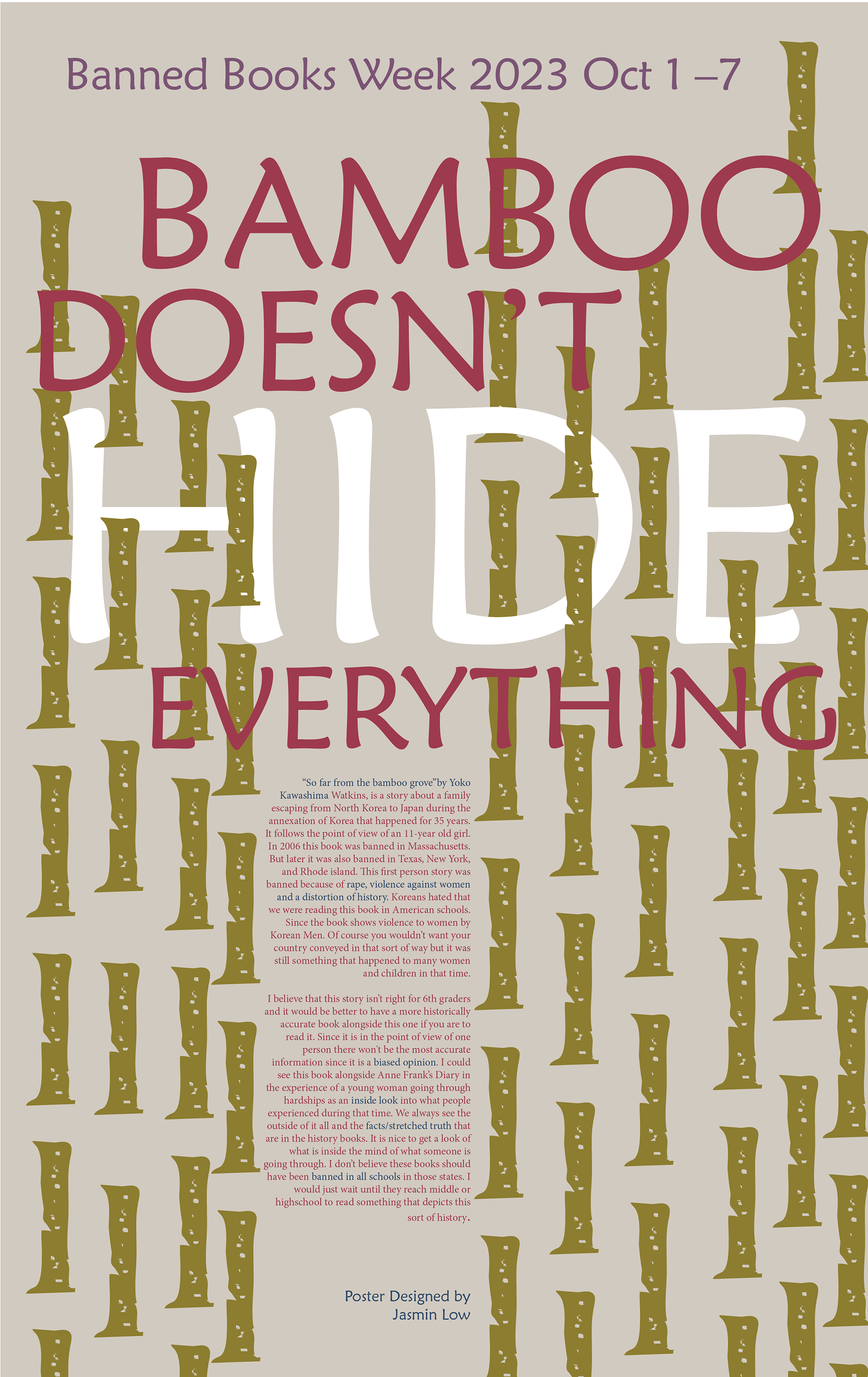
REVISION 1 AND 2
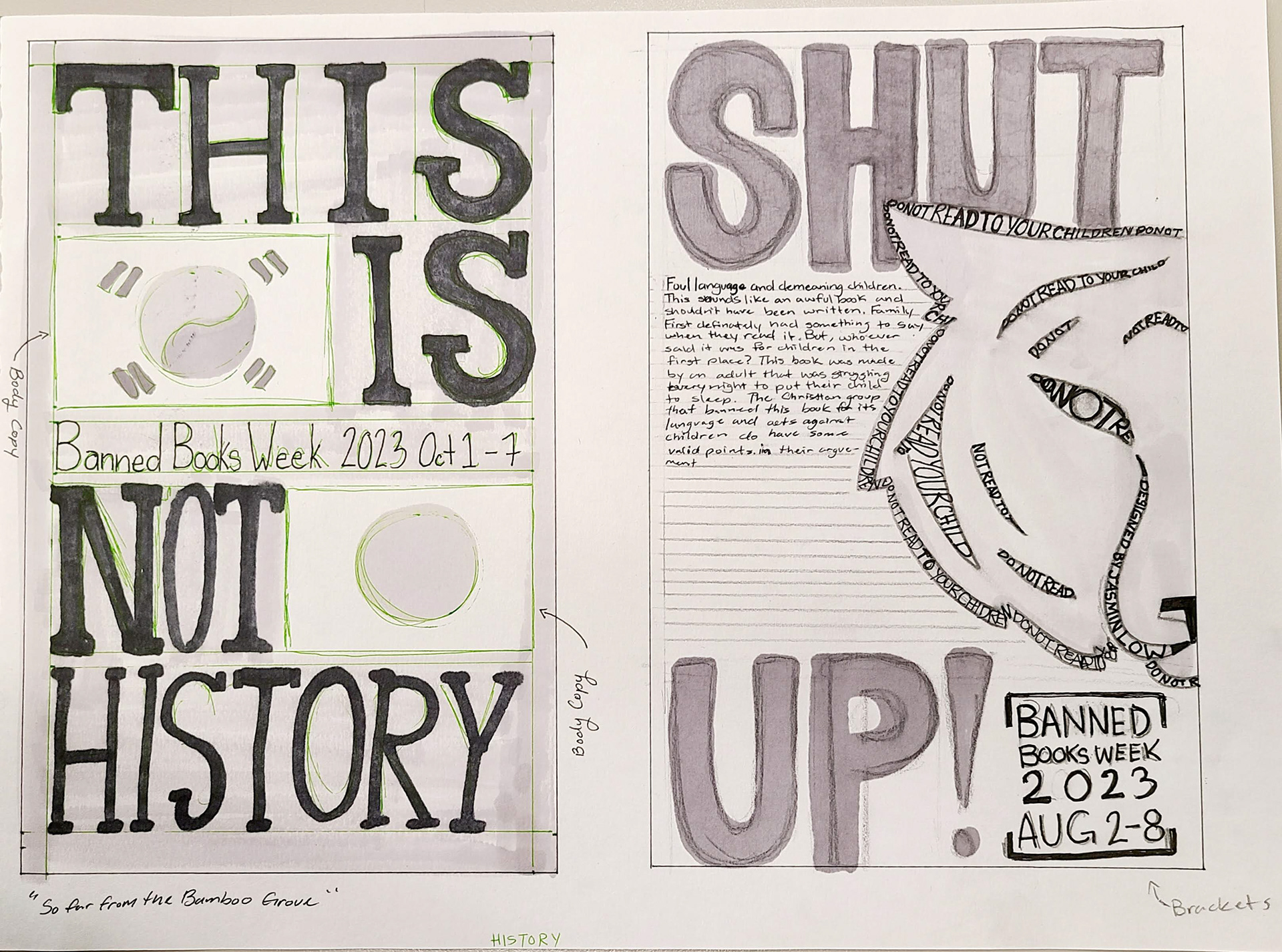
These are the first 2 renditions of the new design. We were discussing how to make everything have a better layout and readability. The first didn't seem dynamic or interesting enough so I changed the position of the title and played around with there the placing was.
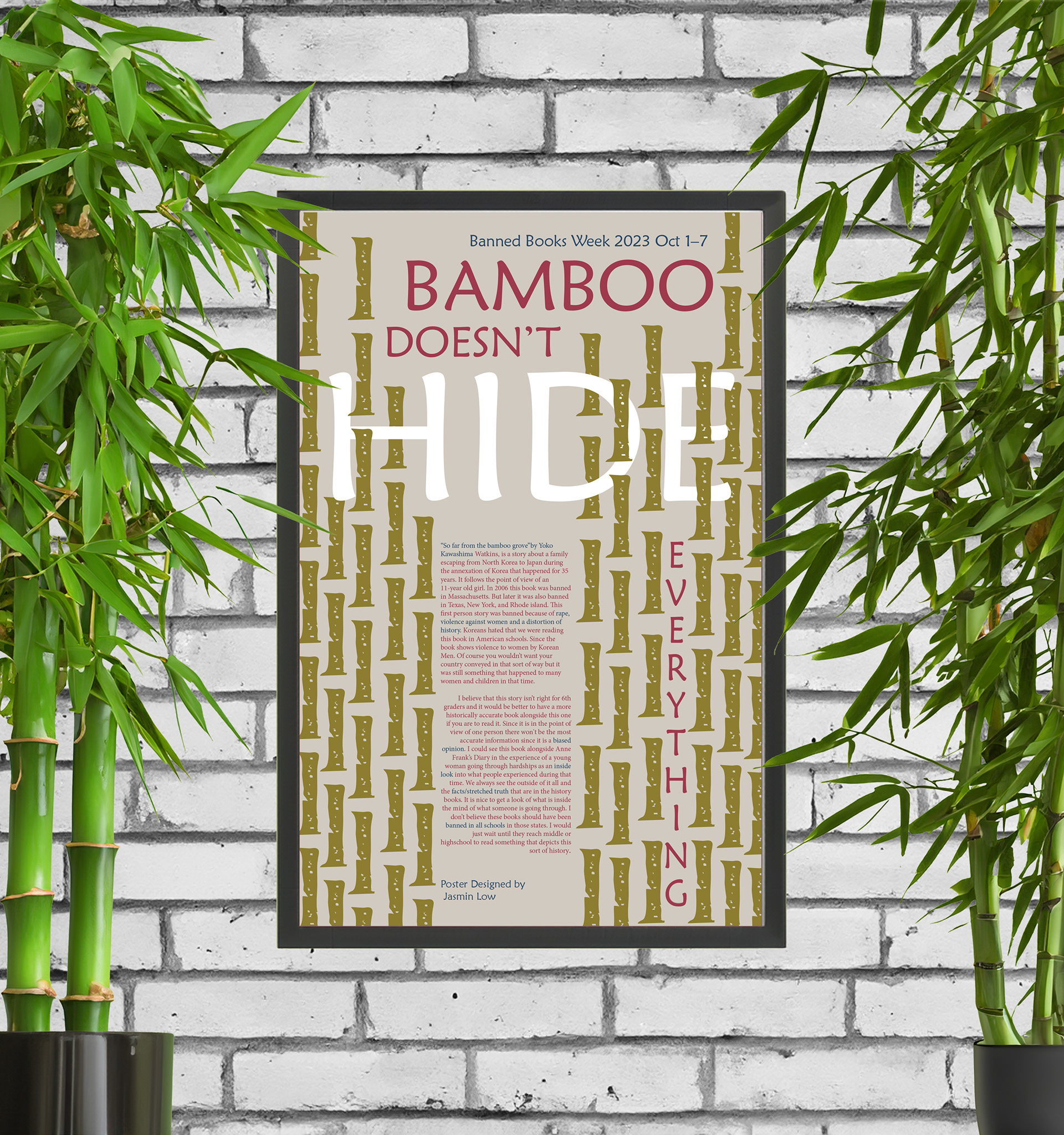
The second one has a more hidden "HIDE" which make things more interesting. The other parts of the title don't easy to read so I did some rearranging with those as well.
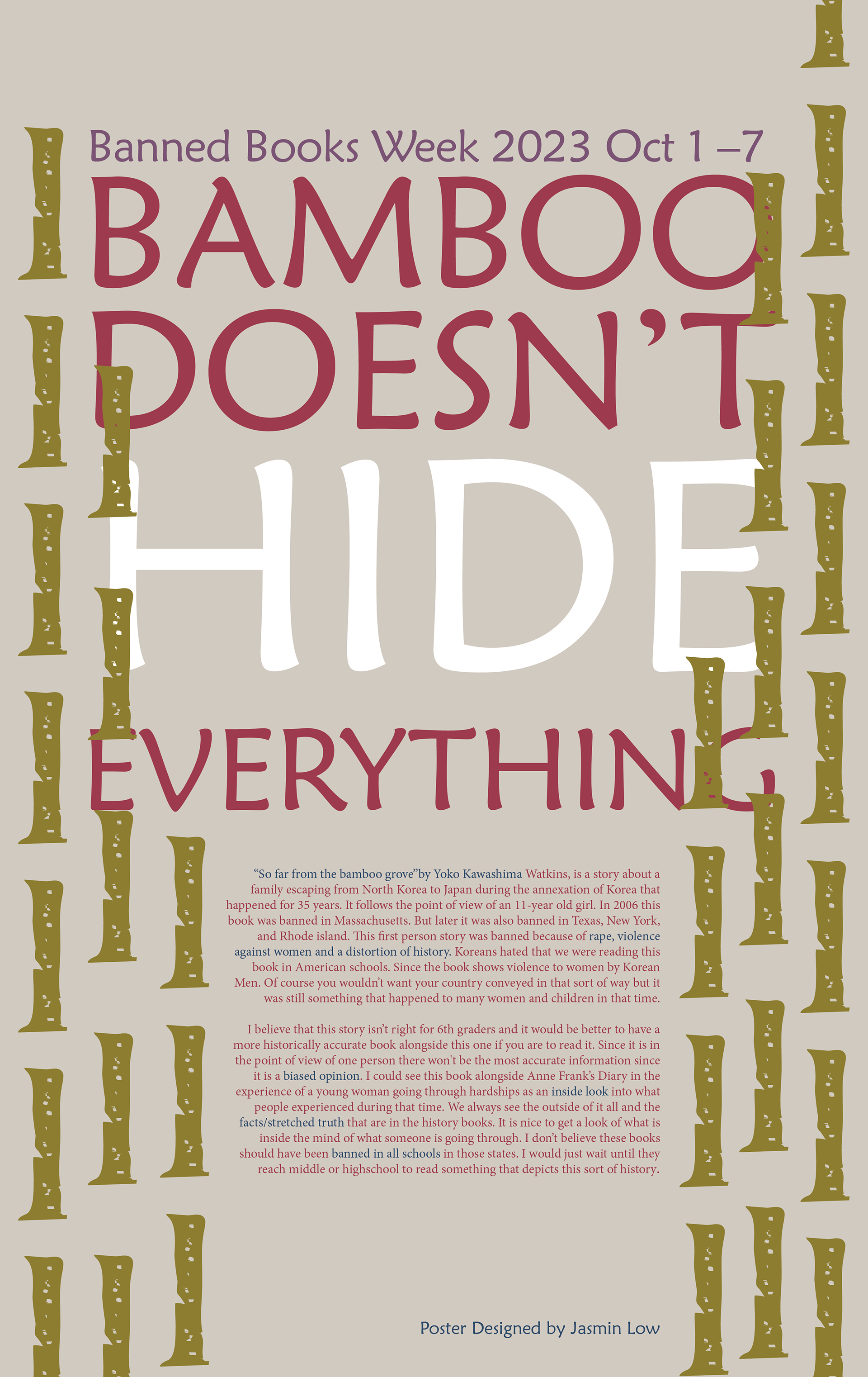
FINAL
This came out better than I expected. I was really happy with the outcome! There are interesting parts and I really like how I played with how the text was placed in the design.
