OVERVIEW
Starting with a gable box and a sleep wear product we are tasked with making a product that conveys the most peaceful part of our day. This project needed a to have many elements including: a size chart, brand, company info, etc. With these elements we had to make a sleepwear product for a chosen target audience.
SKETCHES & DOODLES
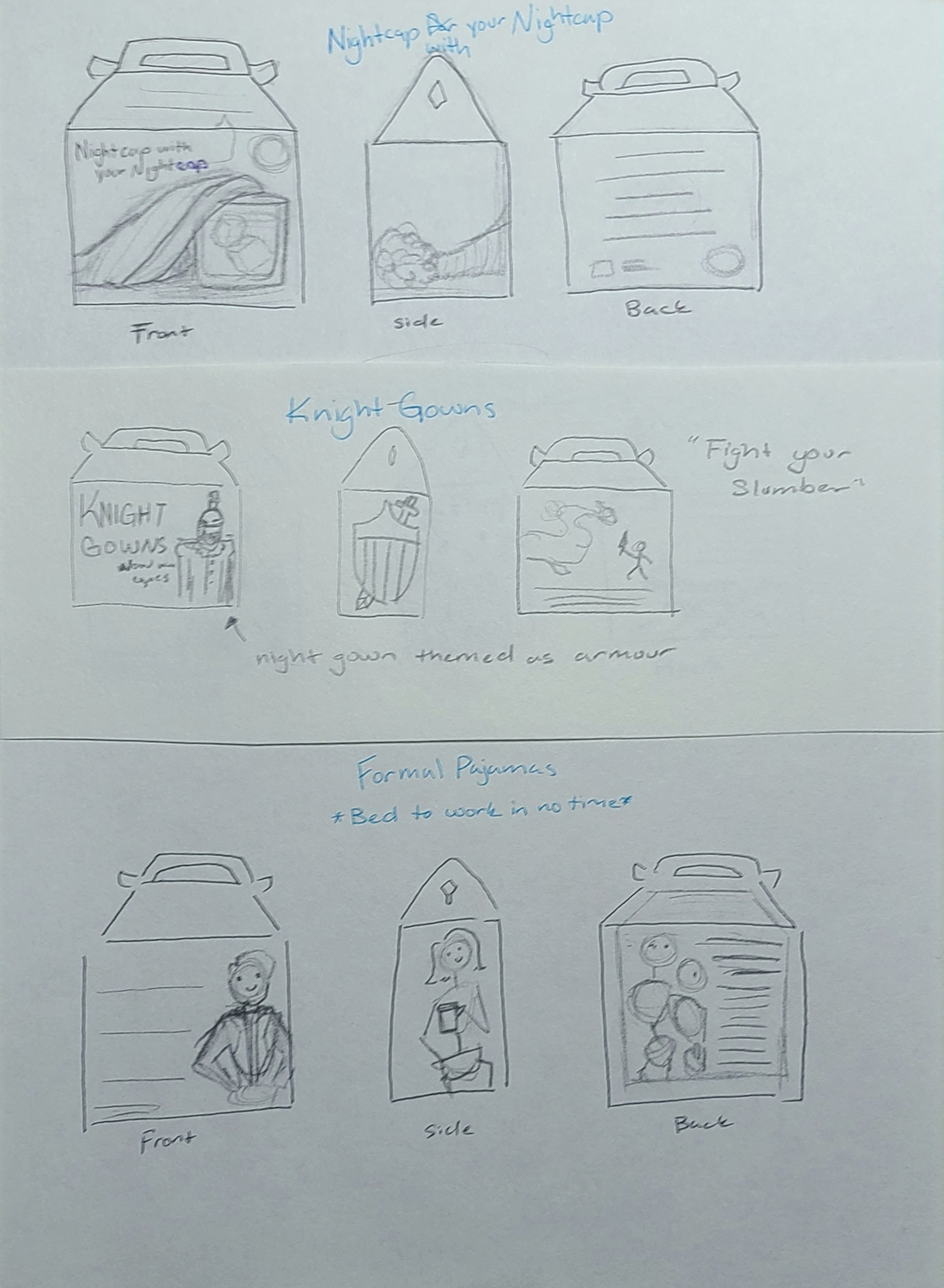
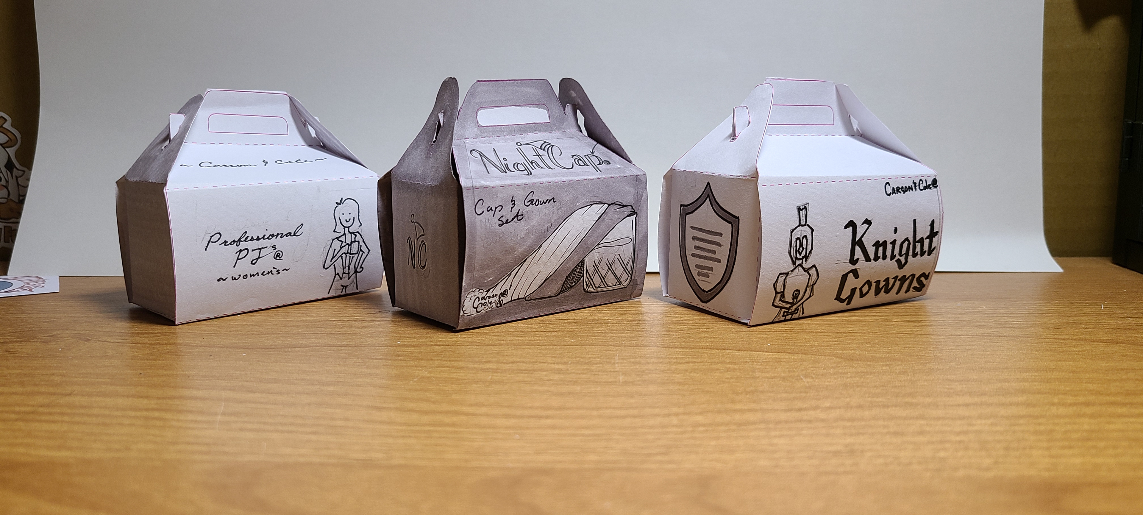
I really liked the idea of twisting the word "night" I had nghtcap and night cap which is a hat and a drink. To cater toward nerdy men I did "knight" gowns. It was a little too kitschy for this project so I didn't move forward with it. The last one was for lazy people. It was pajamas that looked like formal office clothing. Either for people the sleep in and dont have time to change before work or it was for people that work from home and just need to attend a zoom meeting and they still want to be comfortable.
THUMBNAILS
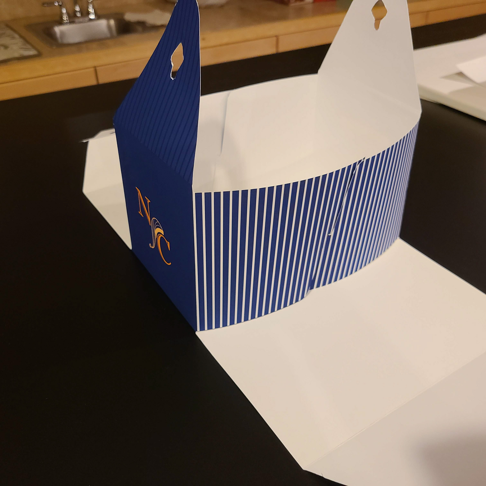
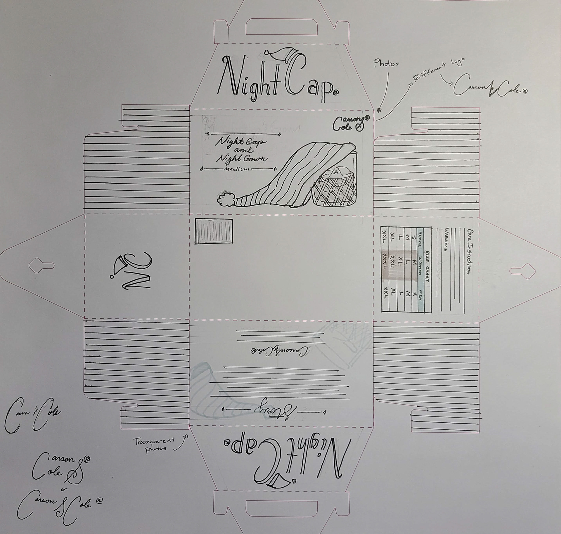
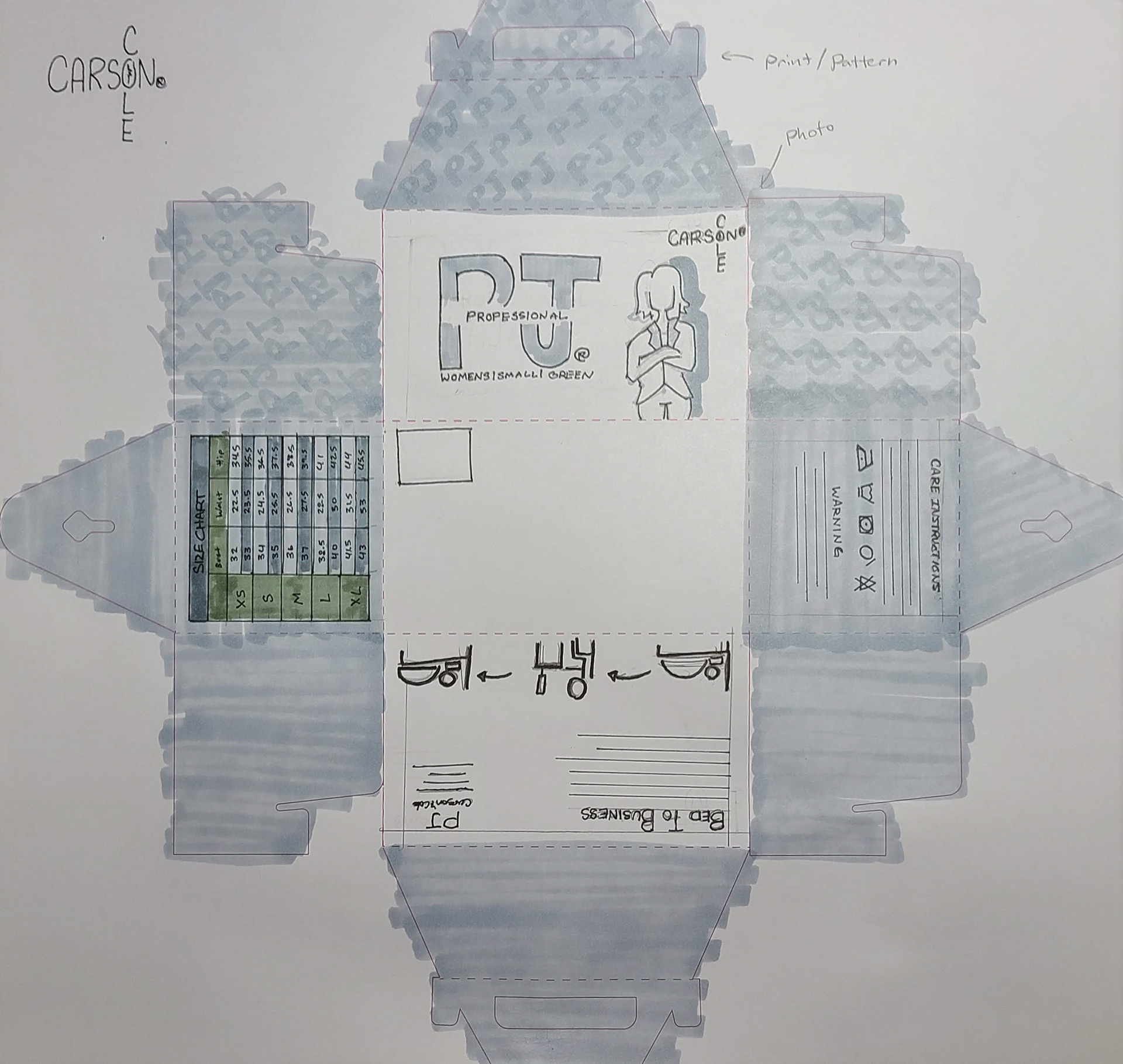
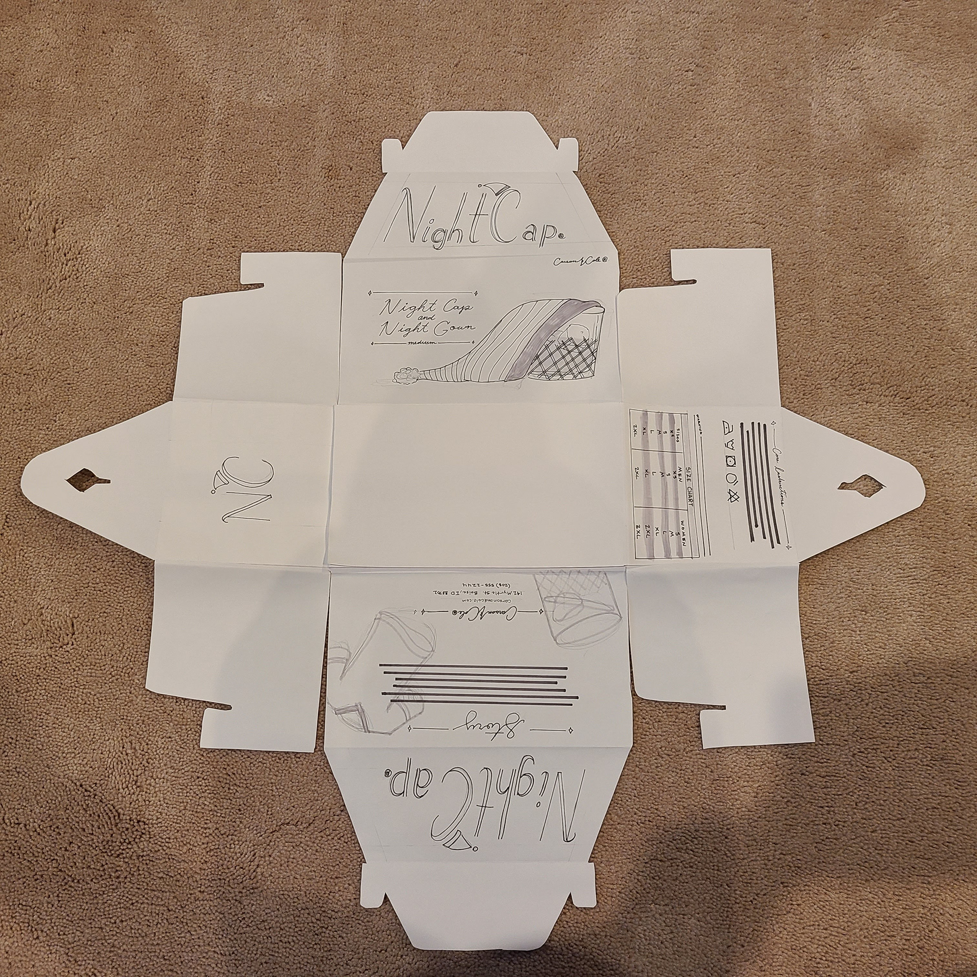
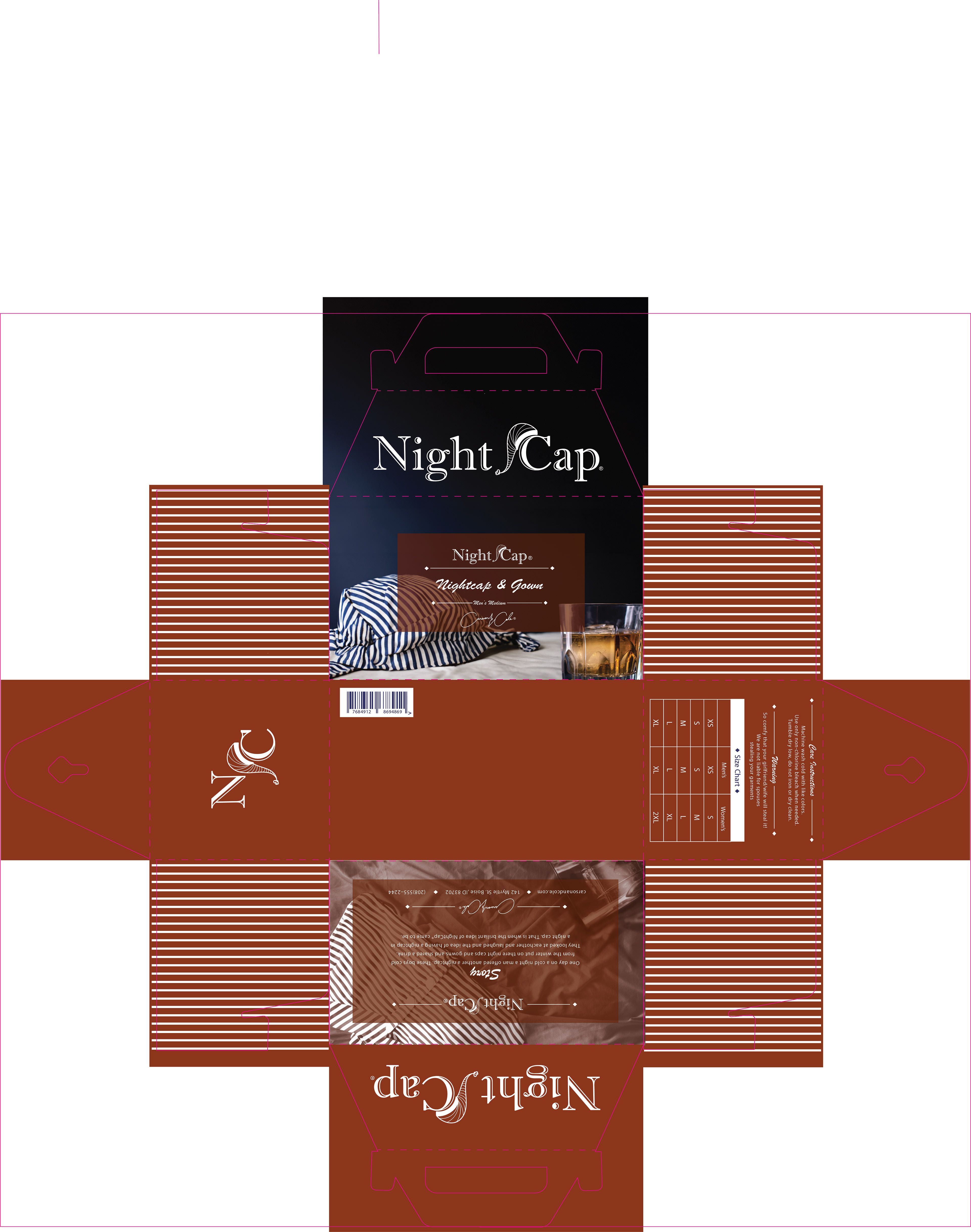
These were hard to get my head around at first since I was combining two different dielines just so that I dont have to work with glue. This also gave a fun chance to have a design in part of the inside of the box.
INTERMEDIATE
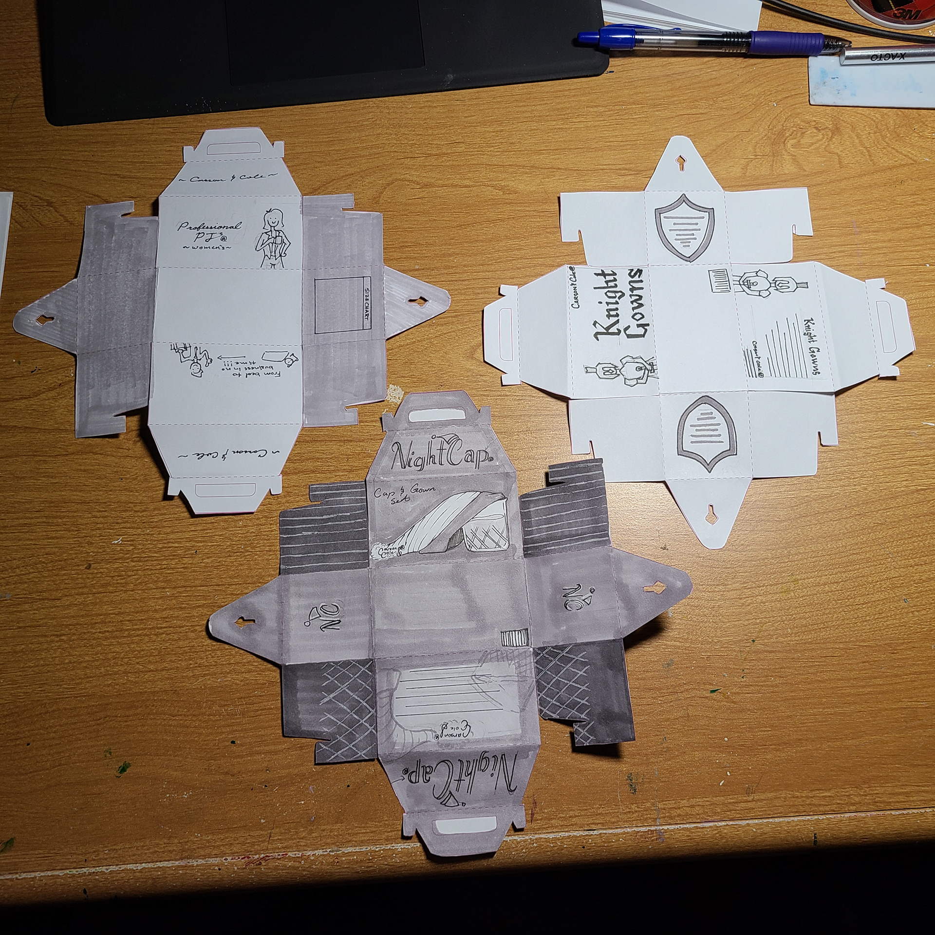
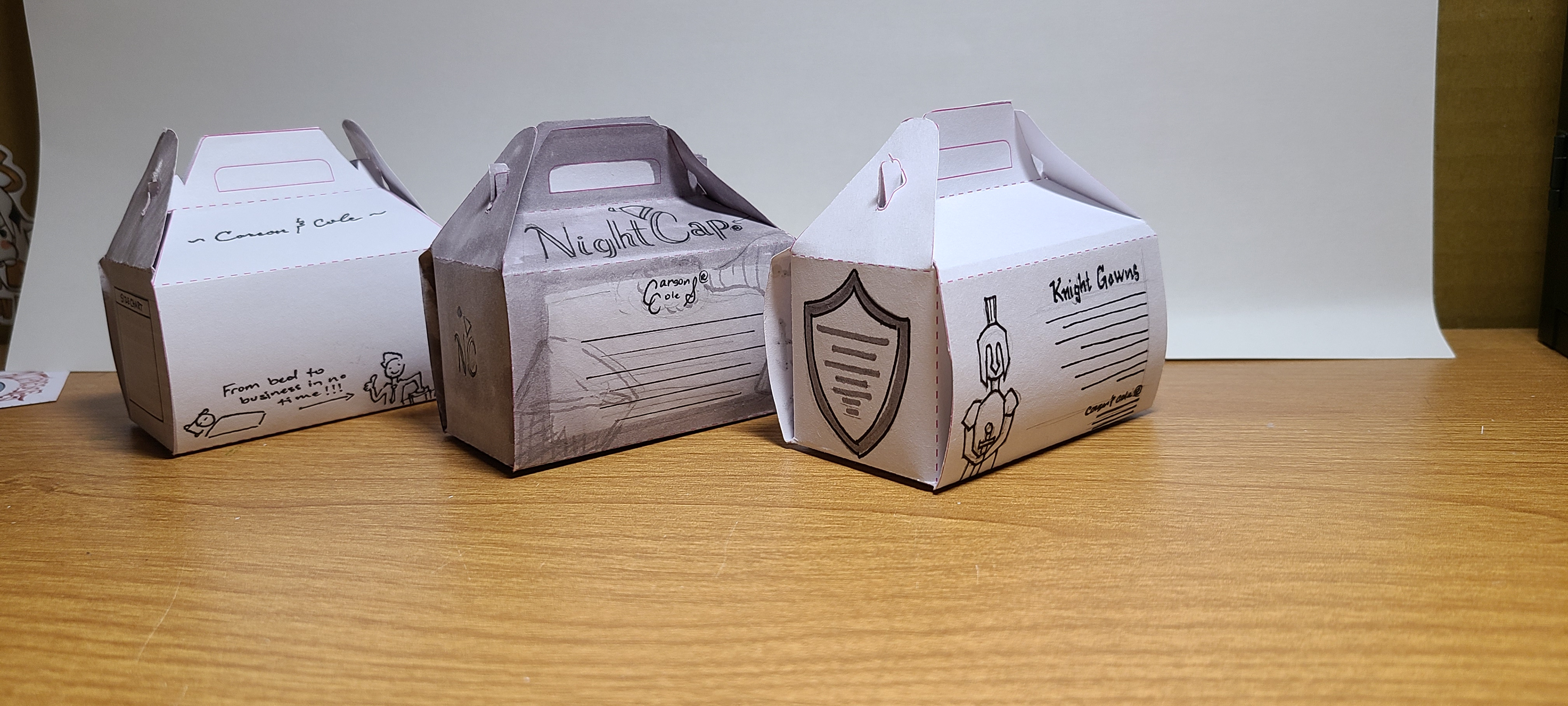
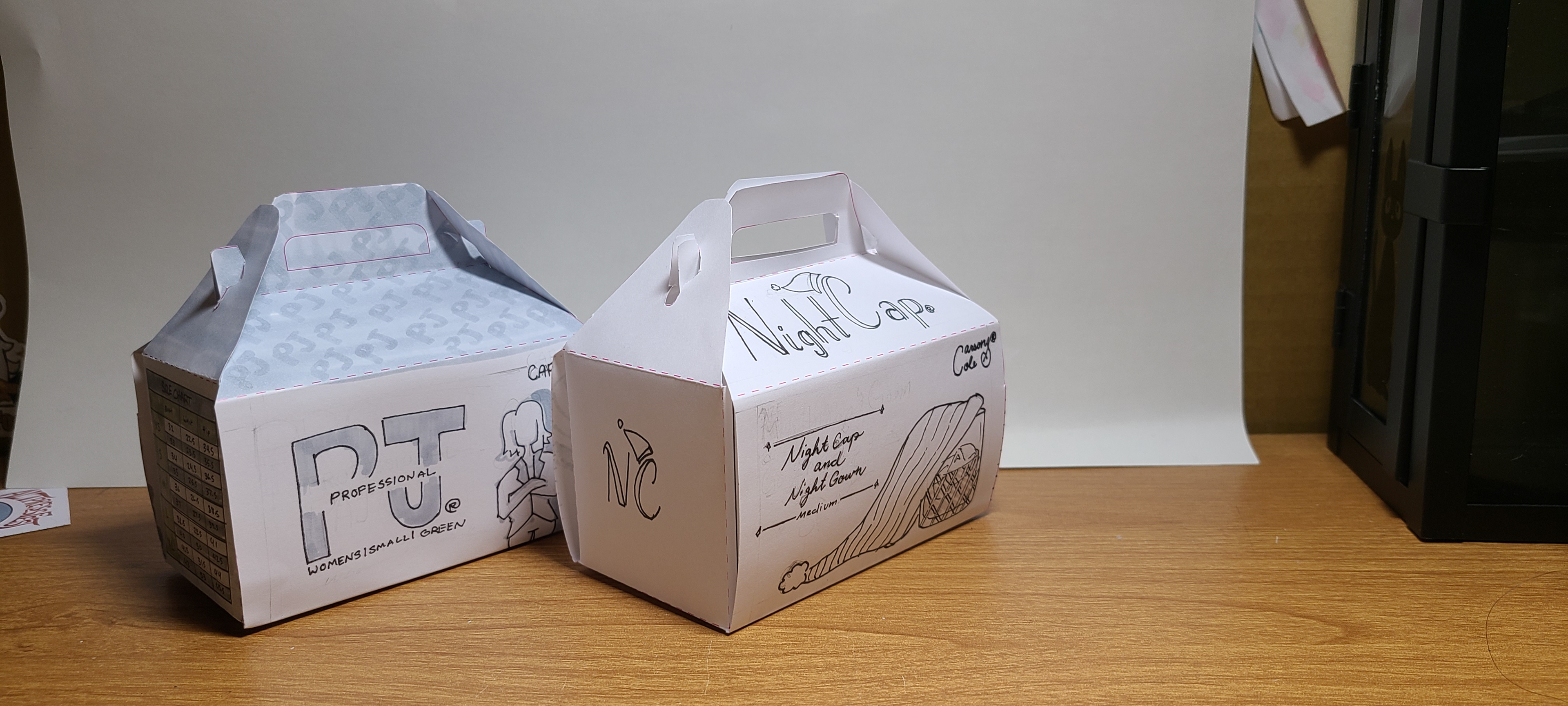
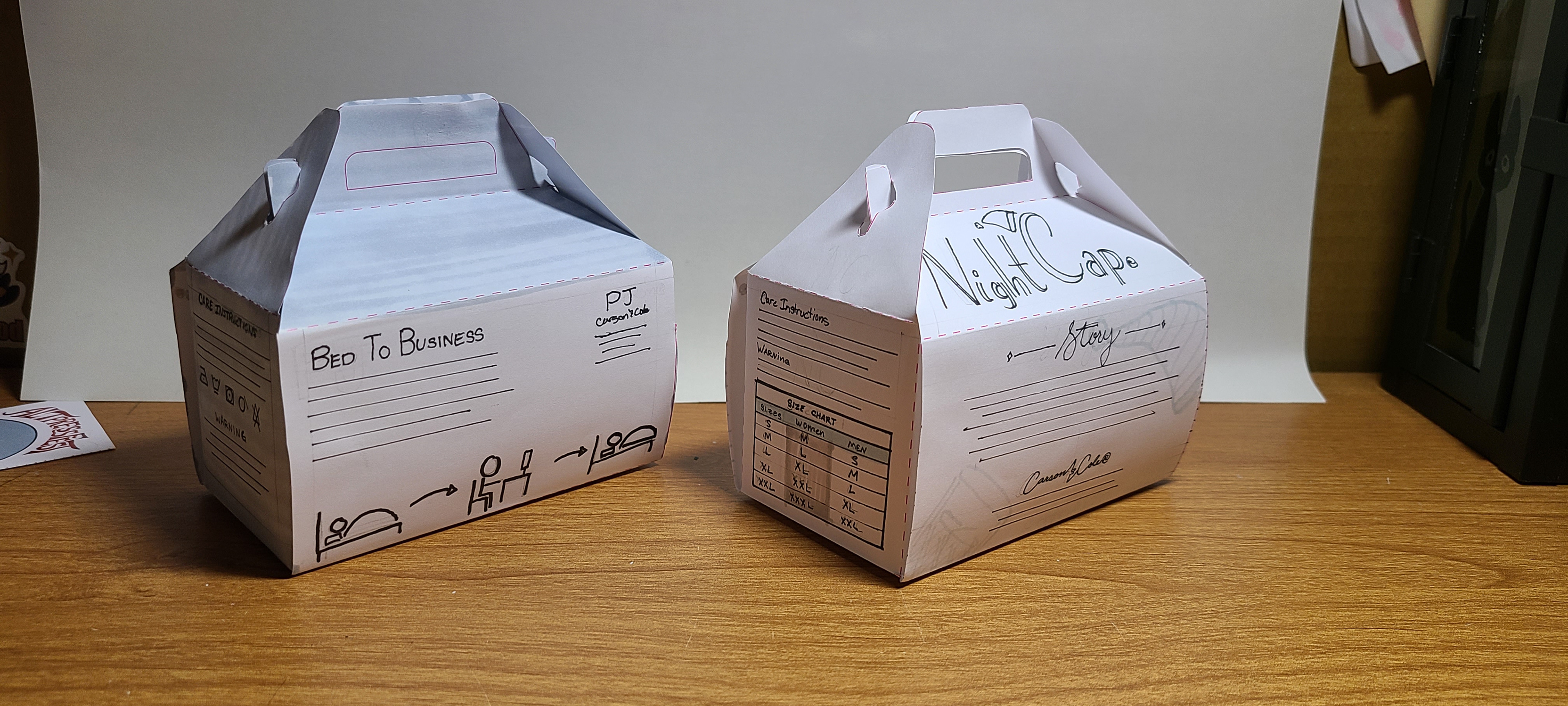
I moved forward with NightCap and Professional PJs. They felt more like a product that I would see everyday. Out of the two I really liked both and both of them were easy enough to be able to only use photos like I wanted. I don't use photos as much in my designs so I wanted to step out of my comfort zone with the project.
FINAL
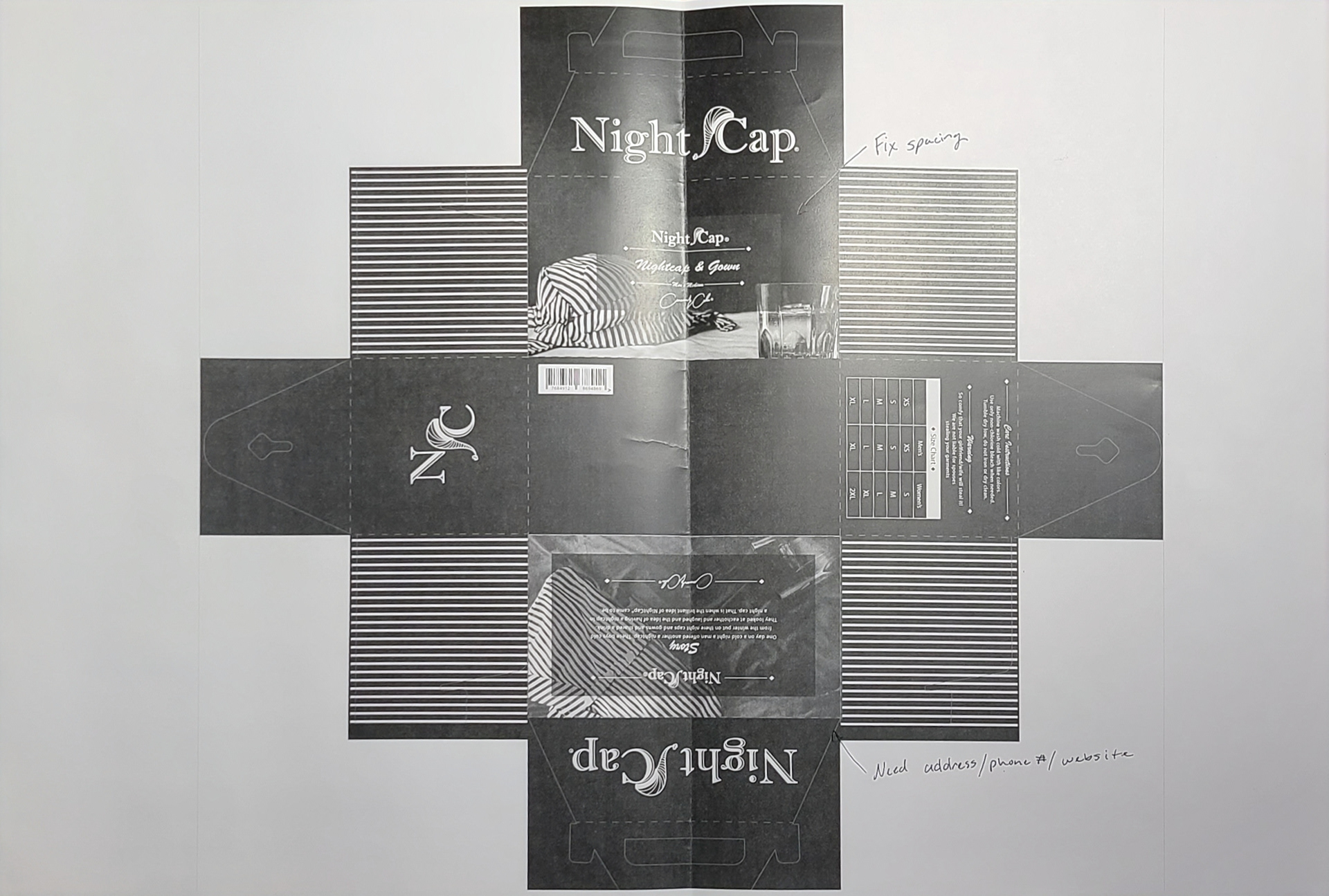
My final wasn't as tight as I wanted it and I was really bummed that I didn't spend the time on it. The full size was huge and after just doing what is shown I was getting tired. I had a lot of wishful thinking hoping that I would find the exact images that I needed.
COMPUTER PROGRESSION 1
My first computer progression was pretty good to me. I had some information that I missed. I didn't have the back information that I needed but I got that in the end. I also needed to say what color I was selling.
COMPUTER PROGRESSION 2
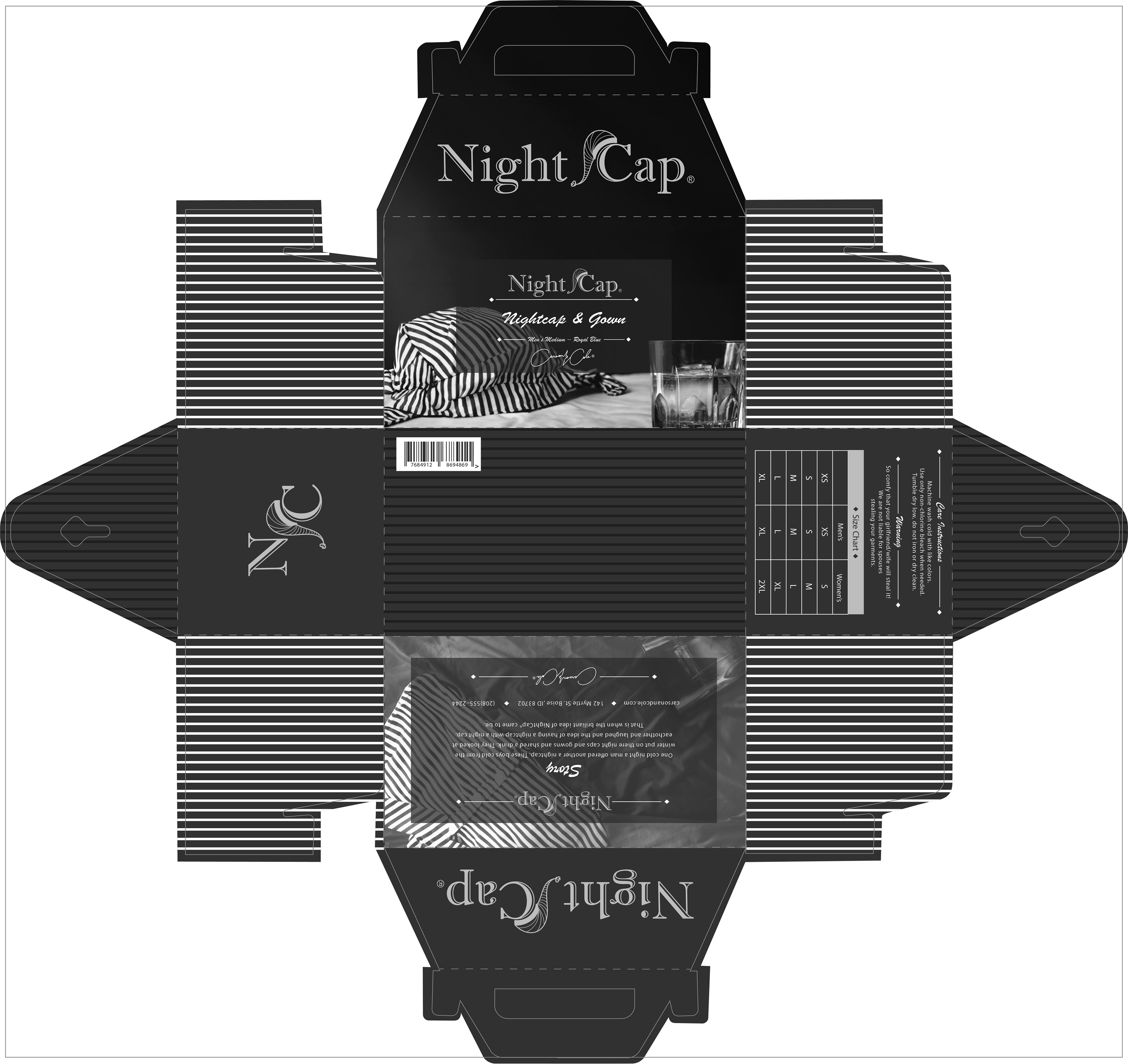
This progression had some items that I needed to change position. There were things that I needed to have better better show of importance. The front had too many elements that conflicted with each other.

COMPUTER PROGRESSION 3
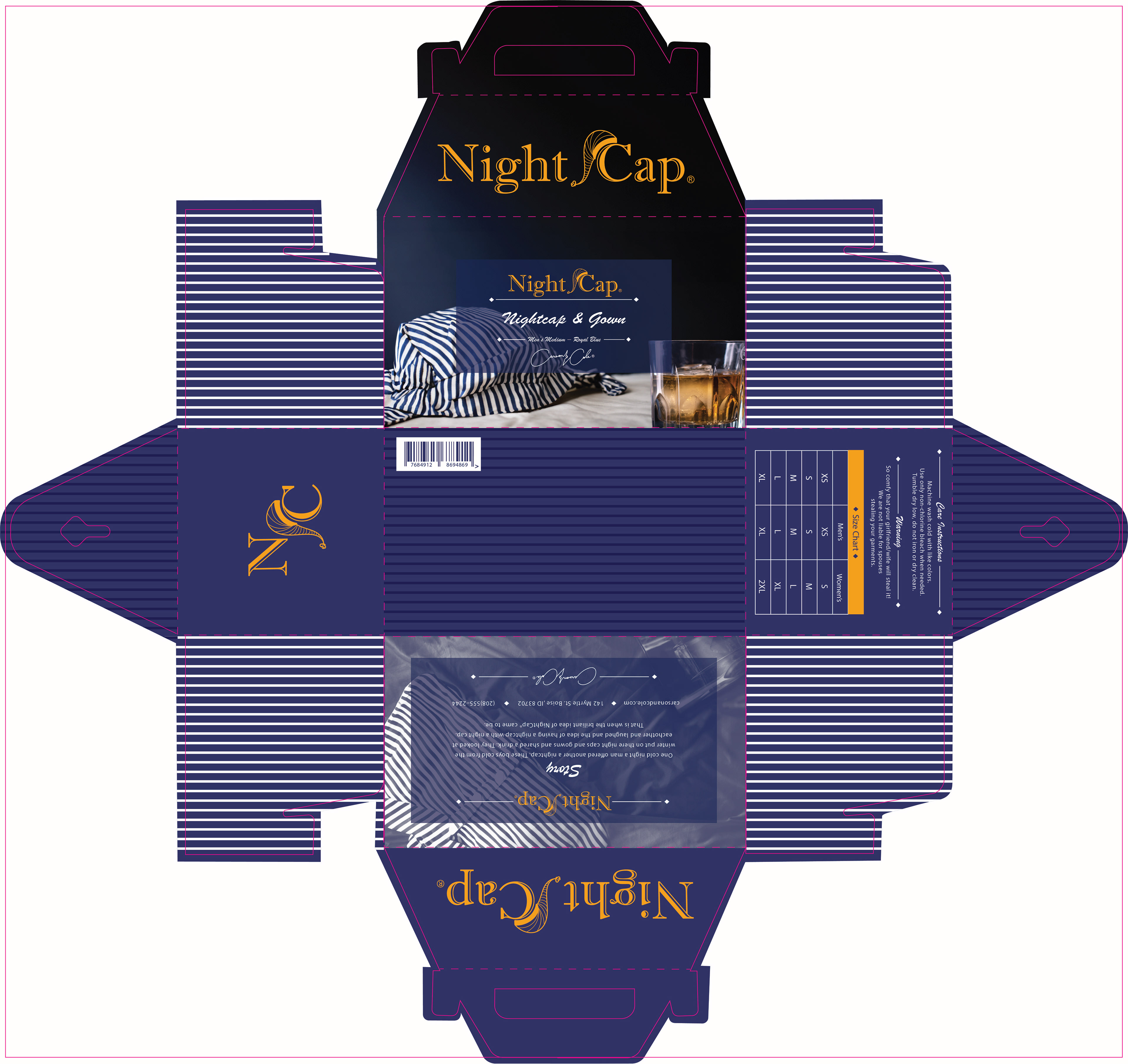
I cleaned up the dieline since it was pretty messy on the other progressions. I added some stripes to the bottom and the top sides to add a little more interest. The back got rearranged a little so that I can make the spacing a little more.
COLOR STUDIES
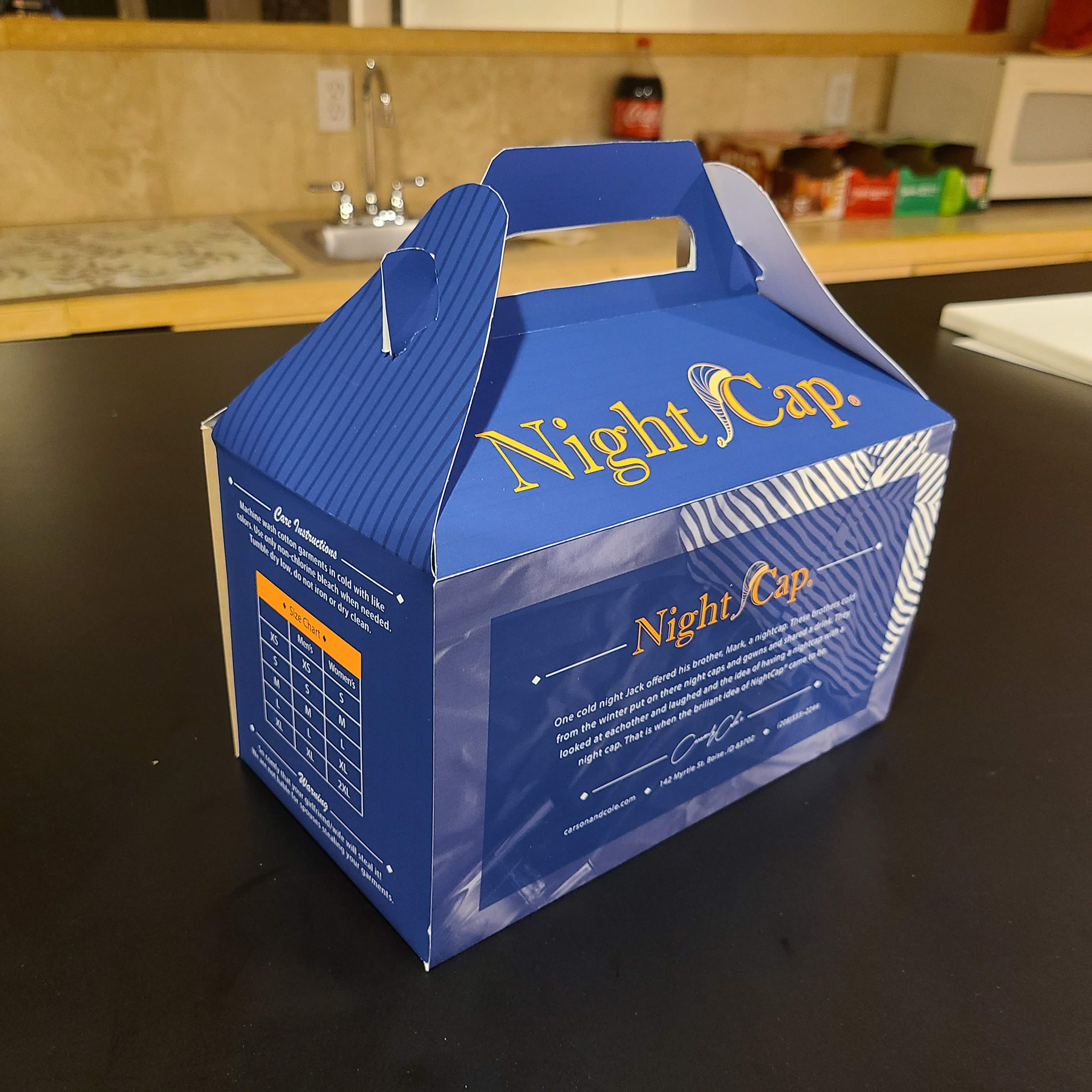
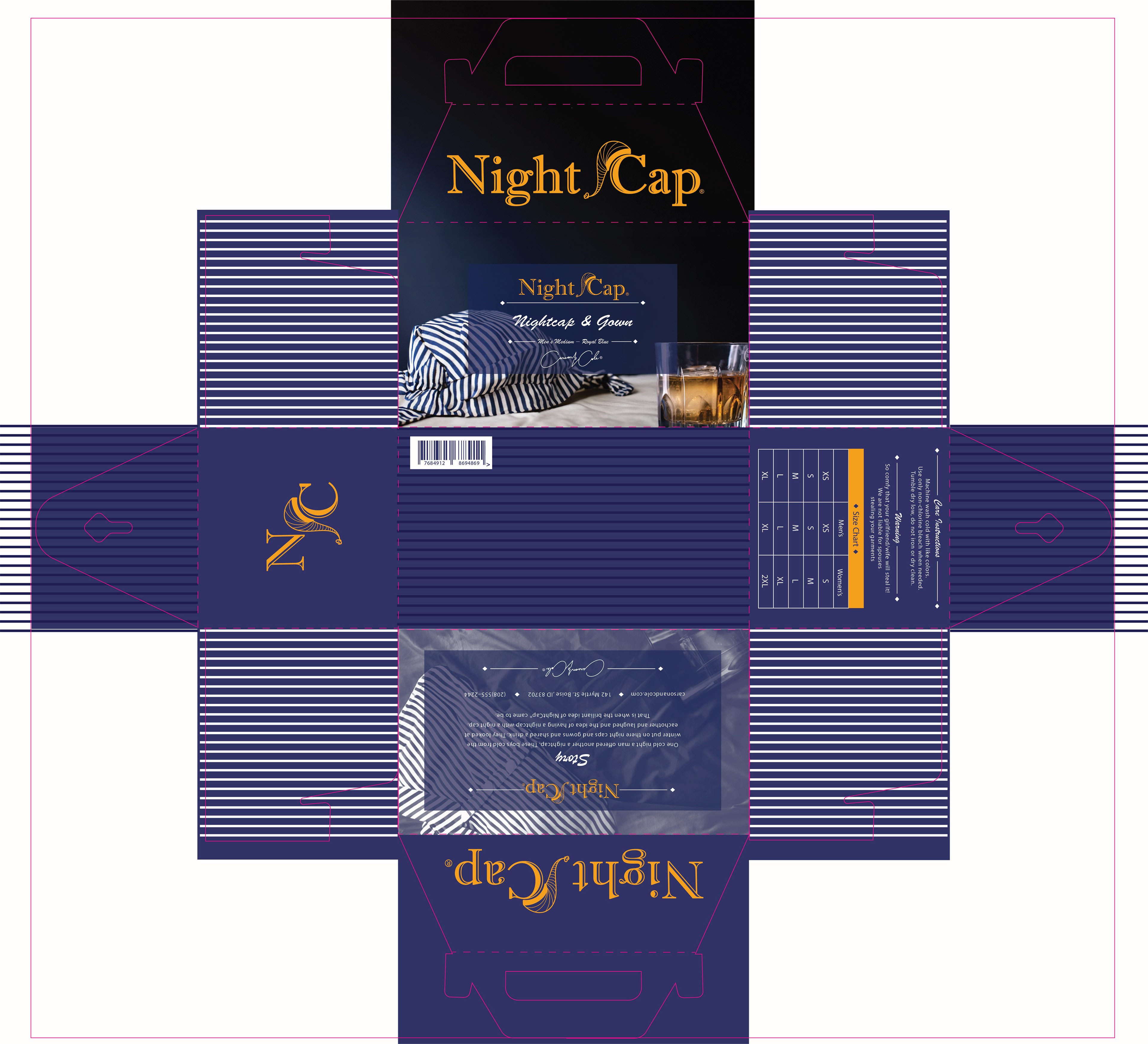
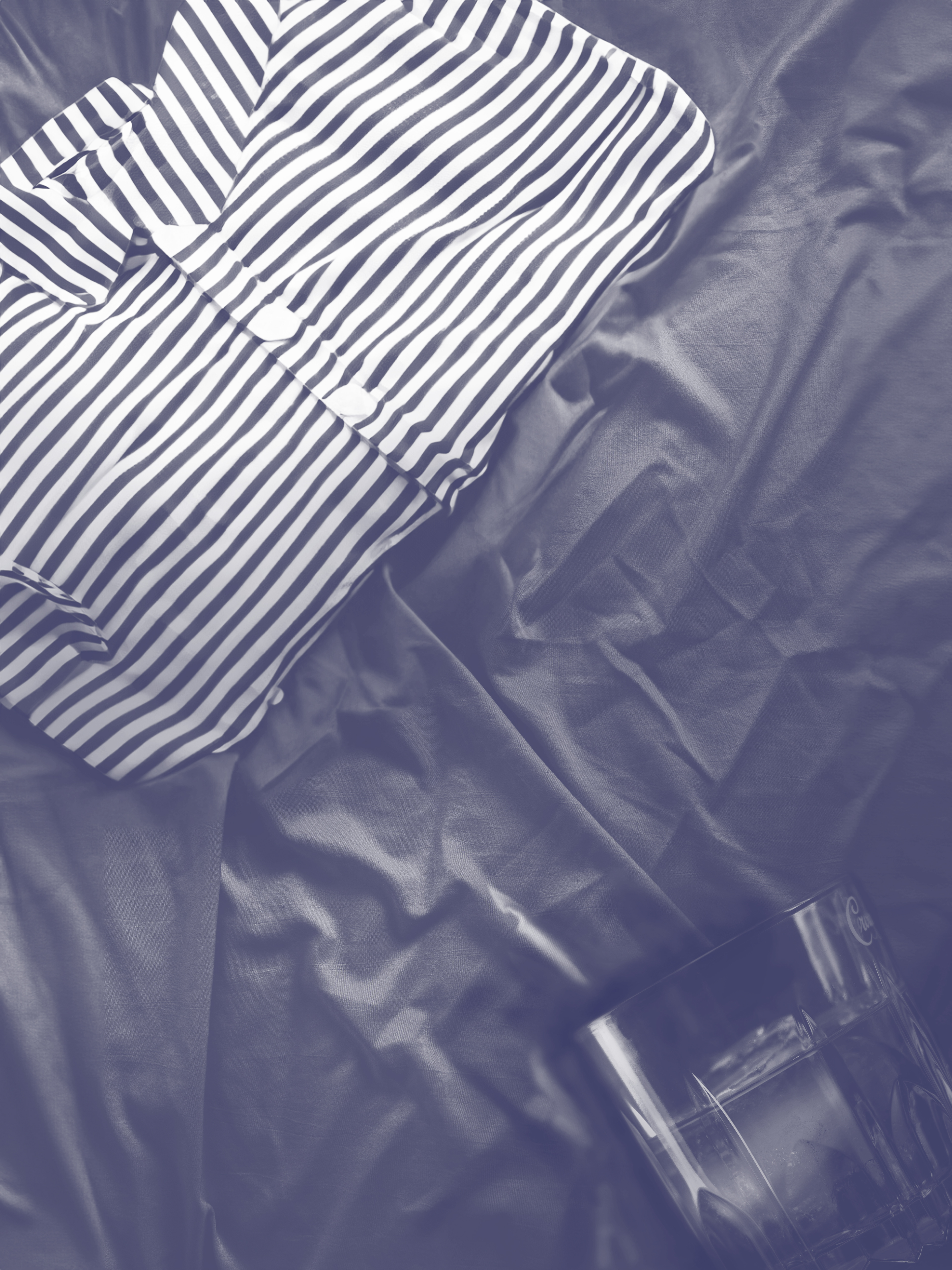
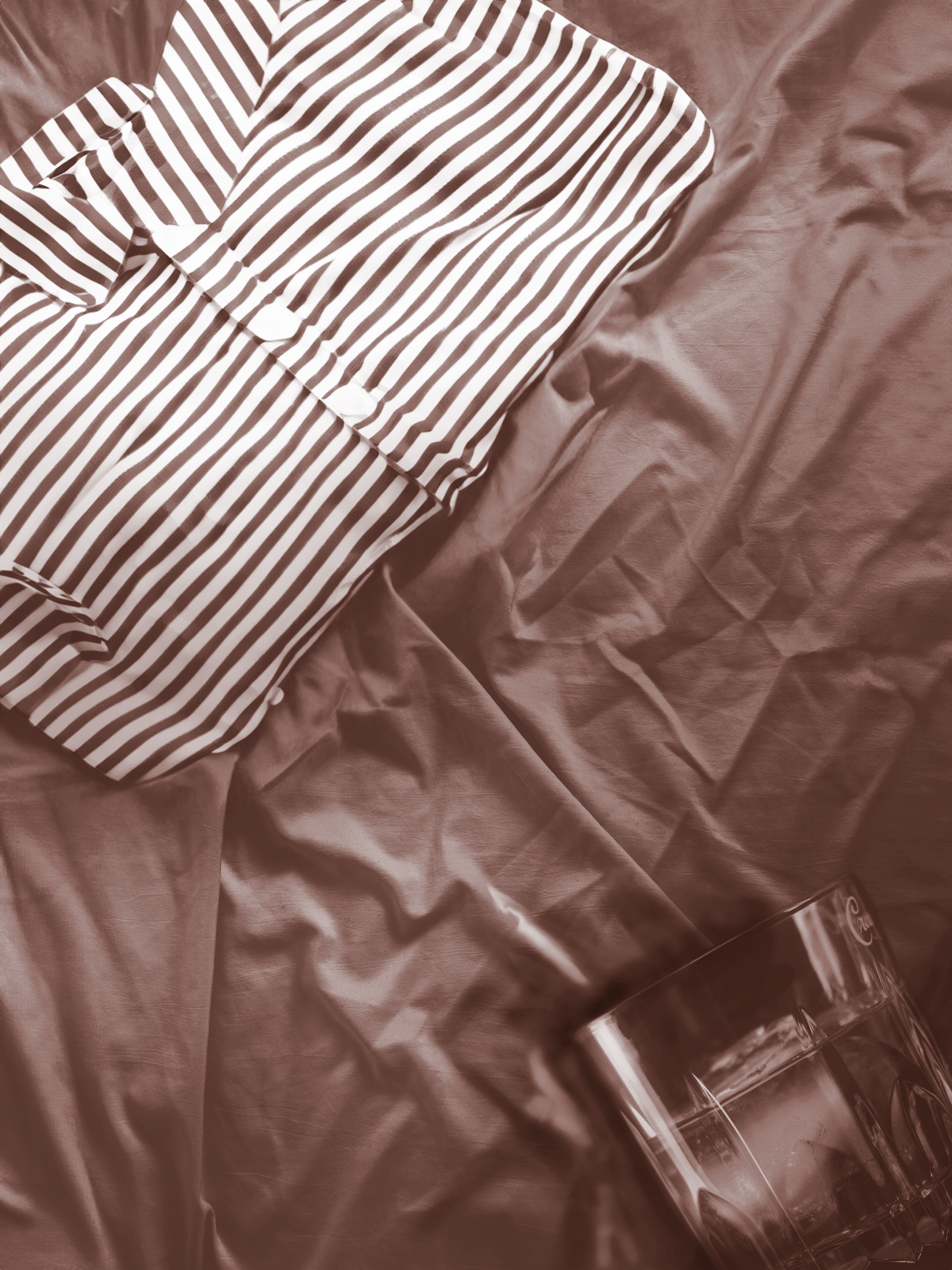
I did a color finder for the photo of the nightcap and the whisky that I found. I wanted to pull the gold color and that rich royal blue color. When I was working on the computer versus the printed blue it was very different. The blue on the screen was more purple. The blue that was printed was more true to the royal blue that I wanted.


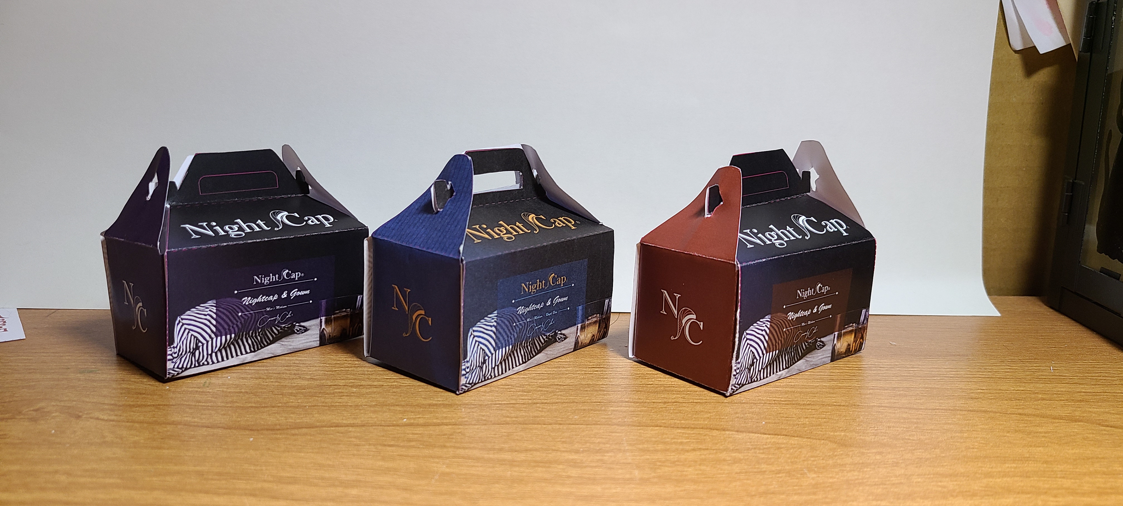
COLOR STUDIES DUMMIES
These dummies really showed me what the color printed is. Printing these out really showed me how much the printer, paper and computer matter. The difference in paper made the colors so different. The difference in the printer also made a huge difference as well. The blue on the left and the middle are the same but they are printed on different paper and with different printers.
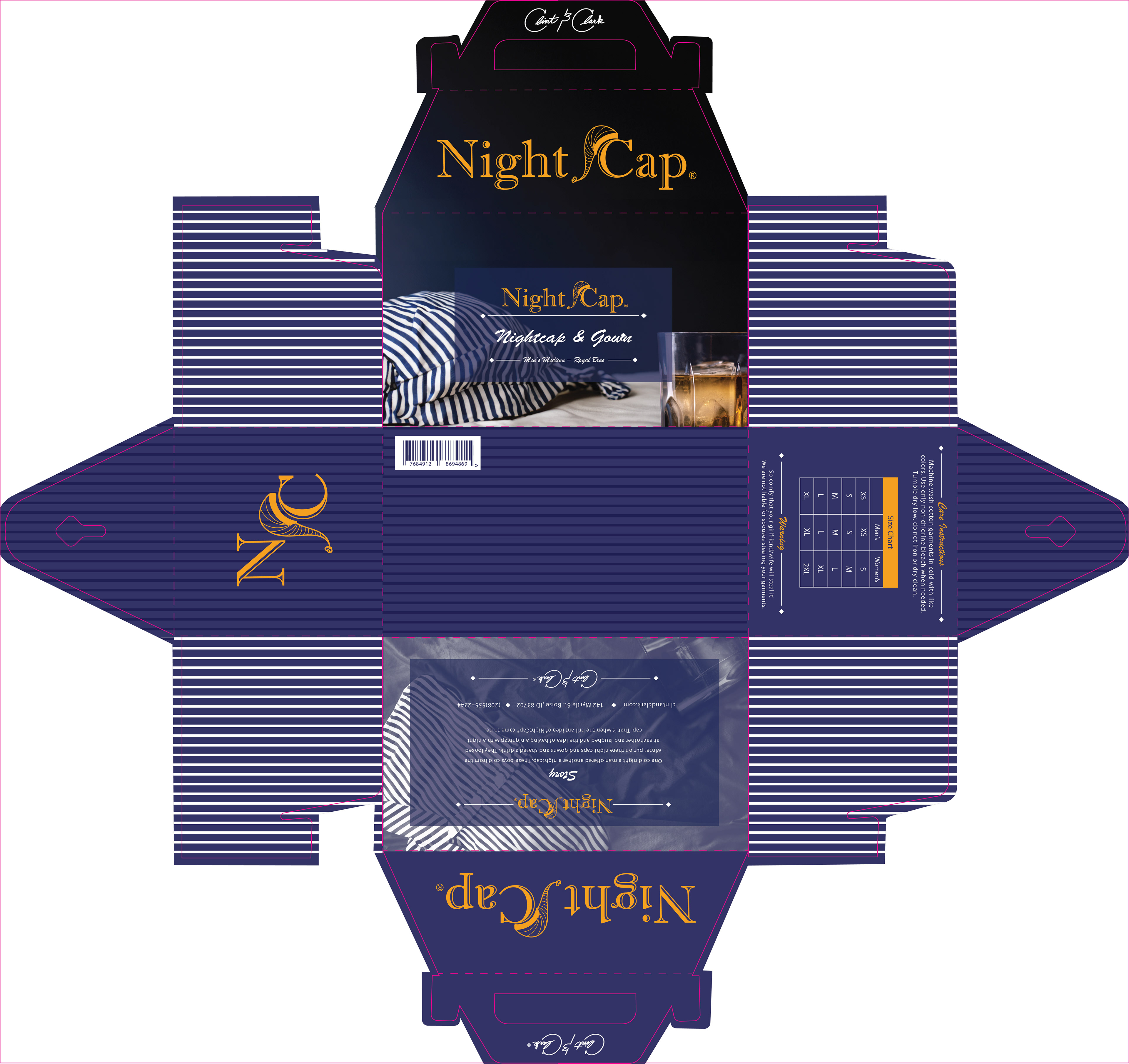
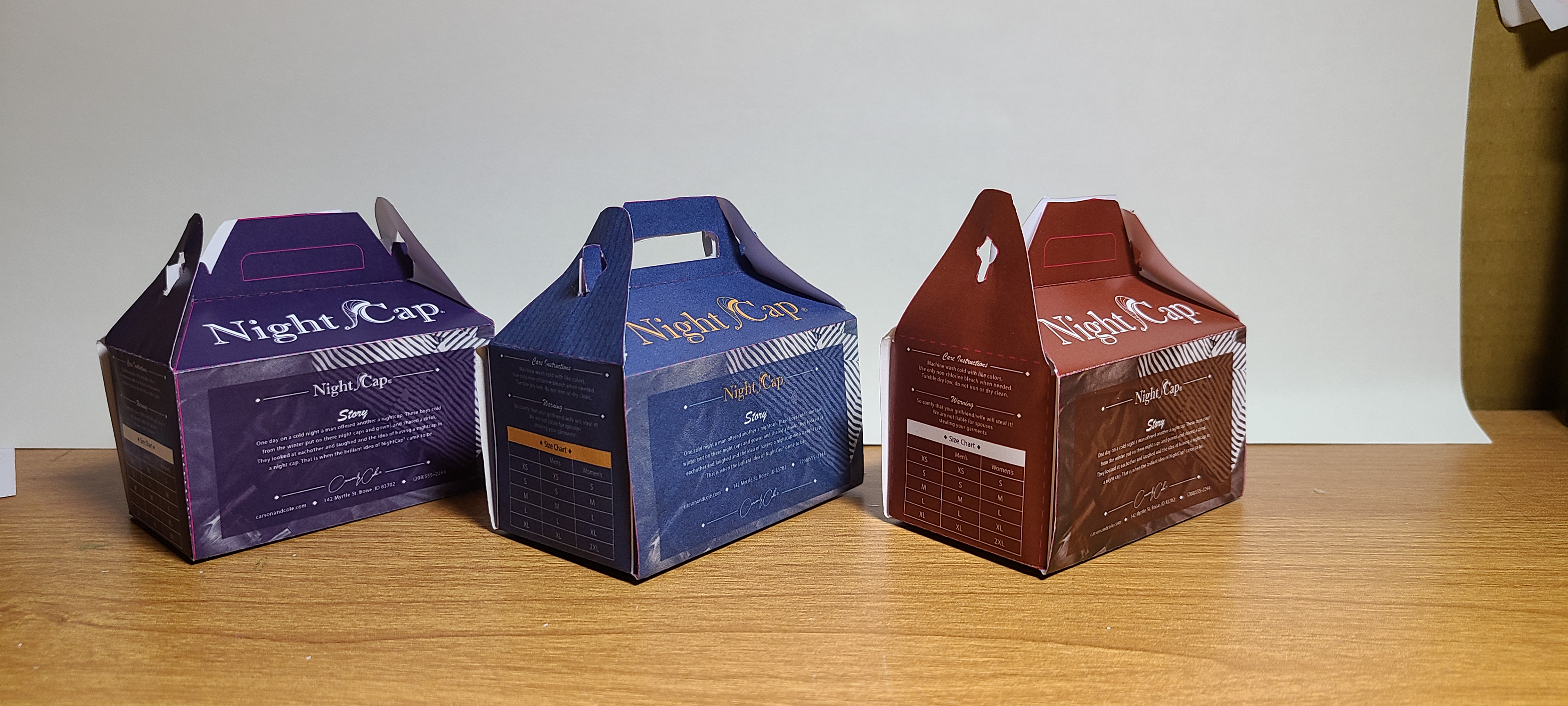
FINAL
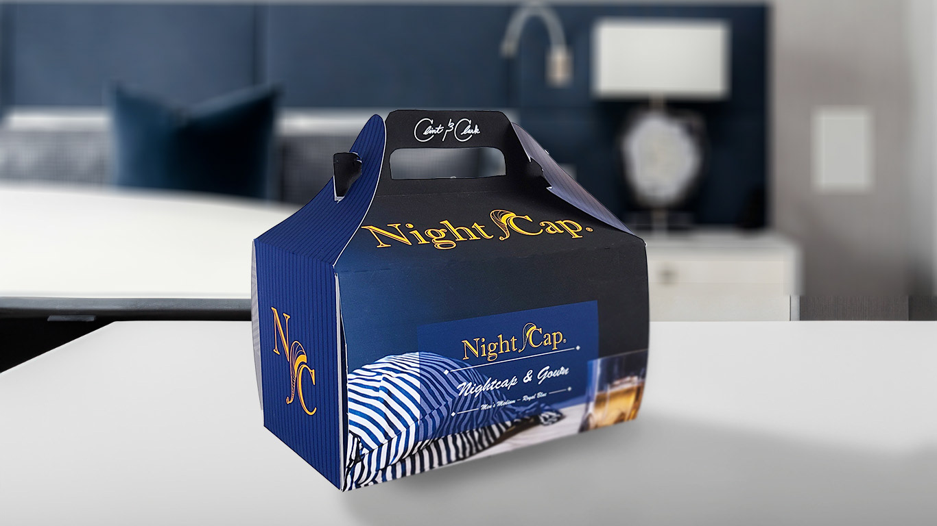
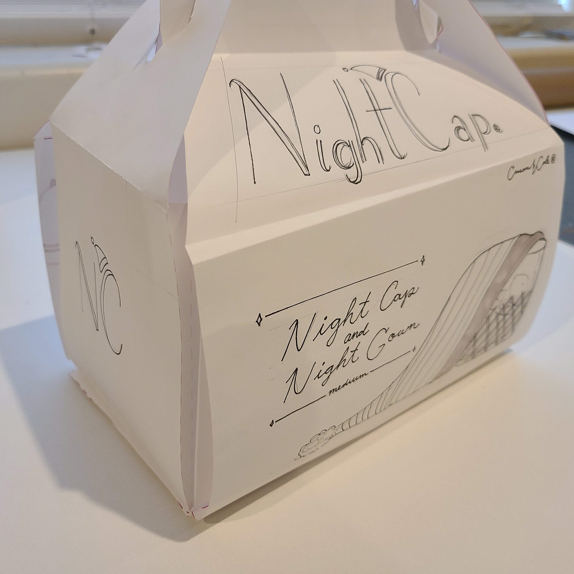
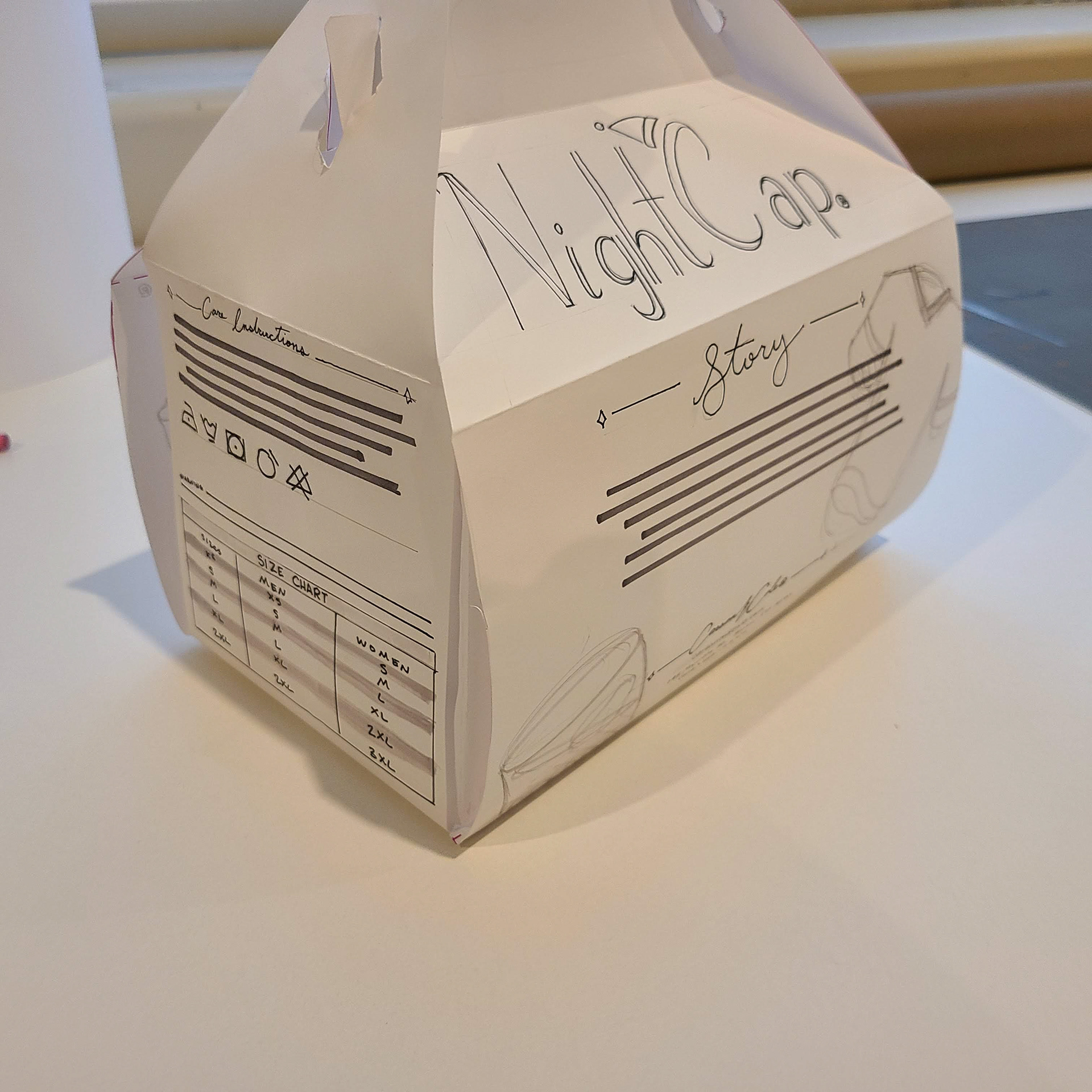
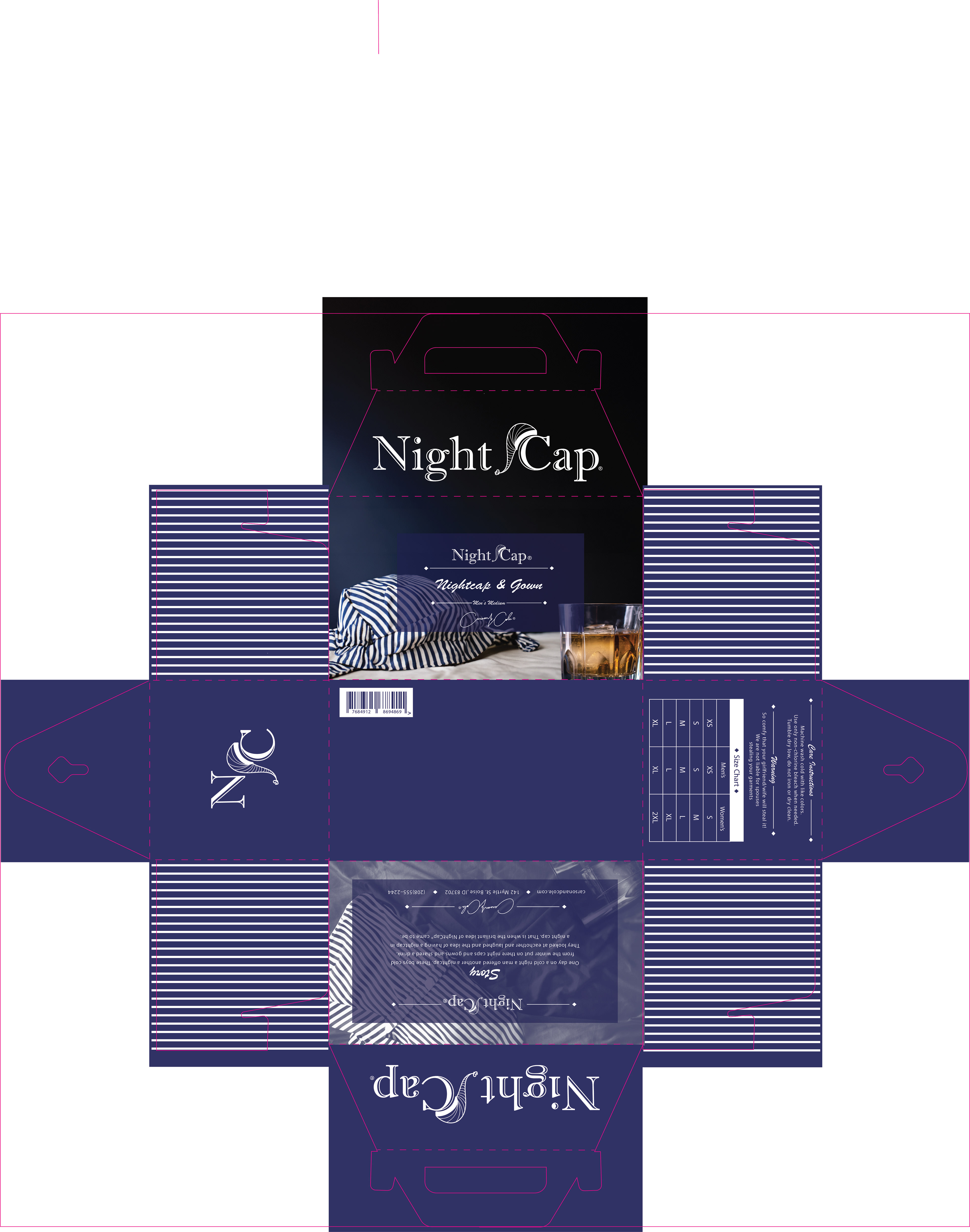
I went with the blue and gold colors in the end. It all tied together nicely and having the slightly lighter color nightcap in the logo really made a difference. I really liked how it all turned out. The monotone photo on the back of the box shows the nightgown and the whiskey glass that would be in the box. I thought that the subtly of the photo was really nice. All in all really liked this end product.