
OVERVIEW
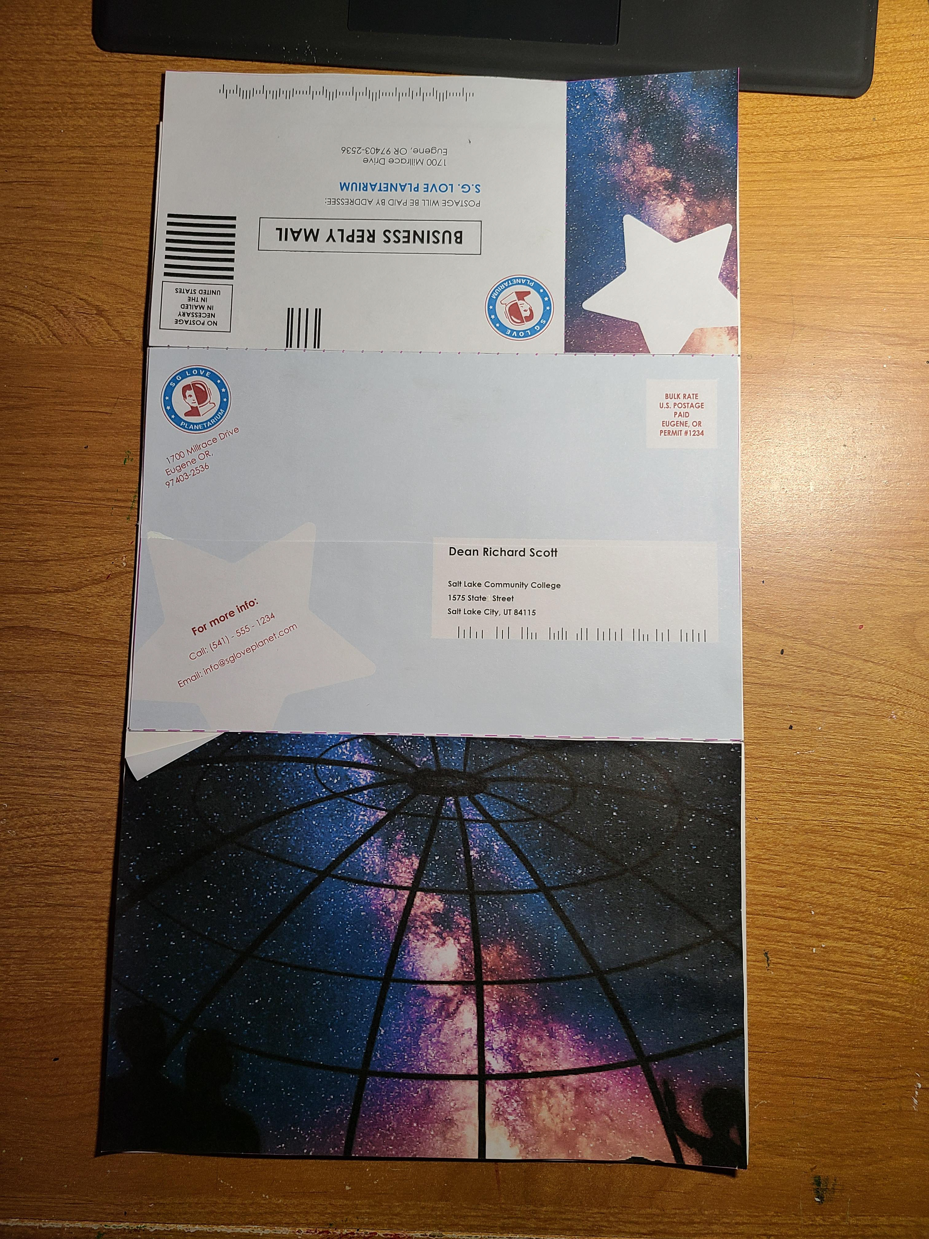
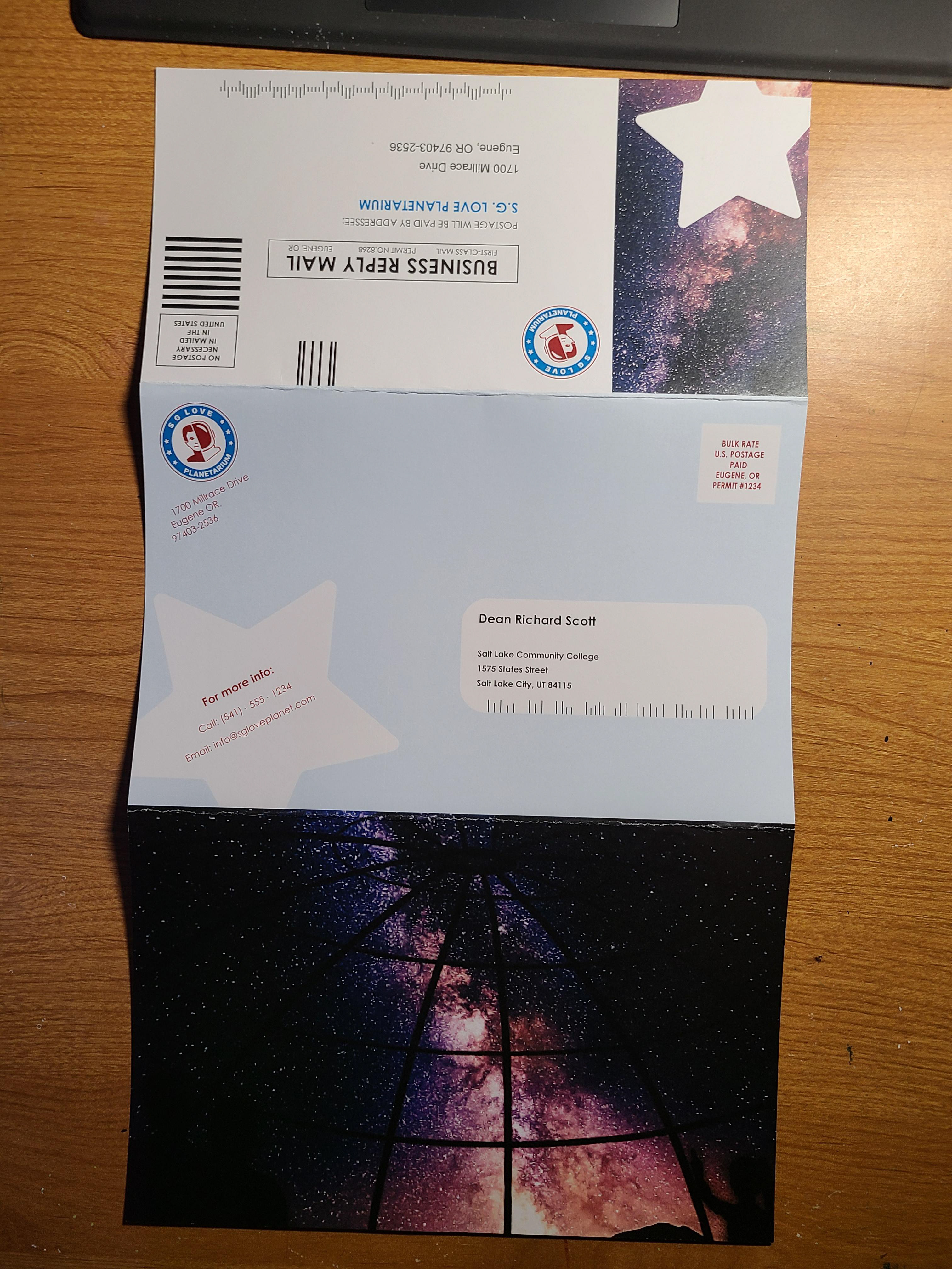
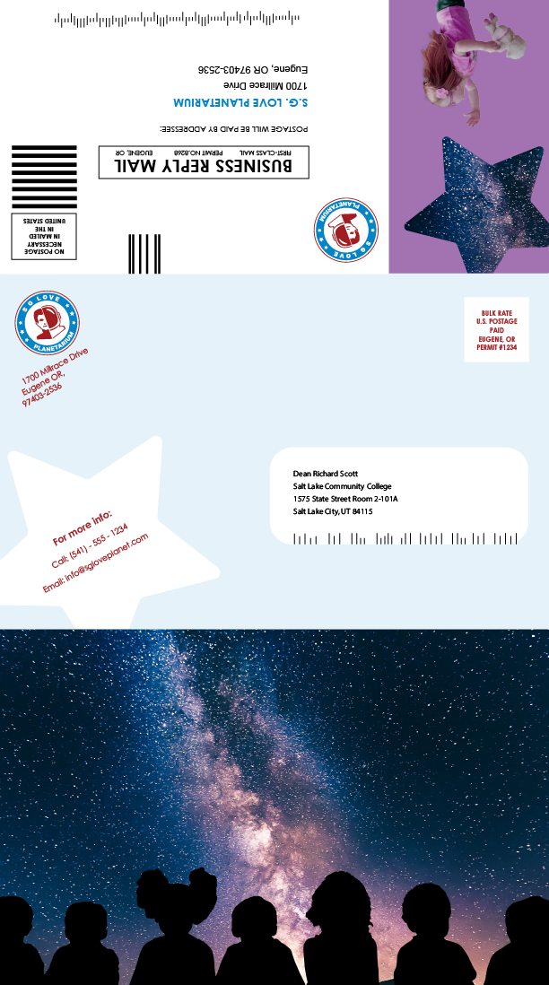
With the company that we chose we were tasked with making a brochure for the mail. We were required to have the business reply and a coupon. The mailing information had to be the same as our business letter as well. This was a way to start to introduce other elements and colors after we worked on our kit cover and stationary package.
Brainstorm and Research
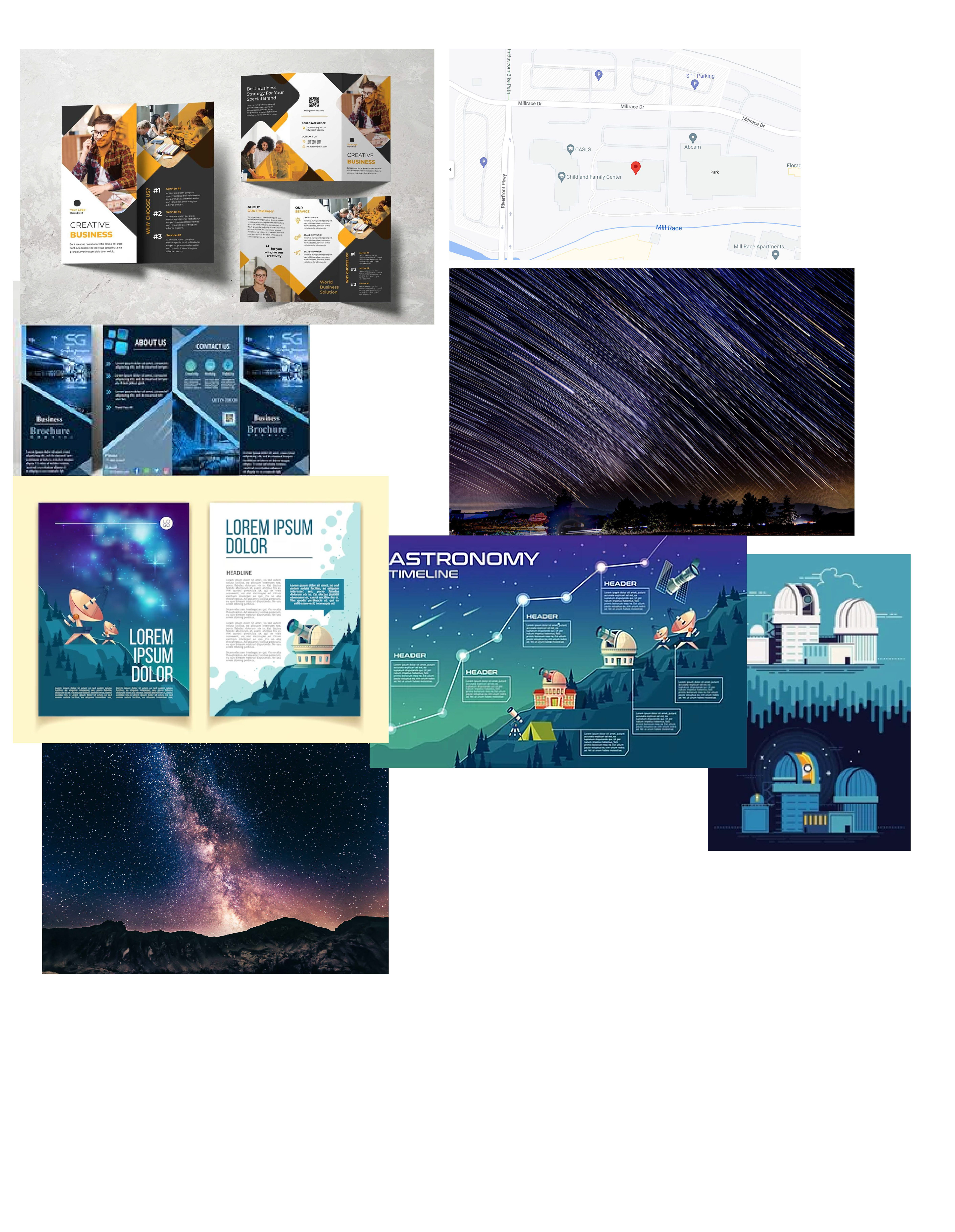
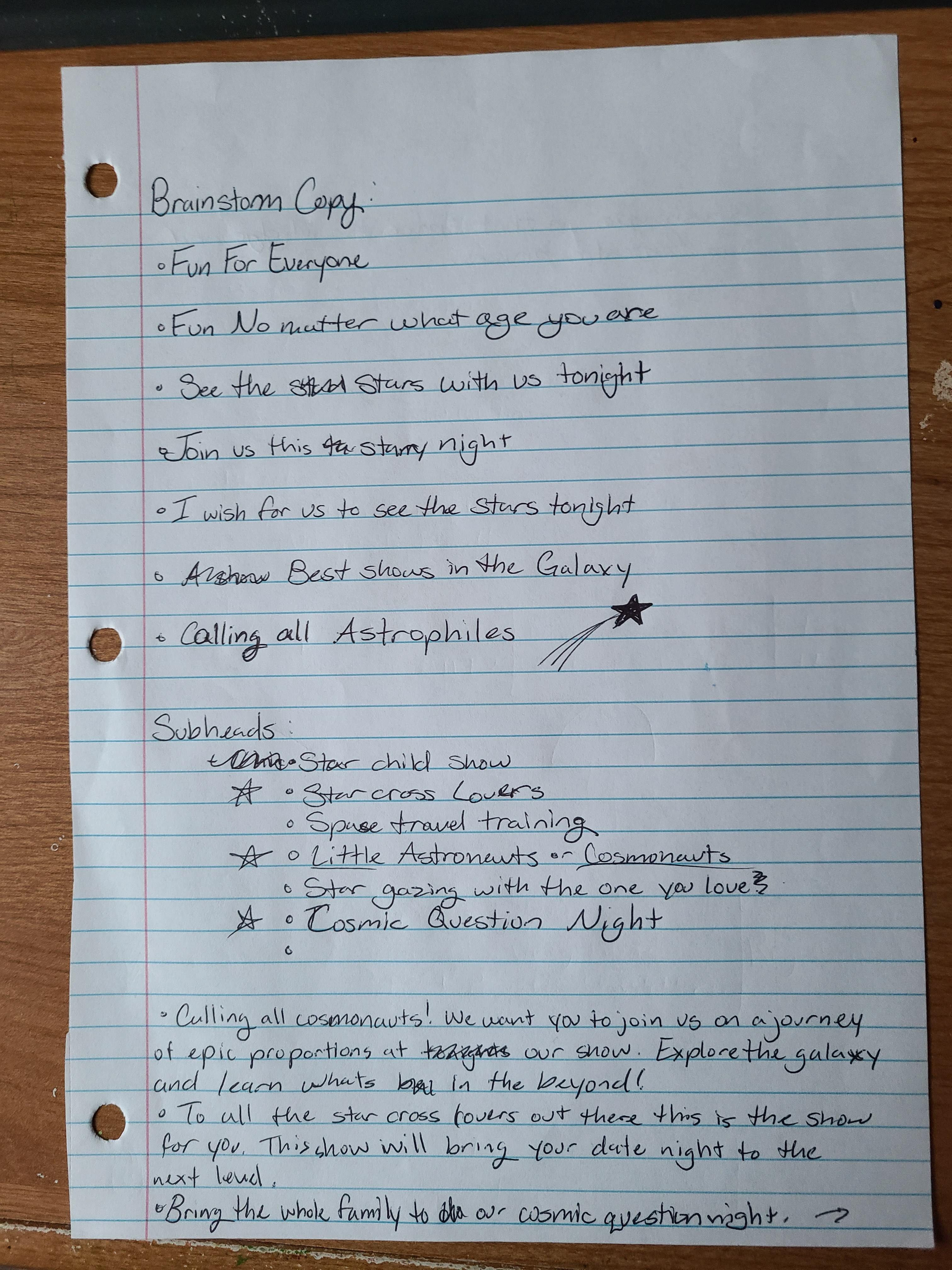
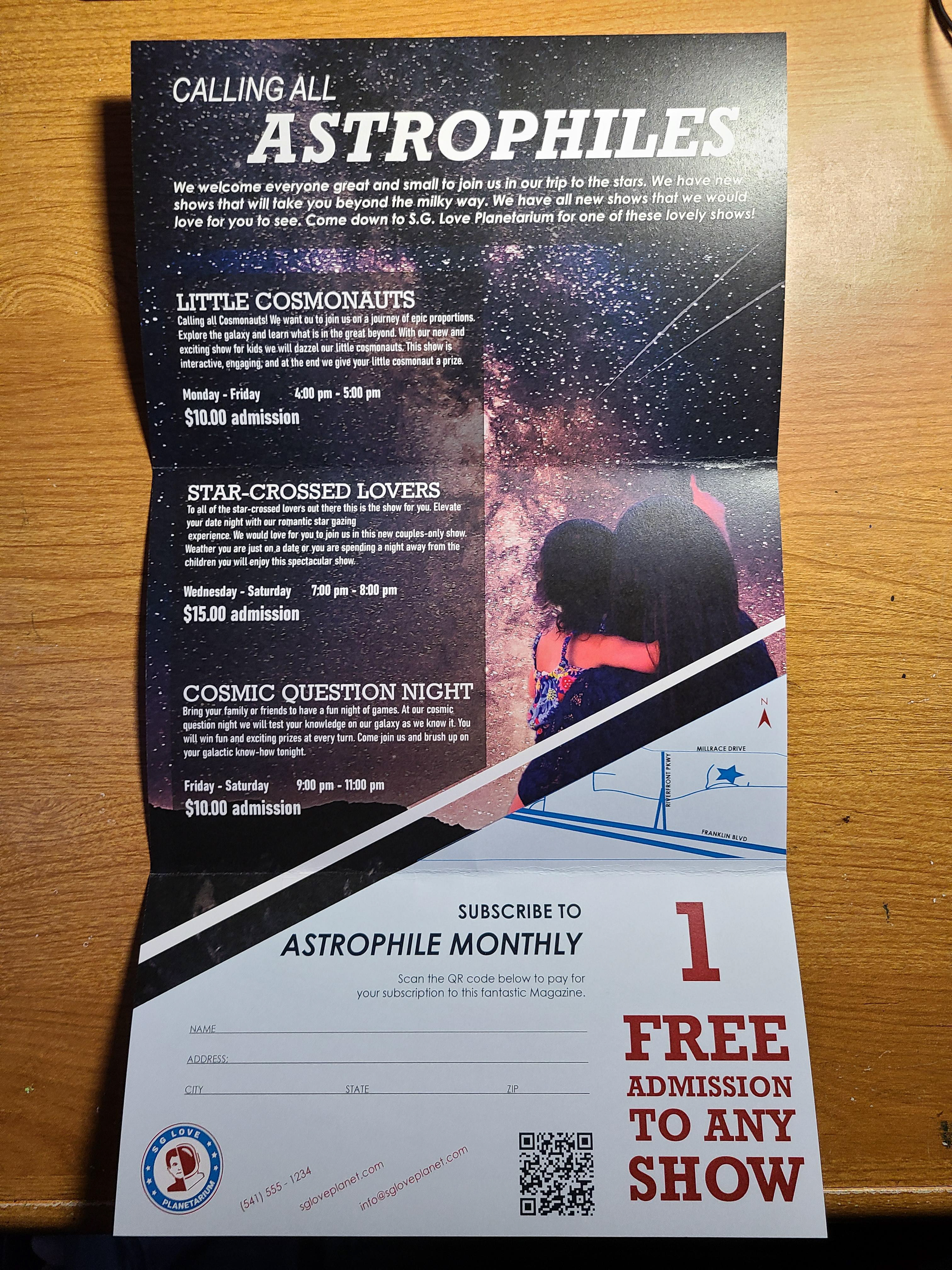
I really liked trying to find space related imagery and thinking of headlines. There were a few headlines that I came up with that became subhead for shows. This is the point that I got the idea to add these shows for different age groups and that really outlined the rest of the projects.
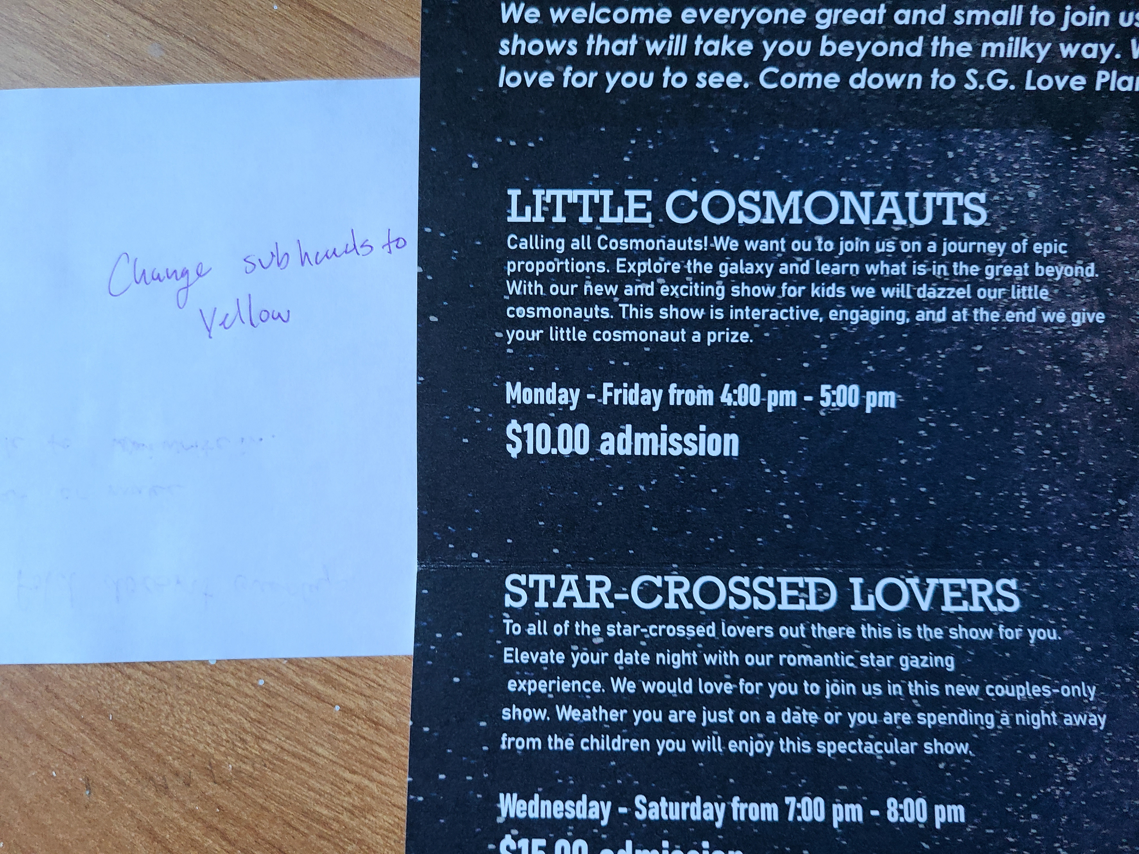
Thumbnails
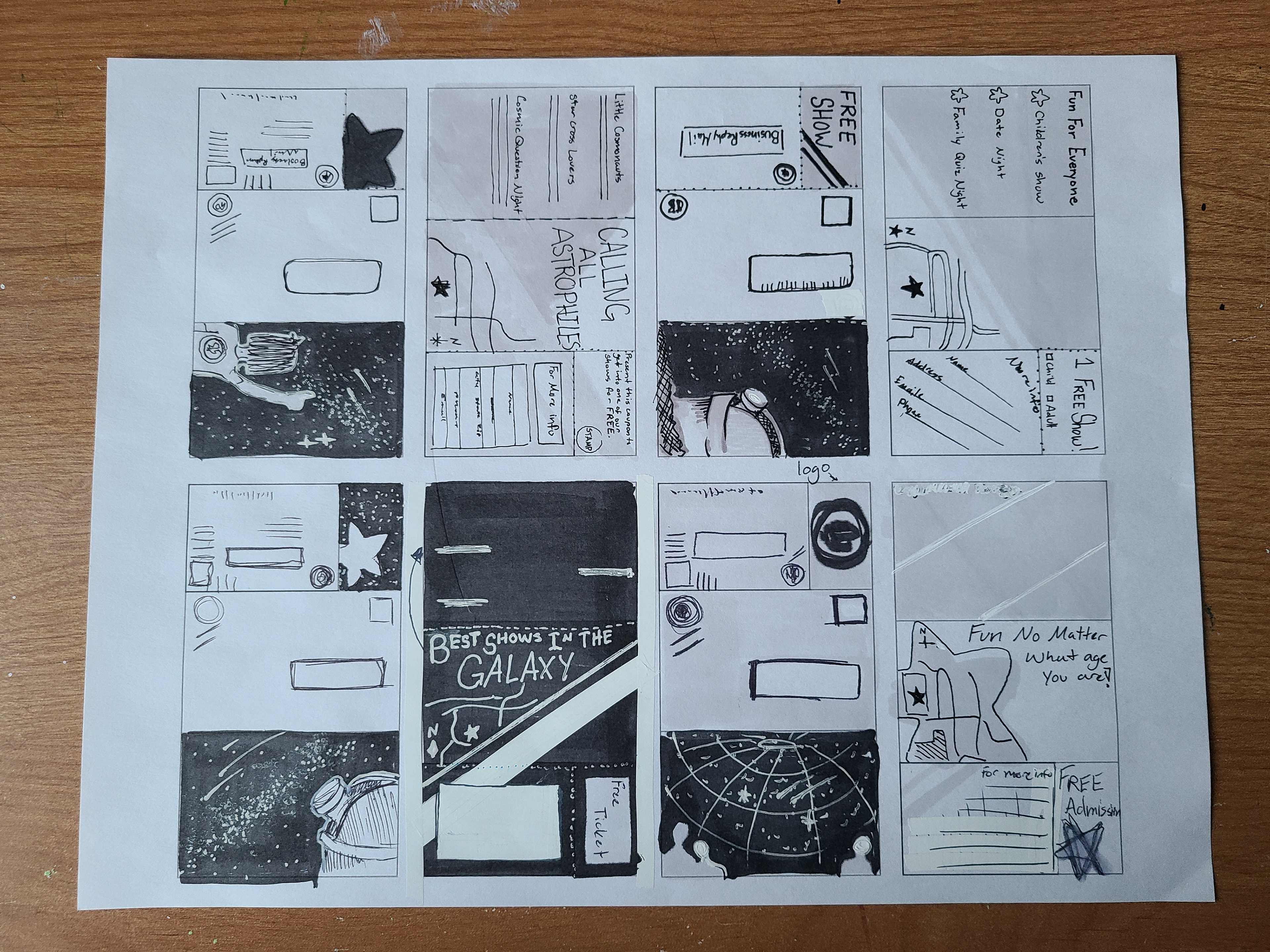
I was really excited to layout all of the ideas that I had for these. I went straight to my thumbnails. I think I was really ambitious at first and that was my downfall in the end. I wanted to add certain elements but they got cut in the end because I didn't give myself enough time to figure out a way to do it.
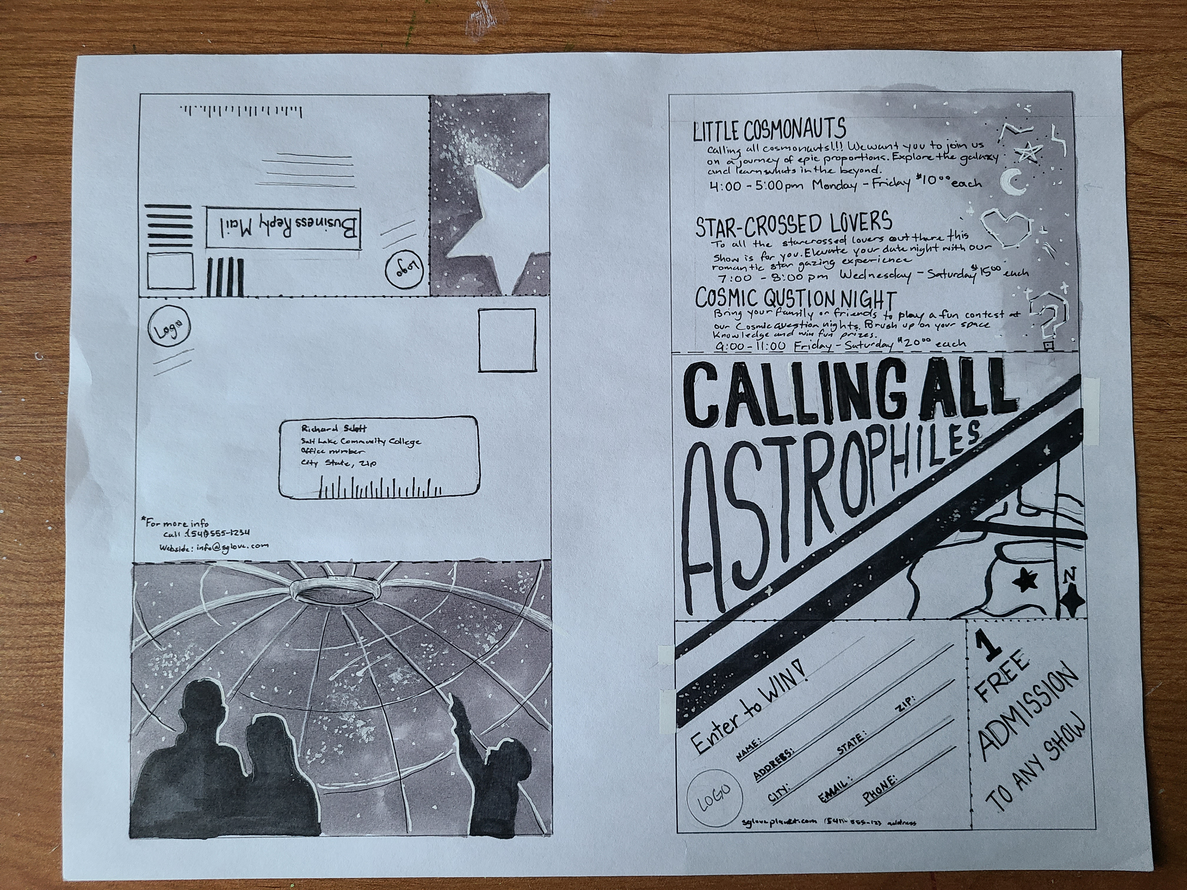
Intermediate
I decided to do with a vertical design instead of a horizontal design. It felt like a better layout and I had a good portion figured out.
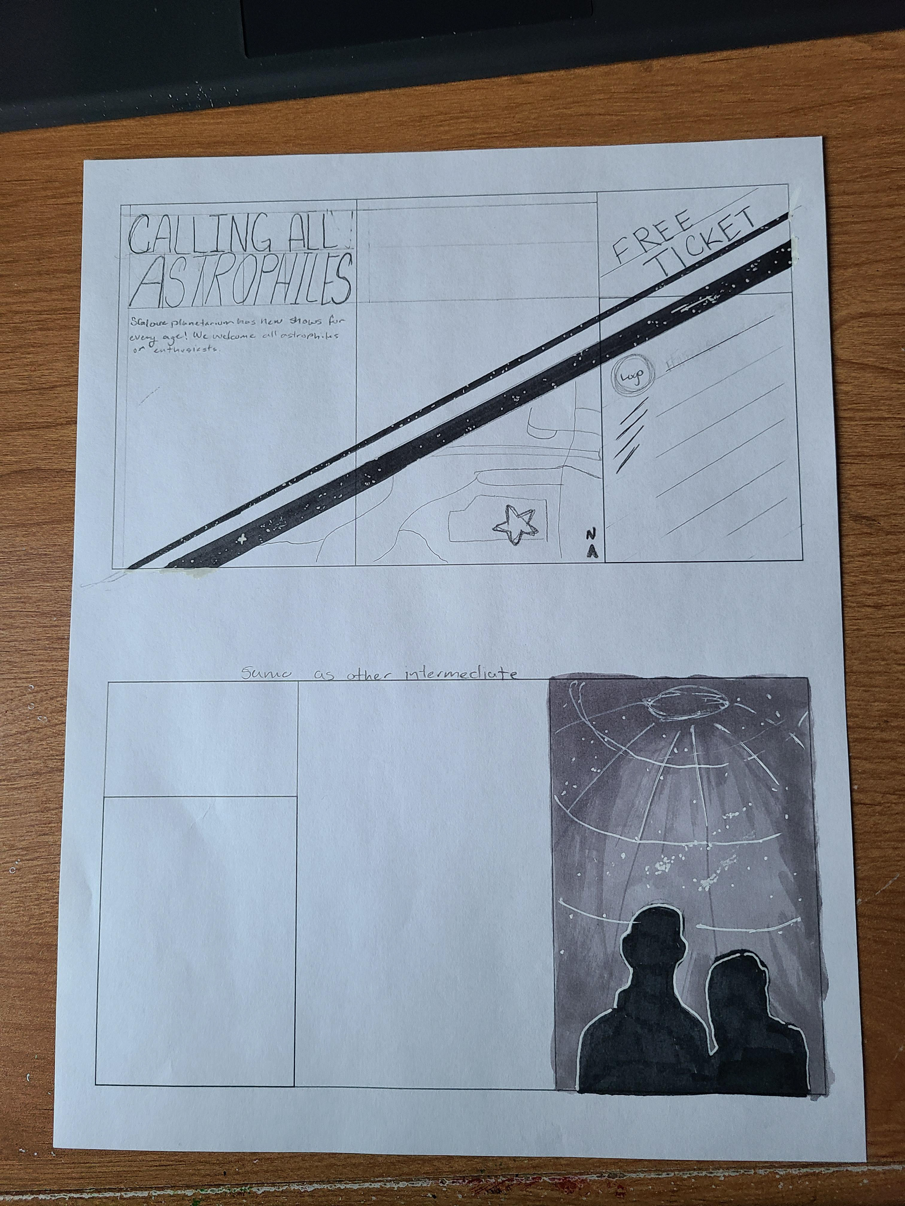
First computer progression
This was a rough start to the project. I was also rushing a lot of the process so the layout wasn't completely solidified. I changed so much from this to the next one because I didn't like a lot of what I had.
Second Computer Progression
This was the first version and it was far from perfect. I had a lot of elements that didn't work together. I had to lighten up the photos and make more contrast in my planetarium photo. You couldn't see a lot of the detail that I drew in. I agree with Kerry when she said that it still felt too red, white and blue. So on the next progression I added more color. Maybe too much that I made some more mistakes but in the end it works out.
Third Progression
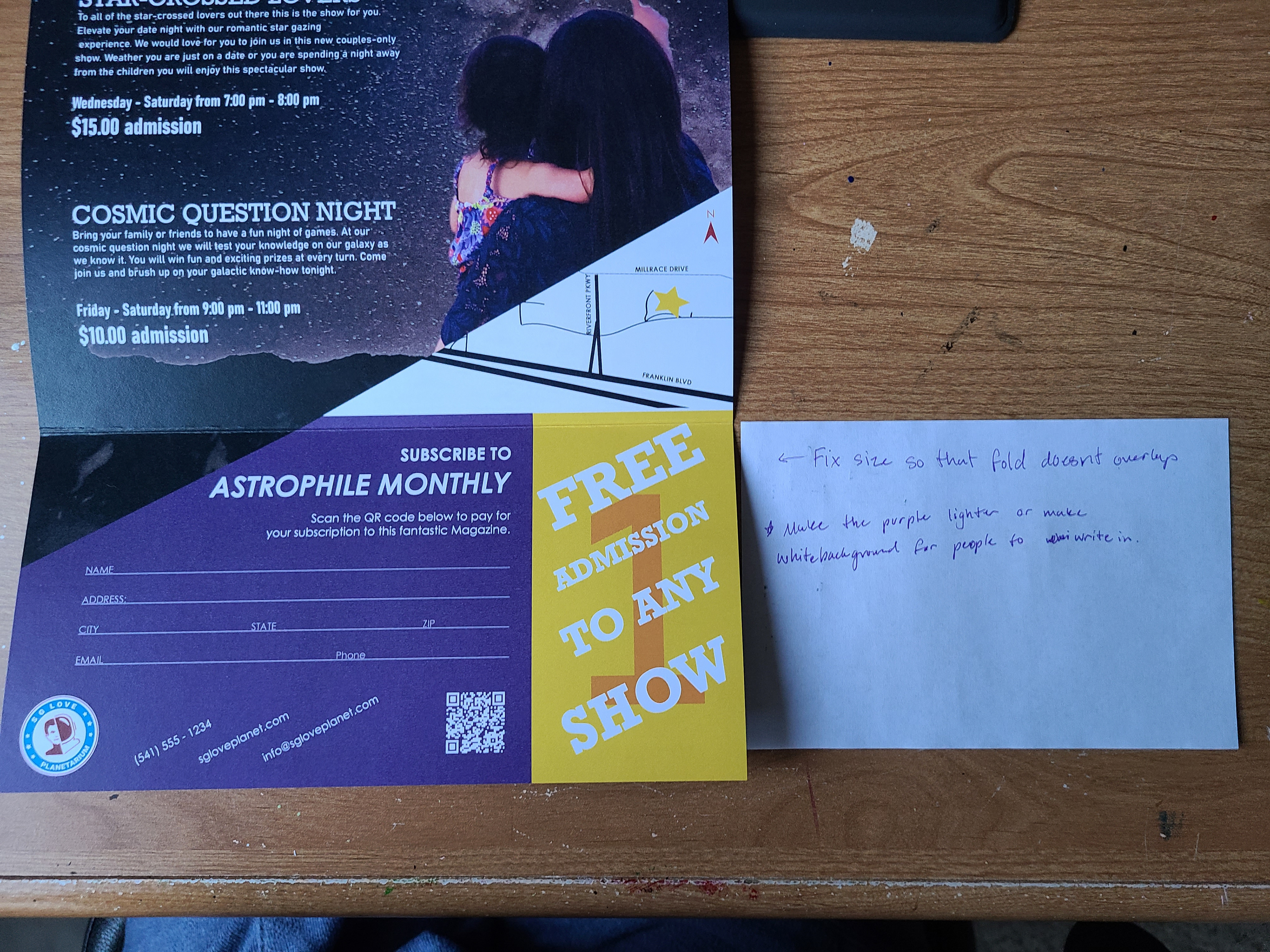
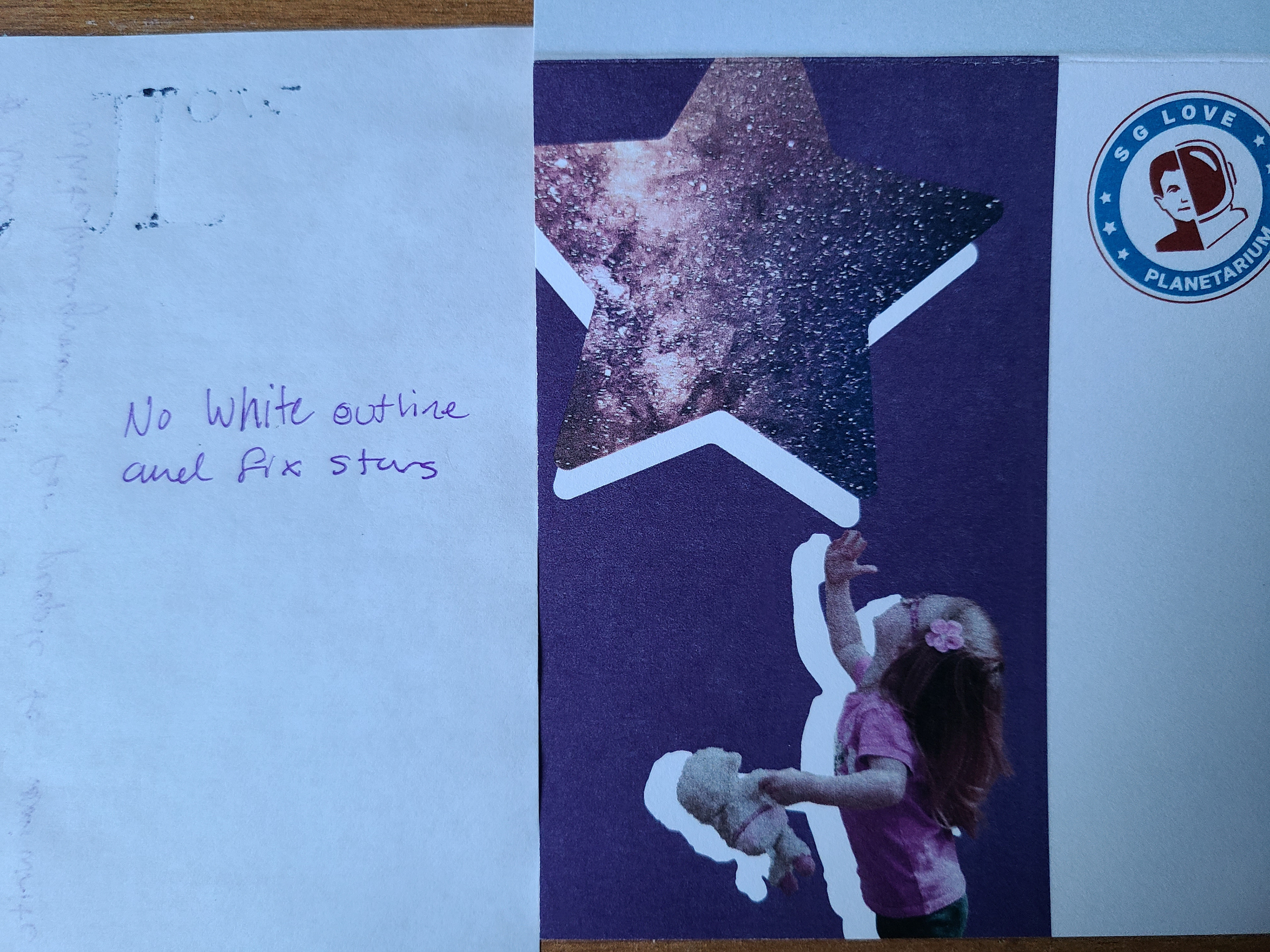
On the second go at this brochure I definitely fixed a lot and was able to introduce a purple and a yellow into the color scheme. I was really happy with these additional colors but the purple had some complications. The purple was too dark and the girl on the coupon was not working well with it as well. There were also complications with the offset white behind her that made it look weird.
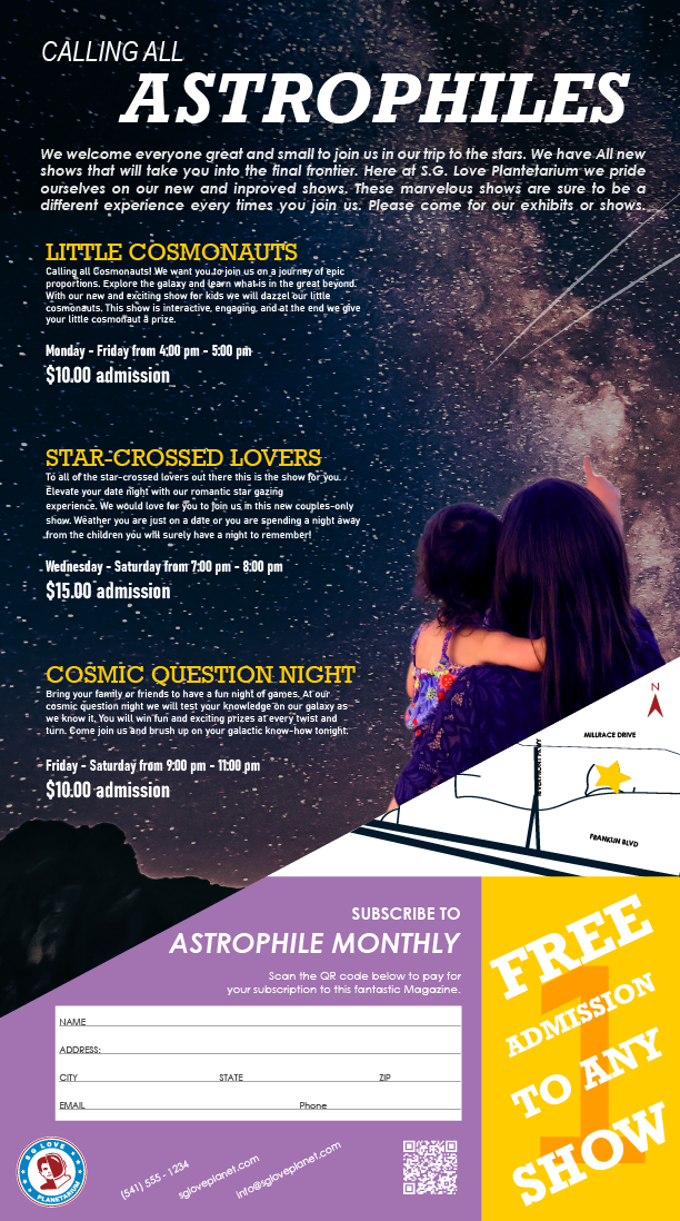
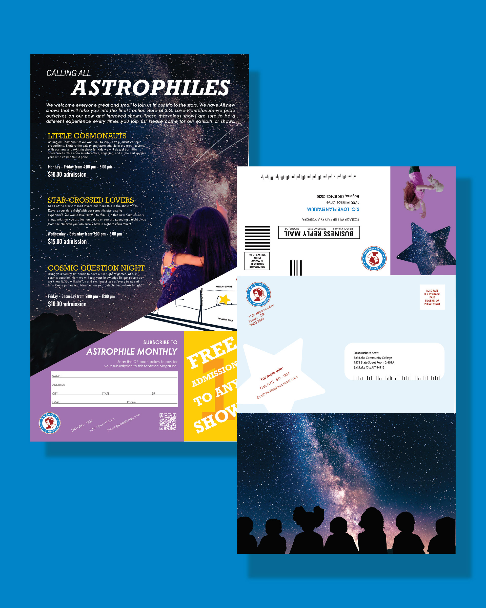
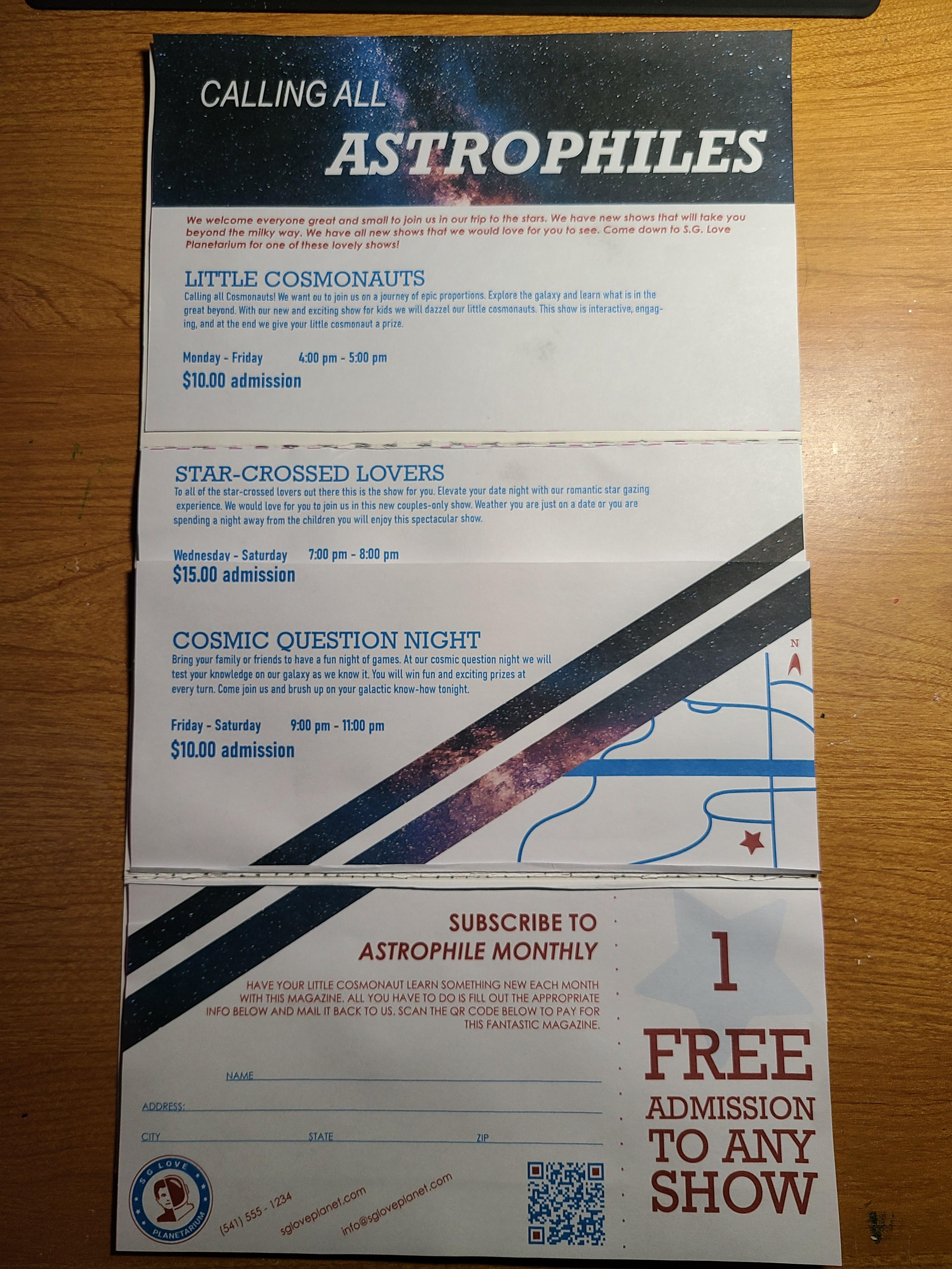
FINAL
After all of the critiques this is the finished product. Getting down to the wire and this is what we have in the end. I am actually happy with how it turned out. I know that there are many things that could be fixed but for the amount of time that I gave myself to work on this project I am happy with the outcome.