
OVERVIEW
Black and white logos are the best start to logo design. We were tasked with creating logos for 4 different companies but only sticking with one company by the end for a finished logo design that will later be used in other projects.
Research and Brainstorming
Research and brainstorming is critical for making a logo. You have to know your company to create a logo for them. Some of the key elements to need to know are Location, Target audience, and what the company is trying to covey with their logo.
I made sure to focus on the meanings of the words and I also researched more traditional aspects with the second design. The third design was a different approach in the beginning since I wanted to focus more on the actual person rather than a regular space themed logo. The last logo was one of the hardest for me to come up with ideas. I wanted to add the right elements but everything seemed so blah that none of them felt right.
Sketches and Doodles
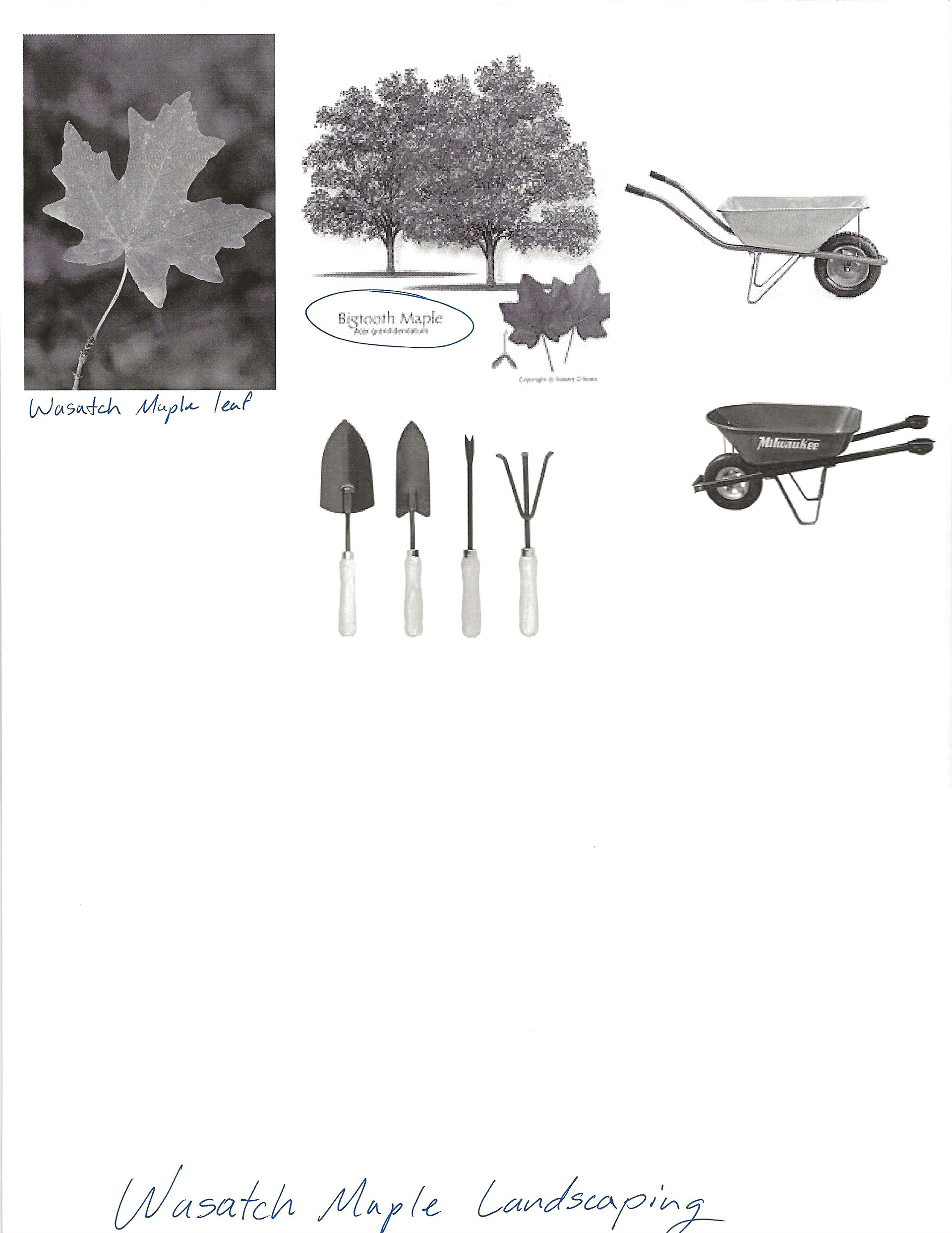
Sketches and doodles help get ideas and concepts onto paper. Doing these sketches helped with getting initial shapes and positions down.
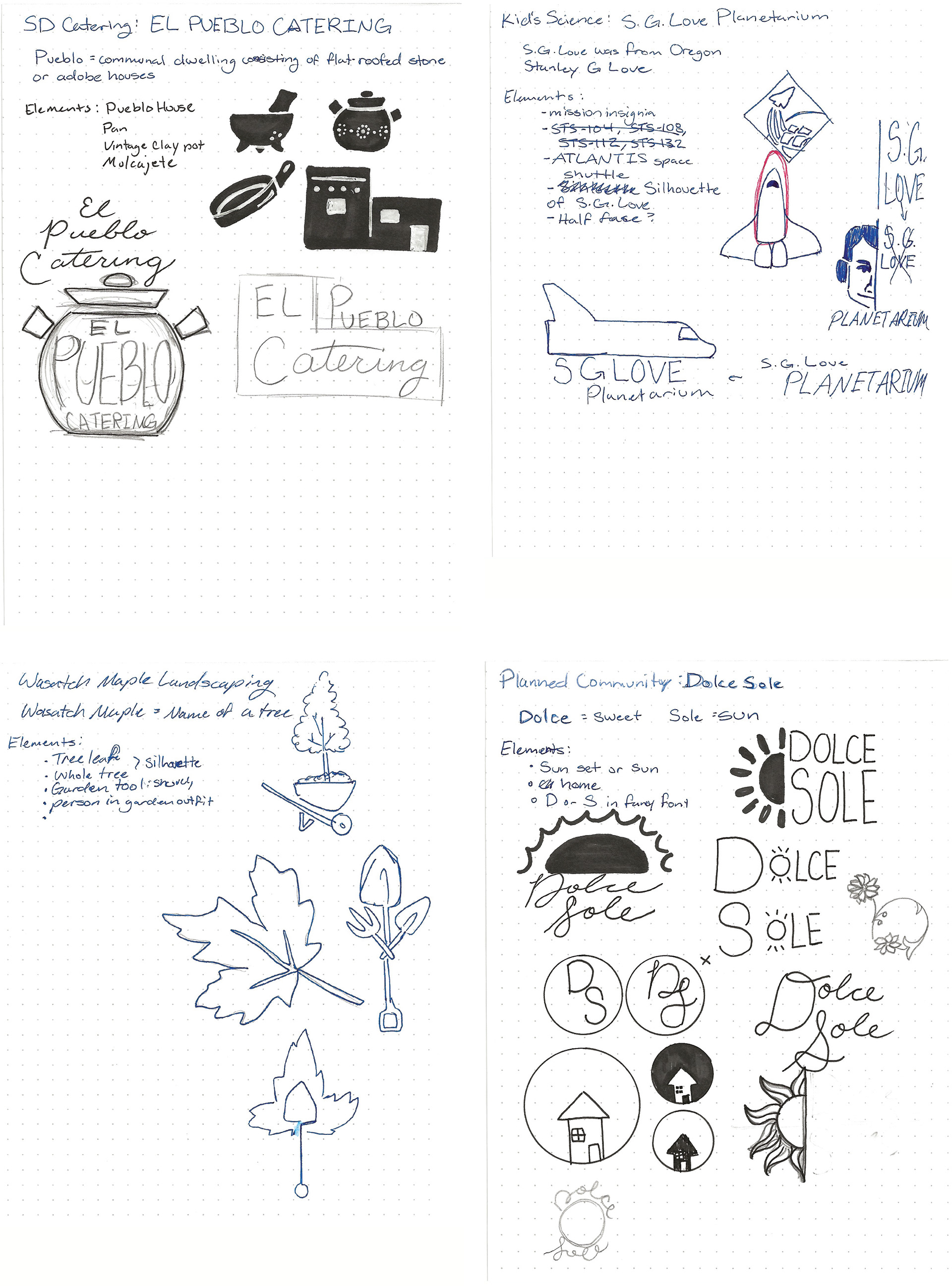
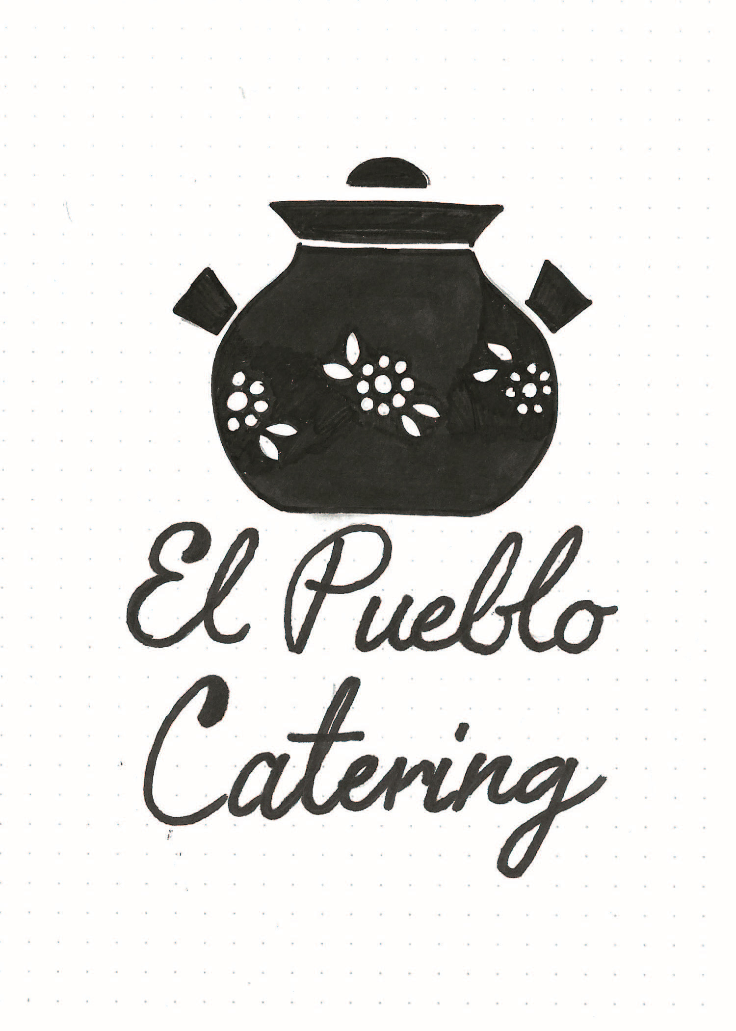
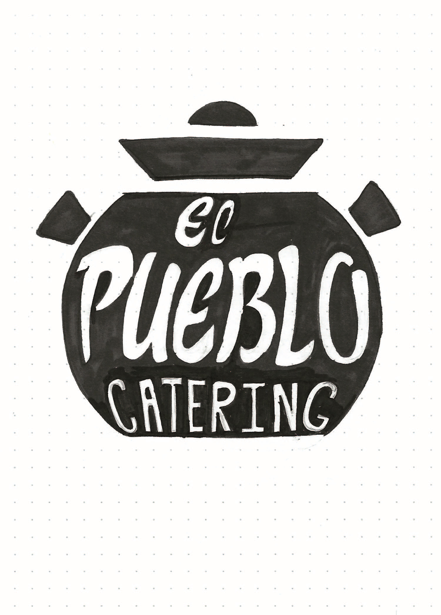

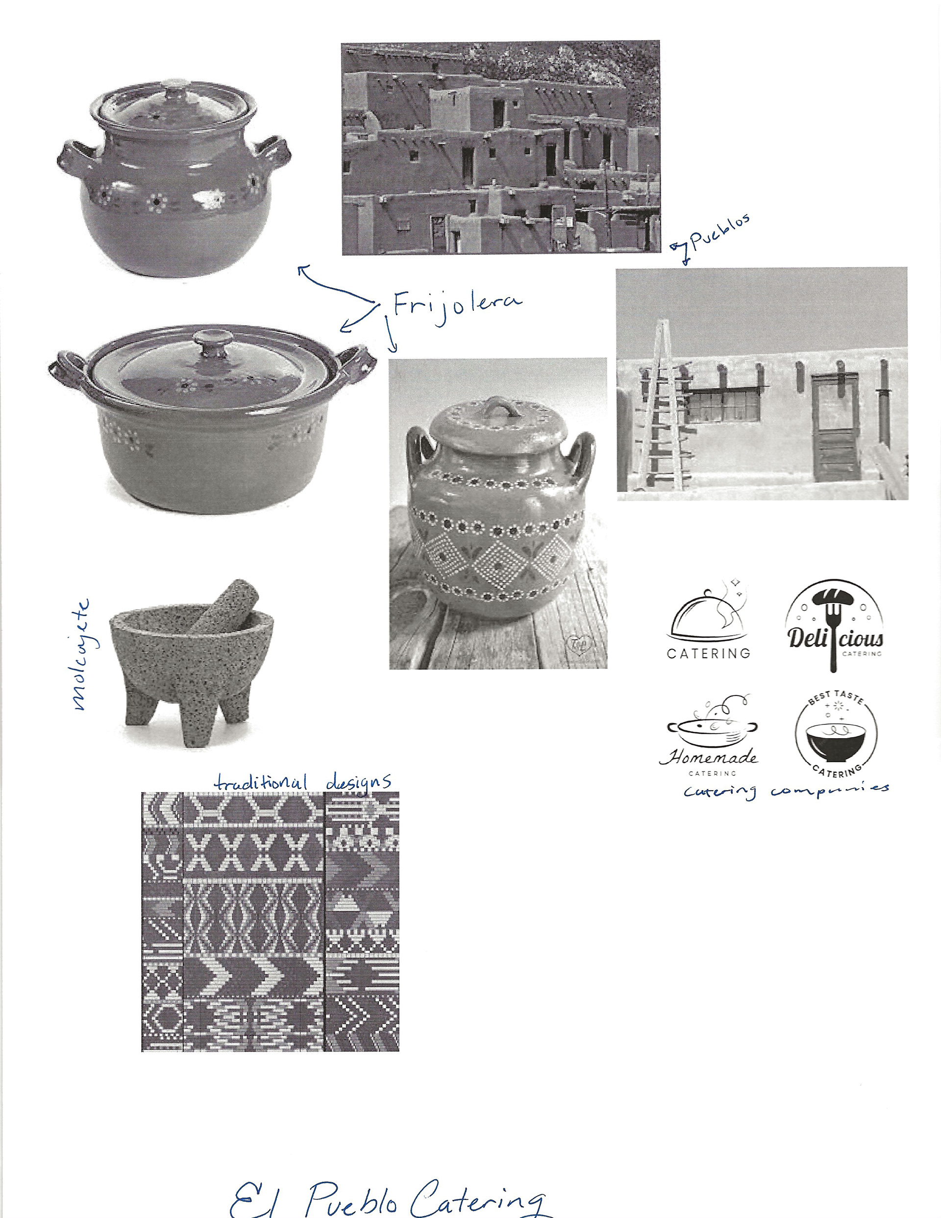
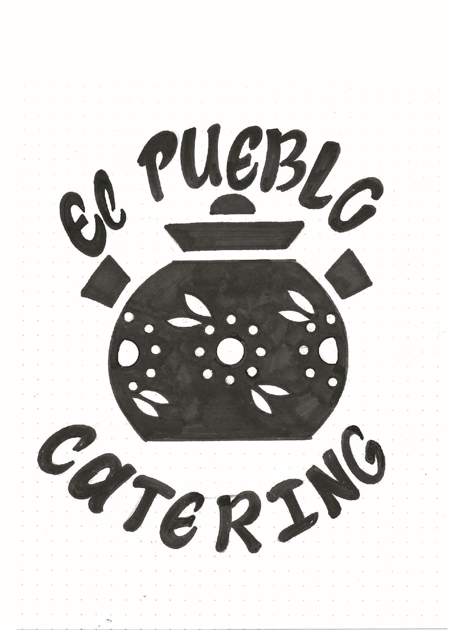
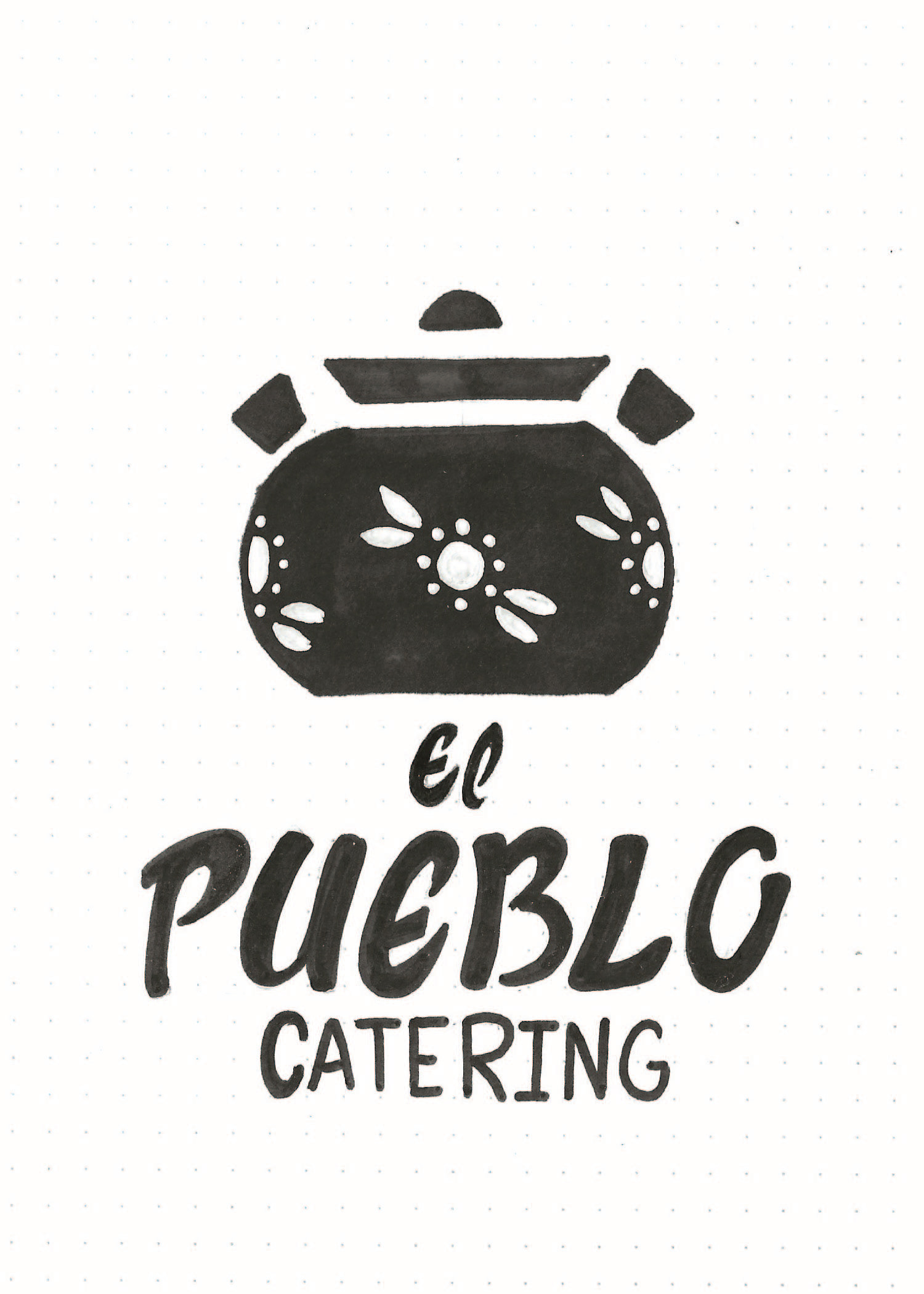
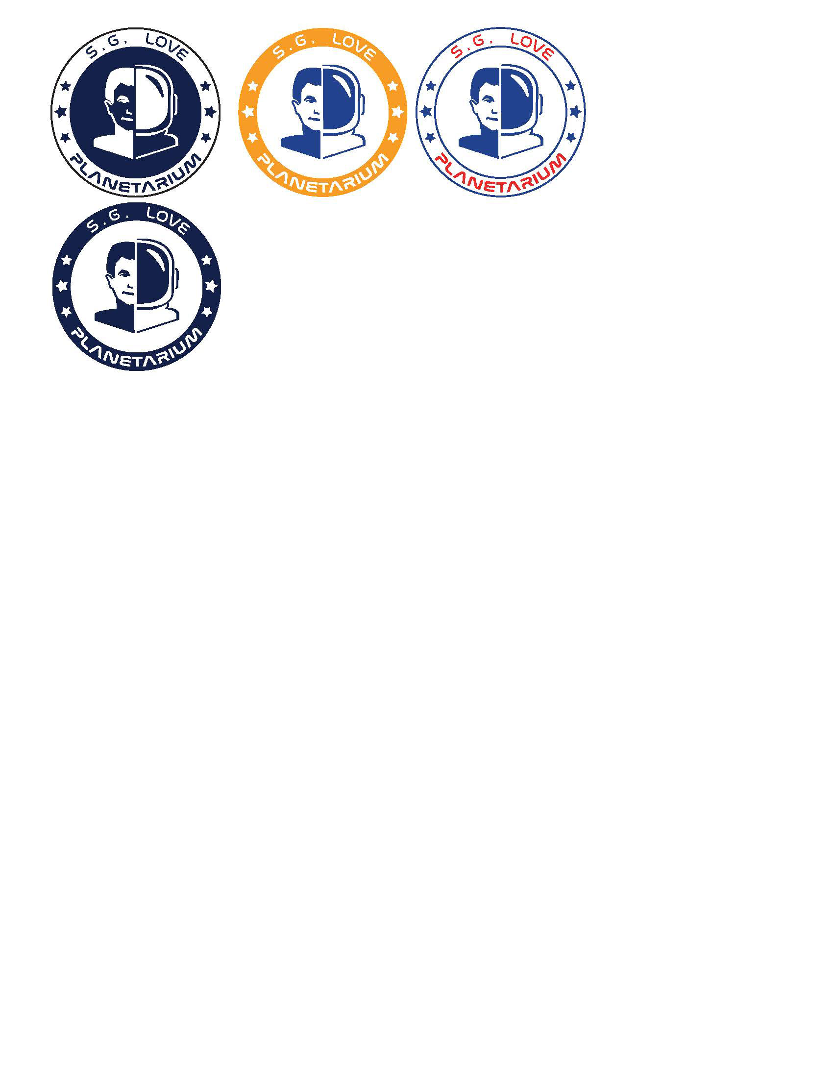
Tight Thumbnails
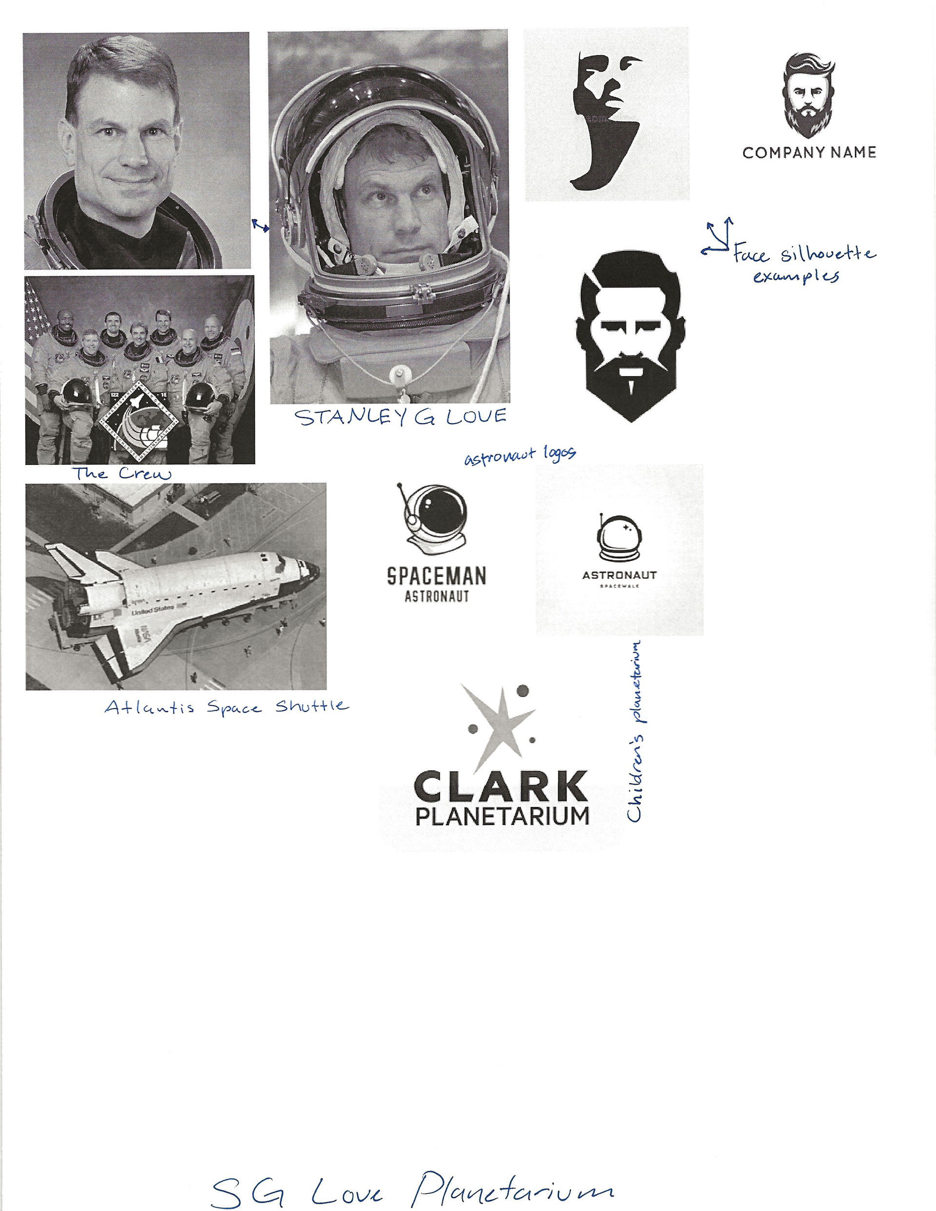
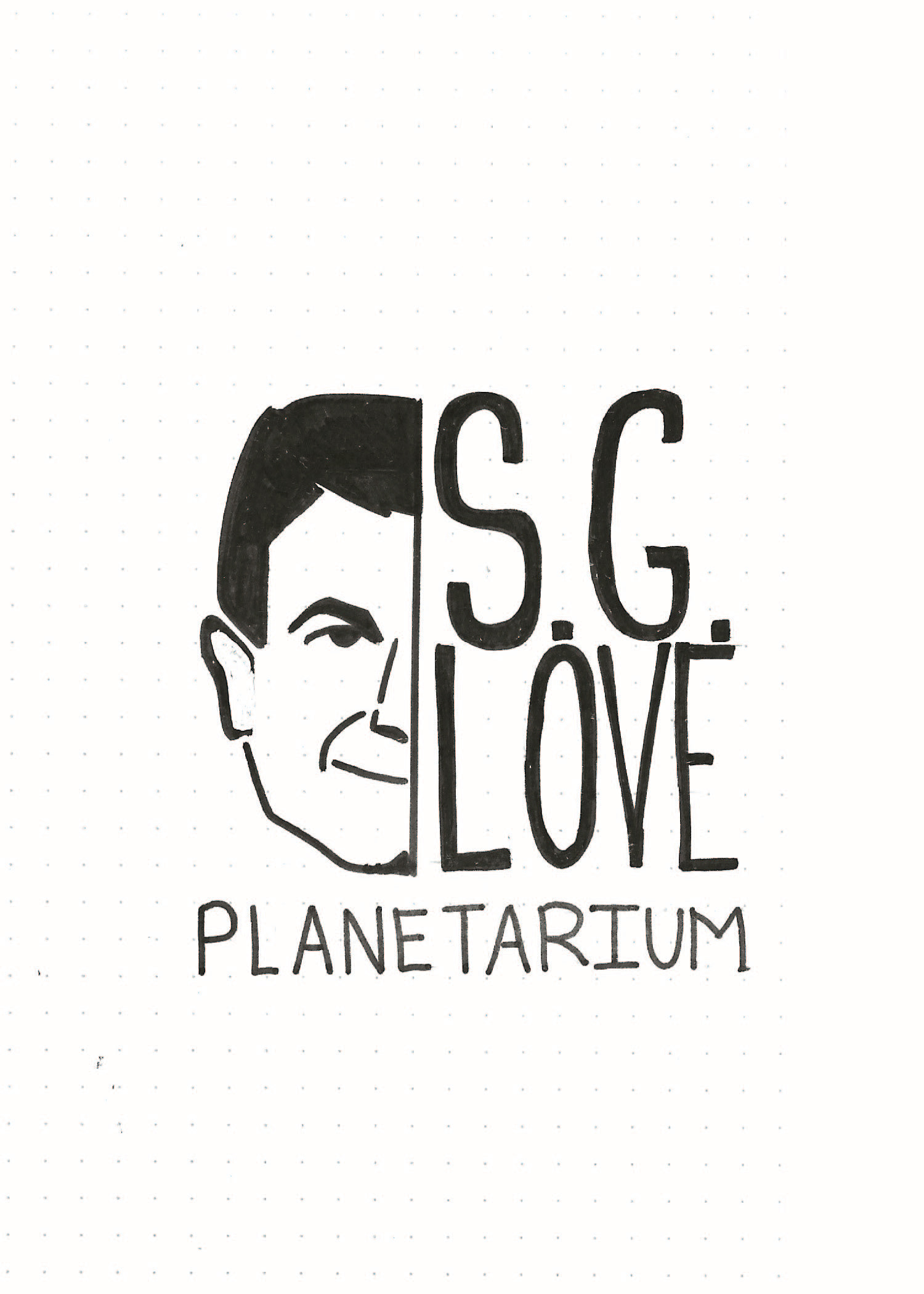
During this part of the assignment we had to come up with 2 logos for each company assigned. I really liked the El Pueblo Catering company and the S.G.Love planetarium company. They were the ones I did the most research on as well.
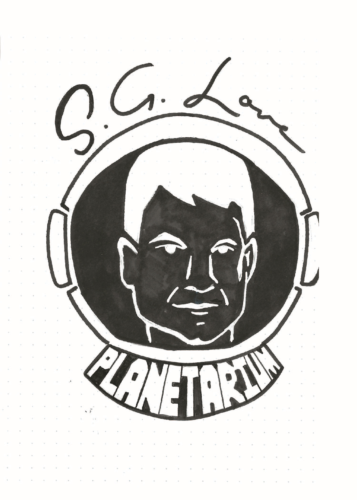
Tight Intermediate Hand Compositions
I went with these two companies for my tight intermedia hand compositions. In the end I chose the S.G. Love planetarium. Some of the things that we talked about in the critiques was making it less like a snow globe and simplifying the detail in the face.
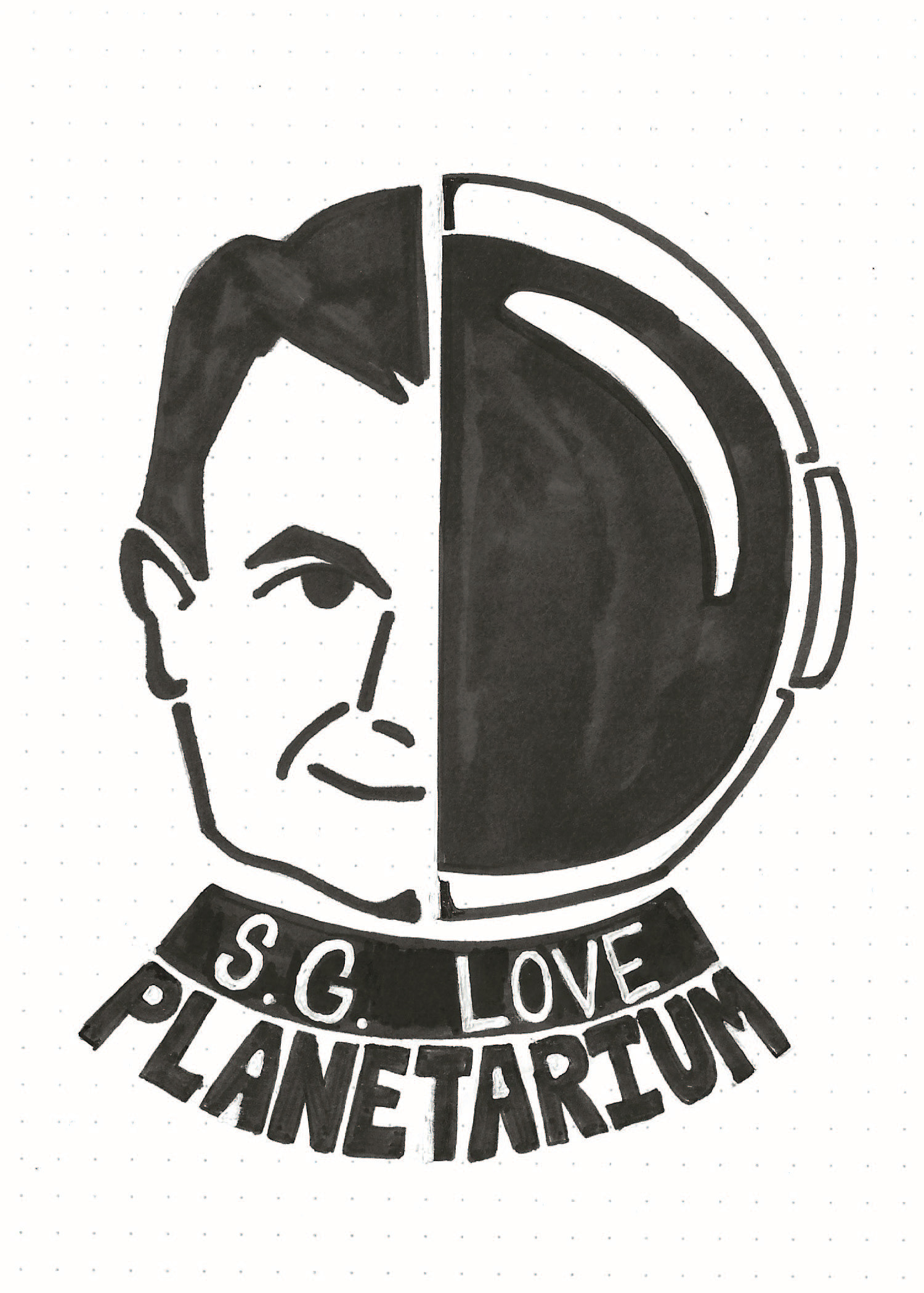
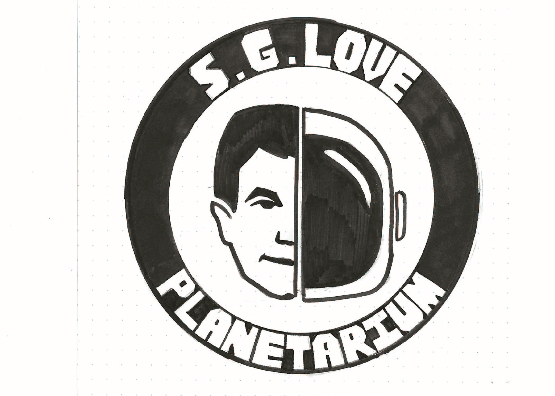
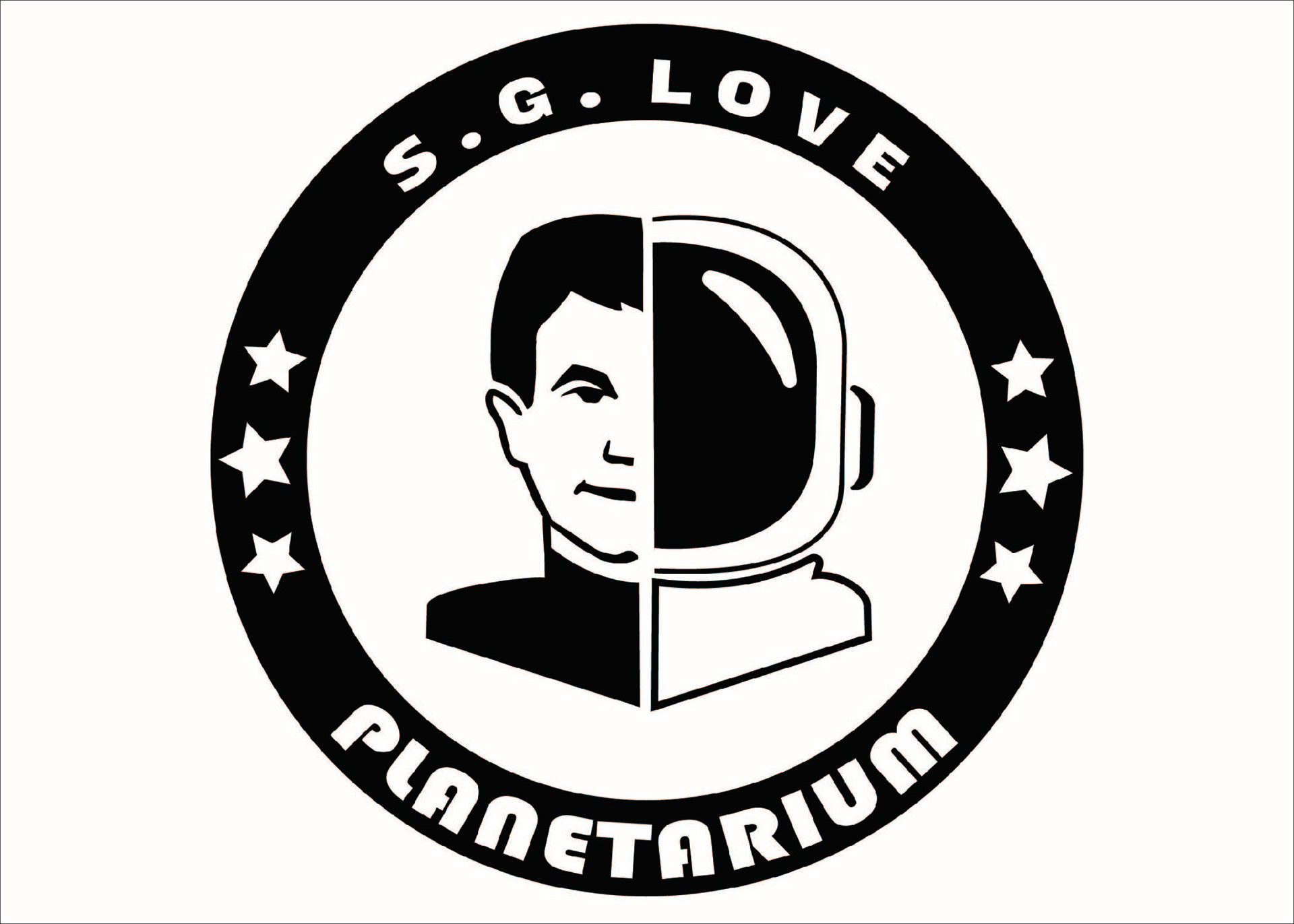
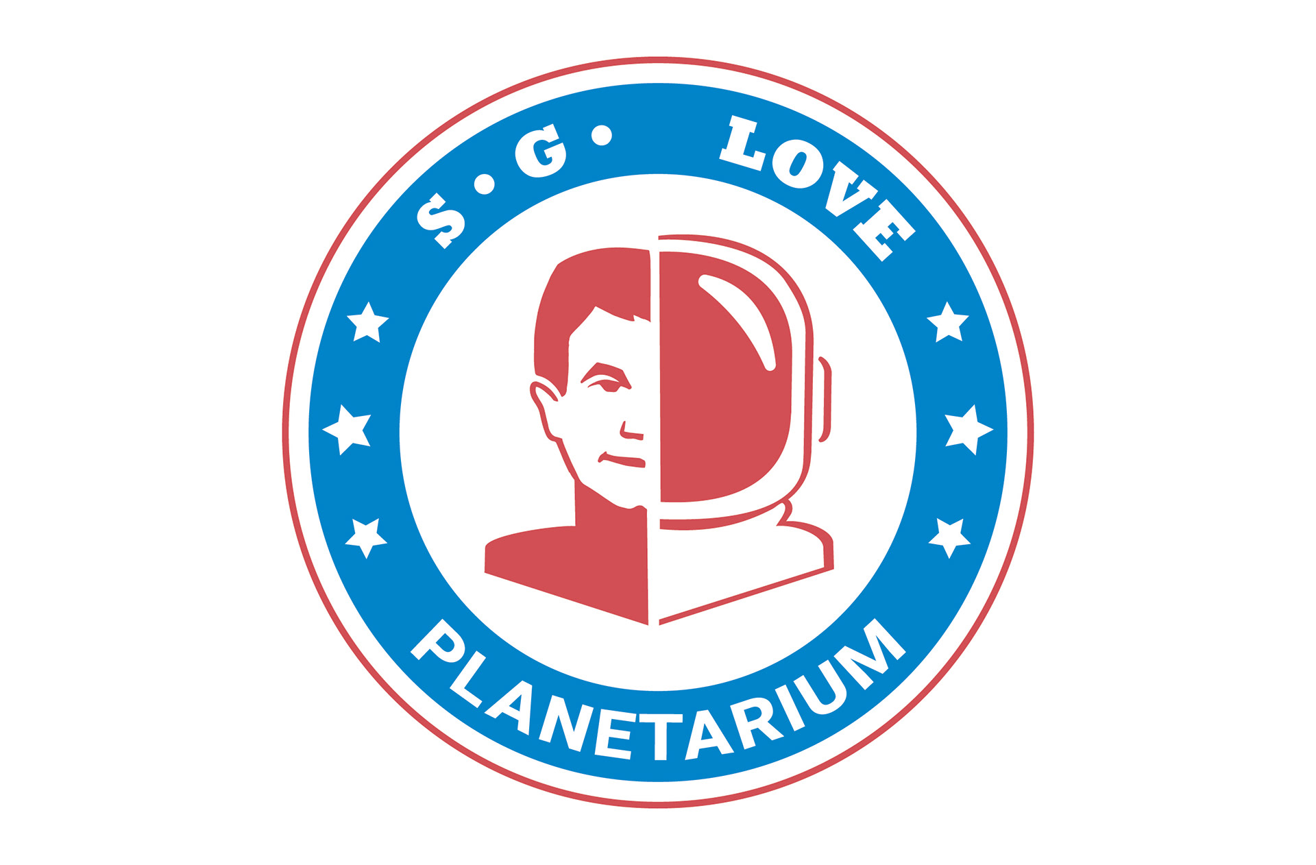
Tight Final Hand Compositions
This was the logo that I wanted to move forward with after all of the corrections. I wanted to have a patch feel to it and make it more condensed into a circle so that it will also be easy to adapt to most situations in the future. I really liked the Face and Helmet look. This type of logo reminded me of the iron on embroidered patches that they put on uniforms.
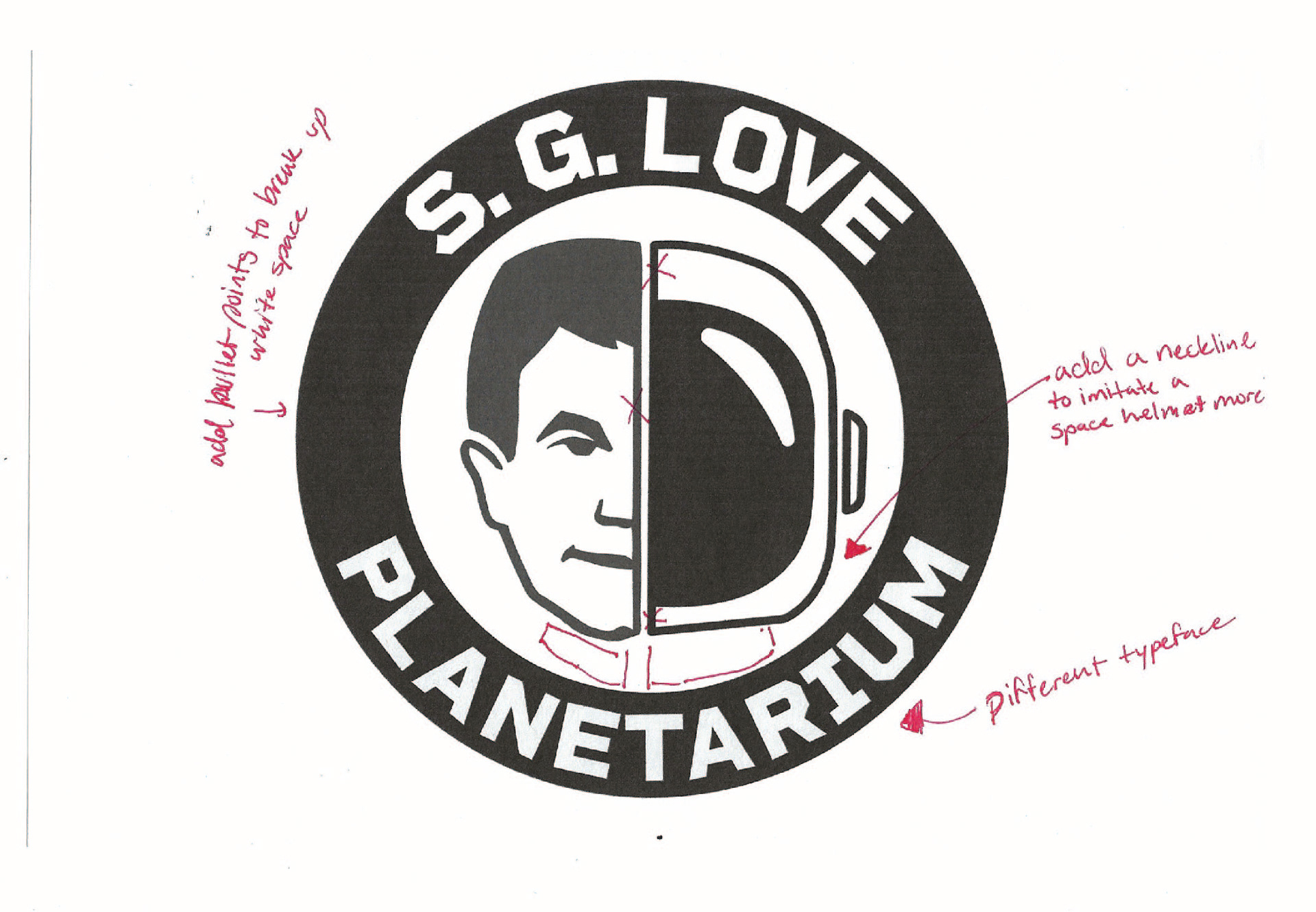
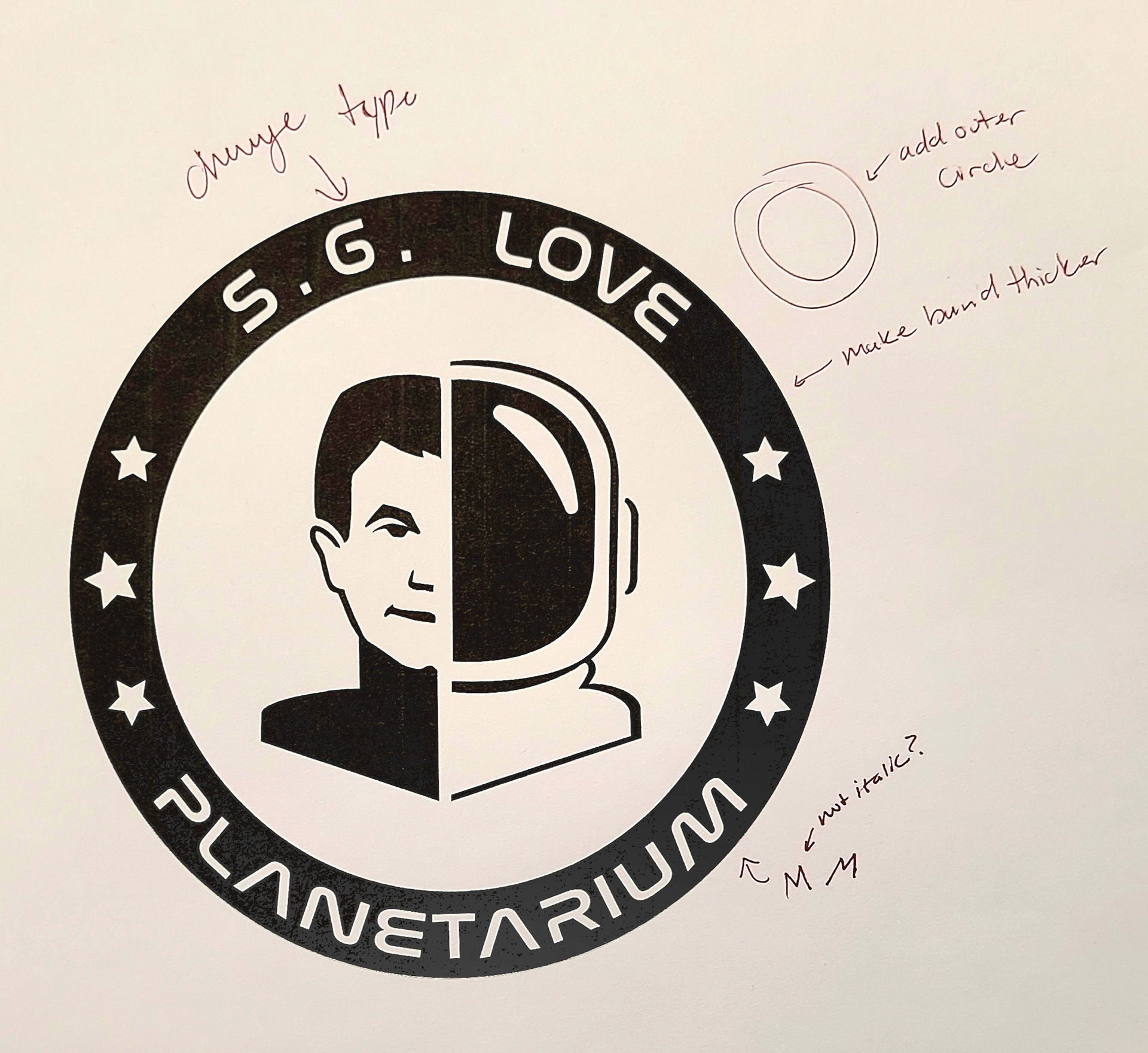
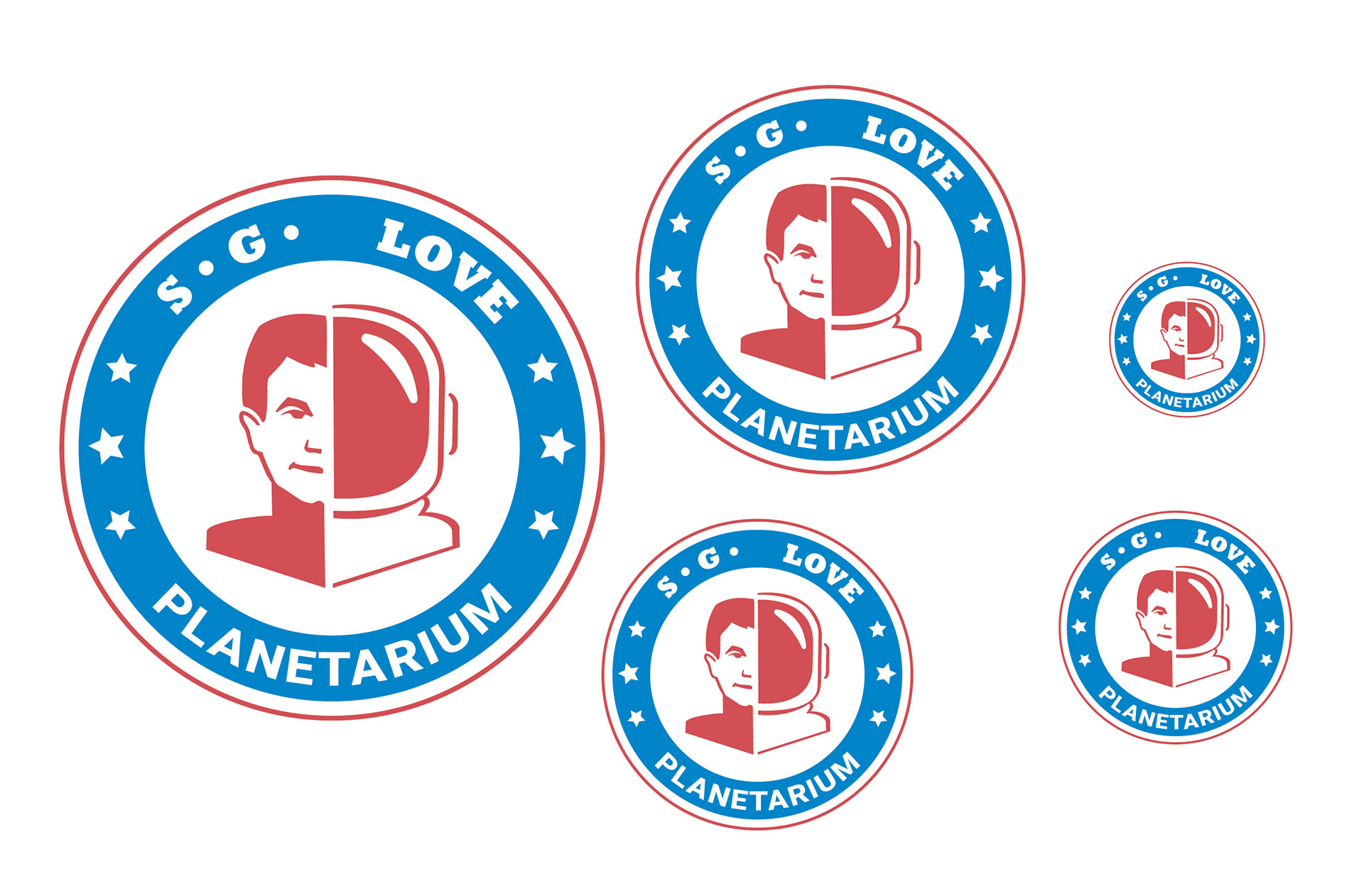
Dummies
After the critique we came to the conclusion to make these changes. I needed to add a collar and that would make the head look less like they were floating and bring more balance to the inside of the logo. I also needed to change the font and the spacing in general. It felt off balance with all of the white space between the top and bottom works.
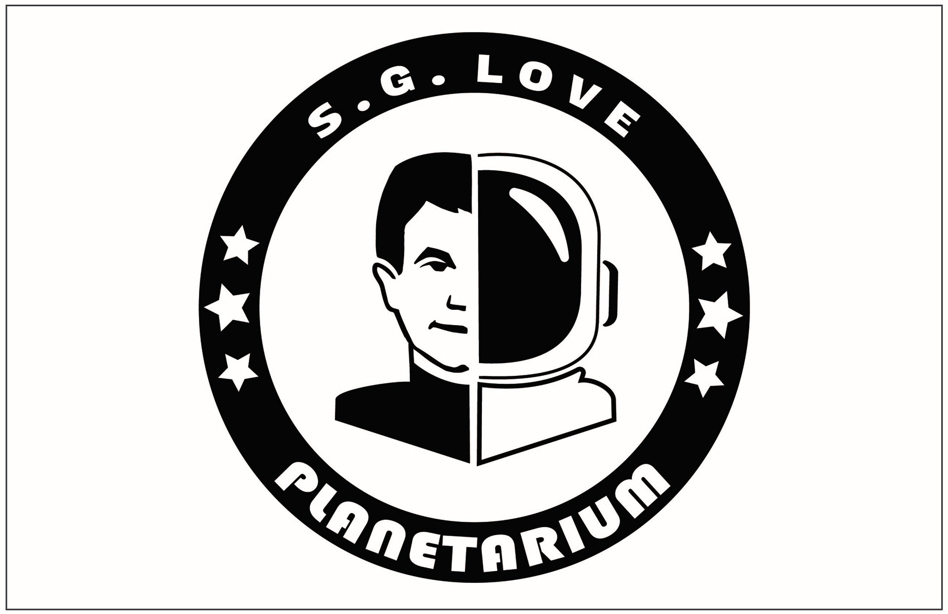
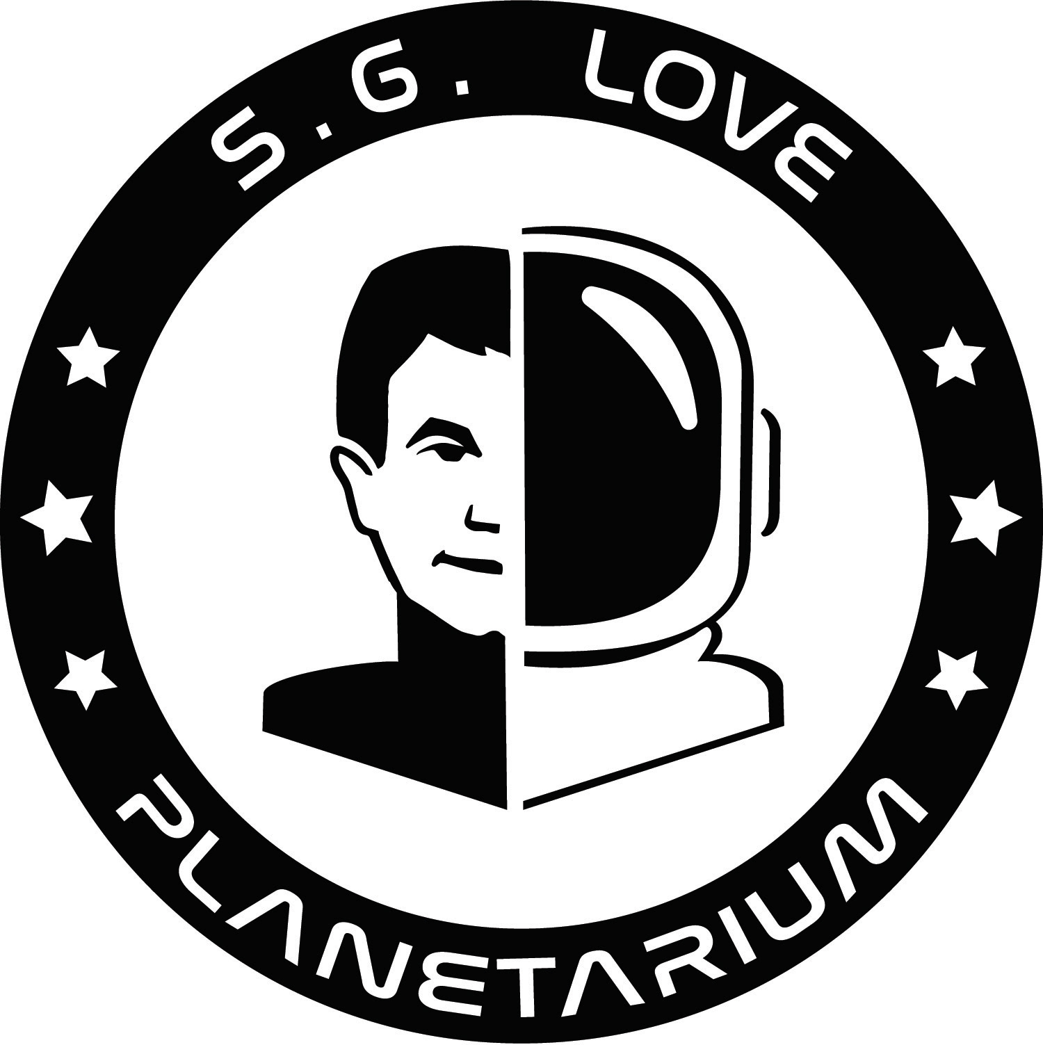
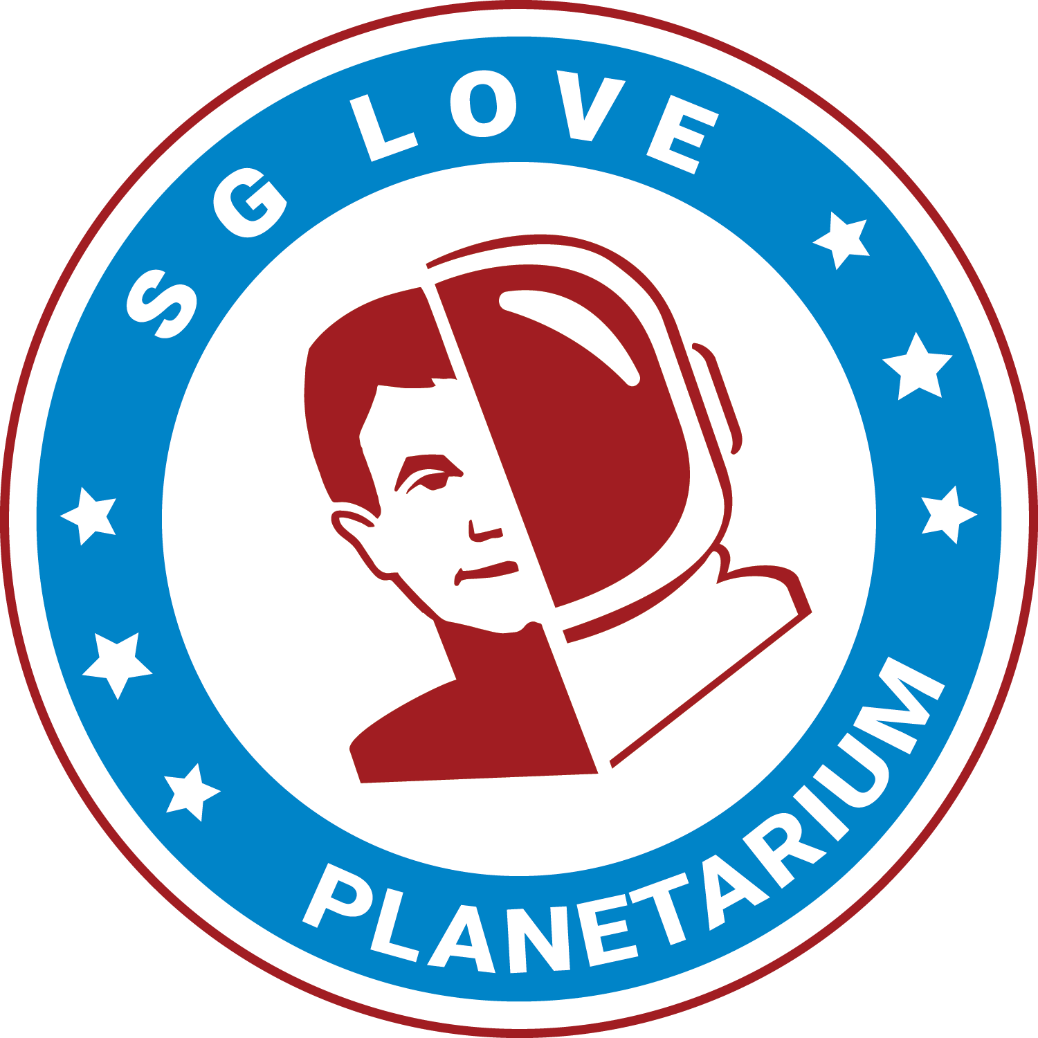
Final
This is the final logo that I ended with. I am quite happy with how the helmet and face cam out as. This feels a lot more balanced and there is a better contrast in the name and the logo.
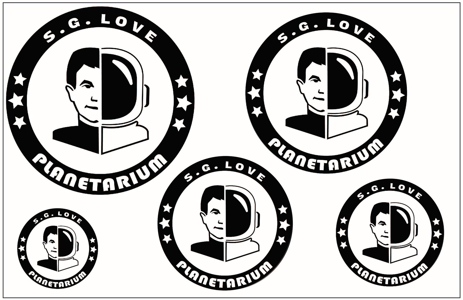
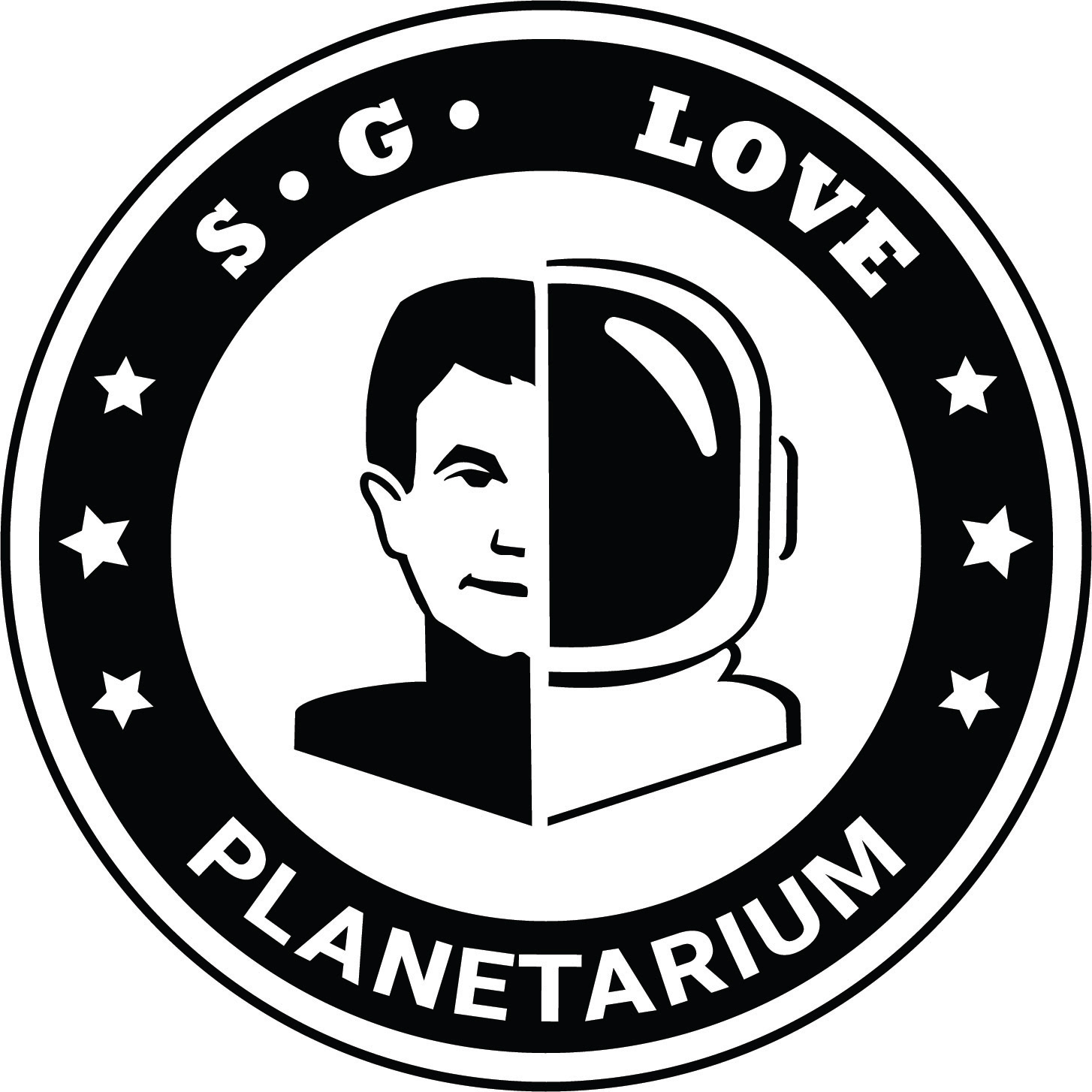
Post Final Critique Revisions
There were some revisions that we made after the initial critique. I changed the type face a few times to something that was easier to read and something that will make the S.G. Love pop more. The spacing needed some work as well so I worked with the kerning and alignment.
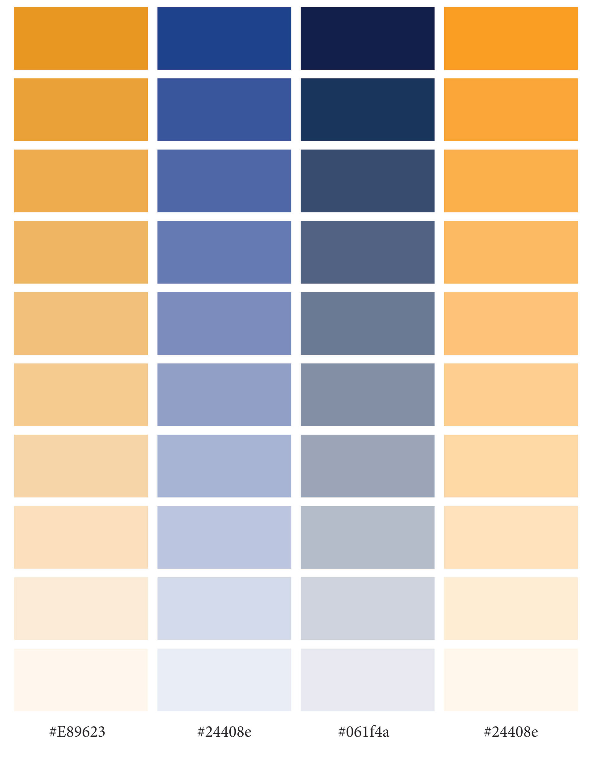
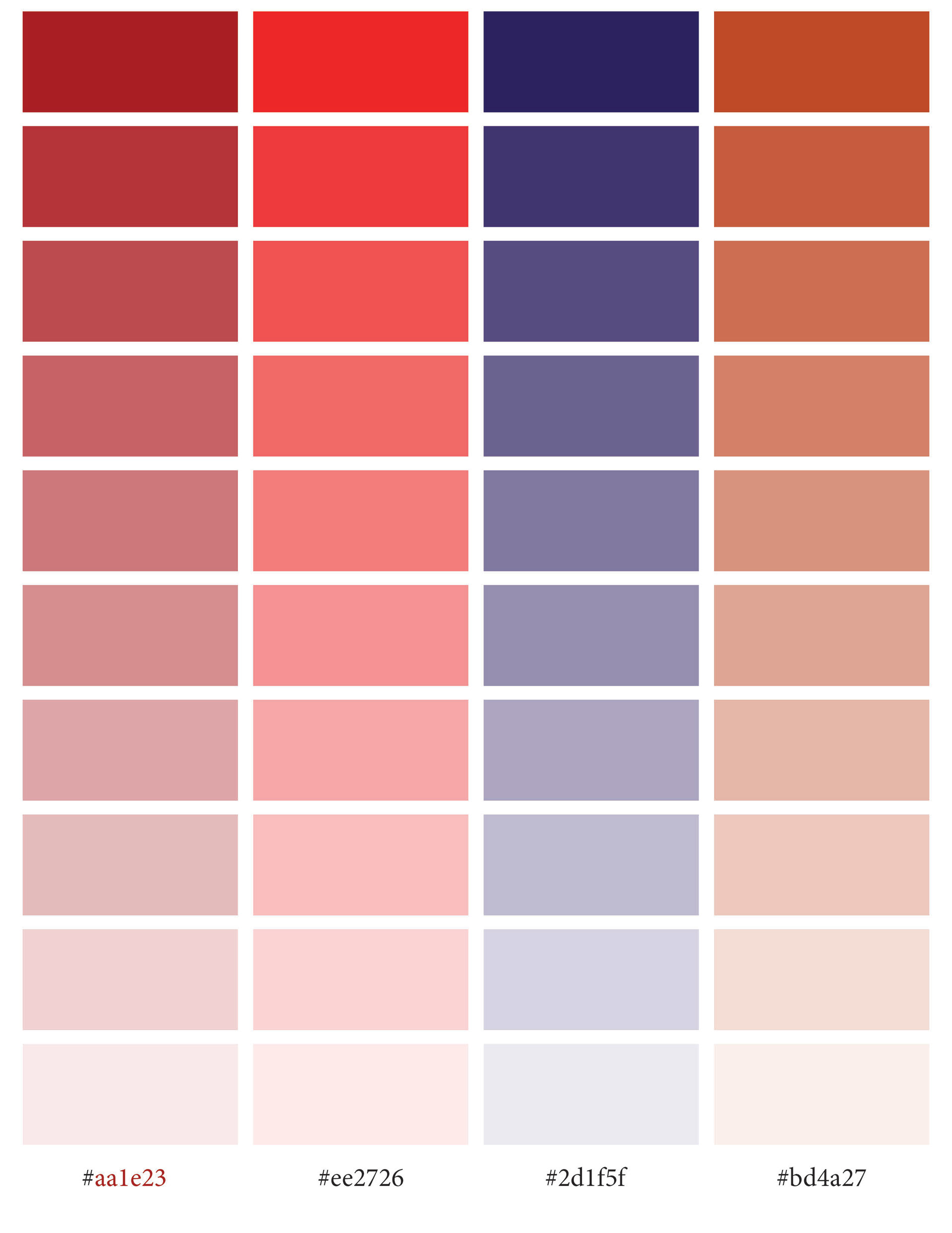
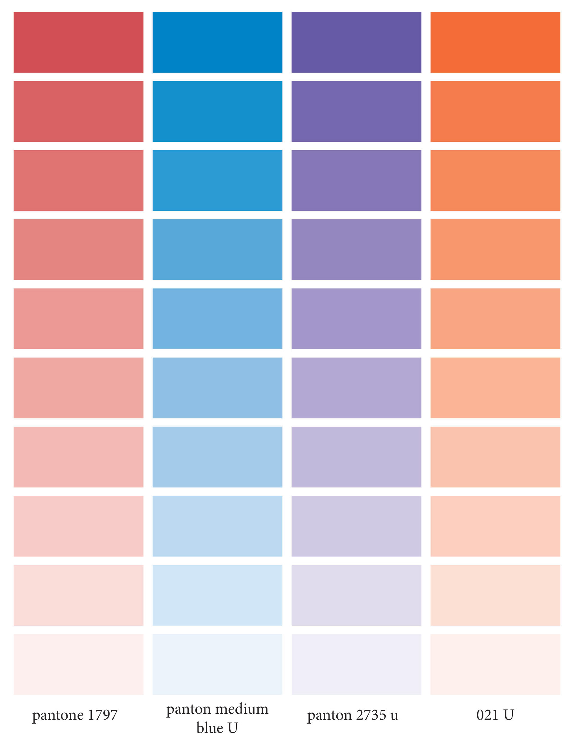
Color Studies
At first I wanted to do with a more muted color like navy or a mustard color to emulate the space suits. Then I thought more about the target audience and that is children. Children like bright colors and the colors will be eye catching. So I went with more bright colors in the end with the medium blue and 1797.
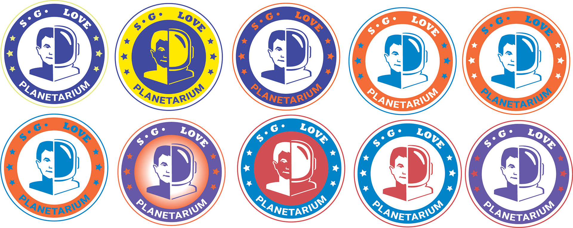
Final 2 Color Logo
I really like the direction I took with the logo. The colors are bright and there is enough contrast with the colors that there isn't a lot of clashing. I can already see designs with all of these colors and making the stationary with these colors. I really like the combo since I can have a lot of freedom with both colors with how much they contrast each other.
After Critique Revision
This is the 2 color design that I when with! I really like how it turned out and it feels more fun but the color is richer as well. I really like the darker read in comparison with the lighter red before. During the critique we talked about tilting the logo so that it has a more playful feel and changing the top typeface and spacing it out instead of the having the dots that I had before.