OVERVIEW
The Form assignment is centered around creating a design for a cake order form. Most forms that you find are very utilitarian and boring. It all gets the job done but they are poorly designed in general. With this assignment we were tasked with making an interesting and functional cake order form for a make up company called "Patty Cakes."
RESEARCH AND BRAINSTORMING
When you research forms there isn't much to go off of since all of them are boring and plain. I tried to find the most interesting ones to me. I really liked the idea of having the personal information on the left side of the page and you will see that I stuck to it when it comes to my first and final draft in this assignment.
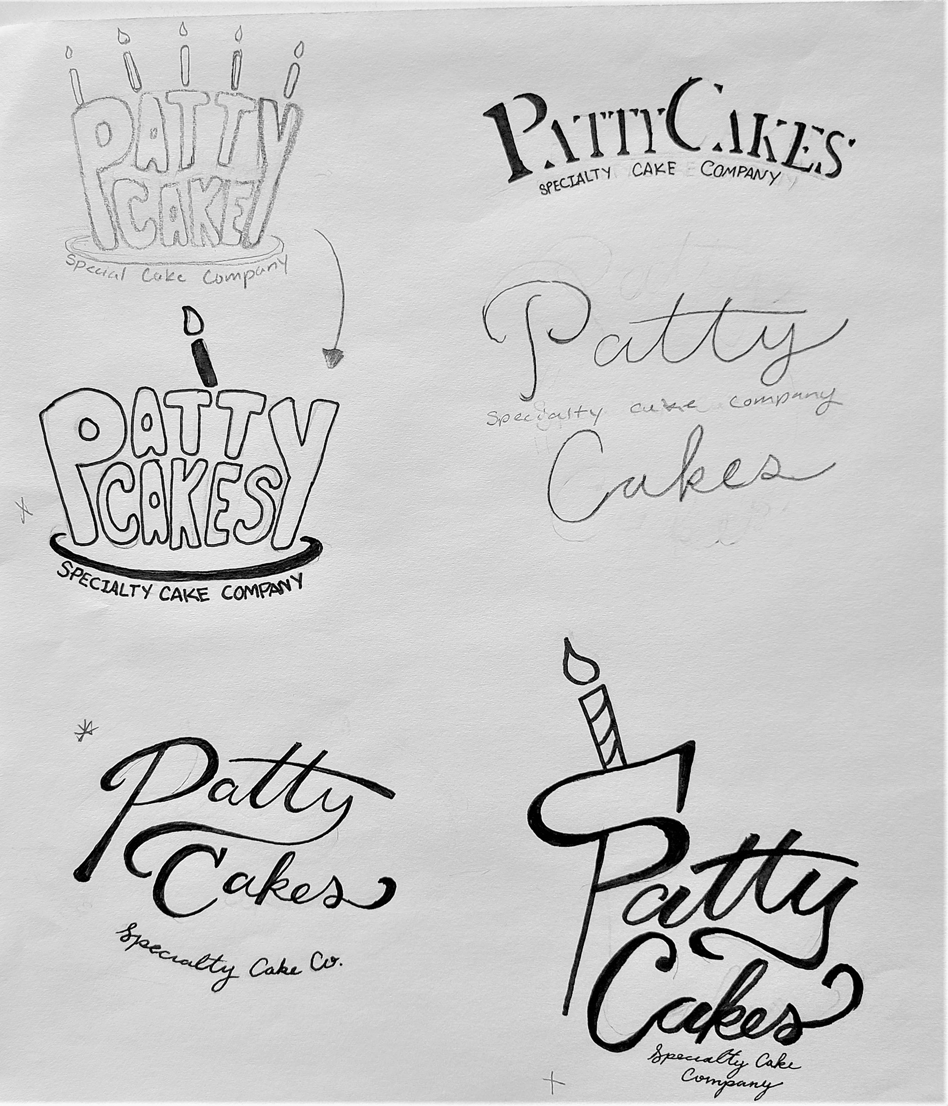
When came to the logo I really wanted to add a candle or some special elements but since we were only aloud to do a Logo type majority of my ideas were scrapped. I for my final I did a version of the bottom left logo to keep everything simple.
THUMBNAILS
I rushed the Thumbnails for this assignment. I really liked the idea of the top left but I ultimately went a different direction with it. You will see in my had final that I didn't fully understand all of the elements that I needed to have and I also wanted to be more creative with it but it got too confusing.
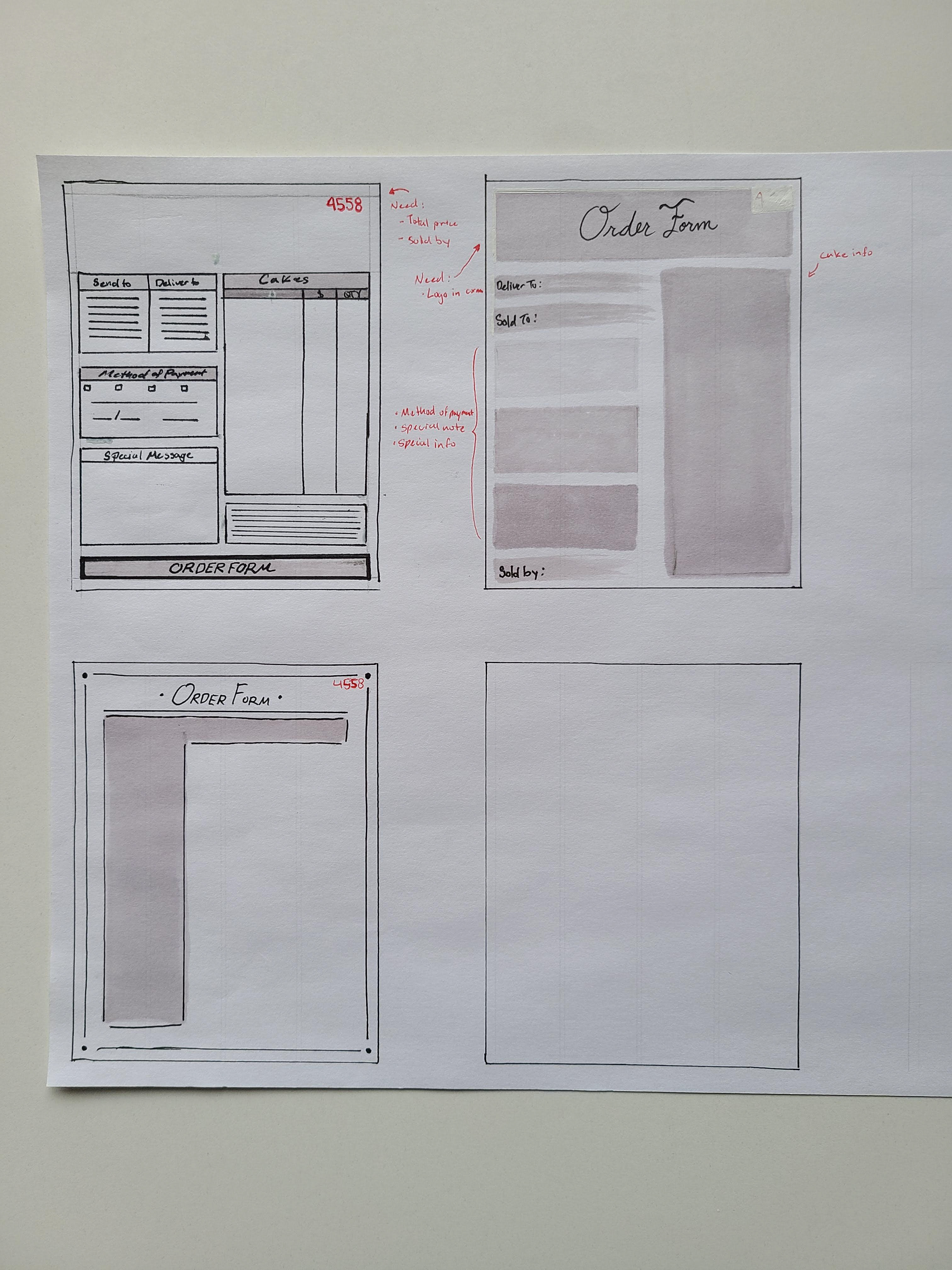
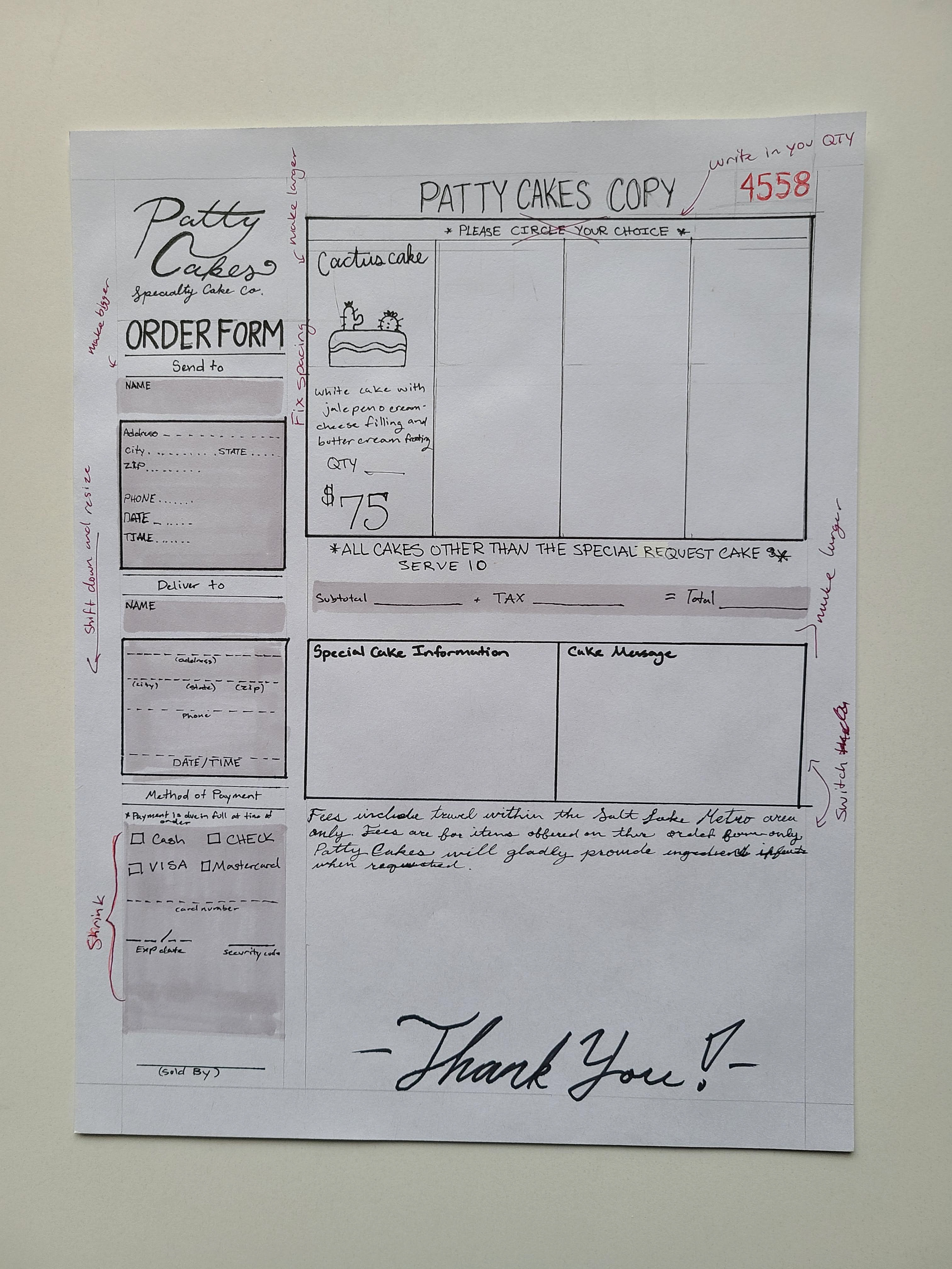
HAND FINAL
My hand final had a lot of missing elements and I wish I got it tighter and more finalized but I wanted to get to the computer as soon as possible. At first I want to have the drawings of cakes to make it more visual and I wanted to have a very different layout then what I saw in majority of the forms that I saw when doing my research. That was a bad idea since it was too confusing and you will see in the next step.
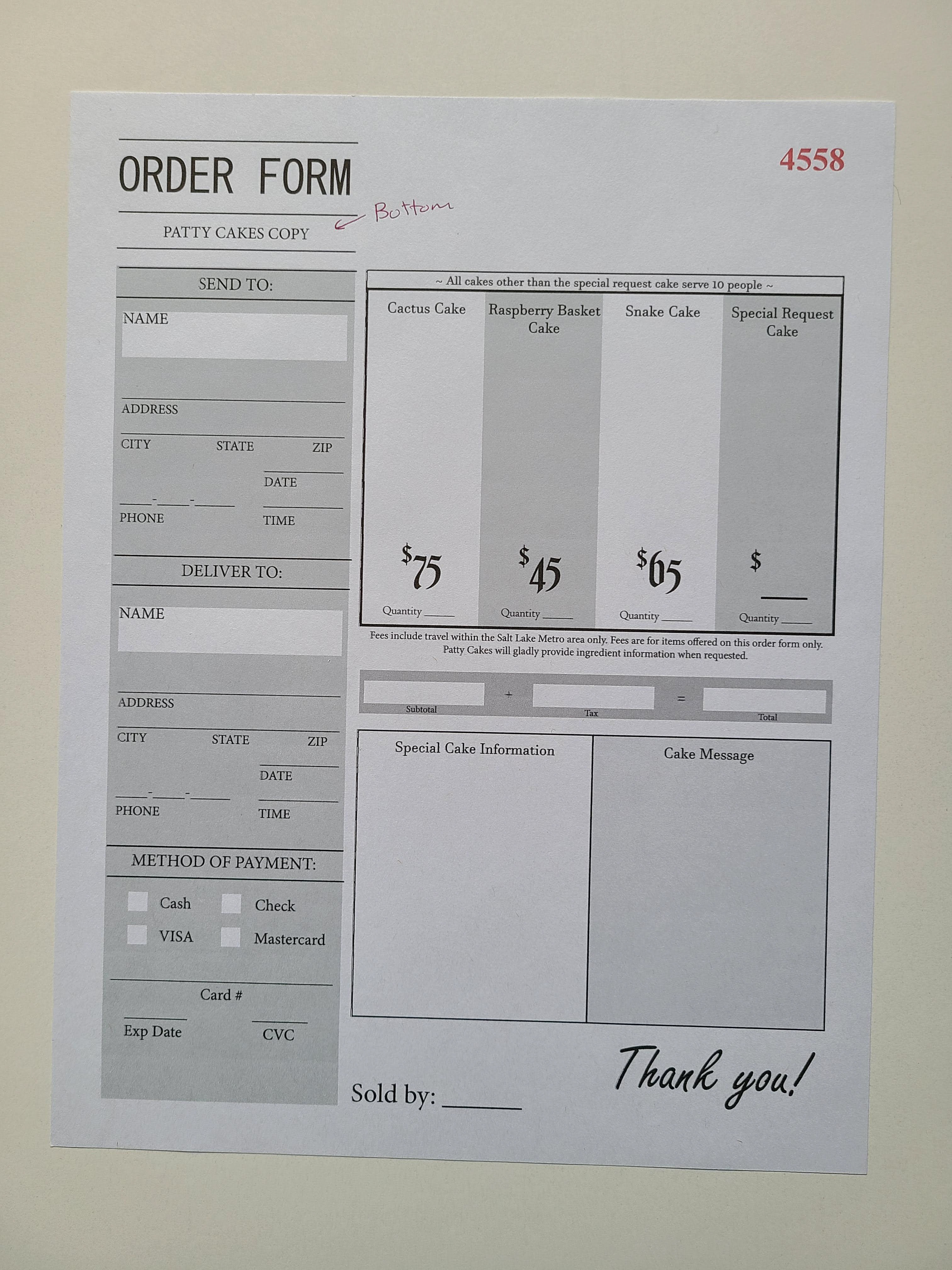
FIRST COMPUTER PROGRESSION
I really wanted to do this layout but like you see in the notes with the hand final that there were too many things missing and it was way too confusing. So majority of this layout was changed in the next progression.
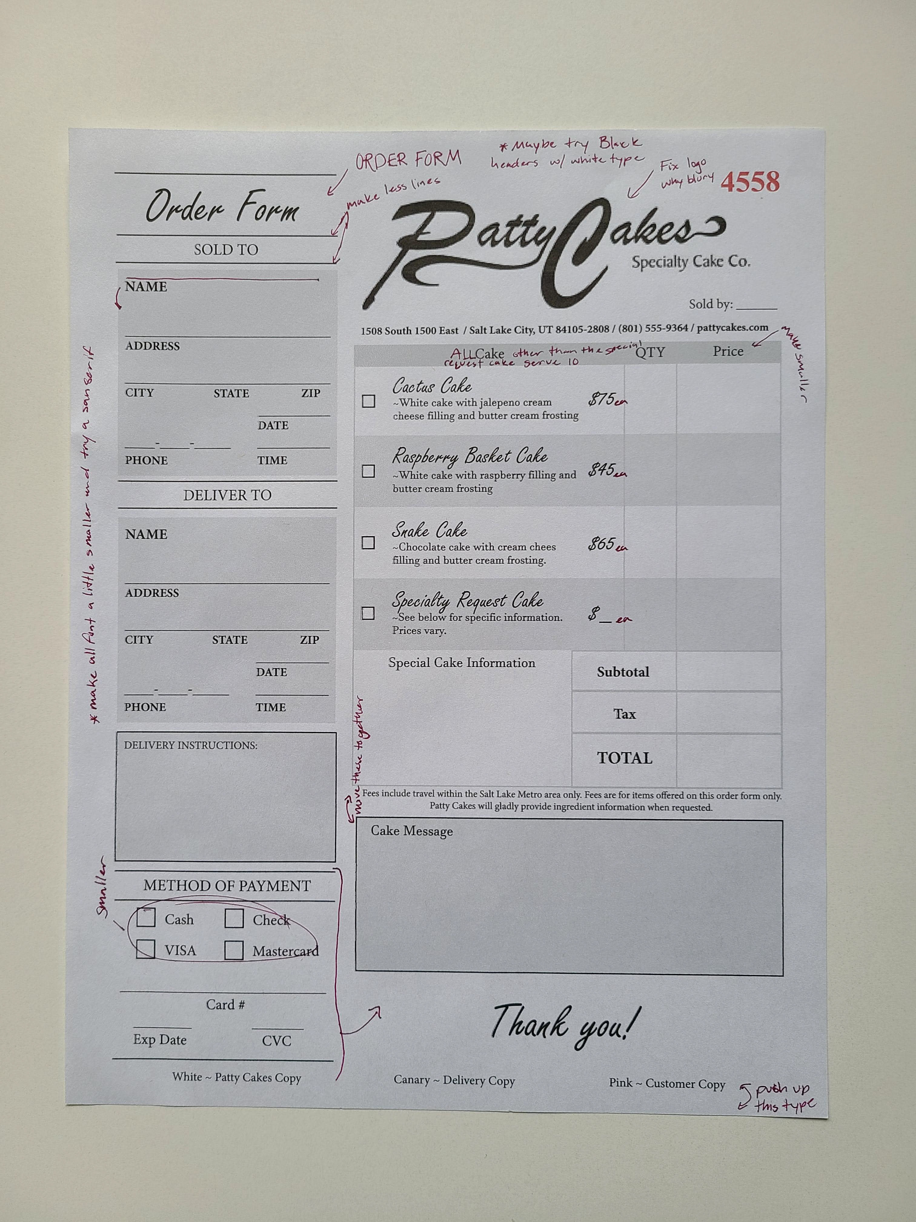
SECOND COMPUTER PROGRESSION
This is the second computer progression with notes and changes that needed to be made with everything. The only idea that I kept was the side bar with all of the information about the customer. In class we talked about bring attention to the titles of sections and making everything align better in all. So in the final you will see more black with white text and better alignment of all of the information that was needed. I also forgot some elements in this progression as well so I had to add those as well.
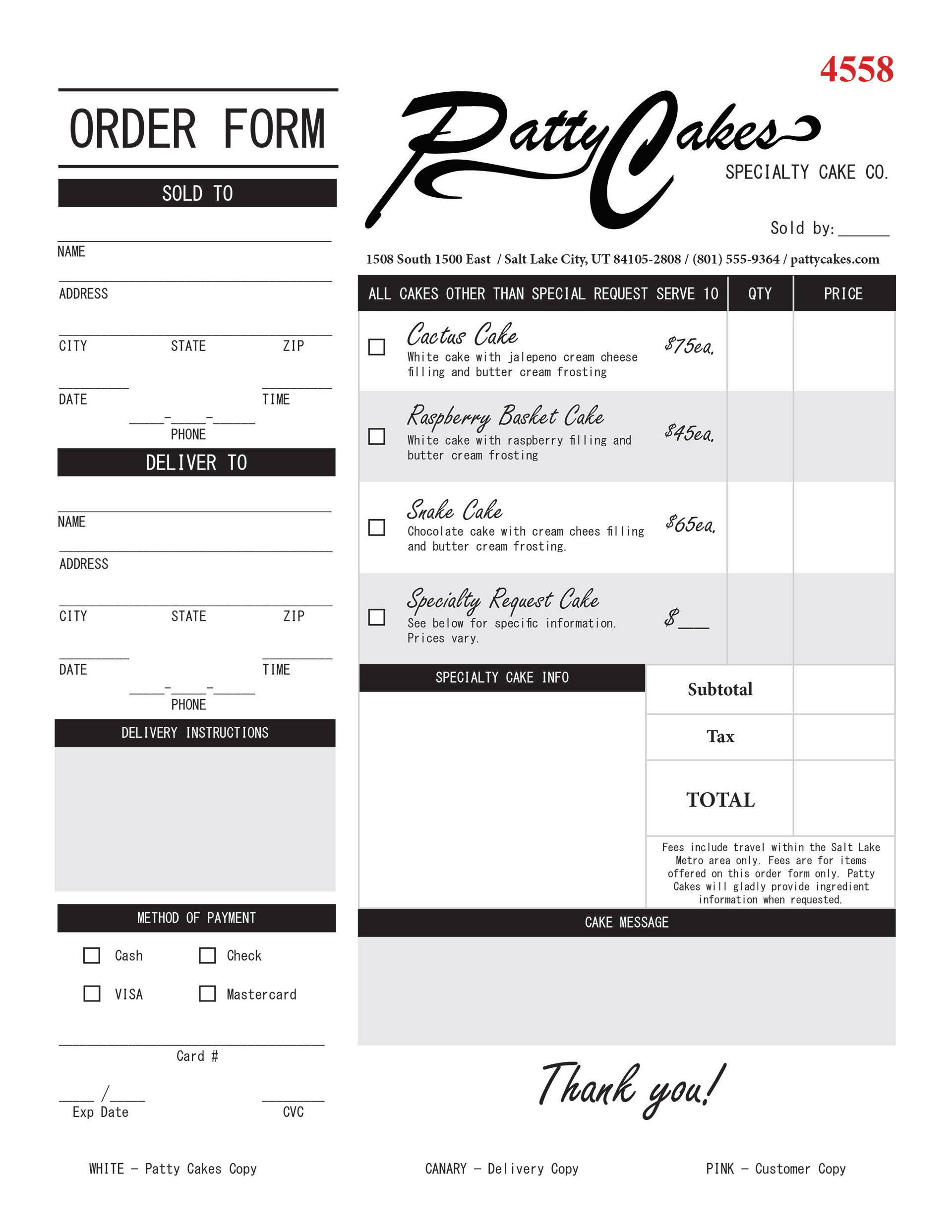
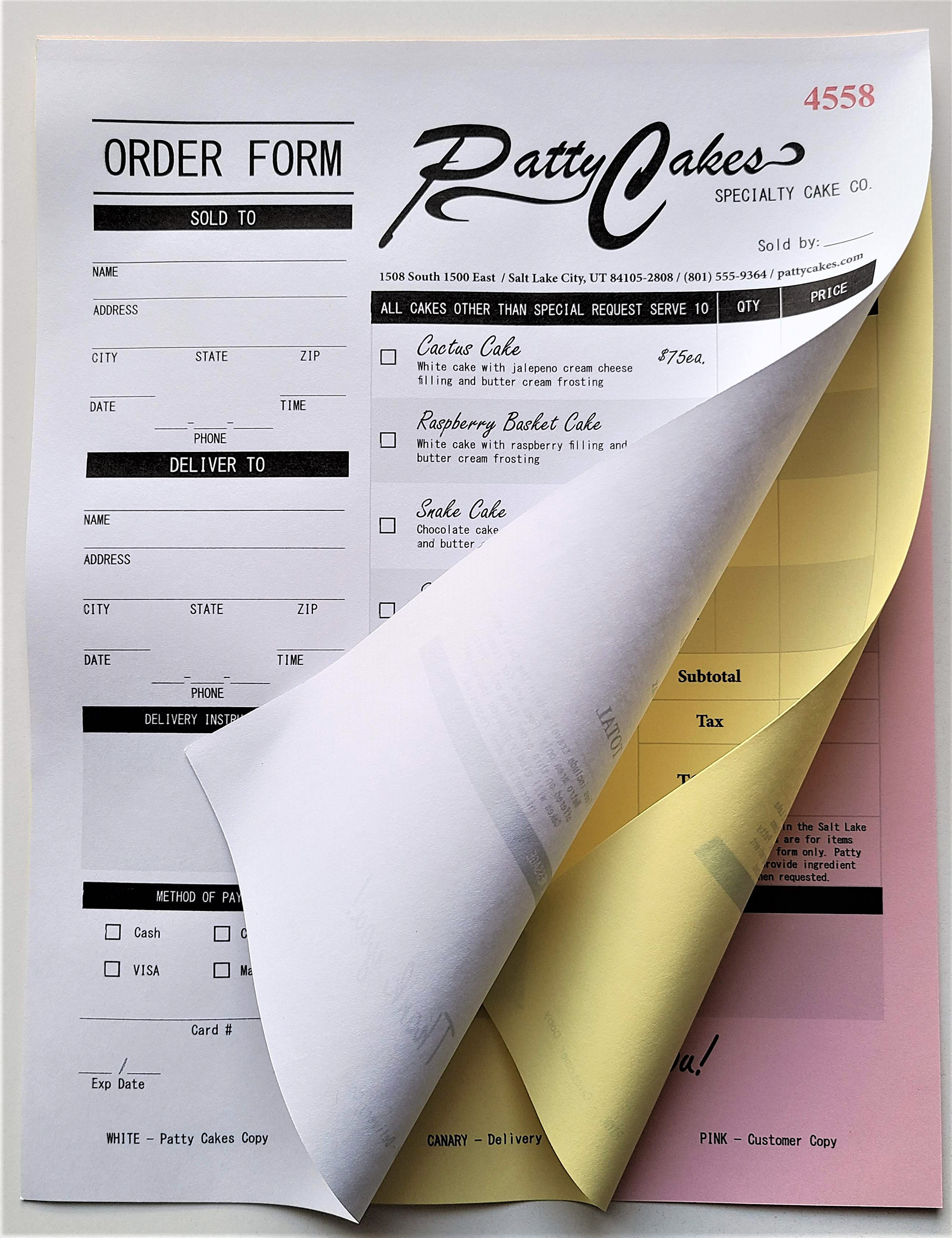
FINAL
I am really happy with how my final form came out. I took all of the suggestions that people gave me and changed what needed to be changed. I really like how you are drawn to each section and you can clearly see everything that needs to be filled out. I also really like how my logo came out on the computer. I changed it from a stacked logo to the side by side. All in all it feel more cohesive and everything has its place in the form.