


OVERVIEW
What is a Kitsch? Art, objects, or designs are considered to be in poor taste because of their cheap quality, tacky look, or lowbrow taste.
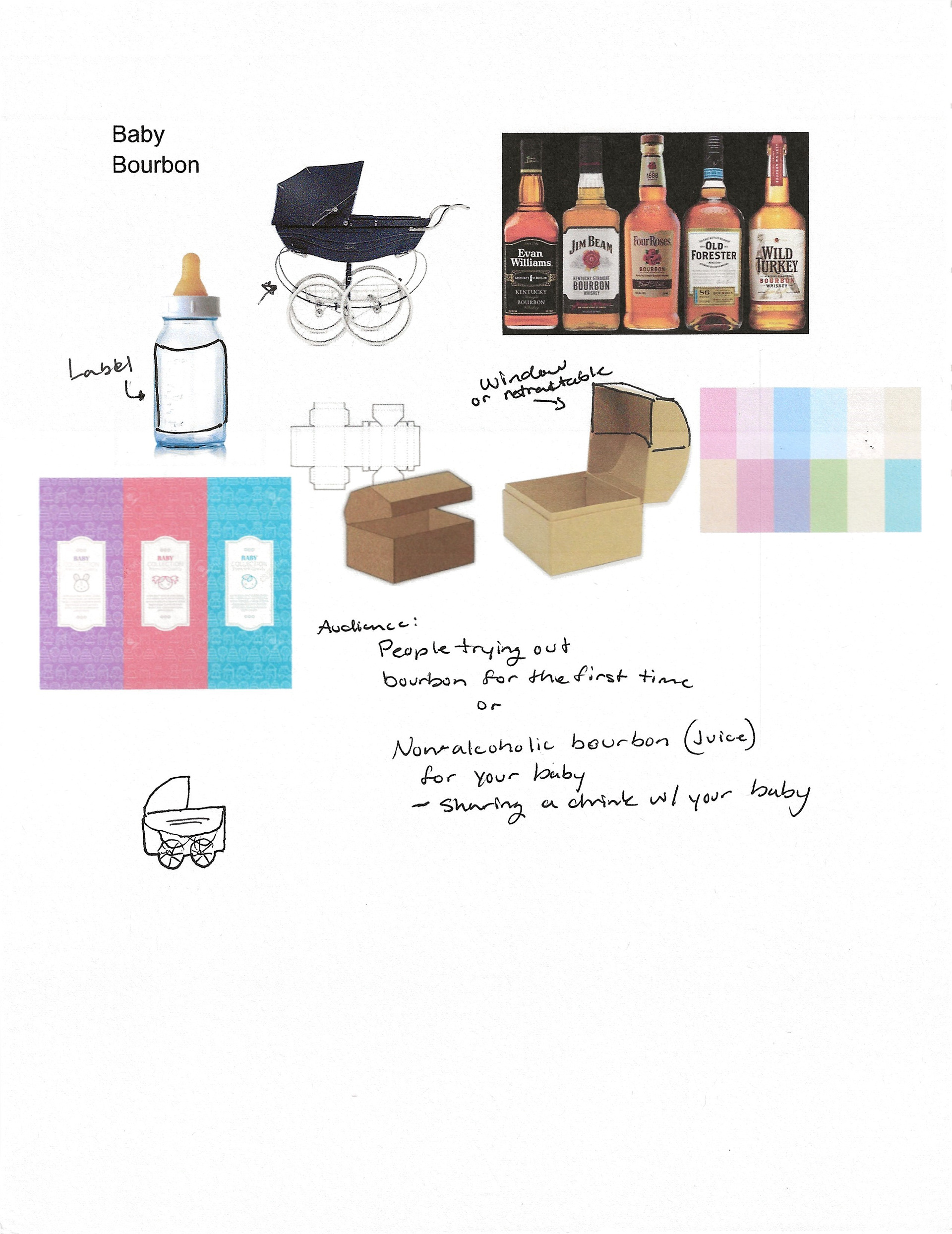
The client wanted a weird or wacky product. With the creative freedom to go wild with this project, Baby Bourbon came to be. Don't spend nights drinking alone with the kids when you can give them Baby Bourbon, and you won't be drinking alone anymore.
RESEARCH & BRAINSTORMING
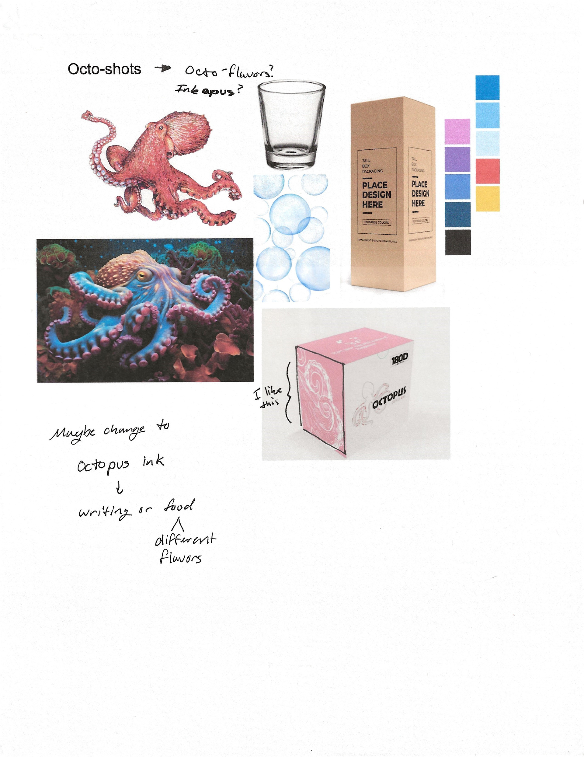
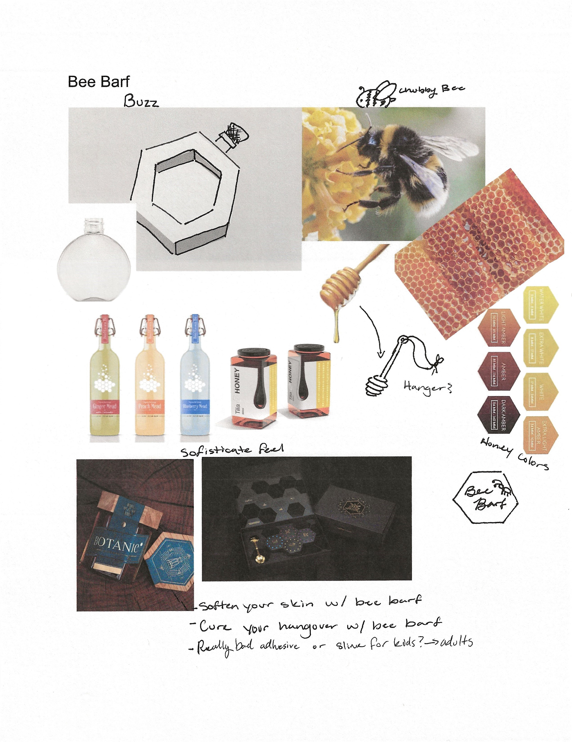
These were the three ideas that I wanted to go with and this is all of the inspiration that I was looking at when creating these objects. So far the strongest ideas were Bee Barf and Baby Bourbon. It also made me realize that I really like B alliteration.
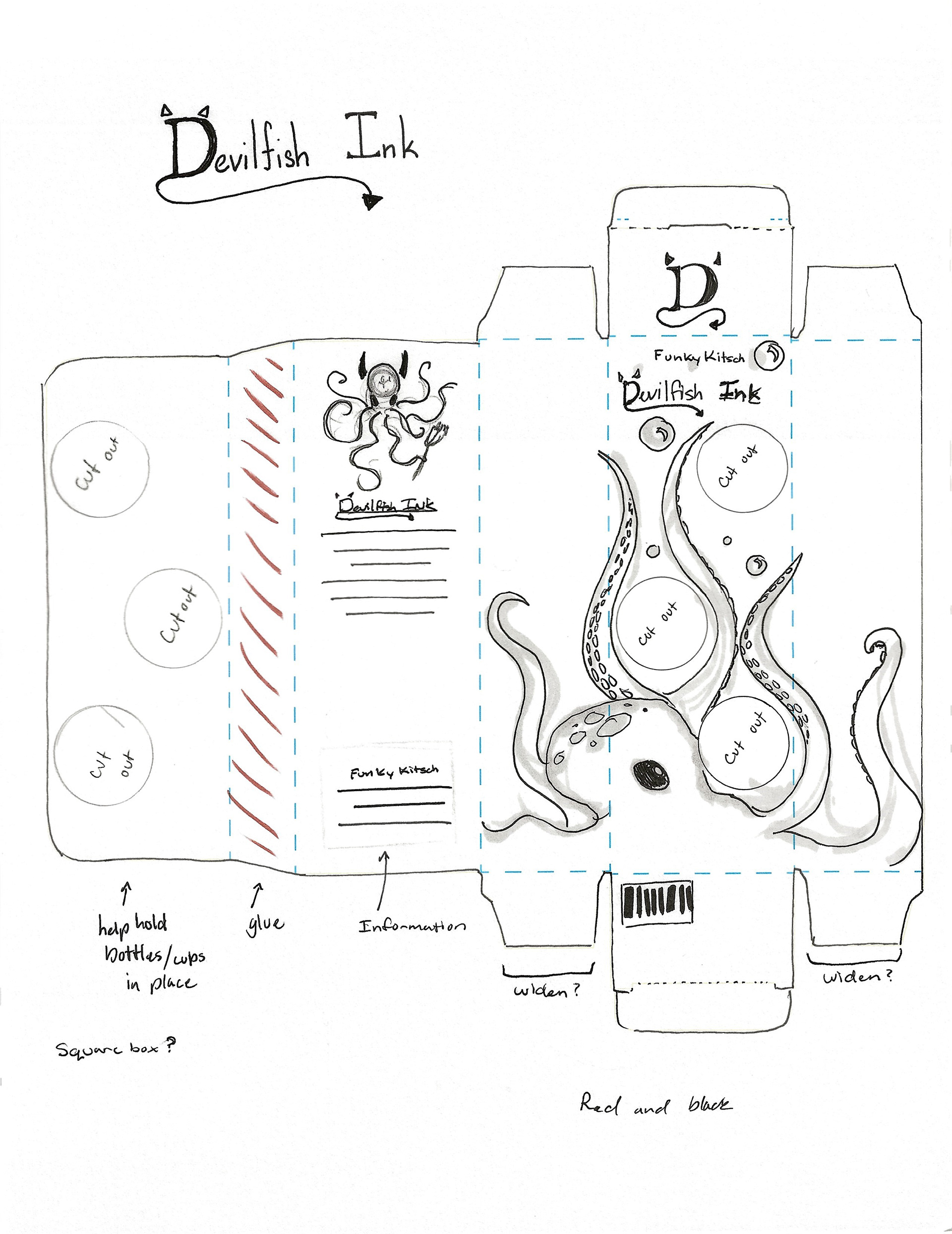
SKETCHES & DOODLES
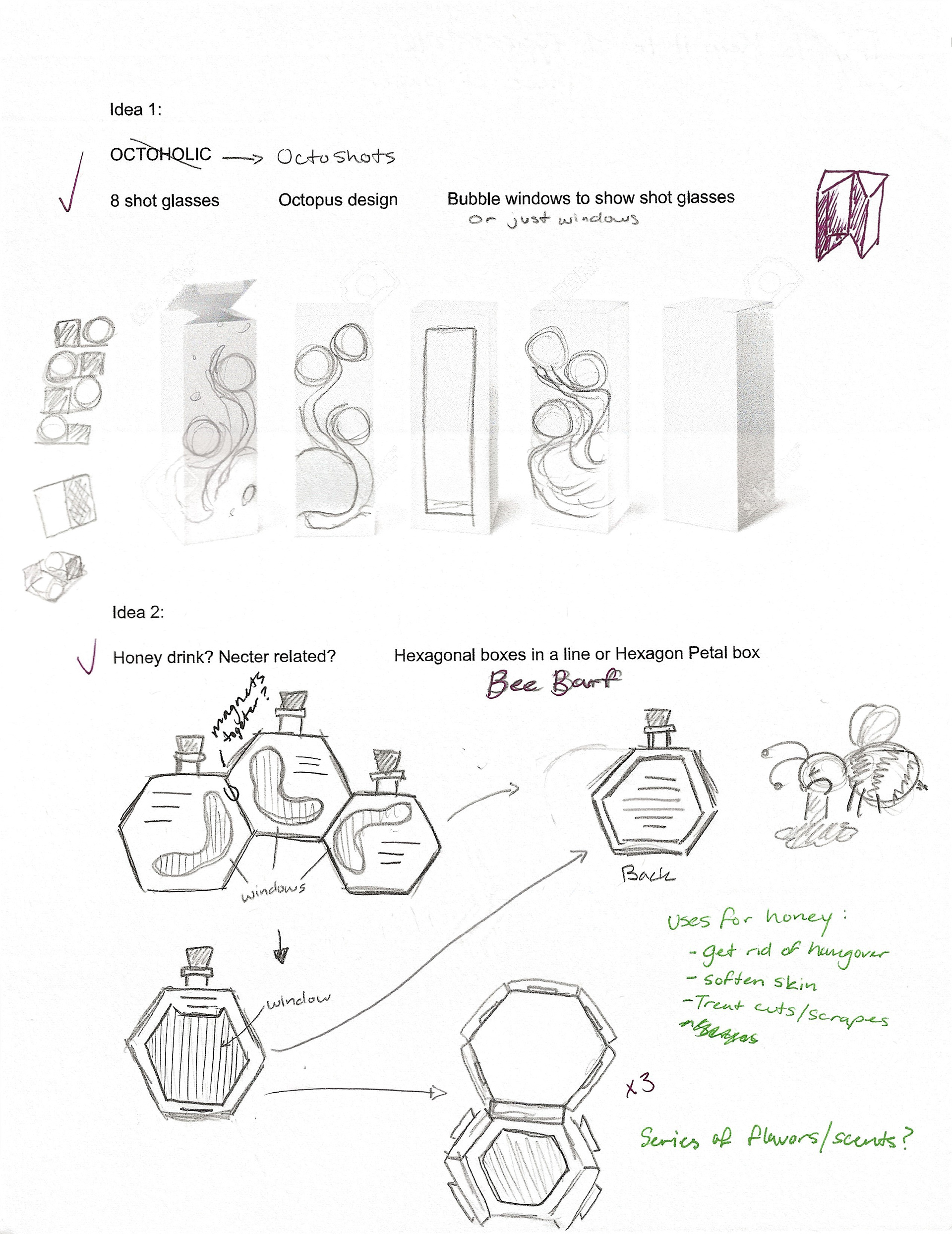
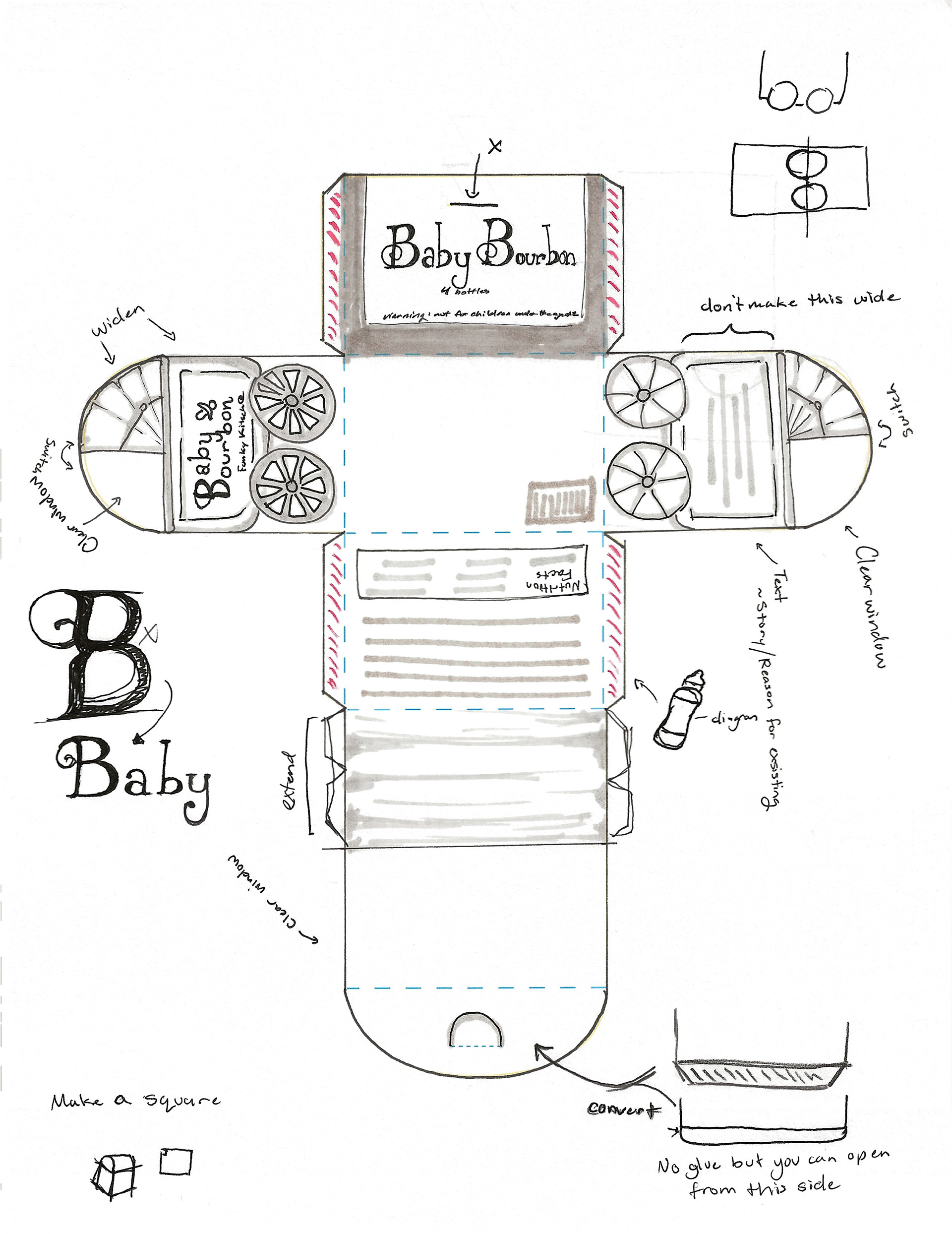
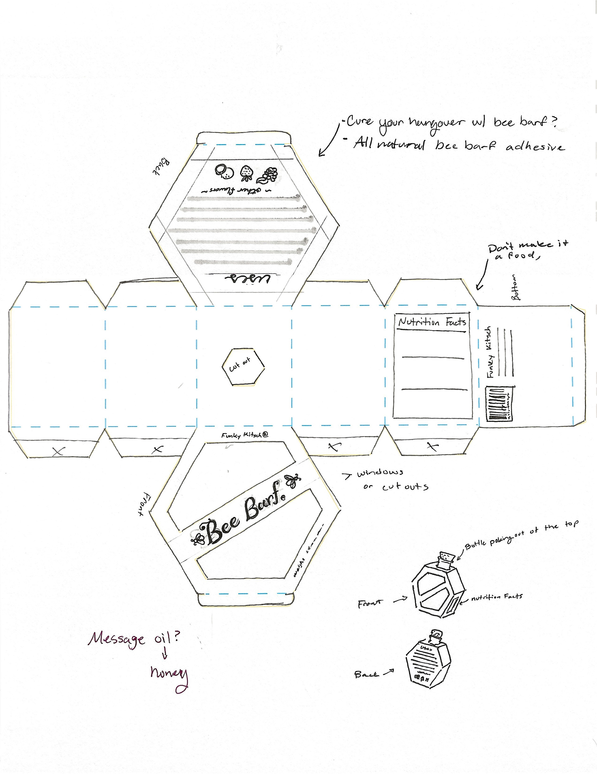
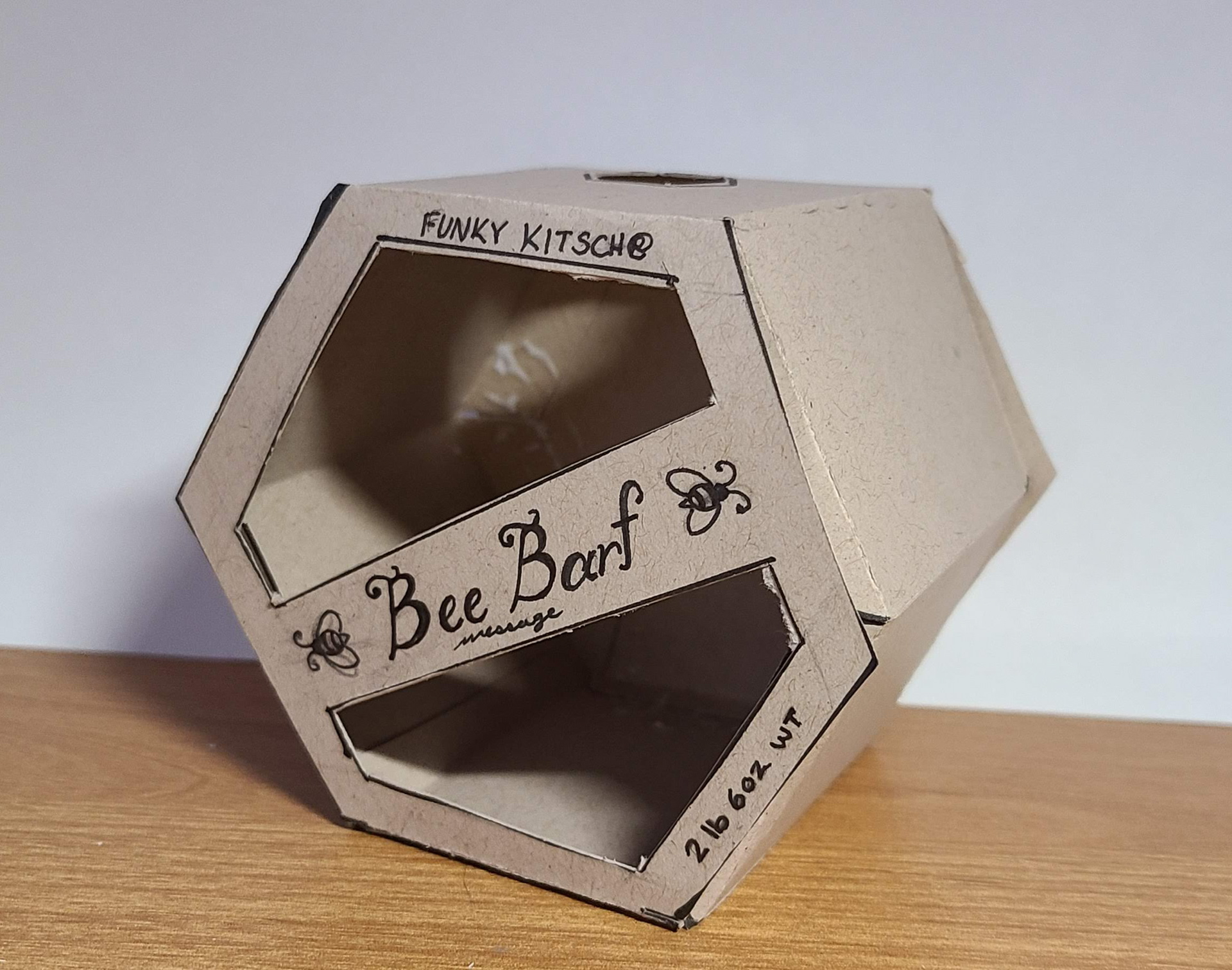
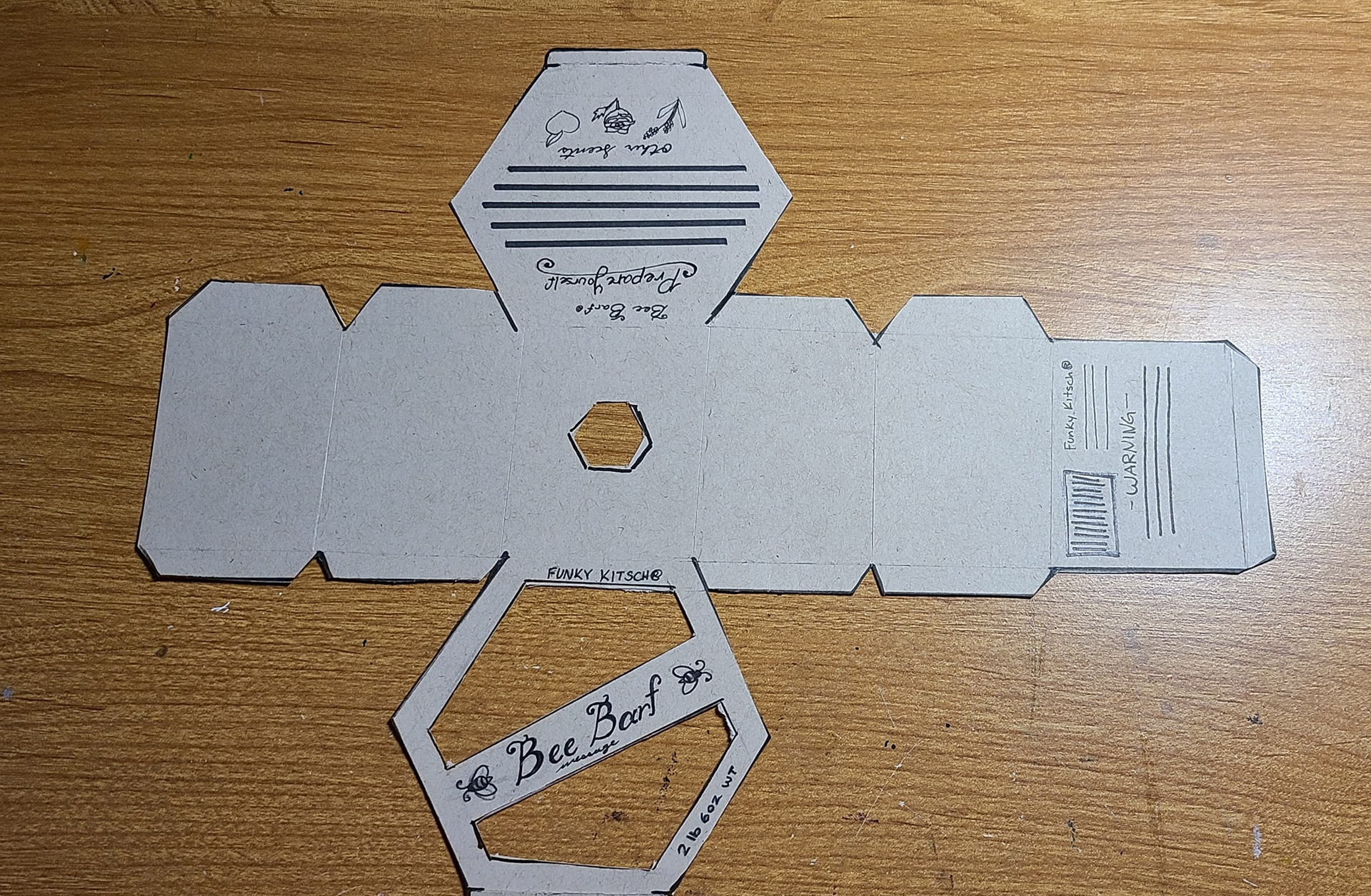
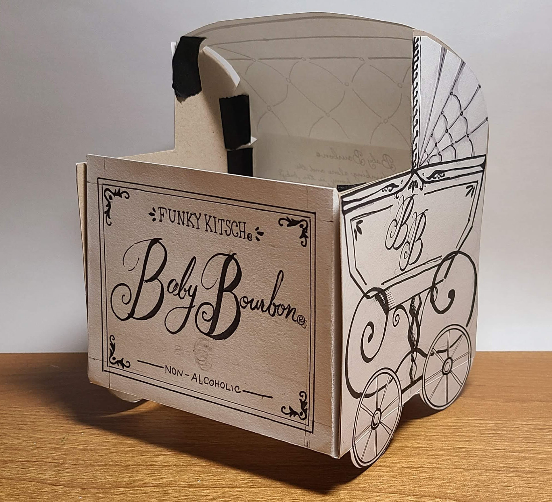
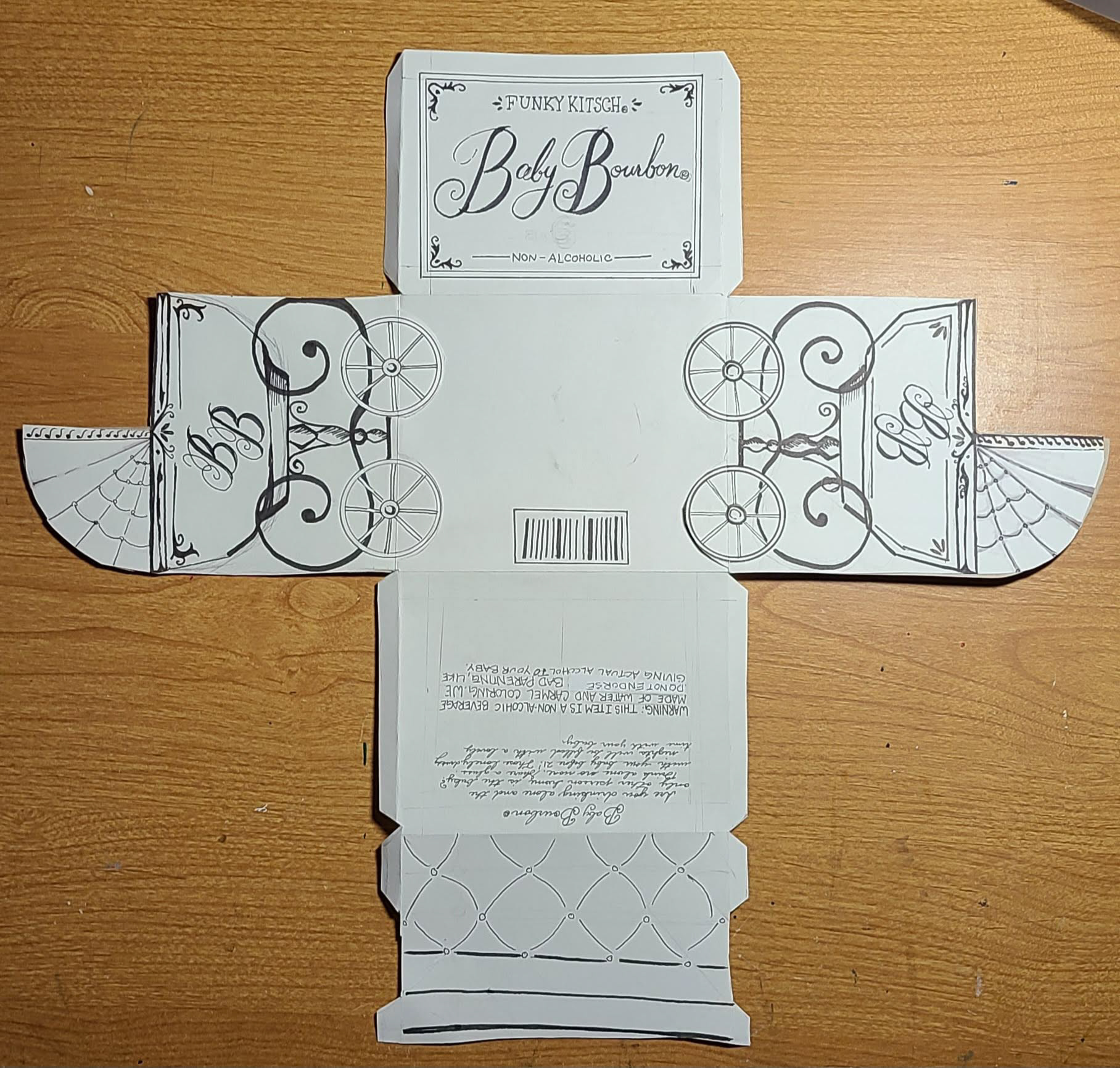
These were the initial doodles for all of my ideas but it is also where I laid out what type of boxes I wanted to do. The hexagon shape seemed really fun and I wanted to be able to use magnets for that one. Idea 1 would have had bubble windows which I would have loved to design. Idea 4 was in a chest-like box to simulate an old baby carriage/stroller.

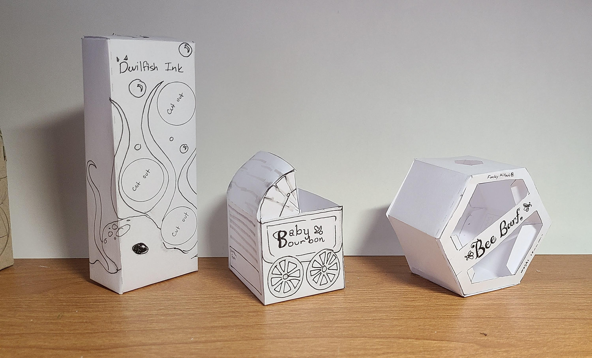
THUMBNAILS
I was really happy with the designs that I made for each design. I know that during this stage I was doubting what I wanted for the bee barf and the Devilfish ink. I didn't know what I wanted the uses to be. Baby Bourbon was still the most strong idea.
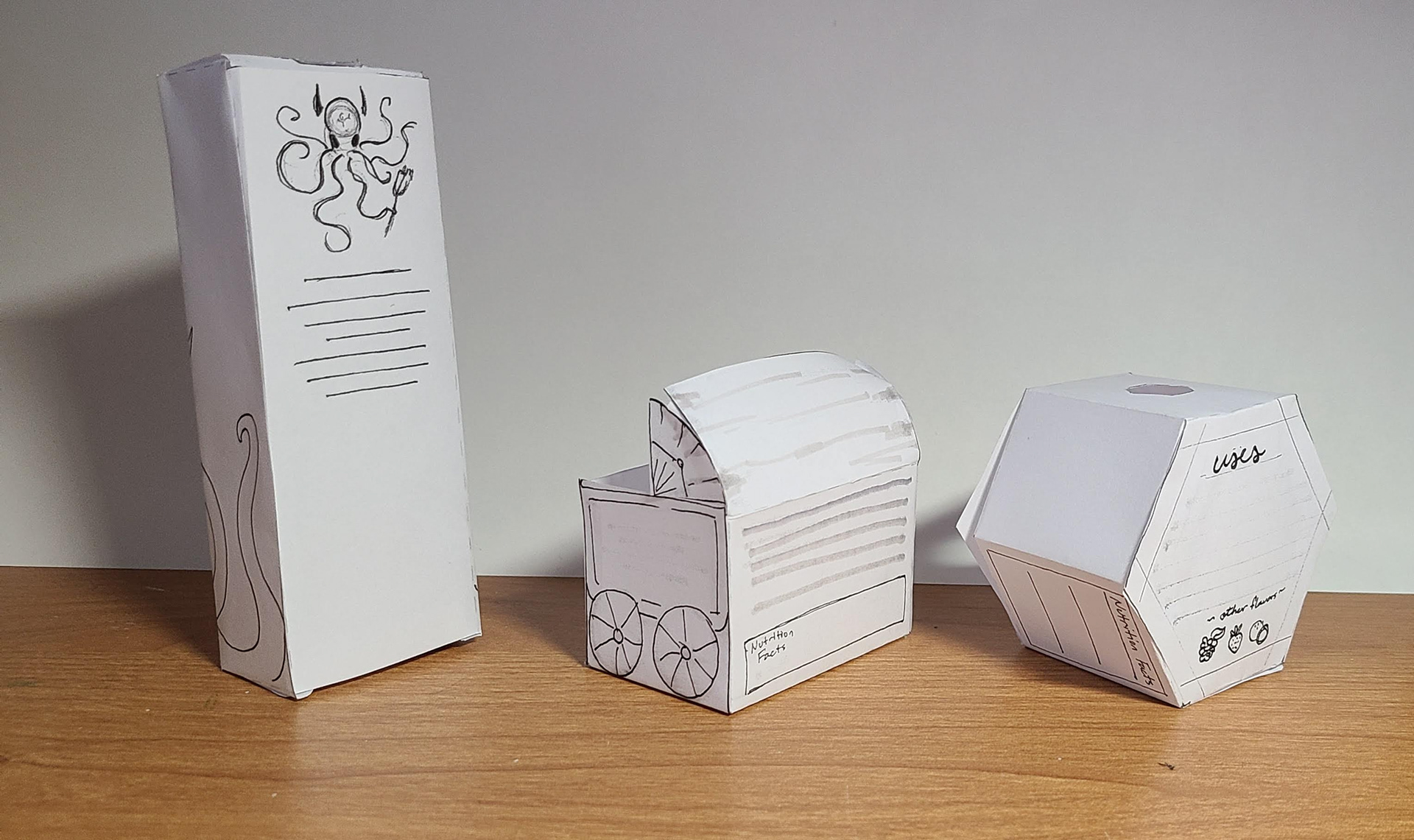
INTERMEDIATES
For the intermediate I went with Bee Barf and Baby Bourbon. It wasn't a surprise with this decision and I really liked how these ones were turning out. I wanted to do a more playful design with the bee barf and I wanted to go with an older feel for the baby bourbon. I also needed to get tighter with these intermediates but I didn't have all of the information and time that I should have given myself.

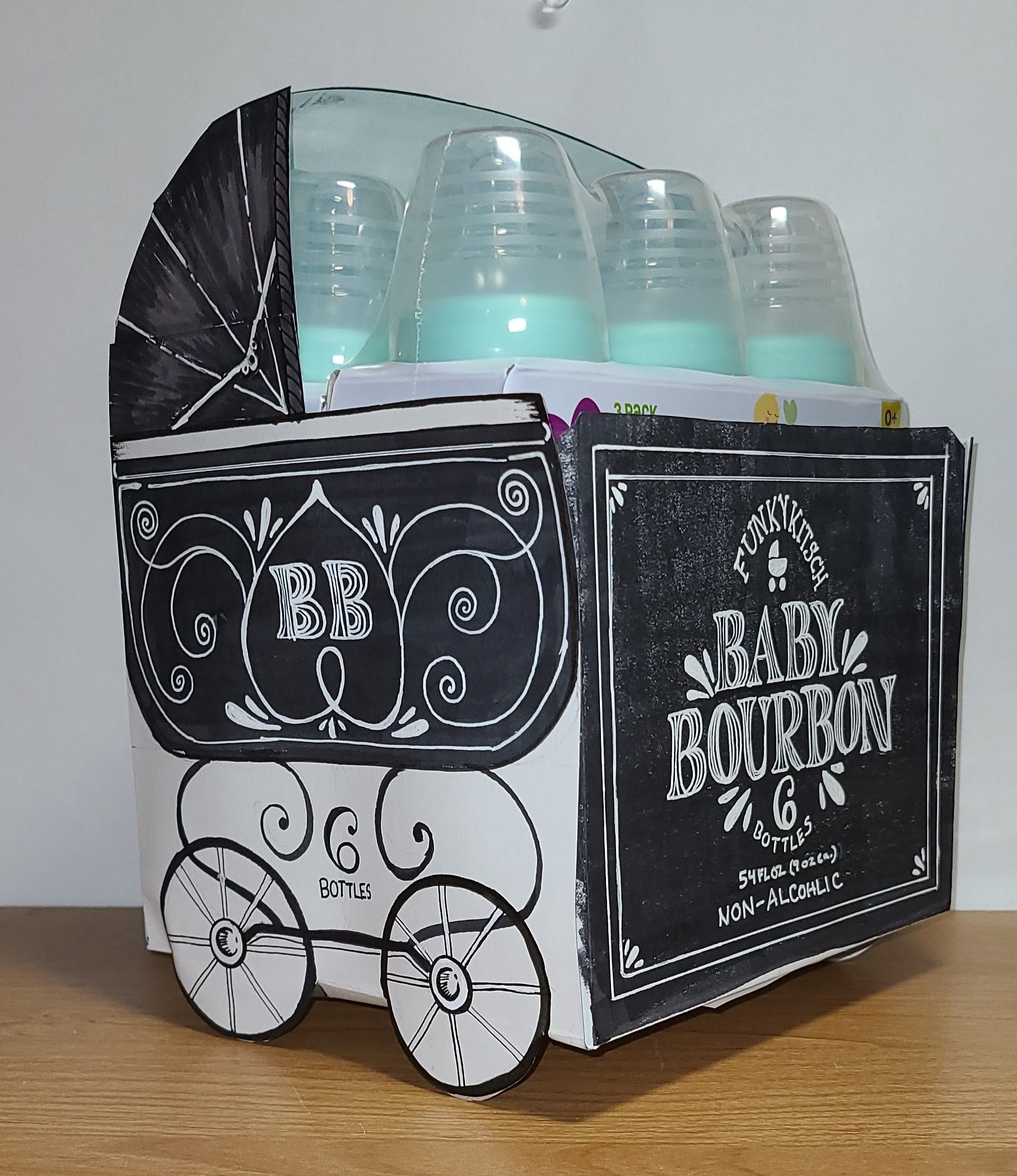
FINAL HAND COMP
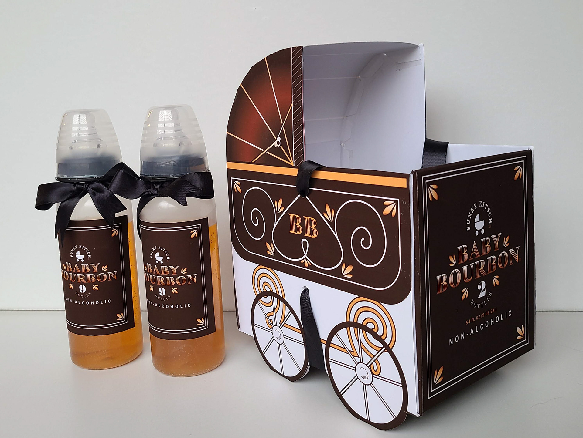
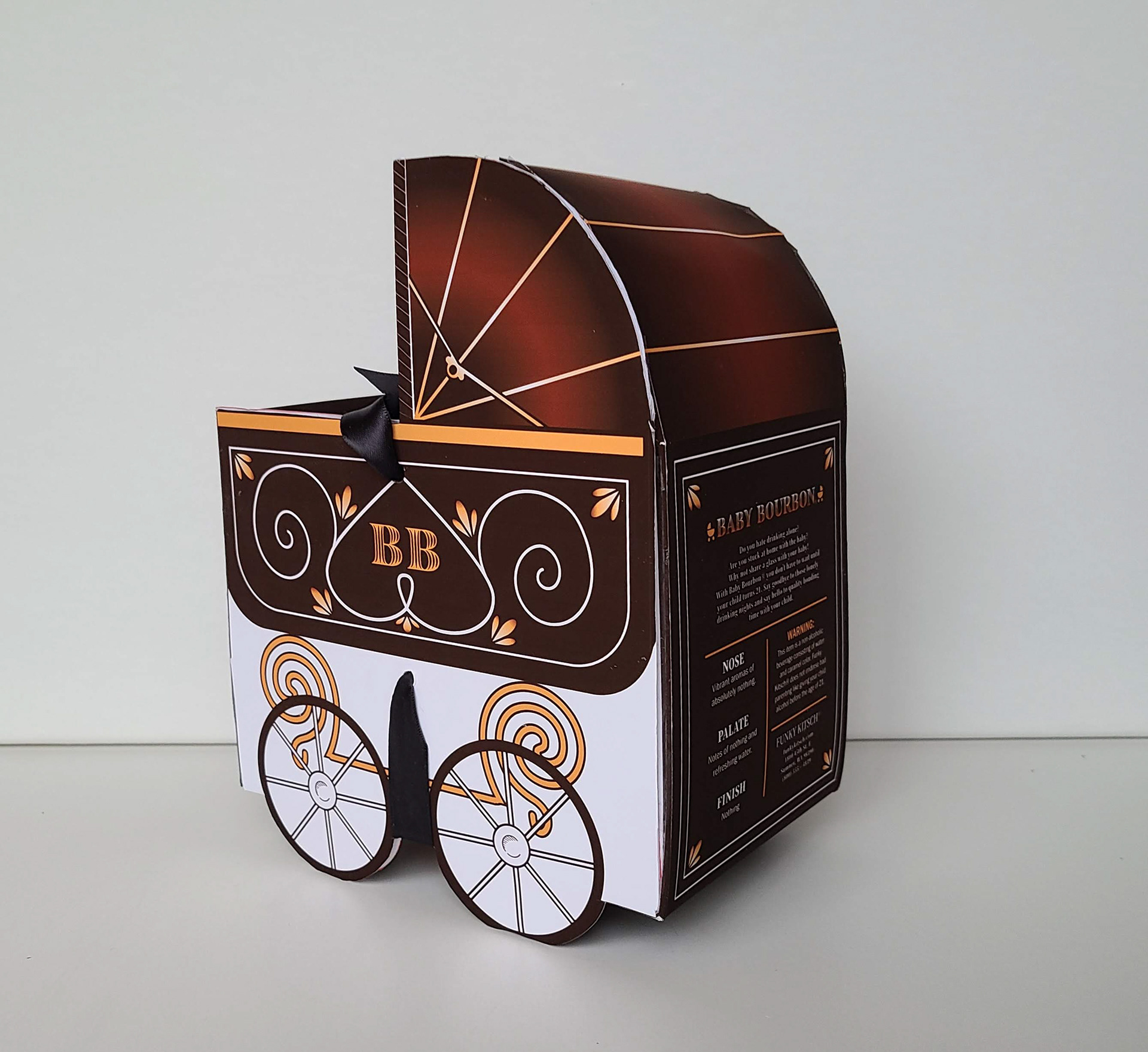
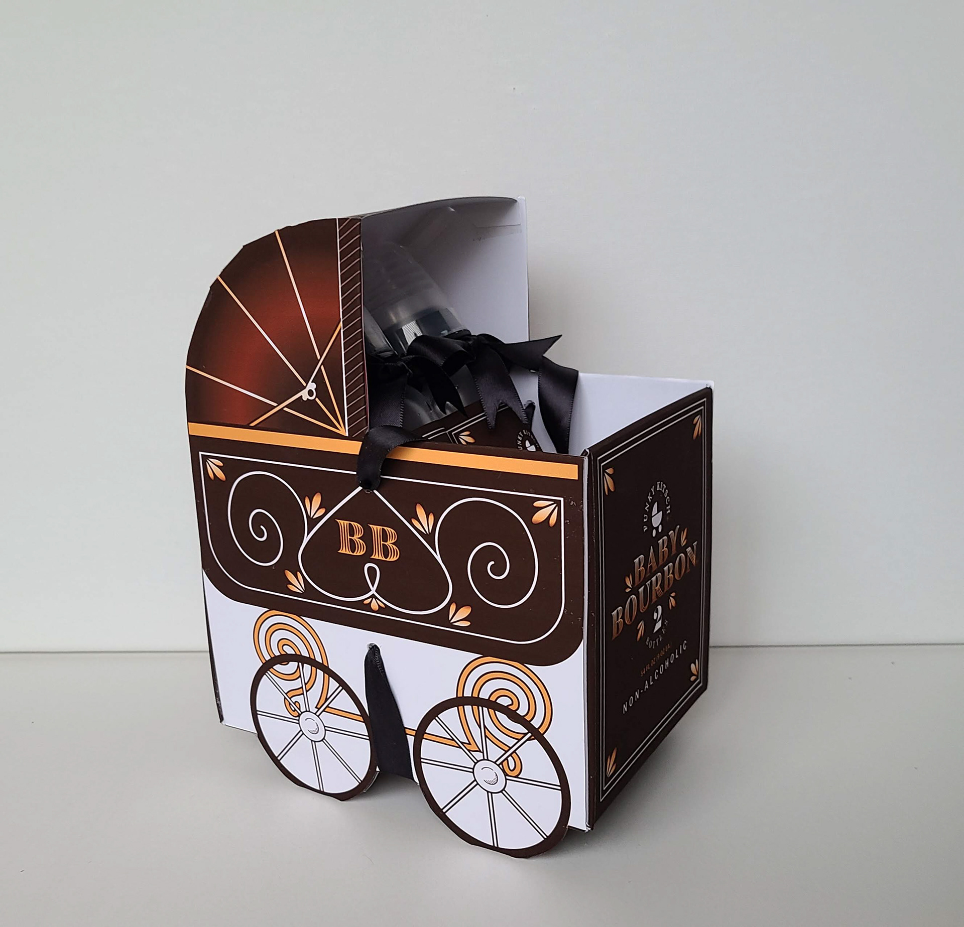
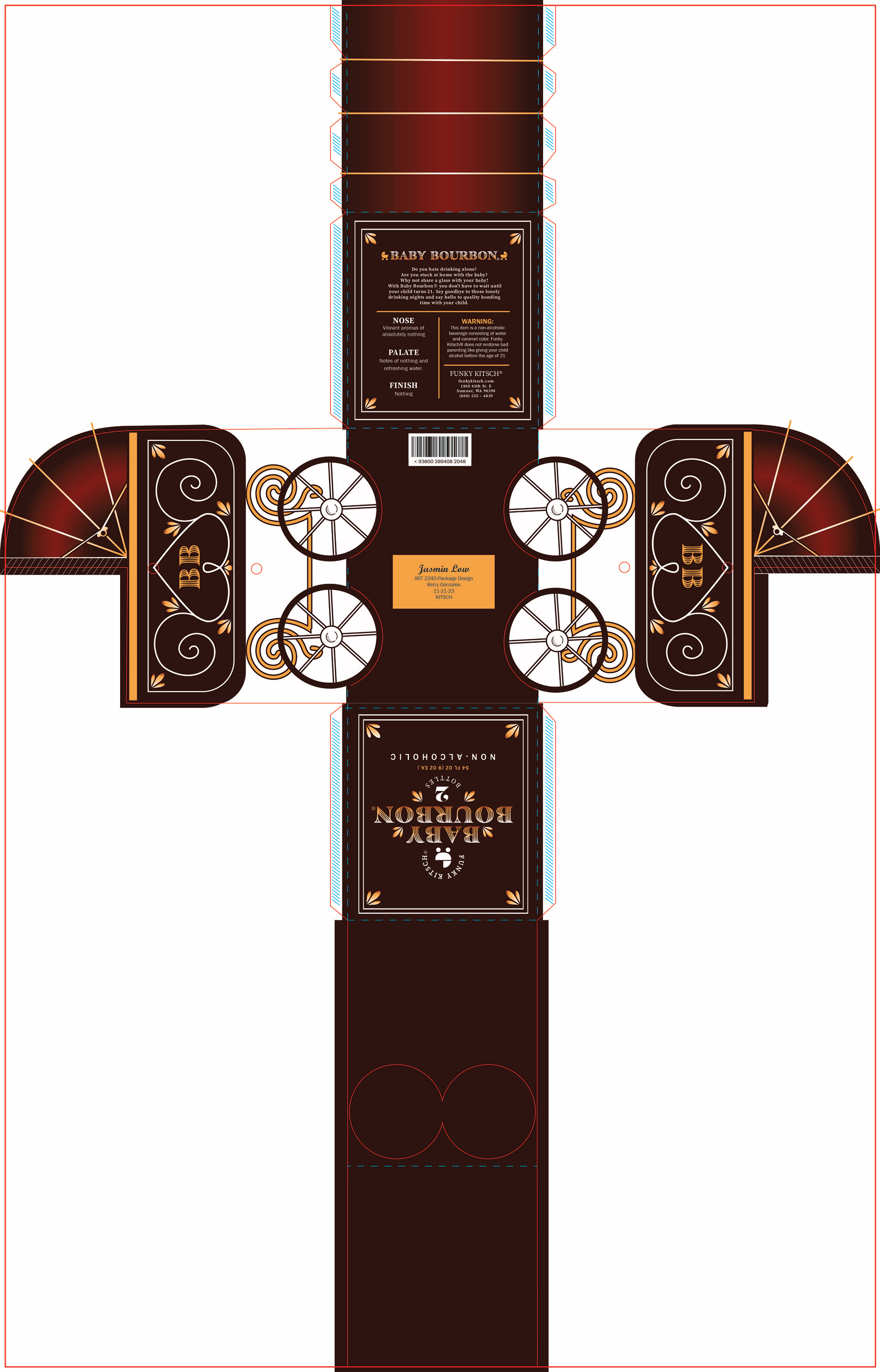
Surprise! I went with the one I wanted from the beginning. I wanted a chalk board feel since old bars used to write their menus on chalk boards. I wanted it to be a 6 pack of bourbon but that was quite a bit of bourbon. This box was quite large as well. As you can see in the photo the bottles were teal and sadly they had stars and moons on them. I sanded those and painted the top teal part so that they would work with my design in the end.
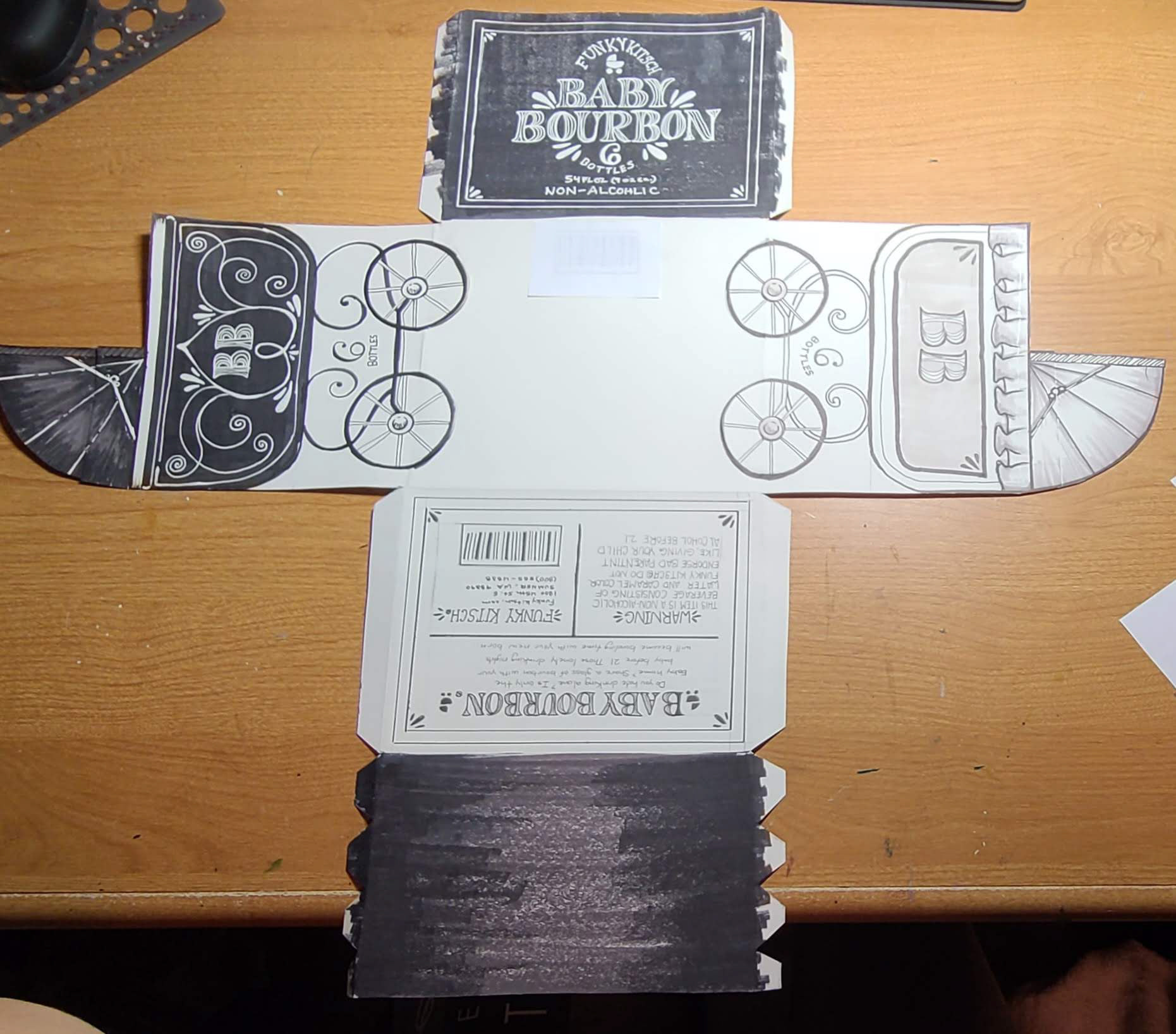

COMPUTER PROGRESSION 1
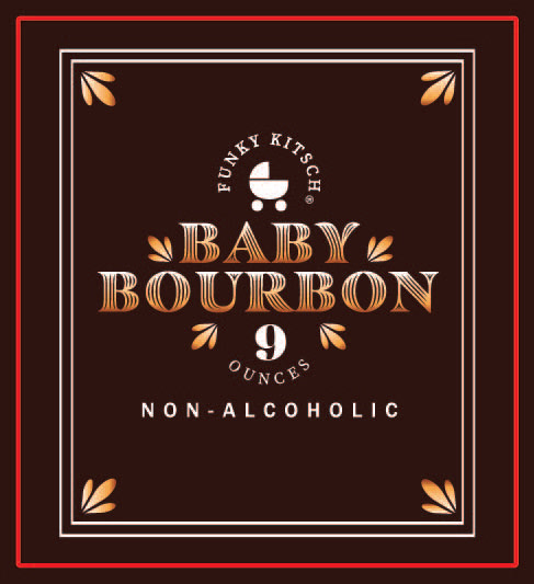
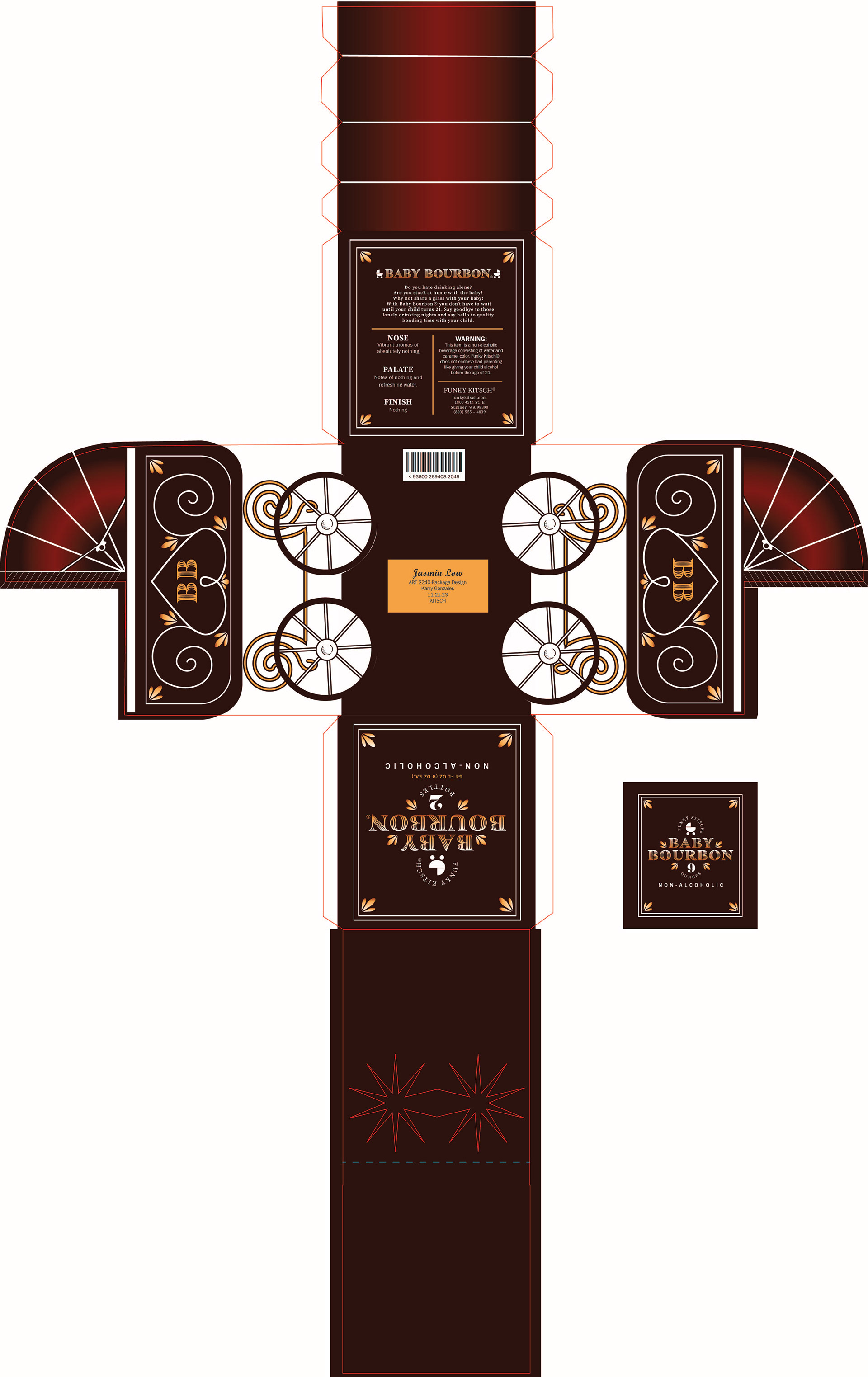
This first progression took a really long time to complete. I was really worried about the design of the sides. I couldn't make the design that I had on my hand final because it was giving me a lot of trouble. I did the best I could. I also made a label for the bottle at this point. I tried to keep it as close as possible but there were some elements that I couldn't put on it since the units would be different. There also arose the concern of where you would grab the box. So I needed a handle.
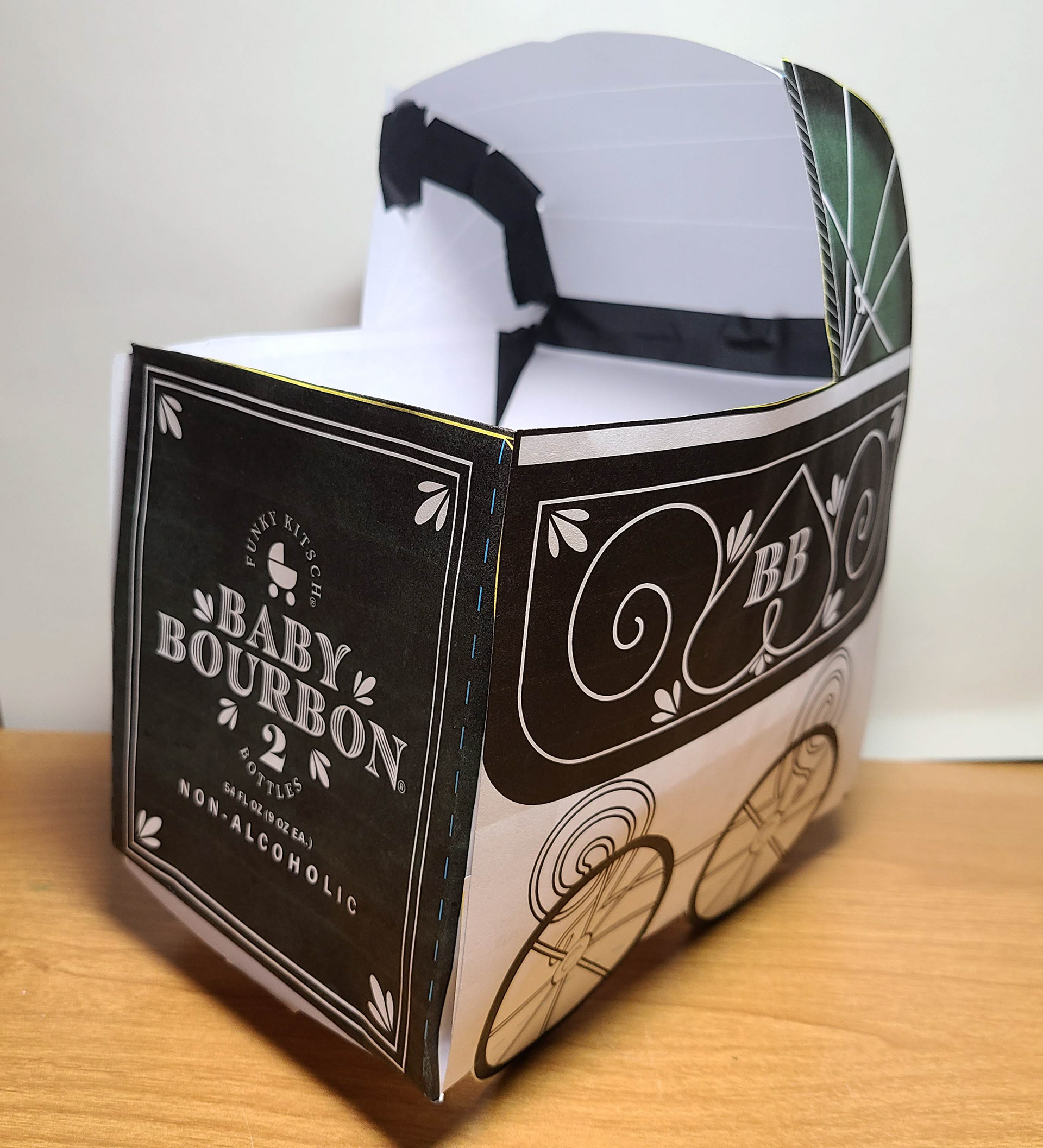
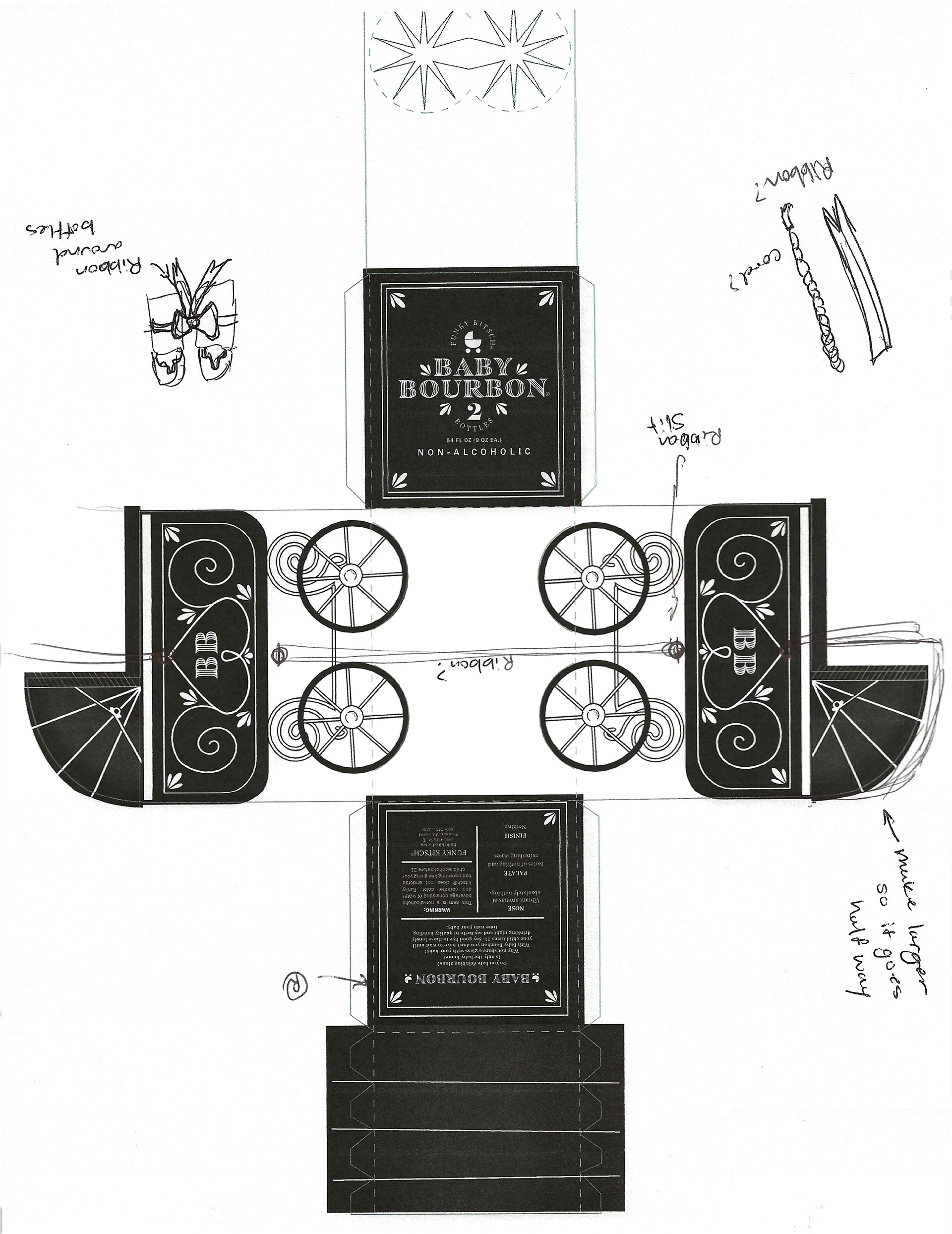
COMPUTER PROGRESSION 2
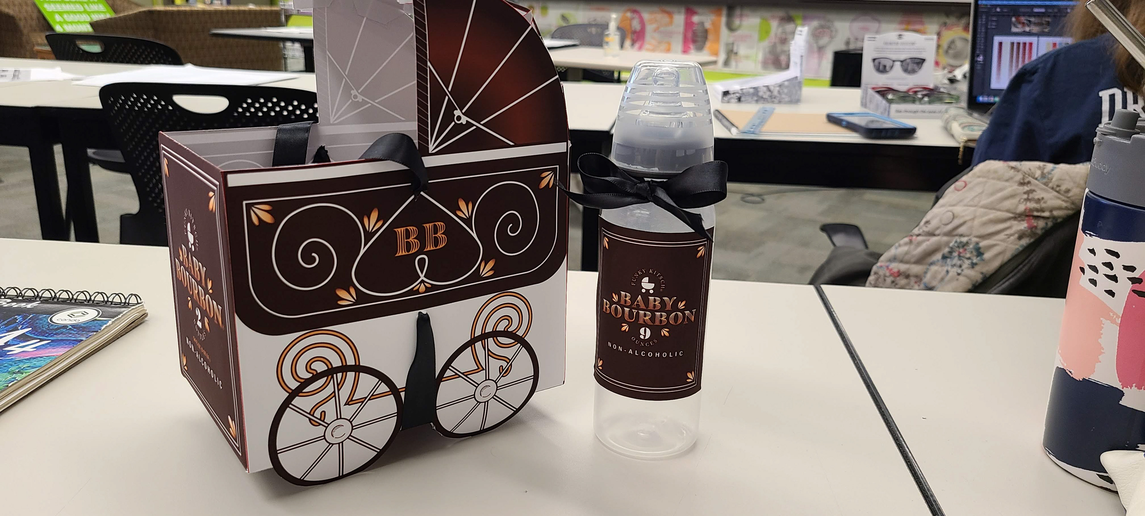
This progression is where I added a ribbon handle where it would come from the bottom and weave through the design as not to disturb the stroller design too much. I feel like there was mainly dieline flaws that I still had to figure out and that took a lot of time.
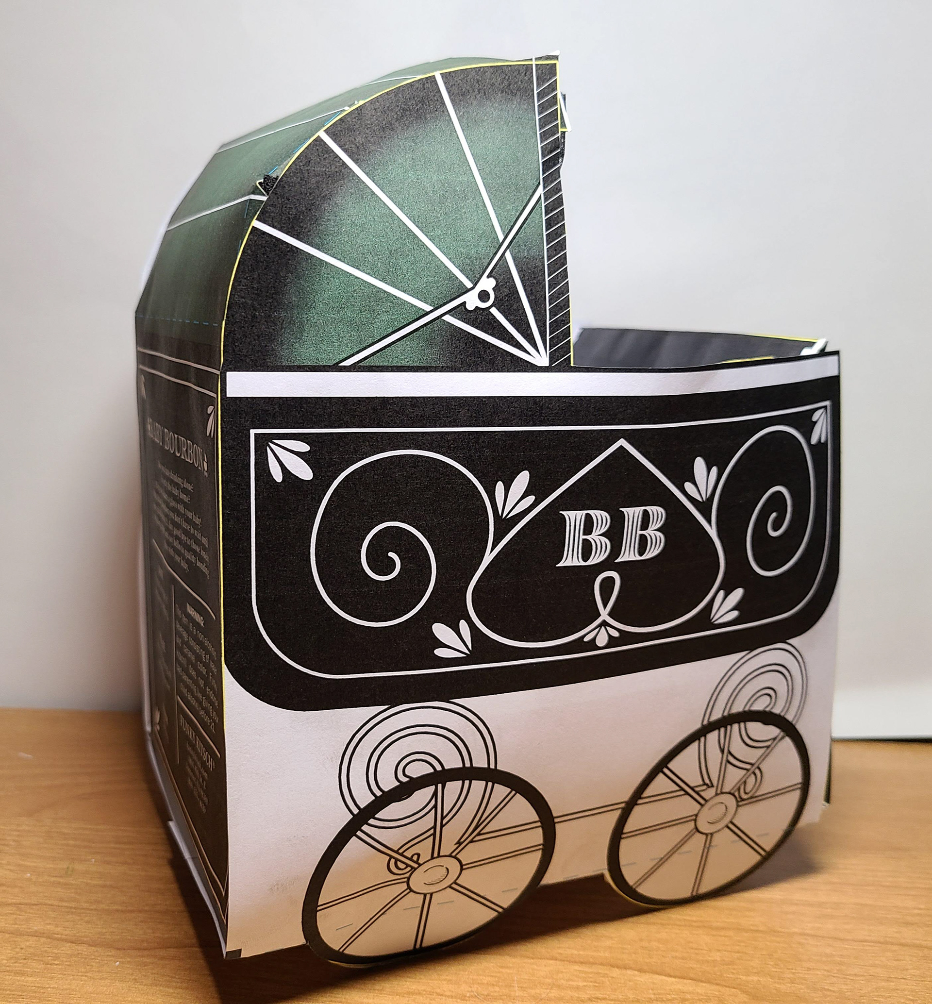
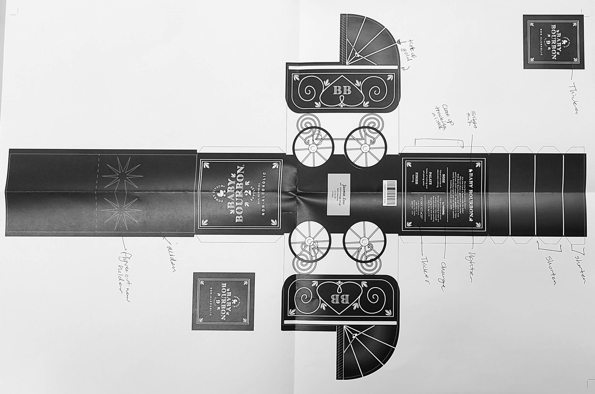
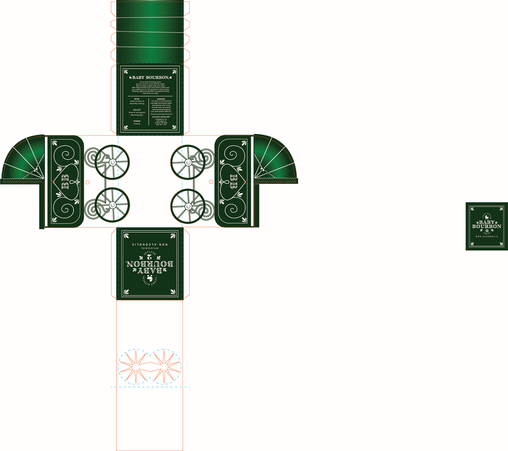
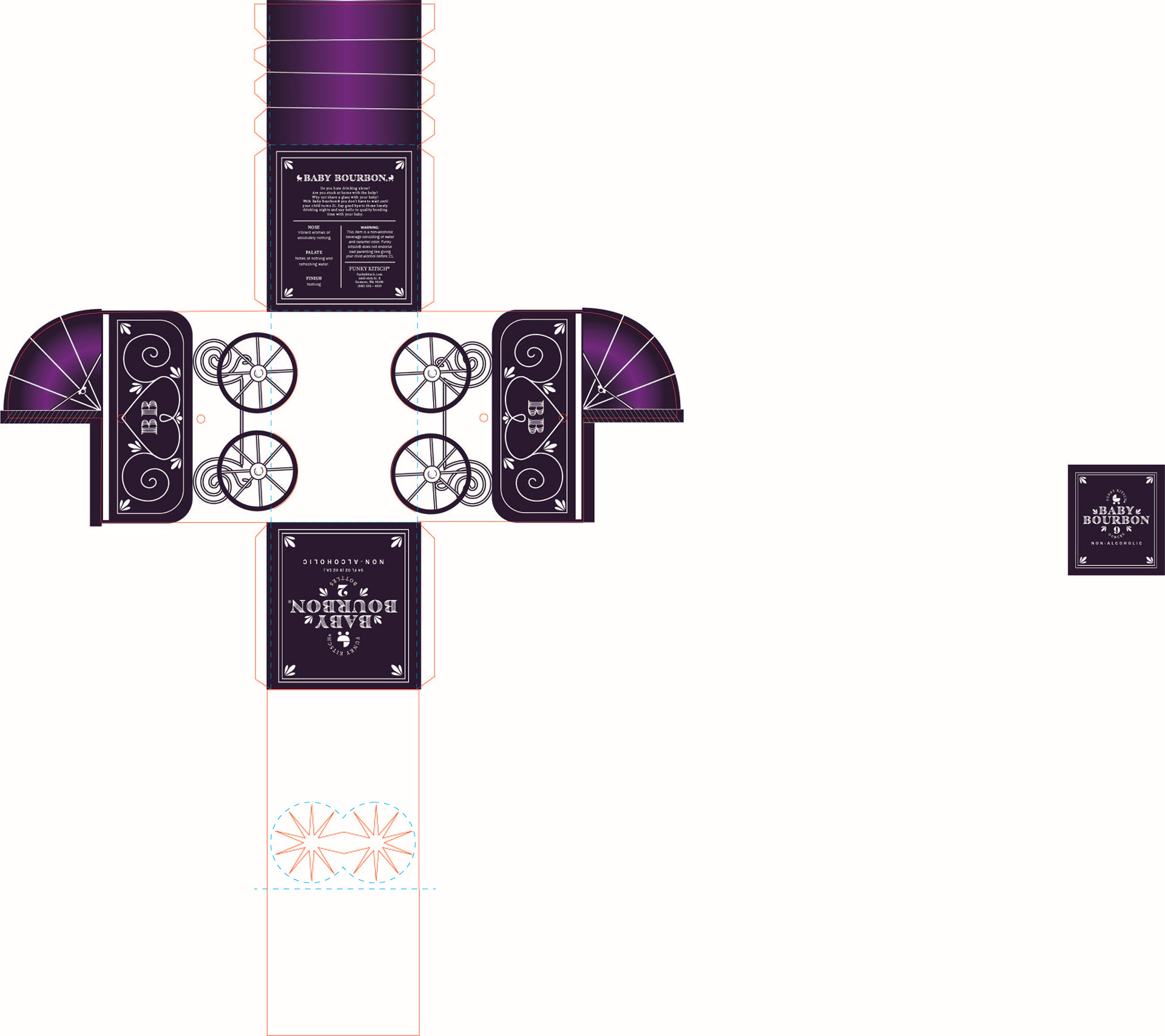
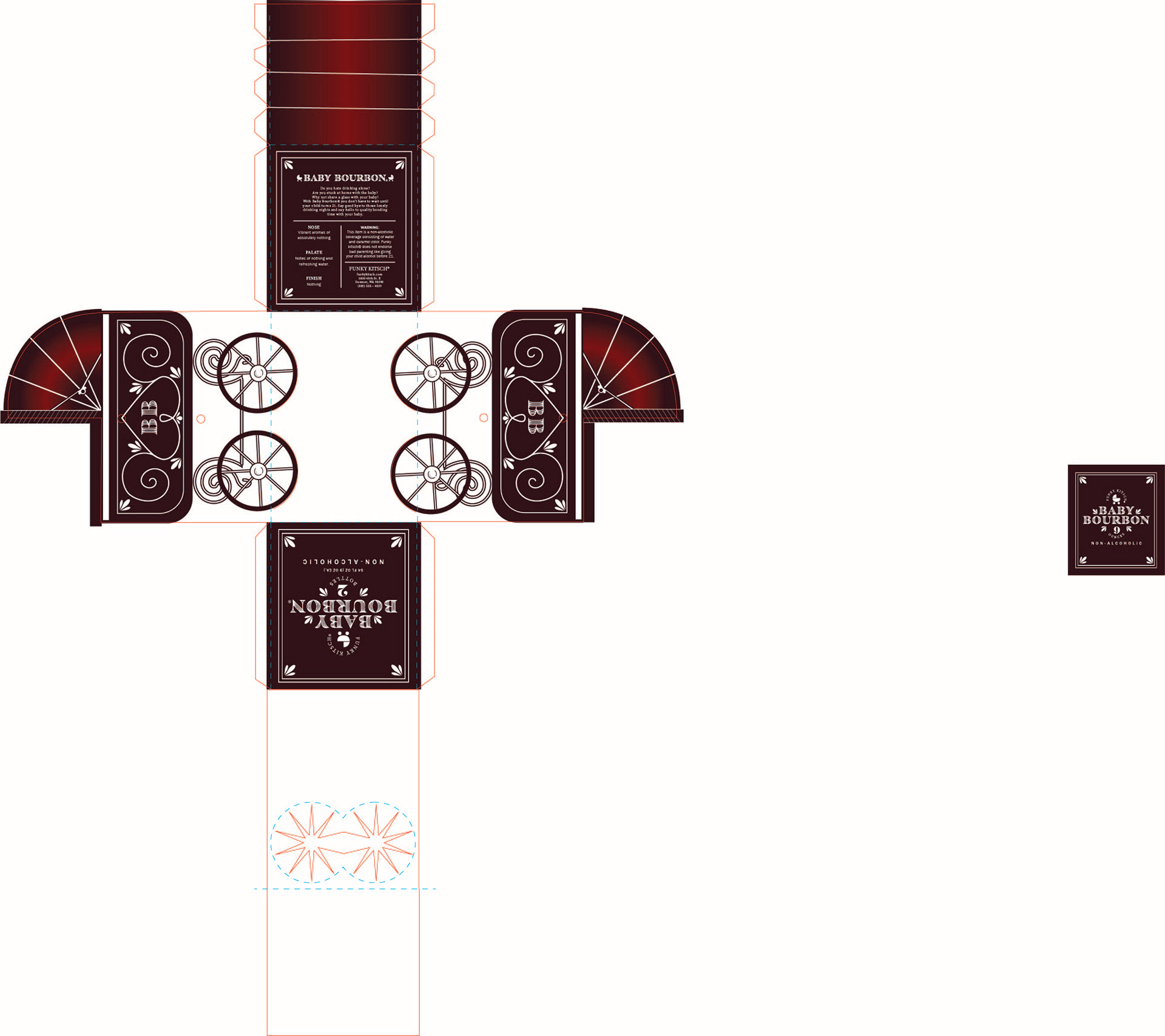
COMPUTER PROGRESSION 3
I did some color studies before I did this step so ignore the colorful dummies. I added a ribbon to the bottle and there were some things that were printed like I hoped on the wide format printer so I had to adjust so that it looked better when printed. I added more gradients to make elements have depth and more color. There were also dieline issues that I had with this progression as well. There were a lot of minor adjustments that I needed with the text.

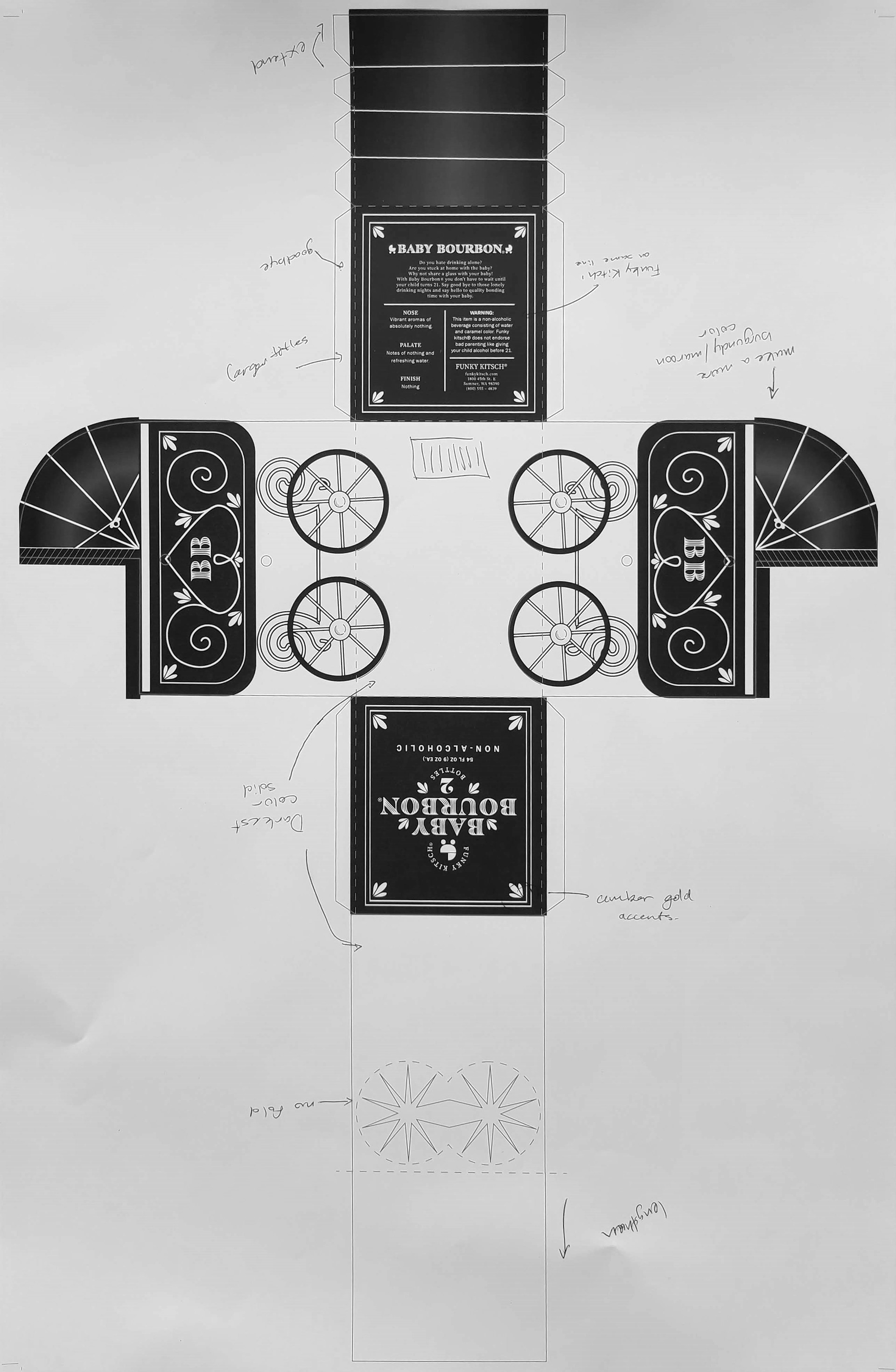
COLOR STUDIES
For these colors I wanted to stick to a color plus white or maybe 2 colors. I was drawn to the red or the green. Then someone said that the green reminded them of absinth so I went with red. Also to add more of the bourbon color I put a gold color as accents.
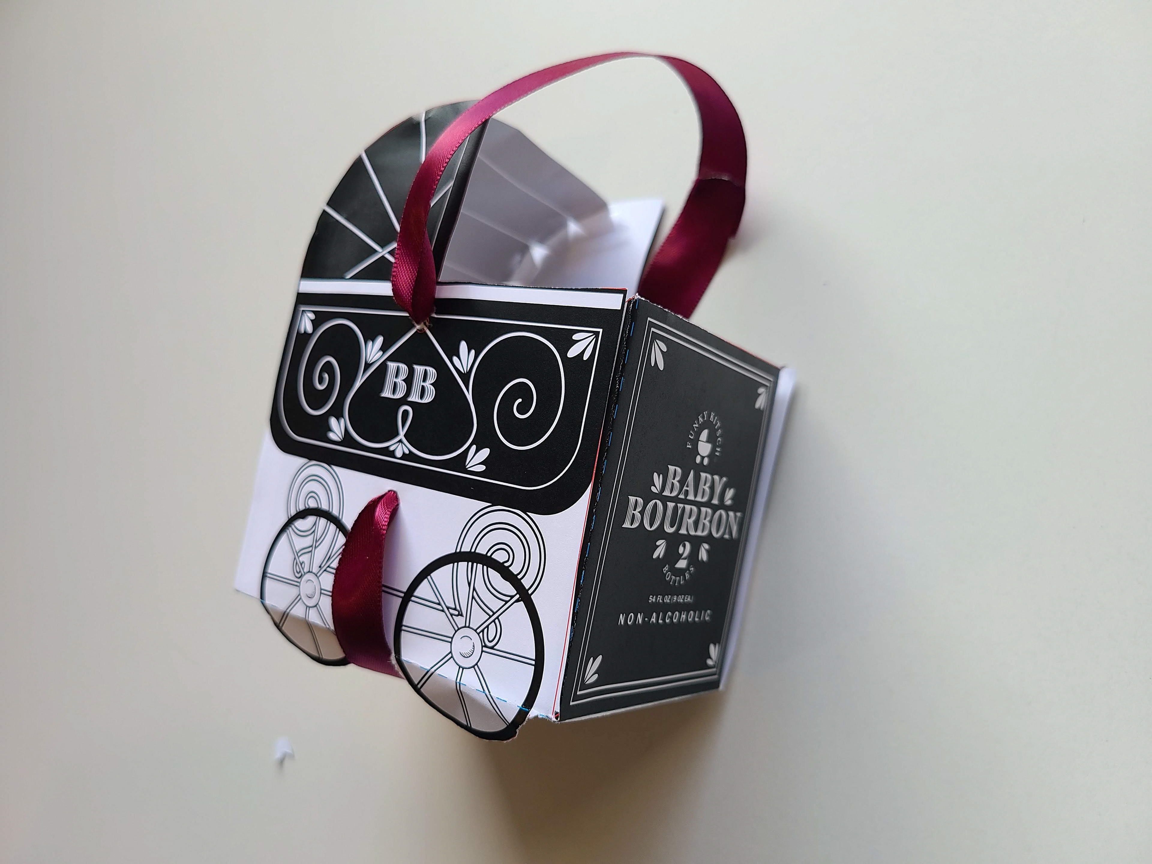
FINAL
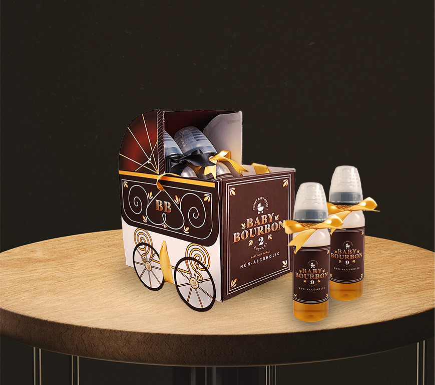
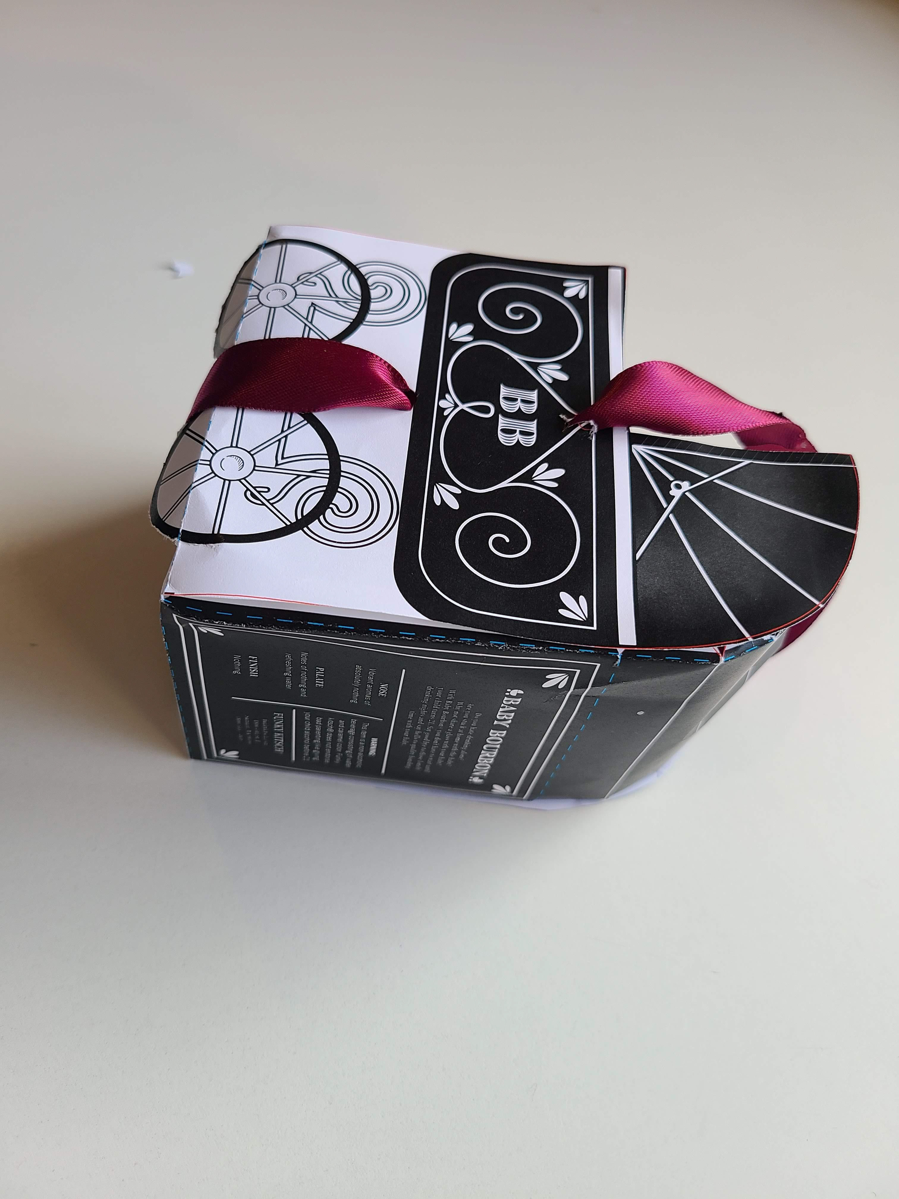
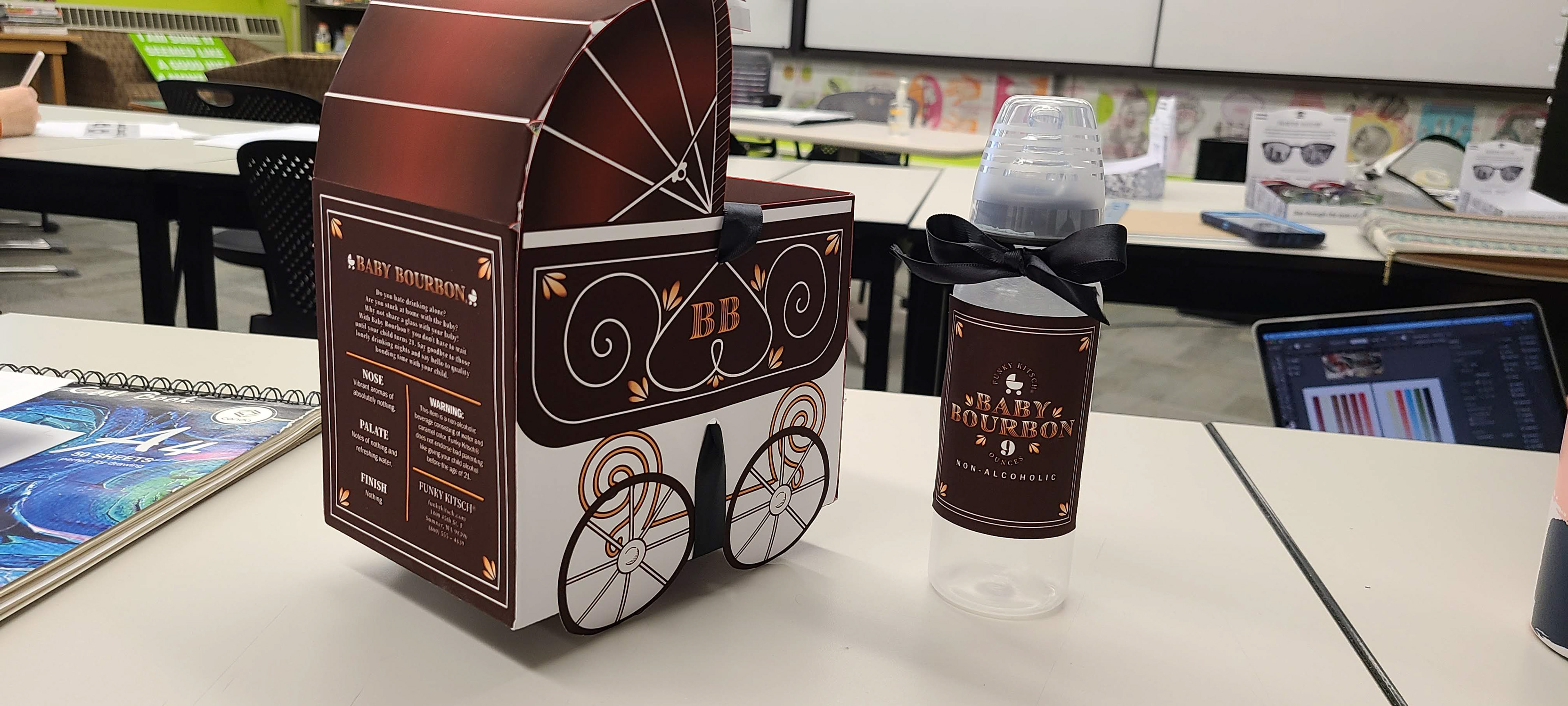
This came out way better than I expected. I will say if I were to remake the box I would have made it 1-2 inches wider so that the bottles had more room. They fit pretty snug in the box. I really like the colors and the final design as a whole. There were some problems with assembly so I would love to not show all of those imperfections like the accidental glue in come areas or the ribbon holes that weren't punched nicely. I had to reinforce the box quite a bit so that the bottles full of liquid could be held. Also for you to be able to pick up the box with the ribbon. I wanted it to be like the actual box but that is a very difficult feat to accomplish.
All-in-all I loved this project and this class.